Introduction
In today’s digital world, where user experience can truly make or break a startup, the significance of responsive web design cannot be overstated. Many tech startups grapple with the challenge of engaging their audience across various devices, and the stakes are high - potential customers may leave a site in frustration if it doesn’t meet their needs. This article delves into ten inspiring examples of responsive web design that not only enhance user interaction but also illustrate how adaptability can profoundly impact business success.
How can startups harness these successful strategies to ensure they not only meet but exceed their audience's expectations? By exploring these examples, we can uncover valuable insights that resonate with the emotional and professional needs of startup founders, fostering a sense of community and support in this journey.
RNO1: Transforming Digital Experiences with Responsive Design
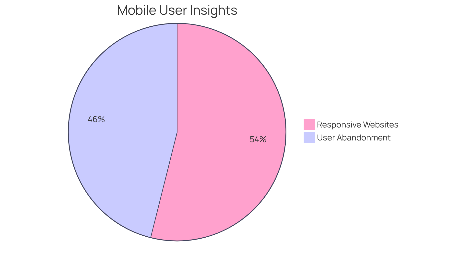
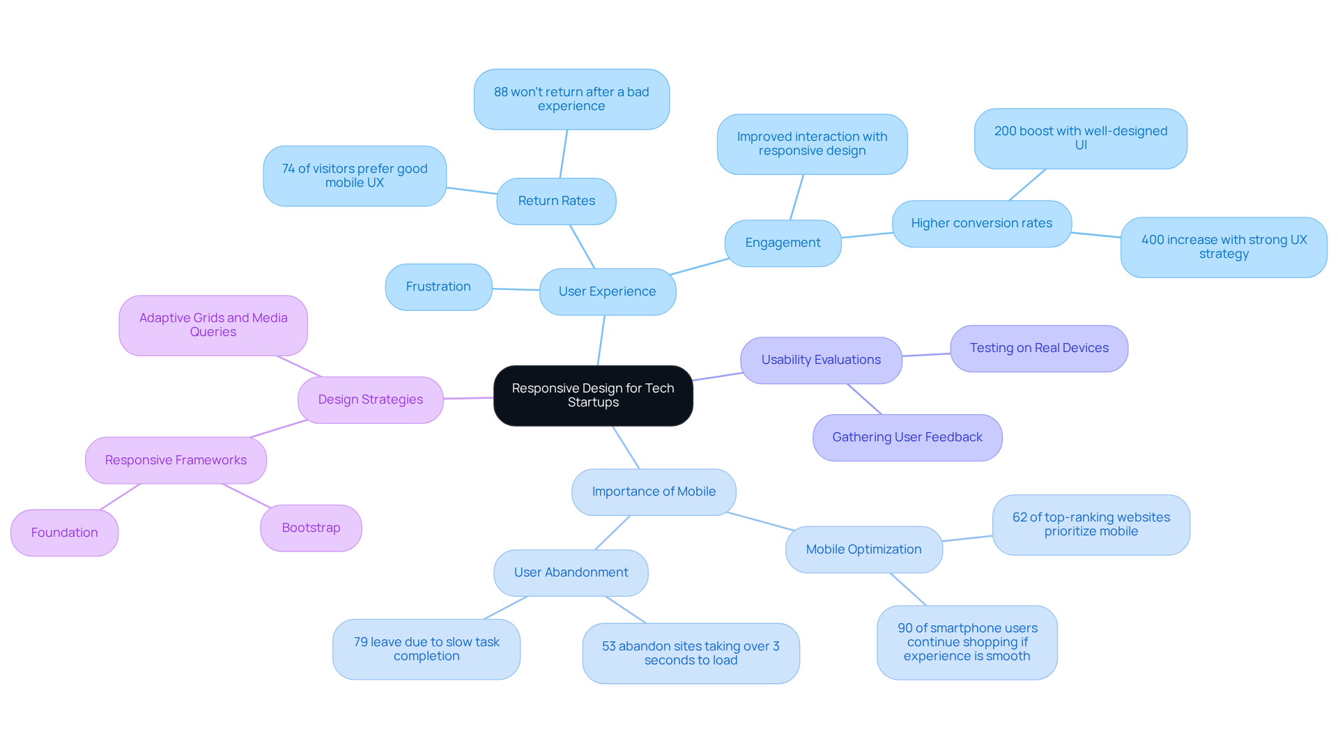
In today’s fast-paced digital world, many tech startups face a common challenge: connecting effectively with their audiences. It’s disheartening to see potential customers slip away simply because a website isn’t optimized for their devices. This issue is more pressing than ever, especially when statistics reveal that 53% of mobile users abandon sites that take longer than three seconds to load. Imagine the frustration of a user waiting for a page to appear, only to give up and move on.
At RNO1, we understand the emotional toll this can take on startup founders who pour their hearts into their businesses. The good news? There’s a solution. By embracing adaptive layouts, you can create web responsive examples that facilitate seamless interactions across multiple devices, enhancing user experience and boosting engagement. In fact, 62% of top-ranking websites serve as web responsive examples, reflecting a significant trend that can’t be ignored.
Consider the success story of a fashion e-commerce brand that utilized web responsive examples with a fully adaptable layout. They experienced a remarkable 30% increase in mobile conversions and a 25% reduction in bounce rates. This isn’t just a statistic; it’s a testament to the real, tangible benefits of adaptive layouts.
As you navigate the complexities of the digital landscape, remember that embracing these principles isn’t just a choice; it’s a vital part of your growth strategy. At RNO1, we’re here to support you every step of the way, helping you connect with your audience in a meaningful way.
The New York Times: Seamless Content Delivery Across Devices
Navigating the digital landscape can be challenging for tech startup founders, especially when it comes to ensuring that their content is accessible across all devices. Many struggle with creating a seamless user experience, which can lead to frustration for both the founders and their audience. This is where web responsive examples highlight the importance of responsive design.
Imagine a potential customer visiting your site on their smartphone, only to find that the layout is clunky and difficult to navigate. This not only diminishes their experience but can also deter them from returning. In fact, studies show that 74% of visitors are more likely to return to a site that offers excellent mobile user experience. This statistic highlights the critical need for tech startups to prioritize web responsive examples in their design layouts.
RNO1 understands this challenge and exemplifies a commitment to solutions driven by aesthetics. Every interaction is crafted with a strong visual impact, ensuring that users feel valued and engaged. As Usman Jatoi wisely notes, 'Achieving a smooth interaction across all devices requires careful planning and execution.' This insight resonates deeply with the journey of many startup founders who are striving to create meaningful connections with their audience.
To truly enhance user experience, tech startups should consider performing usability evaluations that showcase web responsive examples. This step is crucial in ensuring that their sites meet the needs of their audience. Additionally, focusing on elements like adaptable grids and media queries can significantly improve interactions, making users feel more at home on your platform.
By embracing these strategies, brands can foster deeper connections with their audience, ultimately driving engagement and retention. Remember, you’re not alone in this journey; RNO1 is here to support you every step of the way.
Dropbox: User-Centric Responsive Design for Enhanced Usability
Navigating the digital landscape can be daunting for tech startup founders. Many struggle with creating user-friendly interfaces that truly resonate with their audience. This challenge can lead to frustration, as potential customers may abandon a site that feels clunky or uninviting.
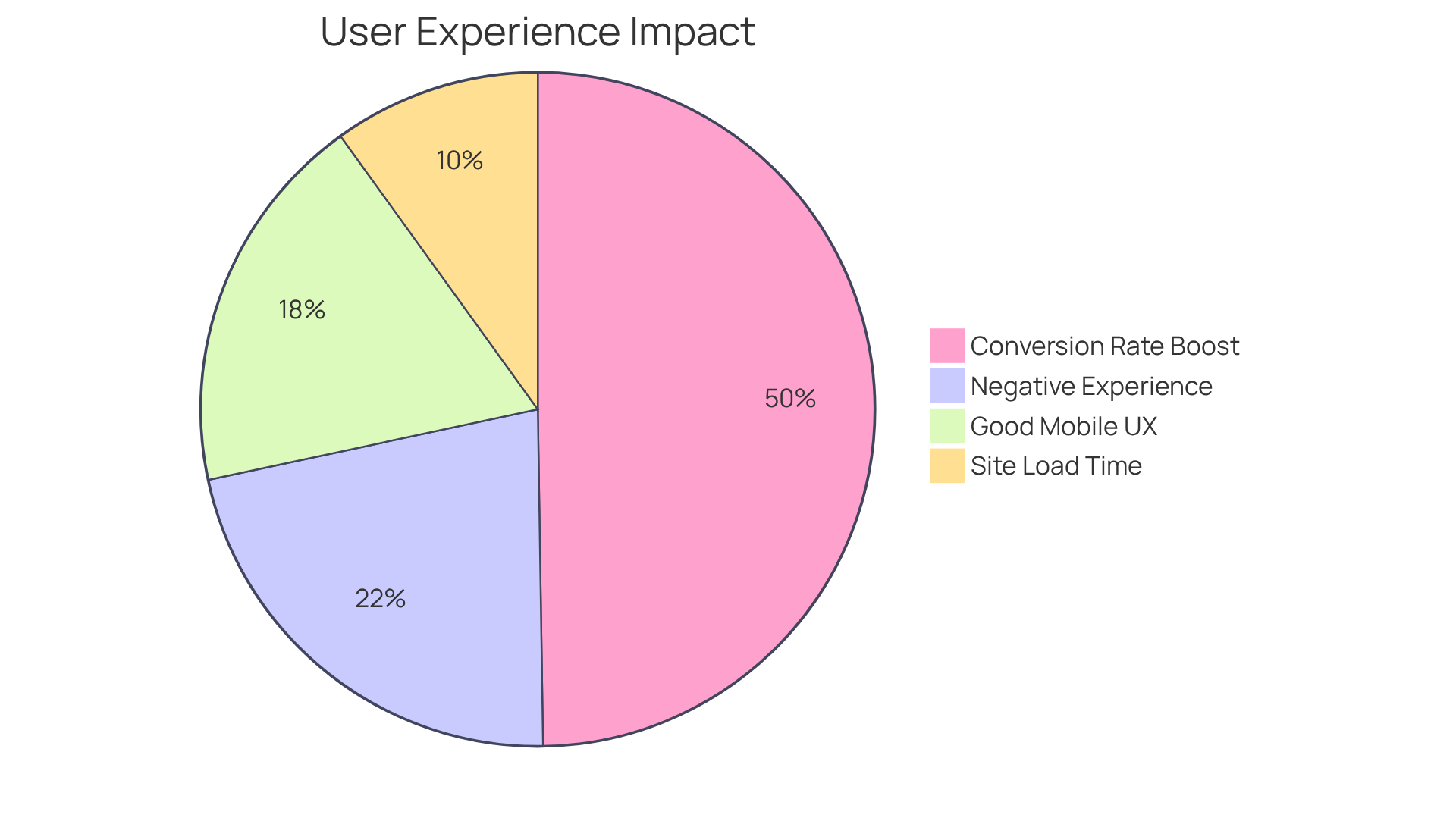
At RNO1, we understand these pain points deeply. We know that when users encounter difficulties, it not only affects their experience but can also hinder the growth of your startup. Did you know that 40% of individuals will leave a site if it doesn’t load within just 3 seconds? And with 88% of users unlikely to return after a negative interaction, the stakes are high.
But there’s hope. RNO1 showcases web responsive examples that exemplify a user-centric approach to responsive design, ensuring that interfaces are intuitive and accessible across devices. By focusing on usability, we enhance the overall interaction, allowing individuals to navigate effortlessly through your services. This commitment not only boosts client satisfaction but also positions RNO1 as a leader in branding and digital growth. We’re here to provide valuable insights for startups looking to refine their own interfaces.
Through collaborations with innovative firms like Amount and Spring Labs, we’ve seen firsthand how design-focused solutions can revolutionize digital branding and audience interactions. As UX specialists point out, a well-crafted interface can enhance conversion rates by as much as 200%. Every dollar spent on design can yield a return of $100, showcasing the financial benefits of investing in client interactions.
As Suay Çakırca wisely notes, '74% of visitors are more inclined to return to a site with good mobile UX.' This highlights the importance of intuitive layouts for startups aiming to create engaging and effective digital experiences, as seen in various web responsive examples. At RNO1, we’re dedicated to helping you create those experiences, ensuring your startup not only survives but thrives in a competitive environment.
Etsy: Crafting a Unique Marketplace with Responsive Design
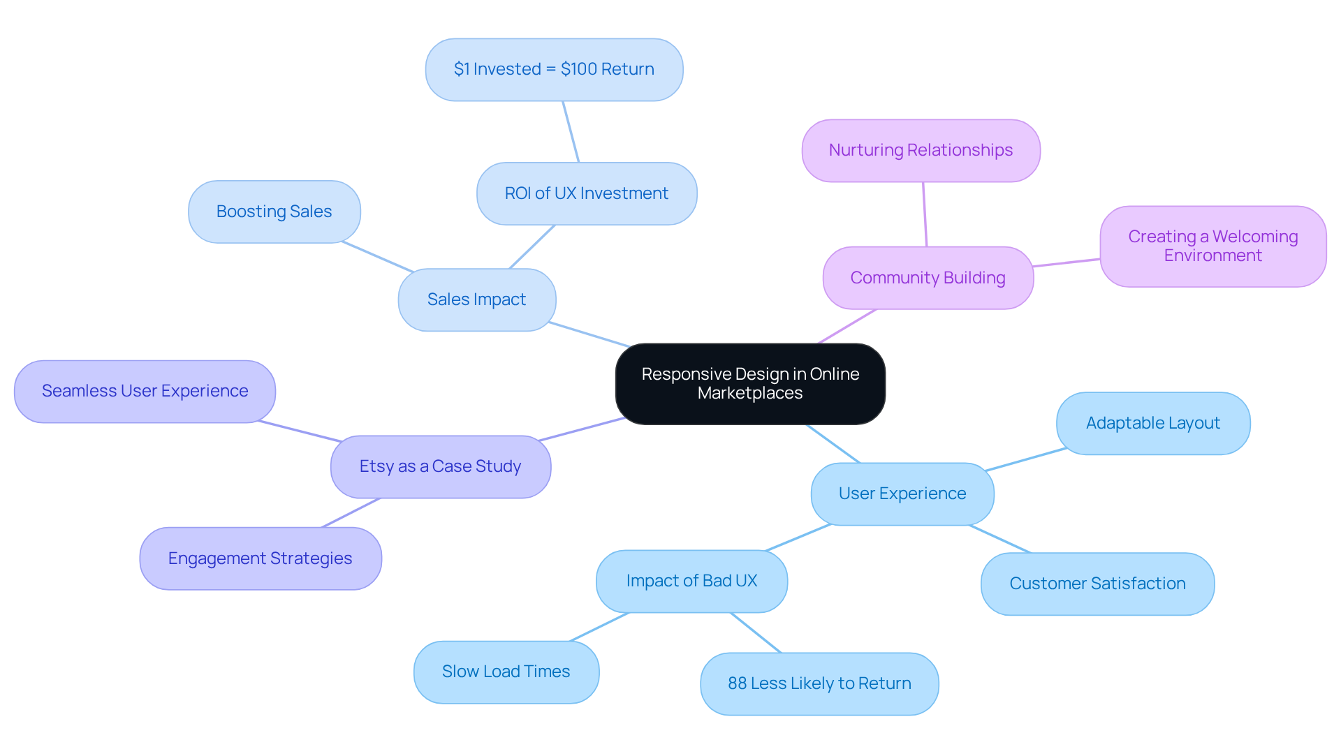
Navigating the world of online marketplaces can be challenging for tech startup founders. Many struggle with creating a shopping experience that truly resonates with their audience. When users encounter a website that doesn’t adapt to their device, unlike web responsive examples, frustration can set in, leading to lost sales and disengagement. This is a common pain point that can feel overwhelming.
Etsy stands out as a beacon of hope in this landscape. Its adaptable layout is not just a feature; it’s the heart of its unique marketplace. By seamlessly adjusting to different screen sizes, Etsy ensures that users can effortlessly explore and purchase handmade items, no matter where they are or what device they’re using. This thoughtful design enhances customer satisfaction and significantly boosts sales, demonstrating that web responsive examples are essential in eCommerce.
For tech startups looking to carve out their own niche, Etsy serves as one of the prime web responsive examples demonstrating how adaptability can foster engagement and lead to success. RNO1 emphasizes a design-centered strategy, recognizing that audience interaction is crucial for boosting conversions. Investing in adaptable layouts isn’t just a technical decision; it’s a nurturing approach that can yield substantial returns.
Imagine the relief of knowing that your online marketplace can meet your customers where they are, creating a welcoming environment that encourages them to return. By prioritizing user experience through adaptable design, you’re not just enhancing your platform; you’re building a community. Let RNO1 guide you in this journey, ensuring that your startup thrives in a competitive landscape.
Airbnb: Global Accessibility Through Responsive Web Design
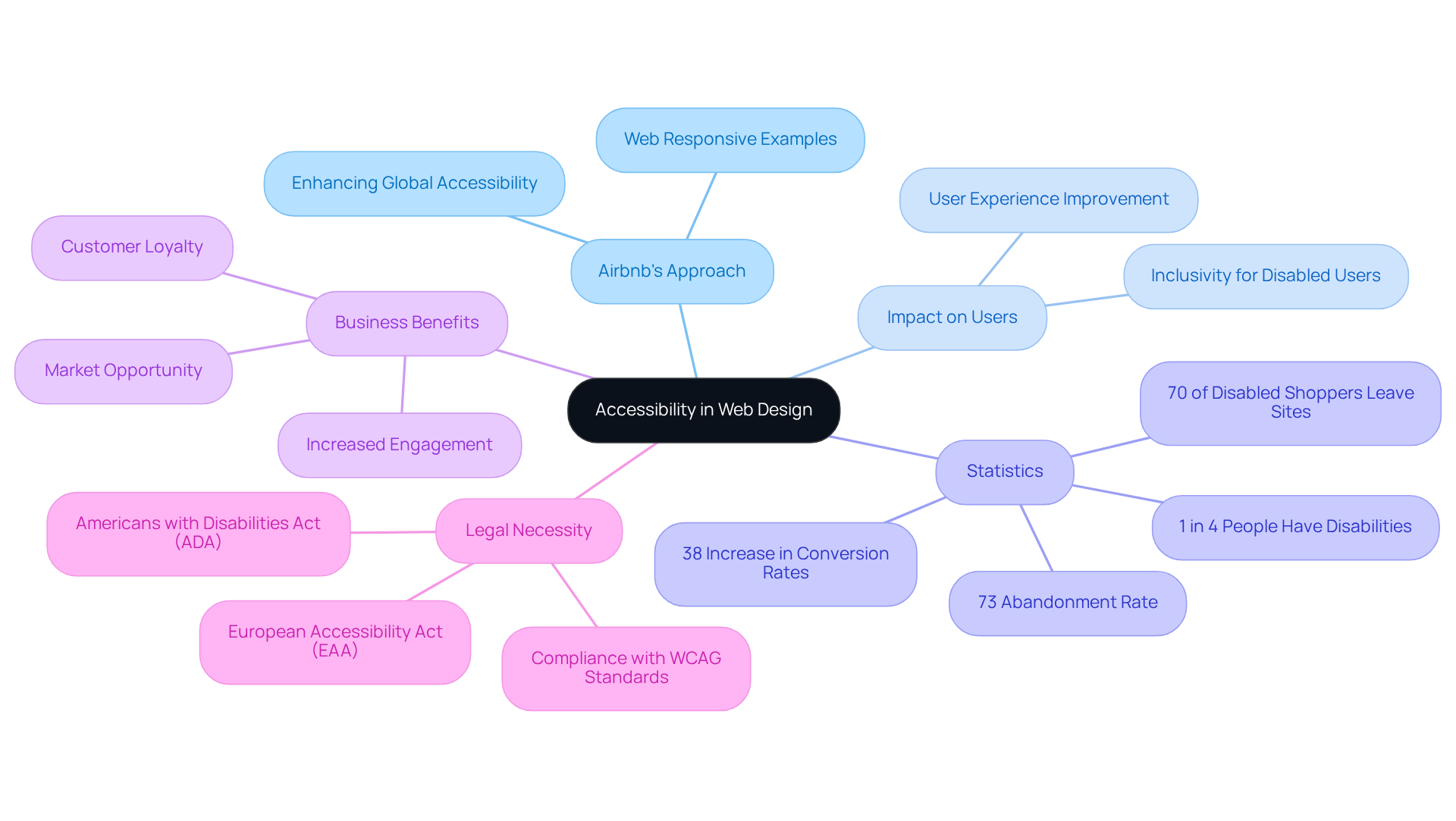
Airbnb serves as a powerful example of web responsive examples that significantly enhance global accessibility. Imagine trying to book a place to stay while navigating a complicated website-frustrating, right? This is a reality for many individuals, especially those with disabilities. By prioritizing accessibility, Airbnb not only improves the overall interaction but also showcases web responsive examples that empower travelers to book accommodations effortlessly from any device, anywhere in the world.
This commitment to inclusivity is more than just good practice; it’s a vital lesson for tech startups looking to broaden their reach. As we approach 2025, the demand for accessible digital experiences will only grow. Startups that embrace web responsive examples will likely see increased engagement and customer loyalty. Research reveals that 73% of disabled individuals abandon websites that are hard to navigate, and 70% of disabled online shoppers often leave sites they find challenging. These statistics highlight the economic impact of inadequate accessibility.
Moreover, adaptive layouts can lead to a remarkable 38% increase in conversion rates. Businesses that emphasize accessibility are not just doing the right thing; they are also likely to attract disabled users and boost sales. By adopting these principles, tech startups can meet the needs of international audiences and travelers, fostering a more inclusive digital landscape.
As industry experts remind us, "When accessibility is prioritized, the digital world becomes more equitable, inclusive, and empowering." With legal frameworks like the Americans with Disabilities Act (ADA) in place, ensuring accessibility is not merely a best practice; it’s a legal necessity for businesses aiming to thrive in the digital age. Let’s work together to create a more accessible future for everyone.
Wired: Engaging Readers with Responsive Media Design
Wired highlights a common challenge many tech startups face: creating engaging content that resonates across various devices, which can be illustrated by web responsive examples. It’s frustrating when your audience can’t connect with your message simply because they’re on a different platform. This issue can lead to disengagement, which is the last thing you want when you’re pouring your heart into your work.
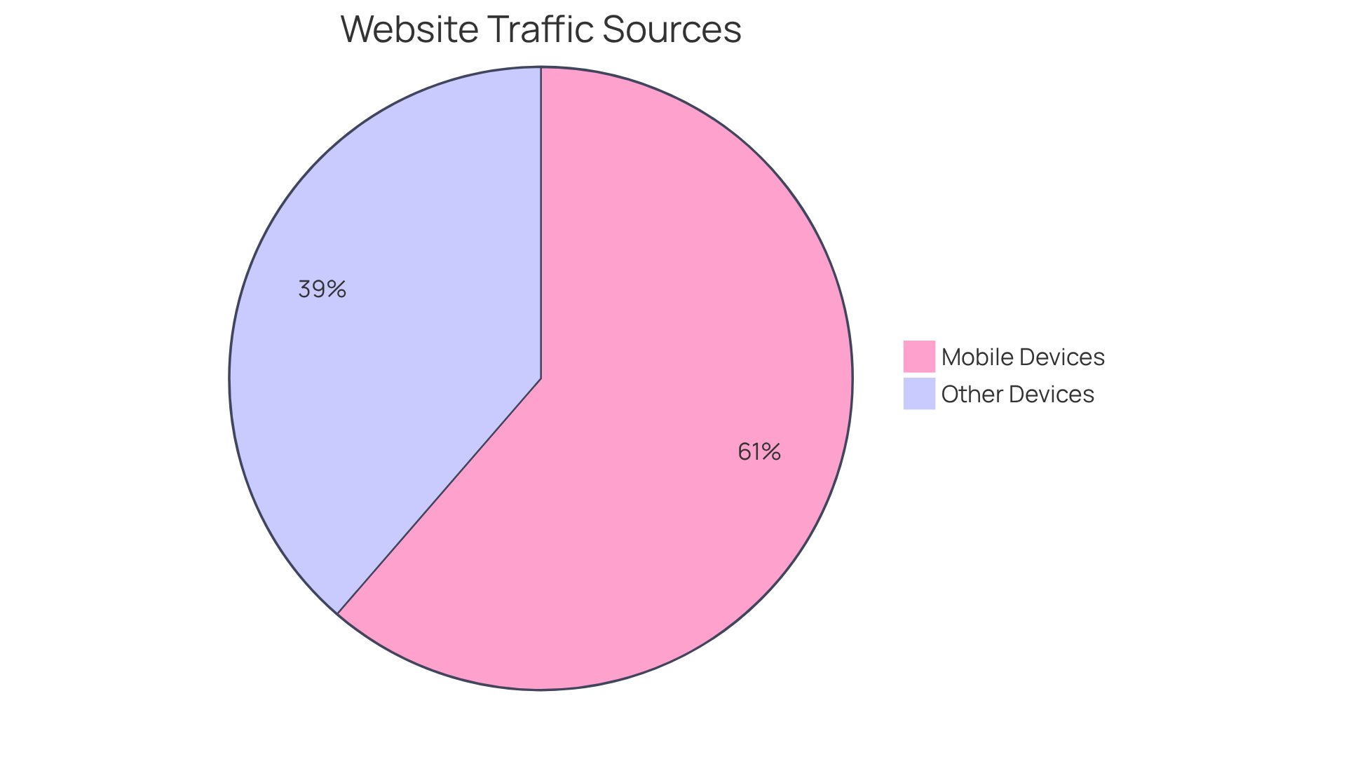
Imagine this: 61.35% of global website traffic comes from mobile devices. That’s a staggering number! If your content isn’t optimized for mobile, as demonstrated by several web responsive examples, you risk losing a significant portion of your audience. It’s not just about aesthetics; it’s about ensuring your message reaches those who need it most. Research shows that mobile-friendly websites enjoy a 40% higher conversion rate compared to their non-optimized counterparts. This isn’t just a statistic; it’s a lifeline for startups striving to make their mark.
As we navigate the digital landscape of 2025, the significance of web responsive examples with adaptable layouts cannot be overstated. They’re not just a nice-to-have; they’re essential for capturing your readers’ attention and delivering your content effectively. At RNO1, we understand the challenges you face, and we’re here to help. Our design-focused solutions are tailored to meet your needs, ensuring that your content shines, no matter where it’s viewed. Together, we can foster success through strategies that resonate with your audience and elevate your startup’s presence in the digital world.
Spotify: Delivering Music Anytime, Anywhere with Responsive Design
Have you ever felt frustrated trying to enjoy your favorite music, only to be met with web responsive examples that just don’t work across your devices? It’s a common struggle for many, and it can really dampen the joy of discovering new tracks. When you’re on the go, the last thing you want is to wrestle with an app that lacks web responsive examples to adapt to your needs. This is where Spotify shines, offering an adaptable layout that allows you to enjoy music effortlessly, whether you’re on your smartphone or at your desktop.
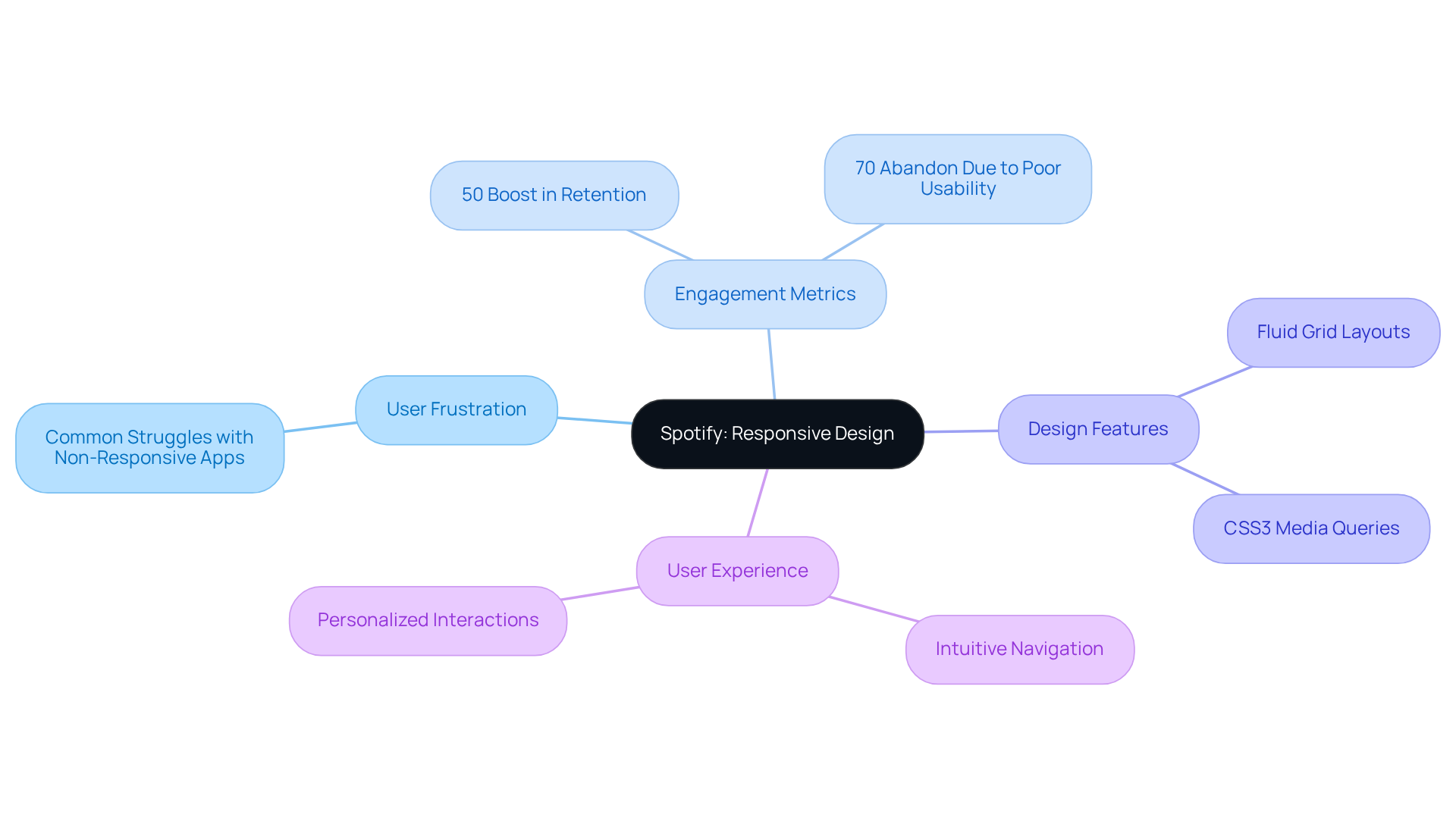
Spotify understands that a seamless experience is crucial. By ensuring its interface is intuitive and adaptable, it significantly enhances your overall experience. Imagine easily discovering and listening to your favorite tracks without the hassle of navigating a complicated layout. Studies reveal that web responsive examples can boost visitor retention rates by 50%, as they enhance engagement metrics like session duration and page views. This commitment to user-friendly design, which includes several web responsive examples, not only elevates listener satisfaction but also solidifies Spotify’s position as a leader in the music streaming industry.
Experts agree that web responsive examples of a well-implemented adaptable layout can profoundly impact user perception and engagement. According to the Nielsen Norman Group, a staggering 70% of users abandon an app due to poor usability. This statistic highlights the importance of web responsive examples for creating a flexible interface. With features like fluid grid layouts and CSS3 media queries, Spotify ensures that your music is always accessible, no matter where you are. It’s about creating tailored interactions that engage you more effectively, making your listening experience not just enjoyable but also personal.
So, the next time you find yourself frustrated with an app, remember that there are solutions out there designed with your needs in mind. Spotify’s dedication to adaptability is a testament to how technology can enhance our lives, making music not just a pastime but a seamless part of our daily experiences.
Magic Leap: Innovative Technology Meets Responsive Design
Magic Leap showcases how cutting-edge technology can blend with adaptive aesthetics to foster immersive augmented reality experiences. Yet, many tech startups face the challenge of creating web responsive examples that ensure their platforms adapt seamlessly across various devices. This struggle can lead to frustration and disengagement, making it difficult to connect with users in a meaningful way.
At RNO1, we understand the emotional toll this can take on founders who are passionate about transforming user experiences in the AR landscape. The implications of not addressing this adaptability can be significant, potentially stalling growth and innovation. We believe that a design-focused approach is essential in every interaction, nurturing digital growth and transformation.
As immersive technologies continue to evolve, the importance of flexible layouts will only grow. It’s vital for startups to prioritize adaptability in their web responsive examples of digital solutions. We’re here to support you on this journey, offering insights and strategies that can help you navigate these challenges with confidence. Together, we can create a community that thrives on innovation and connection.
Dribbble: Showcasing Creative Portfolios with Responsive Design
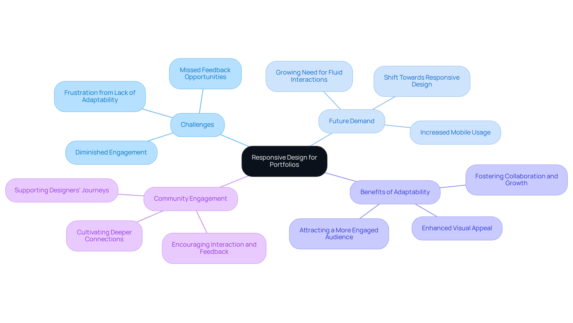
Many designers face the challenge of effectively showcasing their portfolios across various devices. This can lead to frustration, as a lack of adaptability often results in diminished engagement and missed opportunities for valuable feedback from the community. For creative professionals, this interaction is crucial.
As we look ahead to 2025, the demand for fluid digital interactions is only set to grow. Tech startups in the creative sector can take a page from Dribbble’s playbook. By embracing adaptable layouts, they can significantly enhance the presentation of web responsive examples and how users engage with them. Imagine a world where your work is not just accessible but also visually captivating on any device. This approach not only attracts a more engaged audience but also fosters collaboration and growth within the creative community.
By prioritizing accessibility and visual appeal, designers can cultivate deeper connections with their audience. This nurturing environment encourages interaction and feedback, ultimately driving the creative community forward. Let’s embrace this opportunity together, ensuring that every designer feels supported and valued in their journey.
The Boston Globe: Responsive Journalism for Modern Readers
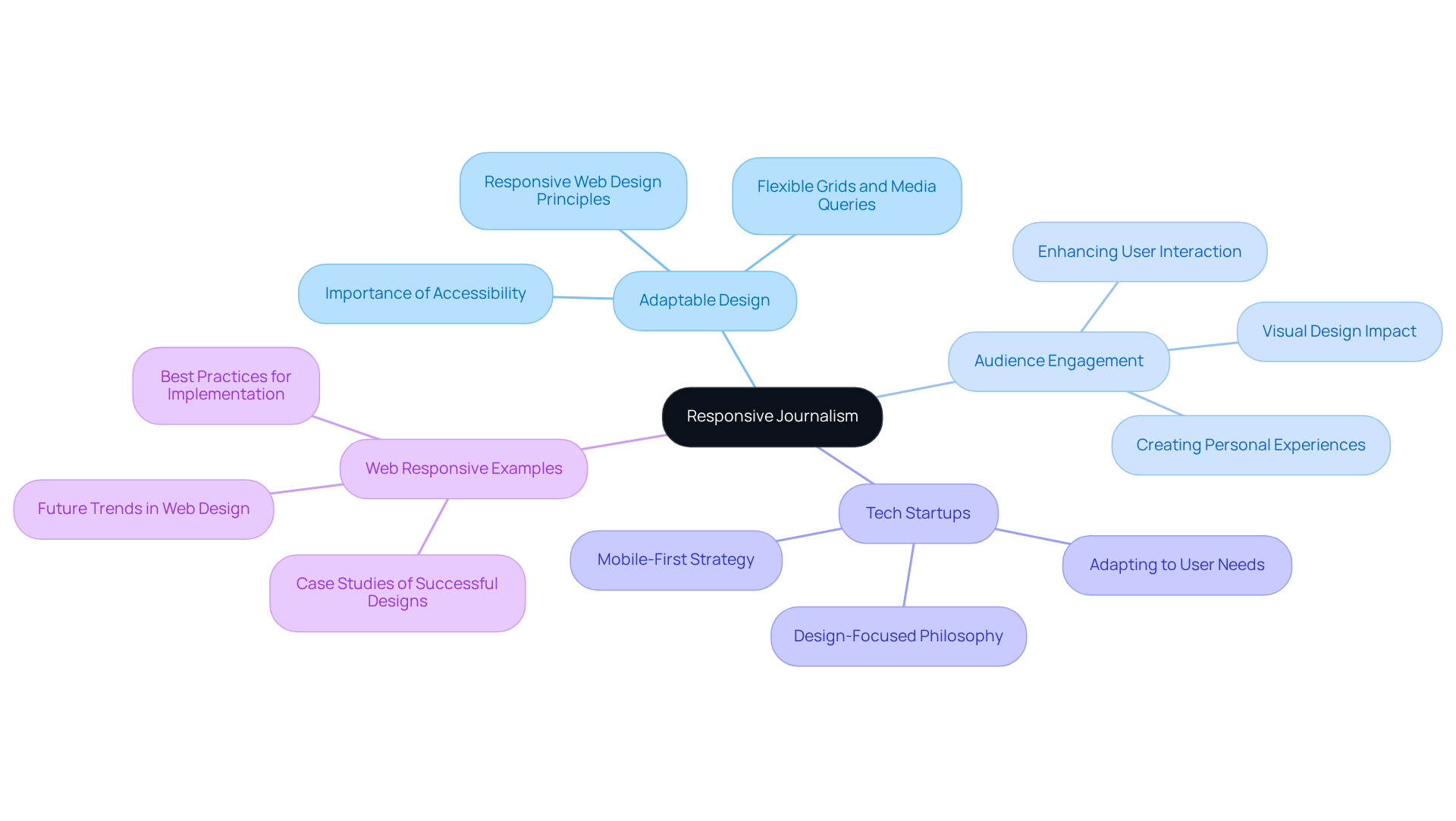
The Boston Globe highlights a common challenge many tech startup founders face: the need for adaptable design in journalism. In today’s fast-paced world, readers have diverse needs, and failing to meet them can lead to disengagement. This can be frustrating, especially when you’re pouring your heart into your work. But there’s hope. By prioritizing accessibility and engagement across various devices, the Globe provides web responsive examples that significantly enhance the reading experience and create a deeper connection with its audience.
This approach not only showcases a commitment to adaptable journalism but also offers a valuable lesson for tech startups in the media sector. As adaptability becomes increasingly vital in content delivery, using web responsive examples can strengthen audience connection and retention. This is where RNO1 comes in. Their design-focused philosophy emphasizes the importance of thoughtful design in every interaction, showcasing web responsive examples and encouraging startups to adopt a mobile-first design strategy.
Imagine the impact of a design that truly resonates with your audience. It’s not just about aesthetics; it’s about creating an experience that feels personal and engaging. By integrating these principles, you can foster success in a competitive environment, nurturing relationships with your readers that last. Let’s embrace this journey together, ensuring that your startup not only survives but thrives.
Conclusion
In today’s fast-paced digital world, embracing responsive design isn’t just a choice for tech startups; it’s a vital necessity for thriving amidst competition. Many founders find themselves overwhelmed by the challenge of creating engaging, user-friendly experiences across various devices. This struggle can lead to frustration, as neglecting responsive design often results in lost users and missed opportunities.
Consider the staggering statistics that reveal how responsive design directly impacts user retention and conversion rates. Companies like RNO1 are committed to transforming digital experiences, while Airbnb emphasizes global accessibility. These examples highlight the importance of crafting seamless interactions that truly resonate with users. The successful strategies of brands like Etsy, Spotify, and Wired serve as a reminder that investing in responsive design is essential for building deeper connections with audiences and fostering business growth.
As we reflect on these insights, it’s clear that the significance of responsive design cannot be overstated. For tech startups navigating the complexities of a competitive environment, prioritizing adaptable layouts and user-centric approaches is crucial for survival and success. By learning from the triumphs of established brands and implementing these practices, startups can not only meet their users’ needs but also flourish in an increasingly digital landscape.
Let’s embrace this journey of transformation and innovation together - it's time to make responsive design a cornerstone of your strategy. Remember, you’re not alone in this; we’re here to support you every step of the way.
Frequently Asked Questions
What is the main challenge tech startups face in the digital world?
Tech startups often struggle to connect effectively with their audiences, particularly when their websites are not optimized for various devices.
Why is responsive design important for websites?
Responsive design is crucial because 53% of mobile users abandon sites that take longer than three seconds to load, highlighting the need for seamless interactions across devices.
What are adaptive layouts and how do they benefit websites?
Adaptive layouts are flexible designs that adjust to different screen sizes, enhancing user experience and engagement. Websites with such designs can see significant improvements in metrics like mobile conversions and bounce rates.
Can you provide an example of the impact of responsive design?
A fashion e-commerce brand that implemented responsive design experienced a 30% increase in mobile conversions and a 25% reduction in bounce rates.
What percentage of visitors are likely to return to a site with excellent mobile user experience?
Studies indicate that 74% of visitors are more likely to return to a site that offers a good mobile user experience.
How can tech startups improve their website usability?
Startups can enhance usability by performing evaluations to showcase responsive design, using adaptable grids, and media queries to improve user interactions.
What is the potential impact of a well-designed user interface on conversion rates?
A well-crafted interface can enhance conversion rates by as much as 200%, demonstrating the financial benefits of investing in user-friendly designs.
Why is it important for startups to focus on user-centric design?
Focusing on user-centric design can prevent potential customers from abandoning a site, as 88% of users are unlikely to return after a negative experience. This approach fosters deeper connections with the audience, driving engagement and retention.


