Overview
The article addresses a common challenge faced by startups: the struggle to create an effective design that communicates clearly and engages users. This issue can lead to confusion and disengagement, ultimately impacting growth and success.
By exploring various design principles—like the F-pattern, Z-pattern, color usage, typography, and minimalism—the article illustrates how these elements can transform user experience. When applied thoughtfully, they guide customer attention and foster brand cohesion, making a significant difference in conversion rates.
We understand that navigating these design choices can be overwhelming, but with the right support and insights, your startup can thrive in a competitive landscape.
Introduction
In the competitive landscape of startups, mastering visual hierarchy is not merely a design choice—it's an essential part of your journey. Effective visual hierarchy has the power to transform your brand's digital presence, ensuring that your messages are communicated clearly and engagingly. Yet, many startups face challenges with this critical aspect, often leading to confusion and disengagement from potential customers.
Have you ever felt that your audience just isn’t connecting with your brand? This struggle is all too common, but it doesn’t have to be your reality. How can emerging brands like yours harness the power of visual hierarchy to stand out and foster meaningful connections with your audience?
This article explores ten compelling examples that illustrate how startups can elevate their design strategies and enhance user experience through thoughtful visual hierarchy, guiding you toward a more impactful digital presence.
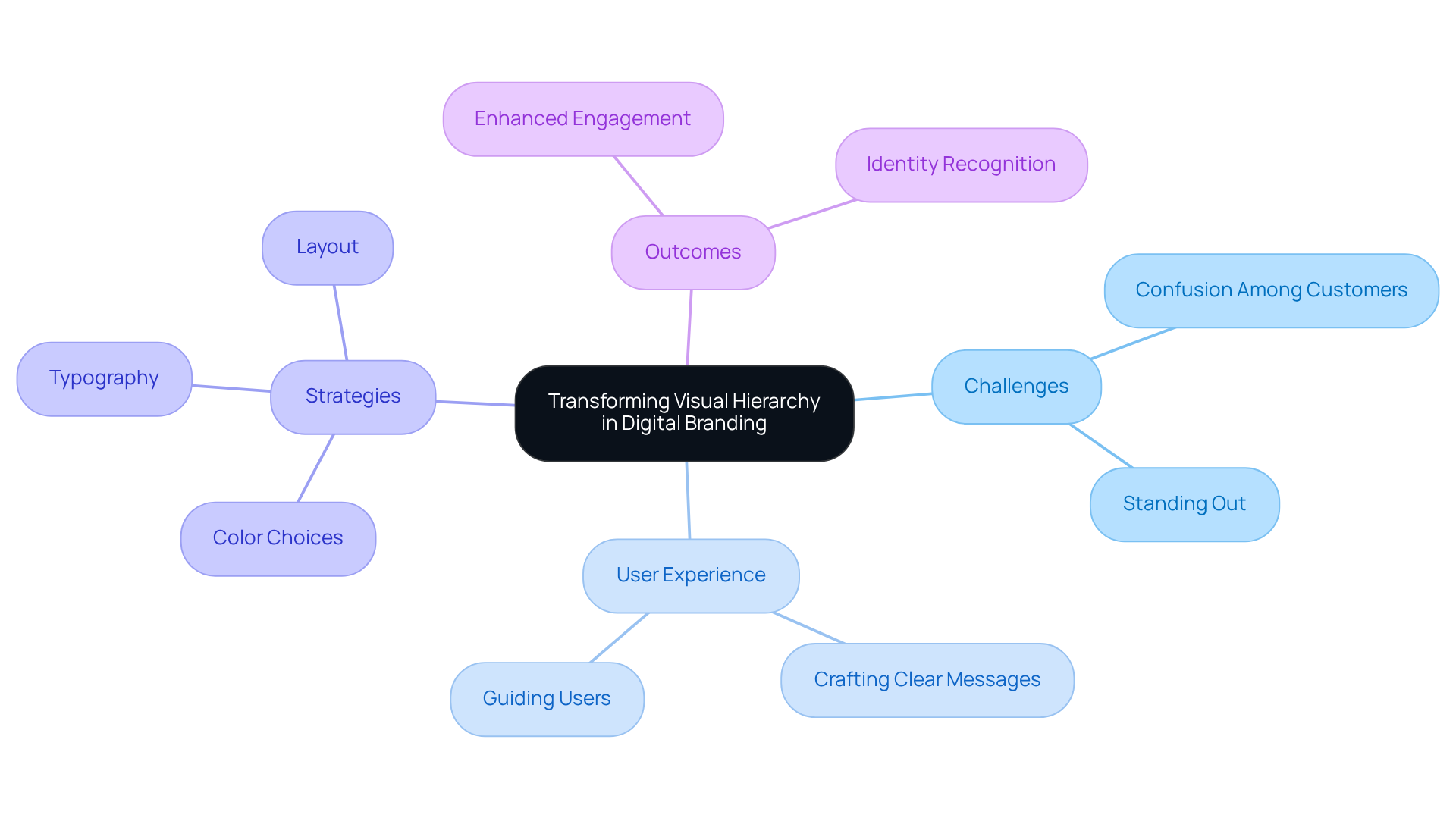
RNO1: Transforming Visual Hierarchy in Digital Branding
In the fast-paced world of digital branding, many startups struggle to establish clear visual hierarchy examples that communicate their message effectively. This challenge often leads to confusion among potential customers, making it difficult for brands to stand out in a crowded marketplace. At RNO1, we understand the pain points that come with navigating these complexities. Our commitment to user experience (UX) allows us to craft solutions that not only convey messages clearly but also guide individuals seamlessly through digital platforms.
Imagine a potential customer visiting your website, unsure of where to go or what to do next. This is a common scenario, and it can be disheartening for founders who pour their hearts into their brands. By leveraging strategic color choices, typography, and layout, RNO1 creates visually engaging experiences that serve as visual hierarchy examples resonating deeply with target audiences. Our approach enhances identity recognition and significantly boosts engagement and conversion rates.
As brands increasingly recognize the importance of a strong digital presence, we at RNO1 are here to support you. Our methodologies illustrate effective branding strategies that prioritize customer interaction and satisfaction, fostering a sense of community around your brand. Together, we can turn your vision into a compelling reality, ensuring that your brand not only stands out but also connects meaningfully with your audience.
F-Pattern: Guiding User Attention in Web Design
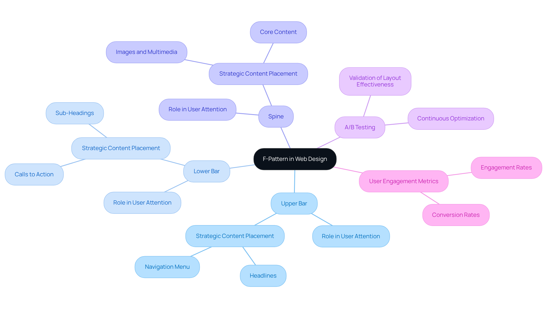
The F-pattern represents a design layout that mirrors how people naturally scan web pages. Often, individuals begin at the top left, moving horizontally across the page before scanning vertically down the left side. This pattern consists of three key components: the upper bar, lower bar, and spine. Understanding this layout is crucial for new businesses, as it provides visual hierarchy examples that highlight the importance of strategic content placement.
New businesses can significantly boost engagement by utilizing visual hierarchy examples, positioning essential elements—like headlines, sub-headings, and calls to action—along the F-pattern path. Research from a 2008 study indicates that individuals typically read only about 28% of the text on a page, making it vital to capture attention quickly.
For instance, the case study 'Engagement with the F-Shaped Layout' demonstrates how successful new businesses have skillfully utilized the F-pattern to guide interaction, resulting in improved engagement metrics. By ensuring that vital content is placed where individuals are most likely to look, startups can cultivate a more compelling and effective web experience.
Furthermore, employing A/B testing, as discussed in the case study 'A/B Testing for Website Optimization,' can validate the effectiveness of these placements, allowing for continuous optimization based on user behavior statistics. This method not only enhances visibility but also nurtures a deeper connection with the audience, ultimately driving conversions and growth.
Z-Pattern: Structuring Content for Optimal Engagement
In the fast-paced world of tech startups, capturing the attention of visitors can feel like an uphill battle. Many founders grapple with the challenge of creating landing pages that not only attract but also engage their audience. This struggle can lead to missed opportunities and frustration, as essential messages get lost in the noise.
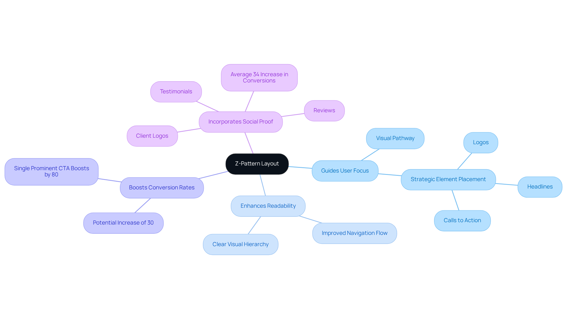
However, there is a nurturing solution: the Z-pattern layout. This design thrives in visually rich environments, guiding individuals' focus in a gentle zigzag from the top left to the bottom right. By strategically placing key elements such as logos, headlines, and calls to action, startups can create a seamless journey for their visitors, allowing them to absorb crucial information effortlessly.
Research shows that using the Z-pattern can enhance readability and navigation flow, potentially boosting conversion rates by as much as 30%. As Sarah Lee wisely notes, "Mastering these patterns is essential for UX designers aiming to enhance user engagement and conversion rates."
This structured approach, which includes visual hierarchy examples, not only captures attention but also facilitates quicker decision-making, making it a vital consideration for any startup seeking to optimize its digital presence. Moreover, incorporating elements of social proof can further increase conversions by an average of 34%.
We encourage startups to embrace the Z-pattern layout in their landing page design, as it offers a compassionate way to maximize effectiveness and connect with their audience meaningfully.
Color and Contrast: Enhancing Visual Hierarchy
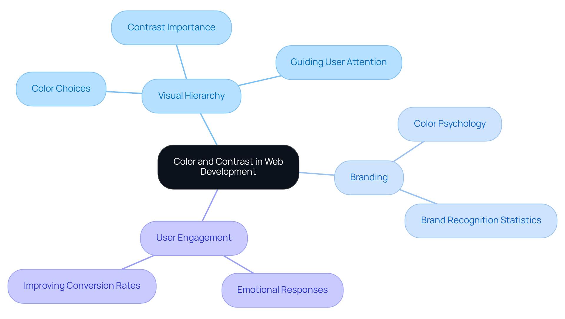
In the journey of web development, many founders face the challenge of creating visual hierarchy examples that are strong. At RNO1, we understand how crucial color and contrast are in this endeavor, as aesthetics play a vital role in every interaction. Designers can create visual hierarchy examples by using vibrant colors for primary elements and softer tones for secondary information, gently guiding users' attention where it matters most. High contrast between text and background is a vital aspect of visual hierarchy examples, as it enhances readability and ensures that important messages stand out.
As we look ahead to 2025, it’s essential for startups to thoughtfully choose their color palettes. This choice can evoke specific emotions and strengthen brand identity, all while maintaining clarity and focus in their designs. RNO1 is dedicated to providing design-focused solutions that underscore the importance of these selections, enhancing marketability through Return On Design & Digital (RODD) strategies.
Statistics show that color can boost brand recognition by up to 80%, underscoring its significance in effective branding. Moreover, understanding color psychology allows startups to craft visuals that resonate with their target audience, ultimately fostering improved user engagement and satisfaction. As Henri Matisse wisely noted, color helps convey the light in the artist's mind, highlighting its profound influence on visual structure.
We invite you to reflect on your experiences with color in your branding journey. Together, we can explore how to harness the power of color to create a compelling visual narrative that speaks to your audience.
Typography: Establishing Hierarchy Through Text Design
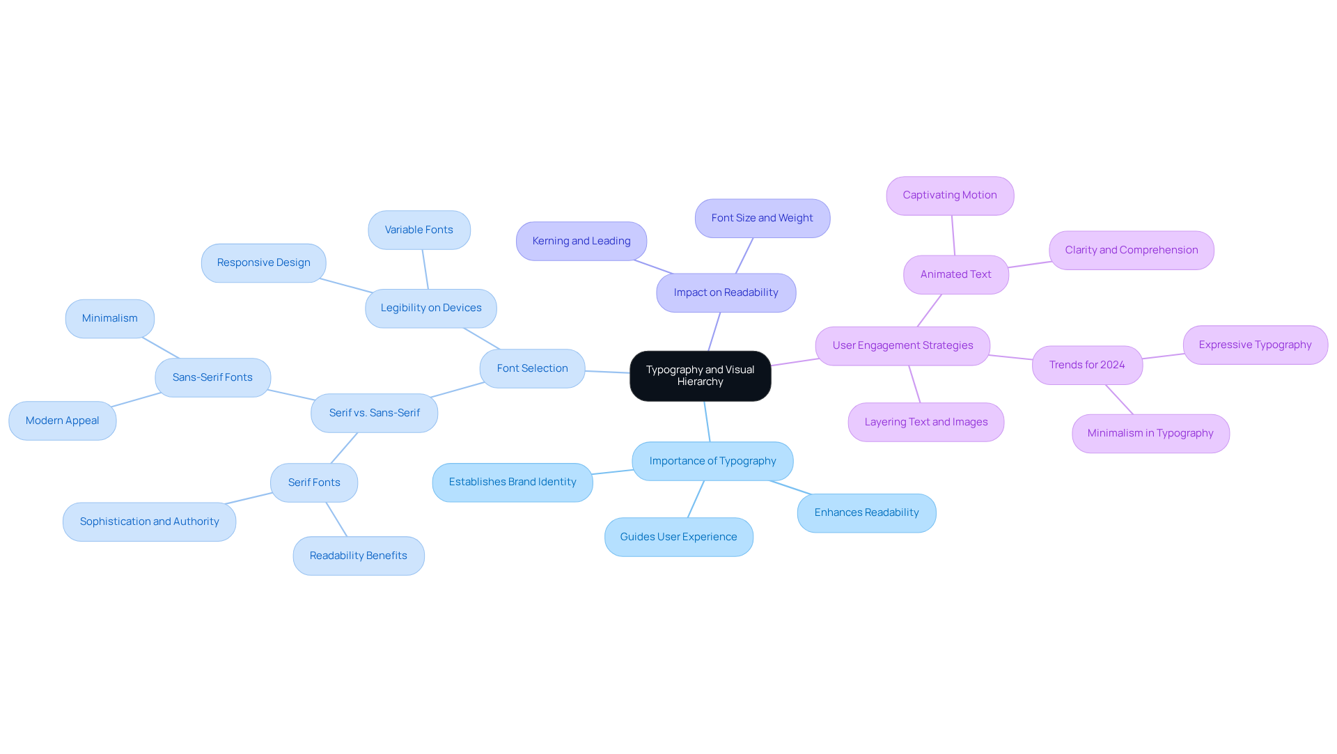
Typography is a crucial element that can significantly impact visual hierarchy examples in design, a challenge many startups face. When font sizes, weights, and styles are varied thoughtfully, as seen in visual hierarchy examples, it becomes easier to distinguish between headings, subheadings, and body text. This clarity not only enhances readability but also provides visual hierarchy examples that help guide users intuitively through content. It's essential for startups to choose fonts that truly reflect their brand identity while also ensuring legibility on different devices and screen sizes.
Have you ever noticed how certain fonts seem to draw you in? Studies reveal that serif fonts may be read up to 10% faster than sans-serif fonts, underscoring the importance of font selection in user experience. This can be particularly painful for startups striving to make an impression. However, effective typography doesn't just improve readability; it can significantly boost user engagement and conversions. In fact, over 300 companies have successfully raised their prices by an average of 35% thanks to improved creative strategies, showcasing the tangible benefits of thoughtful design.
As we look ahead to 2024, typography is poised for a remarkable resurgence. This is an opportunity for new businesses to embrace these trends and craft engaging digital experiences that resonate with their audience. By prioritizing typography in their creative strategies, startups can enhance their overall impact and effectiveness. Remember, you’re not alone on this journey—by focusing on these elements, you can create a welcoming and effective environment for your users.
Whitespace: Creating Breathing Room in Design
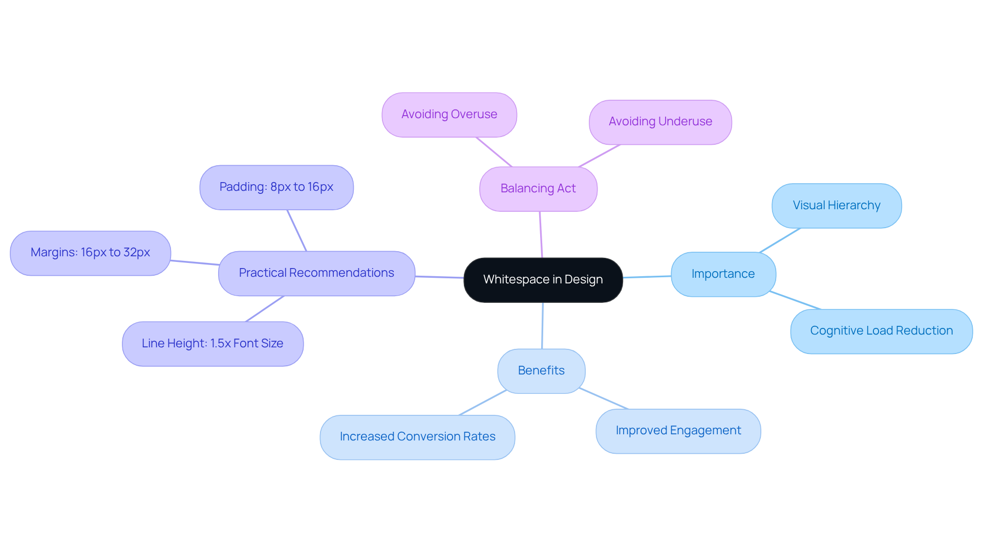
Whitespace, often referred to as negative space, plays a vital role in design by providing essential breathing room around various components. Many startup founders face the challenge of creating an inviting layout that doesn’t overwhelm viewers. By thoughtfully incorporating whitespace, you can significantly enhance visual hierarchy examples, allowing your audience to focus on what truly matters. This technique not only lightens cognitive load but also nurtures a more enjoyable user experience.
Imagine a visitor landing on your site, feeling overwhelmed by a cluttered layout. Research indicates that websites with adequate whitespace see a remarkable 35-45% increase in visual attention compared to their cluttered counterparts. This statistic underscores the importance of embracing whitespace as a fundamental design principle. As Sarah Lee wisely notes, "white space is not merely an aesthetic element, it's a fundamental principle of creation."
Successful projects have demonstrated that effective use of whitespace can lead to greater engagement and improved conversion rates, making it an invaluable strategy for today's digital landscape. To optimize whitespace, consider practical spacing recommendations:
- Aim for a line height of 1.5 times the font size
- Margins between 16px to 32px
- Padding of 8px to 16px
However, it’s essential to strike a balance; overusing whitespace can create a sense of emptiness that detracts from your message.
As you navigate the design process, remember that achieving a harmonious balance between content and whitespace is key to enhancing your visitors' experience. By fostering this balance, you can create a welcoming environment that resonates with your audience, inviting them to engage more deeply with your brand.
Imagery and Icons: Visual Elements that Direct Attention
Imagery and icons can be powerful visual signals that guide our attention and enhance understanding. When designers choose relevant images and intuitive icons, they can communicate complex ideas swiftly and clearly. However, many startups struggle with this aspect, often overlooking the importance of visuals that truly resonate with their message. This oversight can lead to confusion, detracting from the content they wish to share.
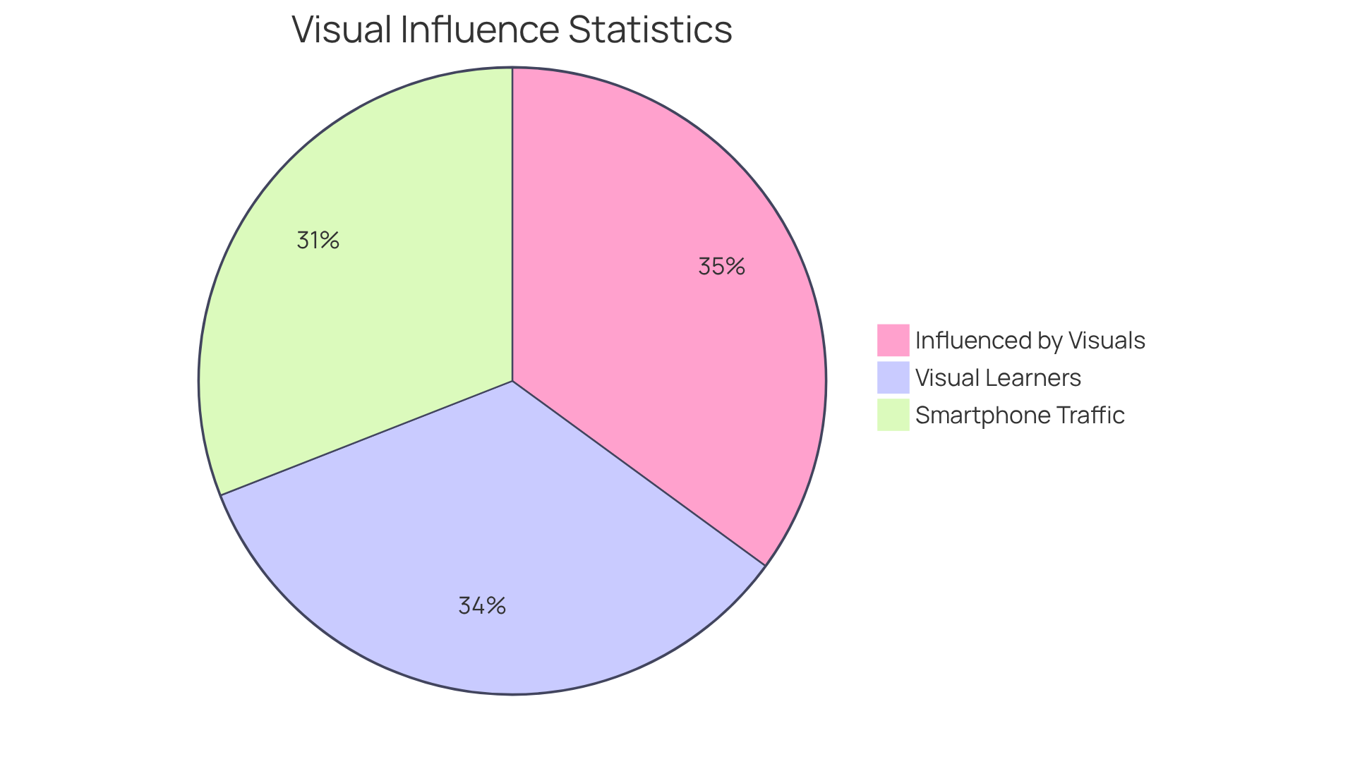
By prioritizing visuals that align with their message, startups can create a more cohesive design that captivates their audience. Research shows that posts with engaging visuals can keep viewers involved for up to 10% longer and yield conversion rates that are seven times higher than other content types. It's vital to incorporate high-quality images, as 67% of consumers are more influenced by clear, detailed visuals than by traditional product descriptions. Additionally, with 65% of the population being visual learners, the impact of well-chosen imagery cannot be understated.
To forge a deeper connection between a brand and its audience, startups should shy away from cliché stock photos. Instead, they should seek out unique, high-quality images that reflect their brand's essence. Furthermore, with 59.16% of web traffic coming from smartphones, optimizing visuals for mobile devices is essential for improving retention rates. By embracing these practices, startups can foster a more meaningful connection with their audience, ultimately leading to greater engagement and success.
Alignment: Structuring Elements for Clarity
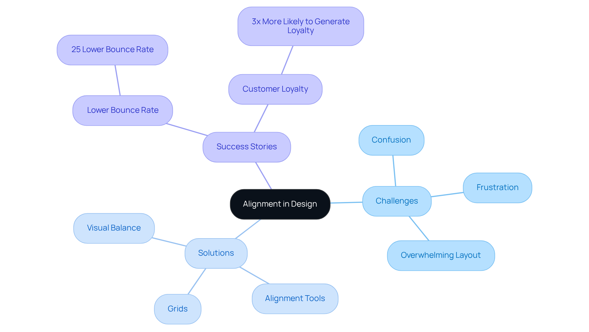
Alignment is often a challenge for many creators, leading to confusion and frustration that can detract from the user experience. When text, images, and other elements are not arranged thoughtfully, it can feel overwhelming for individuals trying to navigate content. This disorganization not only hampers readability but can also diminish the overall appeal of a layout, leaving potential users disengaged.
Startups, in particular, may struggle with this, but there is hope. By leveraging grids and alignment tools, you can create layouts that are not only visually engaging but also easy to navigate. Research shows that websites optimized for visual balance experience a 25% lower bounce rate, which highlights the significant advantages of alignment.
Moreover, many successful new ventures have harnessed alignment to clarify their messaging and boost audience engagement, showcasing its vital role in design strategy. For example, companies that maintain a consistent brand identity are three times more likely to foster customer loyalty. This illustrates how alignment can contribute to a cohesive user experience.
By prioritizing alignment, you can ensure your digital presence is both compelling and user-friendly, ultimately leading to better engagement and conversions. Remember, you are not alone in this journey; many have faced similar challenges and found success through thoughtful design.
Repetition: Unifying Design Elements for Cohesion
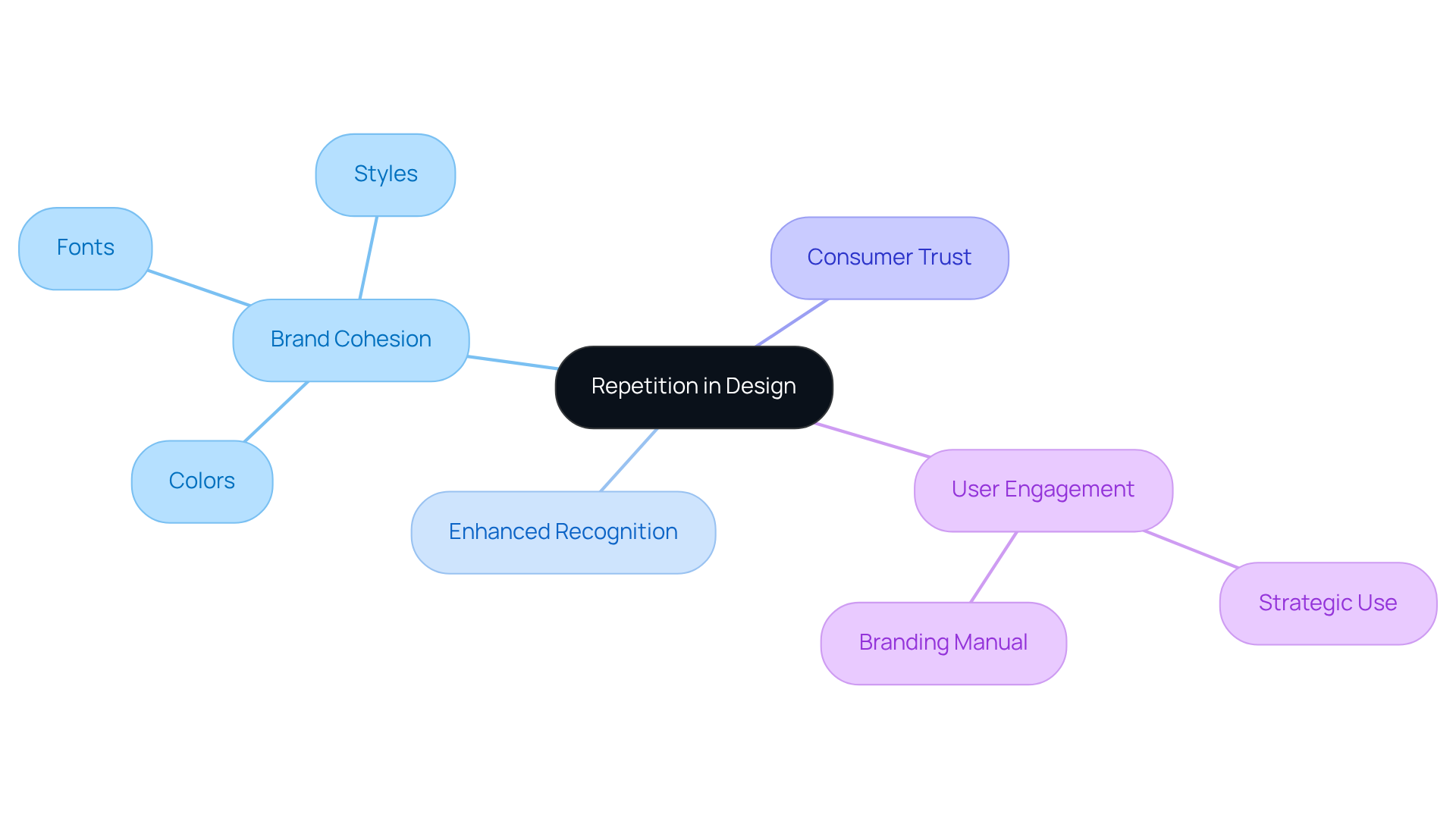
In the world of design, many startup founders face the challenge of creating a cohesive brand identity. It can be disheartening when your efforts to stand out are met with confusion. This is where repetition in design becomes a powerful ally. By employing similar elements throughout your layout—like colors, fonts, and styles—you can foster a sense of unity and cohesion that resonates with your audience.
When designers consistently utilize these elements, they not only strengthen brand identity but also enhance recognition. Imagine how comforting it is for your audience to see familiar visuals that guide their experience. This principle not only directs the viewer's eye but also provides clear visual hierarchy examples, making navigation of your content feel effortless.
As a startup, it’s crucial to strategically use repetition across all digital touchpoints. This approach significantly enhances recall and user engagement. Research shows that consistent branding increases consumer trust; familiarity truly breeds preference. Think about it—when your audience recognizes your brand, it reduces uncertainty and builds trust, which is essential for cultivating customer loyalty.
By employing pattern repetition techniques and creating a comprehensive branding manual, you can establish a memorable identity that resonates deeply with your audience. This connection ultimately fosters loyalty and engagement, creating a supportive community around your brand. Remember, you’re not alone on this journey; embracing these strategies can lead you to a brighter, more connected future.
Minimalism: Simplifying Design for Enhanced Visual Hierarchy
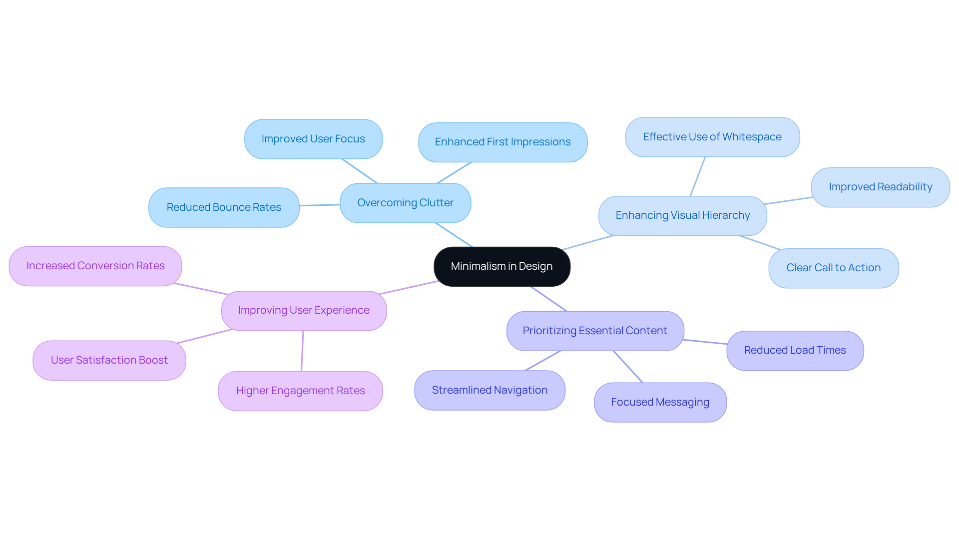
In the fast-paced world of tech startups, many founders face the challenge of creating a brand that truly resonates. Often, the overwhelming amount of design choices can lead to cluttered visuals that distract from what really matters. This clutter can dilute key messages, leaving potential customers confused and disengaged.
However, there’s a nurturing solution: minimalism in aesthetics. By embracing simplicity and clarity, startups can strip away unnecessary elements, allowing their core messages to shine through without distractions. This minimalist approach not only enhances visual hierarchy examples but also fosters a modern and sophisticated brand image.
Imagine prioritizing essential content and using whitespace effectively—this creates impactful user experiences that resonate deeply with your audience. By adopting a minimalist design philosophy, you can improve usability and connect with your customers on a more profound level.
Let’s embrace this journey together, focusing on what truly matters for your brand's success.
Conclusion
In the world of startup design, many founders face the challenge of establishing a clear visual hierarchy, which is crucial for effective communication and user engagement. This struggle can often lead to missed opportunities for connection and impact. However, by applying strategic design principles, startups have the chance to not only enhance their digital presence but also create memorable experiences that truly resonate with their audience. This article has explored various visual hierarchy examples, highlighting how thoughtful design choices can significantly transform the way potential customers interact with brands.
Key insights discussed include the importance of layout patterns such as the F-pattern and Z-pattern, which guide user attention and improve navigation. Furthermore, we’ve highlighted the essential roles of color, typography, whitespace, imagery, alignment, repetition, and minimalism in contributing to a cohesive and engaging design. Each of these elements is vital in ensuring that messages are communicated clearly and effectively, ultimately fostering increased engagement and conversion rates.
As startups continue to navigate the complexities of digital branding, embracing these visual hierarchy principles becomes essential for success. By prioritizing user experience and nurturing meaningful connections with audiences, businesses can stand out in a competitive landscape. Remember, the journey of design is ongoing, and by leveraging these insights, startups can create compelling narratives that not only attract attention but also build lasting relationships with their customers. Together, we can foster a community where every startup thrives through thoughtful design.
Frequently Asked Questions
What is the importance of visual hierarchy in digital branding?
Visual hierarchy is crucial in digital branding as it helps communicate messages effectively, guiding potential customers through digital platforms and enhancing identity recognition, engagement, and conversion rates.
How does RNO1 approach visual hierarchy in branding?
RNO1 leverages strategic color choices, typography, and layout to create visually engaging experiences that resonate with target audiences, ensuring brands stand out and connect meaningfully.
What is the F-pattern in web design?
The F-pattern is a design layout that reflects how people naturally scan web pages, starting from the top left, moving horizontally, and then scanning vertically down the left side. It consists of three components: the upper bar, lower bar, and spine.
How can new businesses benefit from the F-pattern layout?
By positioning essential elements like headlines, sub-headings, and calls to action along the F-pattern path, new businesses can significantly boost engagement and capture attention quickly.
What research supports the effectiveness of the F-pattern?
A 2008 study indicated that individuals typically read only about 28% of the text on a page, emphasizing the need for strategic content placement to enhance visibility and engagement.
What is the Z-pattern layout, and how does it help startups?
The Z-pattern layout guides users' focus in a zigzag motion from the top left to the bottom right, helping startups strategically place key elements to create a seamless journey for visitors, enhancing readability and navigation flow.
What potential impact does the Z-pattern have on conversion rates?
Research shows that using the Z-pattern can boost conversion rates by as much as 30%, making it an effective design strategy for startups.
How can social proof enhance conversions on landing pages?
Incorporating elements of social proof can increase conversions by an average of 34%, further encouraging startups to optimize their landing page design using effective visual hierarchy.


