Overview
The article highlights a crucial issue in web design: the challenge of ensuring visual accessibility for all users. Many tech startup founders may not realize how significant color contrast can be for those with visual impairments. This oversight can lead to feelings of exclusion among users, which is something we all want to avoid. By adhering to WCAG standards for contrast ratios, we can create a more inclusive experience.
To help you navigate this process, the article provides practical guidance on using an accessible colour checker. It walks you through:
- Selecting the right tools
- Inputting color values
- Troubleshooting common issues
This step-by-step approach not only empowers you to enhance your design but also fosters a sense of belonging for every user.
Remember, creating a welcoming web experience is not just about aesthetics; it’s about compassion and understanding. By taking these steps, you’re not only improving your website but also making a meaningful impact on the lives of others. Together, we can build a more inclusive web for everyone.
Introduction
Ensuring that web content is accessible to all users, especially those with visual impairments, is a significant challenge that many designers face. This concern is not just a technical issue; it touches the very heart of effective design. The struggle to achieve optimal color differentiation can be daunting, leaving designers feeling overwhelmed and uncertain. How can they navigate these complexities to foster a more inclusive digital landscape?
An accessible color checker emerges as a vital tool in this journey. It empowers designers to create visually inclusive experiences that adhere to established guidelines, ultimately enhancing user engagement. By utilizing such tools, designers can move beyond mere compliance and truly connect with their audience, ensuring that every user feels valued and included. Together, we can embrace these solutions and work towards a digital space that welcomes everyone.
Understand the Importance of Color Accessibility in Web Design
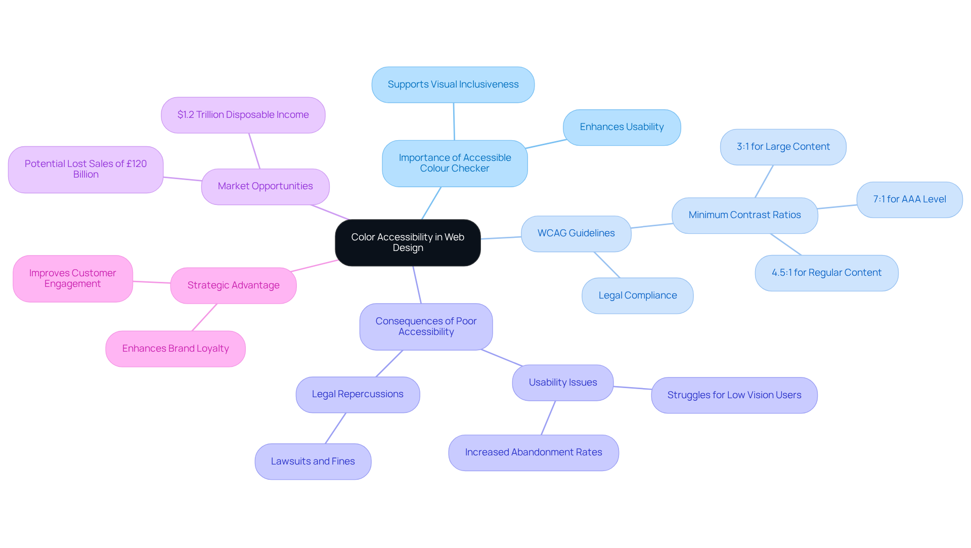
is a fundamental aspect of web design that ensures all users, regardless of their , can access and interact with the content. Unfortunately, poor can lead to significant usability issues, especially for individuals with visual impairments, including color blindness, highlighting the need for an . This is a problem that affects many, and it’s crucial to recognize its impact.
According to the Web Content Accessibility Guidelines (WCAG), using an accessible colour checker is advised to ensure a of:
- 4.5:1 for regular content
- 3:1 for large content
Notably, large-scale content at the AAA level must also adhere to a ratio of 4.5:1. By prioritizing through the use of an accessible colour checker, designers not only comply with but also enhance the overall , making their websites more welcoming and engaging for a broader audience.
As Fahad Lambate insightfully states, "Without sufficient contrast between the foreground and the background/nearby hue of the text, key icons/images, focus indicator, and user interface controls, individuals with low vision often struggle to perceive the information." This understanding is essential for creating designs that incorporate an accessible colour checker, resonate with users, and foster brand loyalty.
Moreover, failing to adhere to can lead to legal repercussions, highlighting the importance of using an accessible colour checker to address hue inclusivity in web design. It’s also important to recognize that individuals with disabilities control $1.2 trillion in annual disposable income, representing a significant market opportunity. The potential lost sales totaling £120 billion due to usability problems further illustrate the of overlooking visual inclusivity in web design.
Adopting accessibility for visuals is not merely a legal requirement; it is a strategic advantage in today’s competitive digital landscape. Together, we can create a more inclusive web that values every user’s experience.

Utilize a Color Contrast Checker: Step-by-Step Instructions
To effectively utilize an , it's essential to understand the challenges many designers face in creating . The problem often lies in ensuring that text is readable against its background, which can sometimes feel overwhelming. But don’t worry; we’re here to guide you through this process with compassion and support.
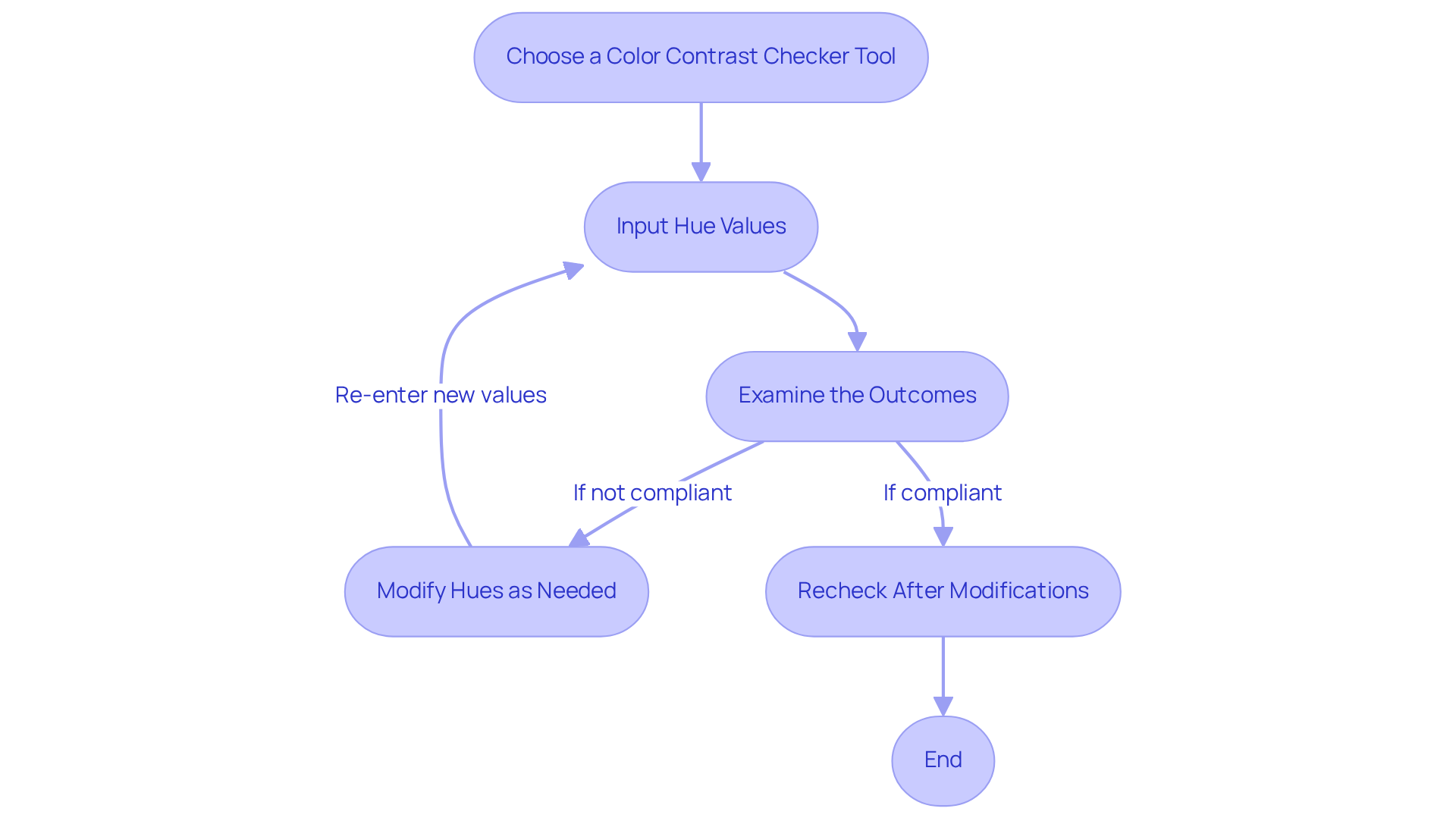
- Choose a : Begin by selecting a reliable tool, such as WebAIM's Contrast Checker, Accessible Web's Color Contrast Checker, or Coolors. These tools enable you to enter your foreground and background hues to assess their contrast ratio, which is essential for using an accessible colour checker and taking the first step towards accessibility.
- Input Hue Values: Enter the hexadecimal codes for both your text (foreground) and background hues. If you’re unsure of the hue codes, consider using an eyedropper tool to select shades directly from your design. This can make the process feel more manageable and less daunting.
- Examine the Outcomes: After entering the colors, the tool will provide a ratio and indicate whether it meets (A, AA, or AAA). Strive for a ratio of at least 4.5:1 for normal text and 3:1 for large text. Remember, appropriate differentiation not only but also ensures compliance with legal standards, reducing the risk of potential lawsuits or fines. This is a crucial step in .
- Modify Hues as Needed: If the differentiation ratio doesn’t meet the necessary standards, don’t hesitate to modify the hues accordingly. You may need to adjust the brightness of one of the hues to achieve the desired distinction, and that’s perfectly okay. It’s all part of the learning process.
- Recheck After Modifications: Once you’ve made your adjustments, re-enter the new hue values into the checker to ensure compliance. This iterative process not only enhances your design but also builds your confidence in .
By following these steps, you can enhance the accessibility and user-friendliness of your web content with an accessible colour checker, ultimately improving . As industry specialists often emphasize, benefit everyone, making content clearer and more engaging. Remember, you’re not alone in this journey; we’re all striving to create a more inclusive digital world together.

Troubleshoot Common Color Contrast Issues in Web Design
Designers often face common challenges when striving for adequate , and it’s important to recognize the impact this can have on usability. Let’s explore some effective troubleshooting tips that can help you navigate these obstacles with ease.
Inadequate Difference Ratios: When the readability of your text is compromised against its background, it can be frustrating. An can serve as a valuable tool to assess . Aim for a for standard content and 3:1 for larger text. If your ratio falls short, consider adjusting the text to a darker hue or the background to a lighter shade to .
Hue Combinations That Conflict: While may catch the eye, they might not always meet usability standards. It’s wise to avoid hues that are too similar in saturation or brightness, such as red/green or blue/gray. Use an [accessible colour checker](https://daily.dev/blog/color-contrast-guidelines-for-text-and-ui-accessibility) to explore various combinations until you find one that is visually appealing and compliant with usability standards, ensuring your design remains practical.
Text Size and Weight: Increasing the font size or weight can significantly enhance readability without changing the color. It’s essential to ensure that your content is not only high-contrast but also presented in a readable size and style, as larger fonts can greatly improve accessibility for users with visual impairments.
Background Patterns: Patterns or images in the background can sometimes detract from the readability of your text. Consider applying a solid color overlay to maintain contrast, ensuring that your text remains legible against .
: Remember that color perception can vary widely across different devices and screens. Always test your designs on multiple platforms to ensure they remain accessible and visually appealing in various contexts. What looks clear on one screen may not translate well on another.
By proactively addressing these common issues, you can . This not only enhances engagement but also fosters satisfaction for all users, allowing you to connect more deeply with your audience.
Conclusion
Creating an accessible web design is not just a technical requirement; it’s a heartfelt commitment to ensuring that all users, including those with visual impairments, can engage with content effectively. Imagine the frustration faced by individuals who struggle to navigate a website due to poor color choices. This challenge can be overwhelming, but utilizing an accessible colour checker not only enhances user experience but also aligns with legal standards that promote inclusivity. By implementing the strategies outlined in this guide, designers can make informed choices that prioritize color accessibility, fostering a welcoming digital environment for everyone.
Let’s explore some key steps to achieve color accessibility, starting with selecting a reliable color contrast checker tool. By inputting hue values and examining the contrast ratios, designers can make necessary adjustments to meet the Web Content Accessibility Guidelines (WCAG). Troubleshooting common issues, such as inadequate contrast ratios and problematic color combinations, empowers designers to create visually appealing and compliant web content. Together, we can ensure that no one is left behind in the digital space.
Ultimately, the commitment to color accessibility transcends mere compliance; it represents a strategic opportunity to connect with a broader audience. By prioritizing accessible design, businesses can tap into a significant market while enhancing user satisfaction. Embracing these practices not only enriches the user experience but also contributes to a more inclusive digital landscape, where every individual can engage meaningfully with content. Let’s take this journey together, ensuring that our digital world is open and inviting for all.
Frequently Asked Questions
What is the importance of color accessibility in web design?
Color accessibility in web design ensures that all users, regardless of their visual abilities, can access and interact with content effectively. It addresses usability issues, particularly for individuals with visual impairments, including color blindness.
What guidelines should be followed for color contrast according to the Web Content Accessibility Guidelines (WCAG)?
The WCAG advises a minimum contrast ratio of 4.5:1 for regular content and 3:1 for large content. Additionally, large-scale content at the AAA level must also adhere to a ratio of 4.5:1.
How does using an accessible color checker benefit web designers?
Using an accessible color checker helps designers comply with legal standards, enhances user experience, and makes websites more welcoming for a broader audience, thereby fostering brand loyalty.
What are the consequences of poor color differentiation in web design?
Poor color differentiation can lead to significant usability issues for individuals with low vision, making it difficult for them to perceive important information, icons, and user interface controls.
What are the legal implications of not adhering to digital inclusion standards?
Failing to follow digital inclusion standards can result in legal repercussions, emphasizing the necessity of using an accessible color checker in web design.
What economic impact does color accessibility have?
Individuals with disabilities control $1.2 trillion in annual disposable income, and overlooking visual inclusivity can lead to potential lost sales totaling £120 billion due to usability problems.
Why is adopting accessibility for visuals considered a strategic advantage?
Adopting accessibility for visuals is not only a legal requirement but also a strategic advantage in the competitive digital landscape, as it helps create a more inclusive web that values every user's experience.


