Introduction
In a world where digital presence can make or break a tech startup, the art of web design feels more critical than ever. Many founders grapple with the challenge of engaging users effectively, which hinges on a few core principles that not only enhance aesthetics but also improve usability and foster a genuine connection with the audience. This struggle can be daunting, especially with the myriad of design options available.
How can startups ensure their websites are not just visually appealing but also intuitively navigable and responsive to user needs? This article explores four best practices that empower tech founders to create compelling web designs. By focusing on these strategies, you can transform casual visitors into loyal customers, nurturing relationships that drive engagement and success.
Prioritize Simple and Intuitive Navigation
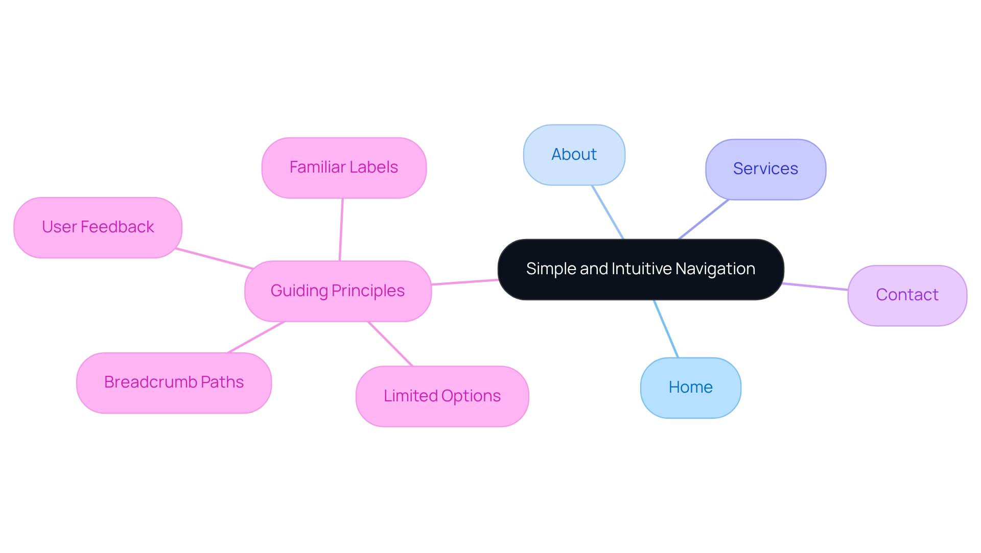
Creating a is essential for who want to connect with their audience. The challenge often lies in that feels clear and straightforward. When visitors encounter a with too many options, it can lead to confusion and frustration. Imagine how disheartening it is for potential customers to struggle to find what they need. To alleviate this pain, prioritize a layout that uses familiar labels for menu items and limits options, making .
A well-structured menu should include like:
- Home
- About
- Services
- Contact
This guides visitors seamlessly through your site. Consider incorporating , which can be incredibly helpful for users to understand their position within the site. For instance, a tech startup might benefit from a simple upper menu with dropdown lists for subcategories. This approach ensures that individuals can effortlessly access relevant information without feeling lost.
It's crucial to continuously evaluate your navigation with . Their feedback can help pinpoint any challenges they face, allowing you to implement necessary modifications. By nurturing this process, you create a more welcoming environment that resonates with your audience, ultimately supporting their journey through your website.

Utilize Clean and Consistent Design Elements
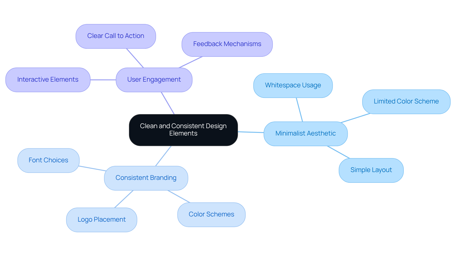
In today's fast-paced digital landscape, many struggle with developing to establish a visually appealing online presence. A cluttered website can overwhelm users, making it difficult for them to engage with your brand. This can lead to frustration and ultimately drive potential customers away. At RNO1, we understand how important it is for your brand to stand out and connect with your audience. By adopting a , you can emphasize whitespace and avoid clutter, creating a serene environment for your visitors.
Imagine a technology startup that embraces a modern sans-serif font and a limited color scheme, perfectly aligned with its . This consistency not only reflects your commitment to design-driven solutions but also enhances usability. When buttons, links, and other interactive elements are visually distinct and follow a consistent style, users quickly learn to recognize them, improving their .
It’s essential to consistently assess your creative components to ensure they align with your brand's evolving identity. Remember, are crucial; studies show that 94% of , and companies that prioritize design see 50% more loyal customers. By focusing on these principles, you can significantly enhance and establish a strong with . At RNO1, our strategies can help maximize your marketability, nurturing your brand's growth and success in a compassionate and supportive way.

Incorporate High-Impact Visuals to Enhance Engagement
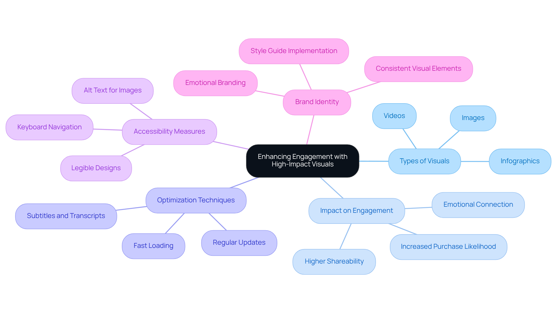
Creating an can feel daunting, especially when it involves utilizing and incorporating visuals. , as they not only tell a story but also highlight the key features of your products or services. Imagine a tech startup showcasing its software through a demo video that illustrates its functionality and benefits; this approach can significantly increase the likelihood of purchase by up to 85%. However, without effective visuals, the message may not resonate, leaving potential customers feeling disconnected.
Moreover, consider how visual materials like infographics can present intricate data in an appealing way. This not only facilitates quicker comprehension but also ensures that your audience engages with the information. Remember, , making them a vital tool in your communication strategy.
To truly , it’s essential to for fast loading times. Slow-loading content can lead to frustration and increased bounce rates, which can be disheartening for any startup founder. Additionally, , is crucial for inclusivity. Regularly updating your keeps it fresh and relevant, reflecting any changes in your offerings or branding. This method not only enhances engagement but also strengthens your . Consistent use of colors, styles, and imagery improves recognition and memorability, fostering a deeper connection with your audience.
By leveraging the power of , tech startups can using that resonate with their audience and drive engagement. As Nathan Hawkes wisely points out, "Engaged individuals are more likely to convert into paying clients or perform other desired actions." Let’s embrace the potential of visuals together, nurturing connections that can lead to lasting success.

Test and Iterate Designs Based on User Feedback
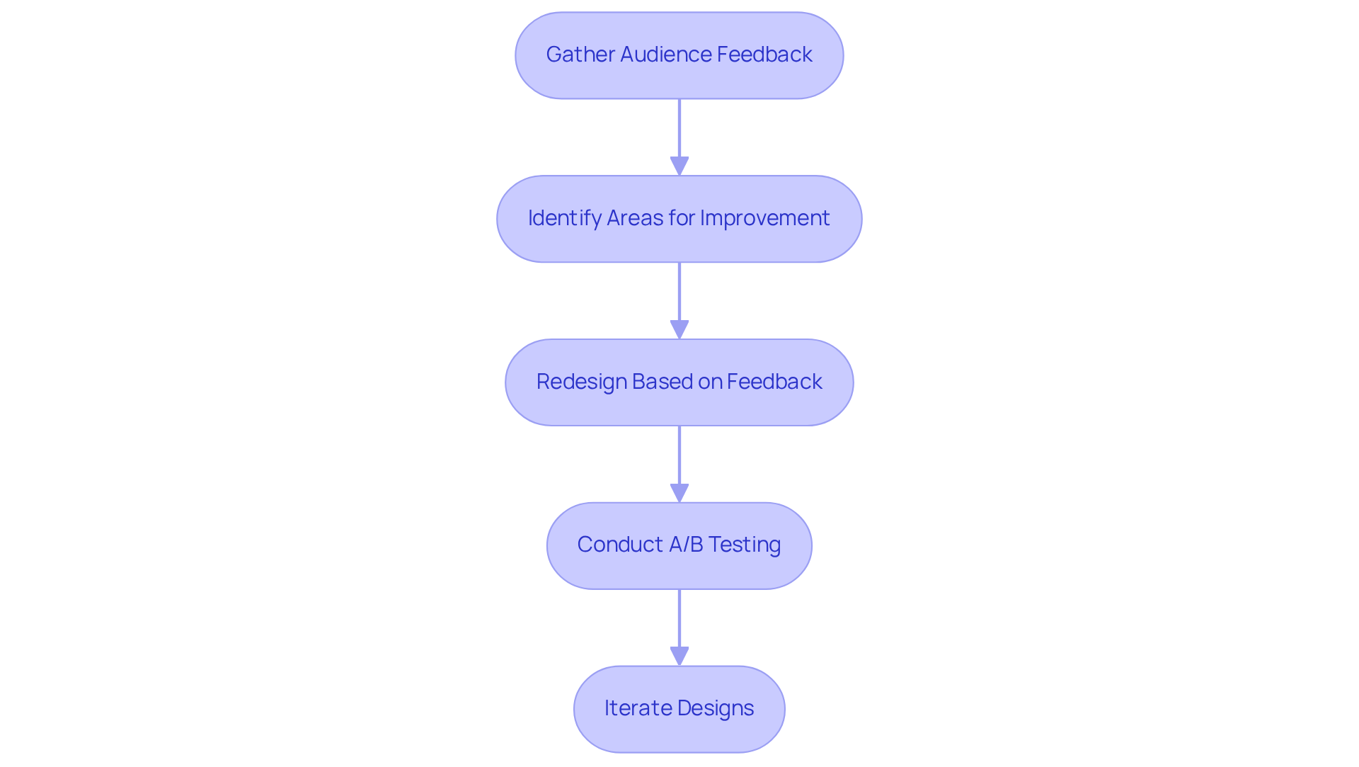
Gathering audience feedback is crucial for creating a . Many founders face the challenge of understanding how visitors interact with their sites. Elevated bounce rates on certain pages can be disheartening. For example, if users struggle to navigate a specific section, redesigning that area based on their feedback can significantly enhance usability. It's important to remember that , which underscores the need for a .
To address these concerns, consider conducting to evaluate different visual elements. This process allows you to discover which versions resonate more effectively with users. Such an iterative approach not only improves —after all, 90% of individuals who have a positive online experience are likely to return—but also boosts conversions. A well-optimized platform is more adept at meeting client needs. In fact, a thoughtfully designed and frictionless UX could potentially increase conversion rates by up to 400%. This highlights the in .
As Christian Holst, Research Director and Co-Founder of Baymard, wisely points out, 'A well-designed can boost your website conversion rate by up to 400%.' Embracing these insights can foster a more supportive and effective online presence for your startup, ultimately nurturing the connection between you and your users.

Conclusion
Creative web design is not just an aesthetic choice; it’s a vital component in fostering user engagement, especially for startups navigating the competitive digital landscape. Many founders struggle with establishing a strong online presence, and it can feel overwhelming. However, by embracing best practices—such as intuitive navigation, clean design elements, impactful visuals, and a commitment to testing and iteration—tech startups can create websites that not only draw visitors in but also transform them into loyal customers.
The significance of a simple and clear navigation structure cannot be overstated. It guides users effortlessly through the site, allowing them to find what they need without frustration. A consistent design aesthetic that resonates with the brand identity is equally important; it helps users recognize interactive elements and feel more connected to the brand. Moreover, incorporating high-quality visuals is crucial for capturing attention and effectively conveying messages. As you reflect on your own journey, consider how these elements can elevate your site. Lastly, the iterative design process—driven by user feedback—facilitates continuous improvement, ensuring that your website evolves to meet user needs. This commitment to growth is what truly sets successful startups apart.
In conclusion, prioritizing these best practices in web design is essential for tech startups aiming to engage their audience effectively. By embracing simplicity, consistency, and user-centric strategies, you can create memorable online experiences that not only drive engagement but also foster lasting connections with your users. Remember, as a founder, recognizing the power of creative web design is crucial in shaping your brand's success. Taking actionable steps towards implementing these practices will lead to a more impactful digital presence, allowing you to connect with your audience on a deeper level.
Frequently Asked Questions
Why is simple and intuitive navigation important for a website?
Simple and intuitive navigation is essential for connecting with the audience and ensuring that visitors can easily find what they need without confusion or frustration.
What are common issues with website navigation?
Common issues include cluttered menus with too many options, which can lead to confusion and make it difficult for potential customers to locate information.
What essential sections should be included in a well-structured menu?
A well-structured menu should include essential sections like Home, About, Services, and Contact.
How can breadcrumb paths enhance website navigation?
Breadcrumb paths help users understand their position within the site, making it easier for them to navigate back to previous pages or sections.
What layout approach can benefit a tech startup's website?
A simple upper menu with dropdown lists for subcategories can help users access relevant information effortlessly.
How can user feedback improve website navigation?
Continuously evaluating navigation with real users allows you to identify challenges they face, enabling you to make necessary modifications and create a more welcoming environment.
List of Sources
- Prioritize Simple and Intuitive Navigation
- designrush.com (https://designrush.com/agency/website-design-development/trends/web-design-statistics)
- clay.global (https://clay.global/blog/web-design-guide/website-navigation)
- Web Design Statistics 2025: Speed, Accessibility & Color Trends (https://sqmagazine.co.uk/web-design-statistics)
- 150+ UX (User Experience) Statistics and Trends (Updated for 2026) (https://userguiding.com/blog/ux-statistics-trends)
- Utilize Clean and Consistent Design Elements
- 15 Must-Know Web Design Statistics Of 2025 - RGC (https://rgcdigitalmarketing.com.au/blog/15-must-know-web-design-statistics-of-2025)
- 100 Inspirational UI/UX Design Quotes [2025] (https://digitaldefynd.com/IQ/inspirational-ui-ux-design-quotes)
- 20 Inspiring UX Quotes You Should Remember (https://blog.uxtweak.com/ux-quotes)
- careerfoundry.com (https://careerfoundry.com/en/blog/ux-design/15-inspirational-ux-design-quotes-that-every-designer-should-read)
- loopexdigital.com (https://loopexdigital.com/blog/web-design-statistics)
- Incorporate High-Impact Visuals to Enhance Engagement
- forbes.com (https://forbes.com/councils/forbesagencycouncil/2022/12/07/visual-marketing-the-power-of-images--videos-for-promoting-your-brand)
- Using Quotes for Better User Engagement - Arcane Marketing - Healthcare Digital Marketing Agency (https://arcanemarketing.com/using-quotes-better-user-engagement)
- emplifi.io (https://emplifi.io/resources/blog/how-to-increase-social-media-engagement-with-visual-storytelling)
- ashworthcreative.com (https://ashworthcreative.com/blog/2023/07/5-ways-visuals-can-boost-your-brand-engagement)
- intergetik.com (https://intergetik.com/uncategorized/leveraging-multimedia-to-enhance-website-engagement)
- Test and Iterate Designs Based on User Feedback
- 99firms.com (https://99firms.com/research/web-design-statistics)
- 150+ UX (User Experience) Statistics and Trends (Updated for 2026) (https://userguiding.com/blog/ux-statistics-trends)
- 40+ UX Statistics (from 200,000 hours of UX Research) – Baymard (https://baymard.com/learn/ux-statistics)
- 50 Web Design Statistics That Will Blow Your Mind - HigherVisibility (https://highervisibility.com/website-design/learn/web-design-stats)
- linkedin.com (https://linkedin.com/pulse/impact-user-feedback-web-design-codifybrain-5rlgc?trk=organization_guest_main-feed-card_feed-article-content)


