Introduction
In the vibrant realm of design, many designers face the challenge of using color effectively. Color is not just a visual element; it serves as a powerful tool that can influence emotions, enhance user experience, and drive engagement. However, without a solid understanding of color theory, designers may struggle to create visually appealing and effective websites. This can lead to frustration, as the right combinations of colors are essential to transforming a mundane interface into an inviting digital landscape.
Moreover, the responsibility of ensuring accessibility and compliance adds another layer of complexity to the design process. It is crucial for designers to consider how their choices impact all users, as neglecting this aspect can alienate potential audiences. This article aims to address these concerns by delving into the fundamental principles of color theory, offering practical techniques for effective combinations, and highlighting the importance of accessibility in creating engaging digital experiences. Together, we can navigate these challenges and create designs that resonate with everyone.
Understand Color Theory Fundamentals
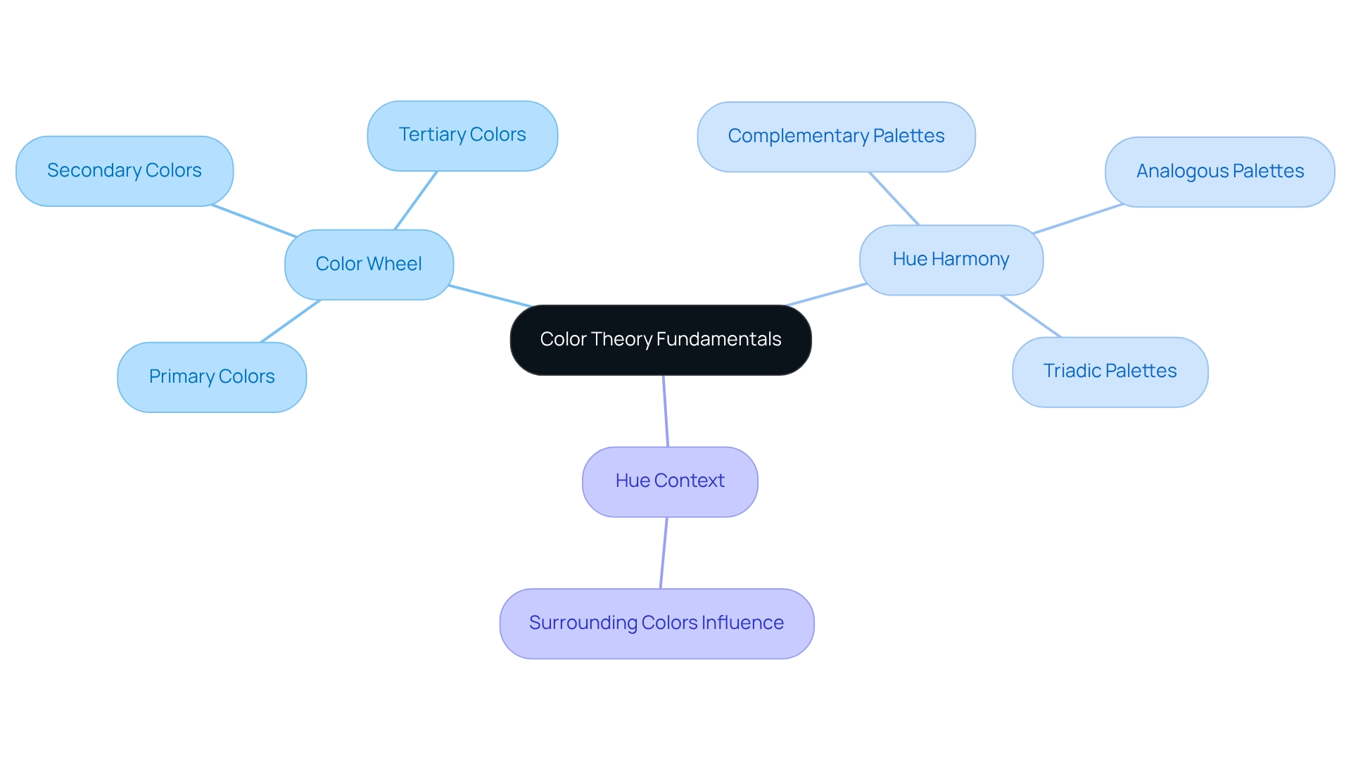
For many designers, creating effective can often feel overwhelming. The challenge lies not just in understanding colors, but in knowing how they interact and can be combined to create something truly special. This is where hue theory becomes essential.
Consider the Color Wheel, for instance. It serves as a visual guide, showing how colors relate to one another. Familiarity with primary, secondary, and tertiary hues is crucial for crafting balanced palettes that resonate with users.
Then there’s the concept of Hue Harmony. It’s about finding those visually appealing combinations of shades that can bring a design to life. Techniques like complementary, analogous, and triadic palettes can be wonderful tools in your creative toolkit, helping to .
Lastly, think about Hue Context. The way a hue appears can shift dramatically depending on its surrounding colors. This is a vital consideration for designers, as context can influence how hues convey messages and evoke emotional responses. By mastering these fundamentals, you can create that not only look stunning but also . Remember, it’s about more than just aesthetics; it’s about connecting with your audience and making them feel something through your design.

Leverage Color Psychology for User Engagement
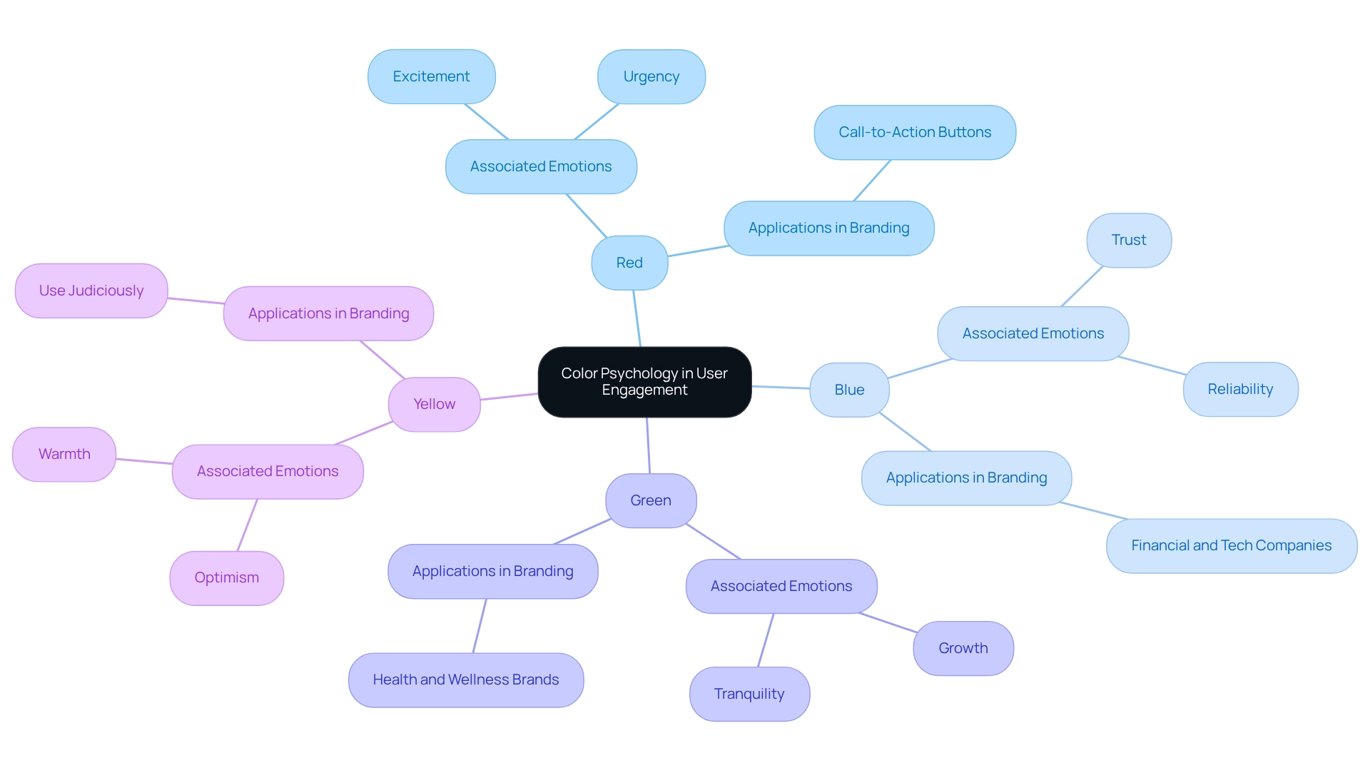
Hue psychology delves into how various shades influence human behavior and emotions, a topic that resonates deeply with many brands striving to connect with their audience. One common challenge is understanding how can influence . For instance,
- Red is often linked to excitement and urgency; it can inspire action, making it a favored choice for call-to-action buttons.
- Blue, on the other hand, embodies trust and reliability, which is why many financial and tech companies choose it to foster confidence.
- Green symbolizes growth and tranquility, making it perfect for brands dedicated to health and wellness.
- Lastly, Yellow brings forth feelings of optimism and warmth, yet it’s essential to use it judiciously, as it can become overwhelming.
By thoughtfully incorporating into web design, brands can significantly and encourage desired actions, such as or making purchases. This strategic approach not only addresses the emotional needs of users but also creates a welcoming environment that . As you navigate your , consider how these colors can reflect your values and mission, ultimately guiding your audience toward meaningful interactions.

Implement Effective Color Combination Techniques
Designers can often feel overwhelmed when creating effective . The challenge lies not just in choosing colors, but in ensuring these choices resonate with users and enhance their experience. It's essential to recognize how color can , making this a critical aspect of design.
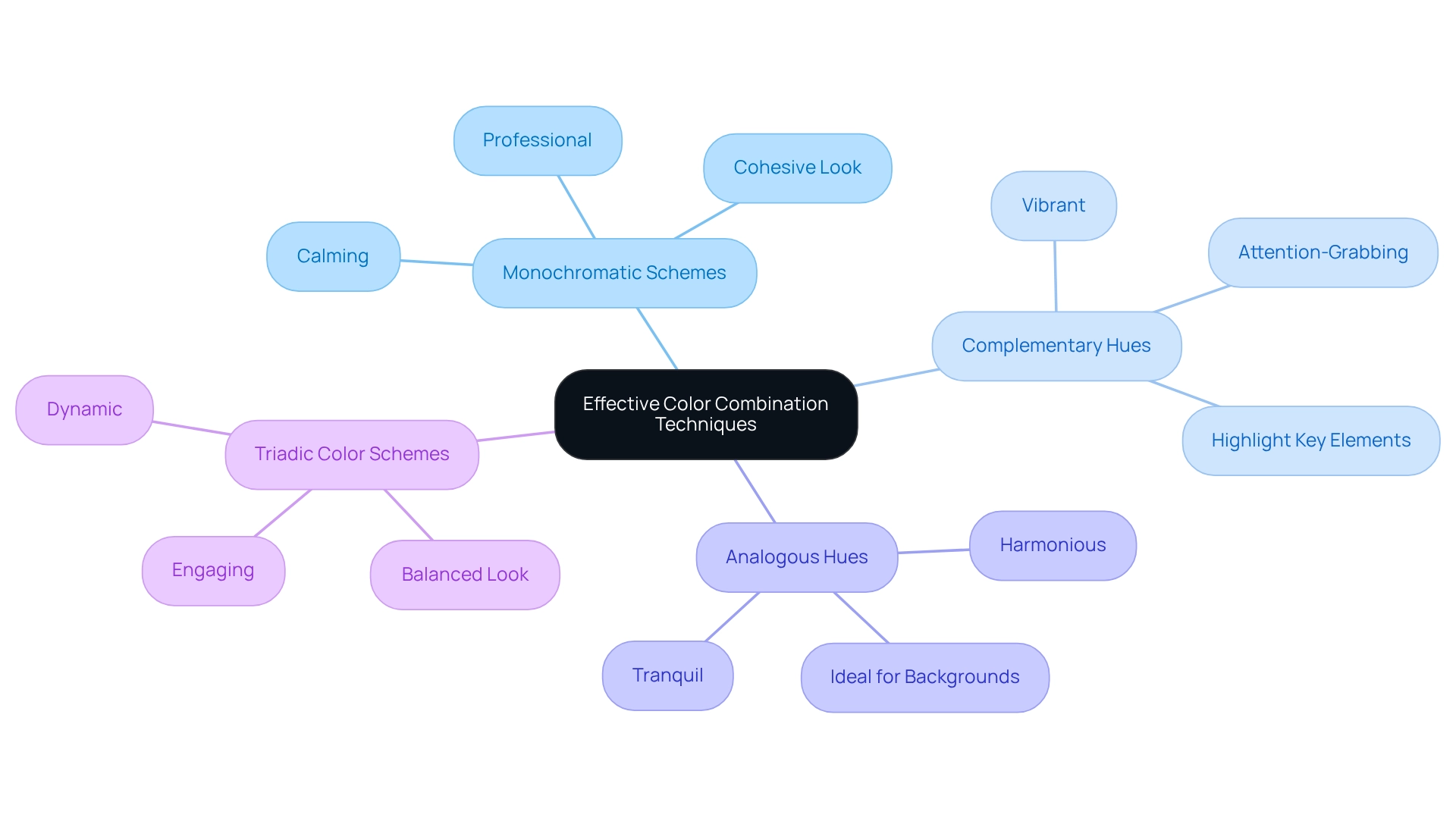
One approach to consider is Monochromatic Schemes. By using variations in lightness and saturation of a single color, you can achieve a cohesive look that feels both calming and professional. This can be particularly comforting in a fast-paced digital world.
Alternatively, Complementary Hues can provide a . By combining shades that sit opposite each other on the spectrum, you create lively visuals that draw attention to key elements. This technique can be a powerful way to highlight important features of your design.
For a more , think about Analogous Hues. Selecting shades that are adjacent on the color wheel fosters a tranquil atmosphere, making it ideal for backgrounds and less critical elements. This choice often brings a sense of peace to the overall design.
Lastly, consider Triadic . By utilizing three hues that are evenly spaced around the wheel, you can achieve a vibrant and balanced look. This method is especially suitable for dynamic websites, where energy and engagement are key. By thoughtfully employing these , you can enhance the visual appeal of your websites while ensuring that the colors complement the overall . Remember, your choices can create a welcoming environment that resonates with users, fostering a deeper connection with your brand.

Ensure Color Accessibility and Compliance
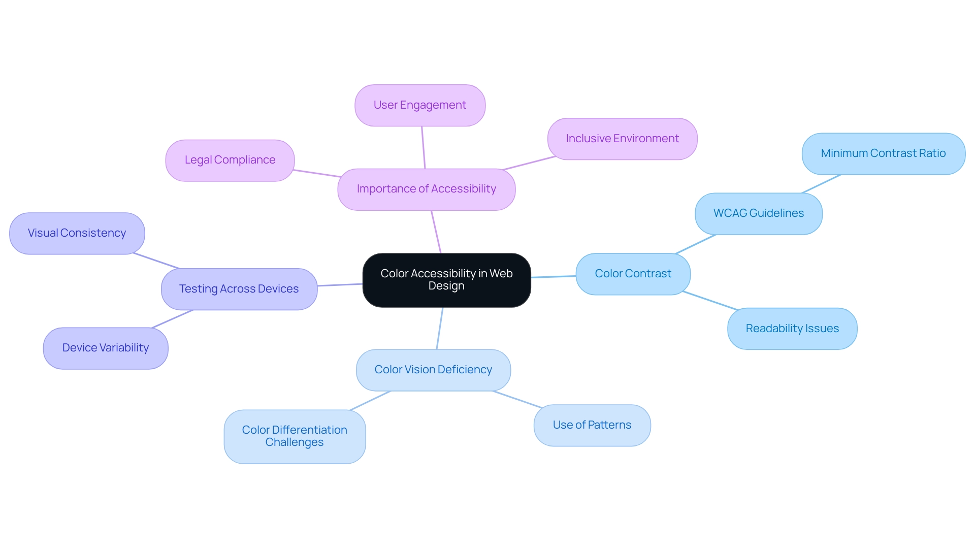
Creating is essential, yet many designers face challenges in this area. One common problem is ensuring adequate color contrast in . Insufficient contrast between text and background in can hinder readability, making it difficult for users to engage with the content. The Web Content Accessibility Guidelines (WCAG) recommend a for normal text, highlighting the importance of this consideration.
Another significant issue is . Many users may struggle to differentiate between certain shades, which can lead to confusion. By incorporating patterns or textures alongside hues, designers can convey information more effectively. Utilizing tools like contrast checkers can also assist in evaluating the accessibility of , ensuring that all users can navigate the site with ease.
Additionally, it’s crucial to test across various devices. Colors can appear differently on different screens, and what looks accessible on one device may not translate well to another. By testing designs on multiple devices, designers can confirm that their color schemes for websites are effective and inclusive.
By prioritizing accessibility, designers not only comply with legal standards but also foster a more inclusive environment. This approach enhances , creating a community where everyone feels welcome. Together, we can build websites that truly serve all users, ensuring that no one is left behind.

Conclusion
The effective use of color in design is a crucial element, serving not only as an aesthetic choice but also as a powerful communicator of emotions and user experiences. Many designers struggle with this aspect, often creating palettes that fail to resonate with their audience. By embracing the fundamentals of color theory, designers can craft visually appealing combinations that truly connect with users, enhancing their overall experience.
Understanding the emotional impact of color is essential. Different colors evoke distinct feelings—red can create a sense of urgency, blue often conveys trust, and green promotes tranquility. By leveraging color psychology, designers can make strategic choices that significantly boost user engagement and inspire desired actions. It’s about more than just looking good; it’s about fostering a connection.
Moreover, implementing effective color combination techniques enriches the design process. From monochromatic schemes to triadic color arrangements, each technique offers unique advantages that can elevate a website's visual appeal while maintaining clarity and focus on key elements. It’s a journey of exploration and creativity, where each choice can lead to a more engaging user experience.
In addition, ensuring color accessibility and compliance is vital for creating inclusive digital experiences. By prioritizing color contrast, accommodating color blindness, and testing across devices, designers can create environments that welcome all users. This commitment not only aligns with legal standards but also nurtures user satisfaction and engagement.
Ultimately, mastering the art of color in design transcends mere aesthetics. It’s about creating meaningful and accessible experiences that resonate with users on a deeper level. By embracing these principles and techniques, designers can transform their work into vibrant, engaging, and inclusive digital landscapes, truly connecting with every audience. Together, let’s make design a welcoming space for all.
Frequently Asked Questions
Why is creating effective color schemes for websites challenging for designers?
Creating effective color schemes can be overwhelming for designers because it involves not only understanding colors but also knowing how they interact and combine to create appealing designs.
What is the Color Wheel and why is it important?
The Color Wheel is a visual guide that shows how colors relate to one another. Familiarity with primary, secondary, and tertiary hues is crucial for crafting balanced color palettes that resonate with users.
What is Hue Harmony?
Hue Harmony refers to finding visually appealing combinations of shades that enhance a design. Techniques such as complementary, analogous, and triadic palettes are tools that can create visual interest and cohesion.
How does Hue Context affect color perception?
Hue Context refers to how a color appears depending on its surrounding colors. This is important for designers because the context can influence how hues convey messages and evoke emotional responses.
What should designers consider when creating color schemes for websites?
Designers should consider aesthetics, user experience, and the emotional connection they want to establish with their audience. Mastering color theory fundamentals can help achieve stunning designs that resonate with users.


