Overview
The article "9 Essential Tips for an Effective Dashboard User Interface" begins by addressing a common challenge faced by many tech startup founders: the struggle to create dashboards that truly resonate with users. This issue can lead to frustration and hinder decision-making processes, ultimately affecting the overall success of the business. By recognizing the pain points associated with user experience, we can better understand the need for a thoughtful approach to dashboard design.
As we delve deeper, it becomes clear that user-centric design is not just a luxury but a necessity. Clarity in navigation and the thoughtful use of effective visualizations play pivotal roles in enhancing user engagement and satisfaction. The article supports these strategies with research and real-life case studies, illustrating how implementing these practices can transform the user experience.
Ultimately, the solution lies in adopting these essential tips to create dashboards that are not only functional but also supportive of users' needs. By fostering an environment where users feel valued and understood, we can enhance their experience and empower them to make informed decisions. This approach not only benefits individual users but also contributes to the collective success of your startup, creating a community where everyone thrives.
Introduction
Creating an effective dashboard user interface can often feel overwhelming; it’s not just about design—it’s about empowering you with the insights necessary to make informed decisions. As many organizations increasingly depend on data to shape their strategies, the challenge of crafting intuitive, user-centric dashboards becomes even more pressing. It’s easy to feel lost in a sea of cluttered, confusing interfaces that fail to serve your needs.
But here’s the good news: transforming these interfaces into streamlined, engaging tools is possible. This article shares essential tips that prioritize user experience and help you navigate this complex landscape.
How can you, as a designer, find the balance between functionality and aesthetics to ensure that dashboards not only look appealing but also effectively serve your users? Together, let’s explore this journey toward creating meaningful dashboard experiences.
RNO1: Prioritize User-Centric Design for Dashboards
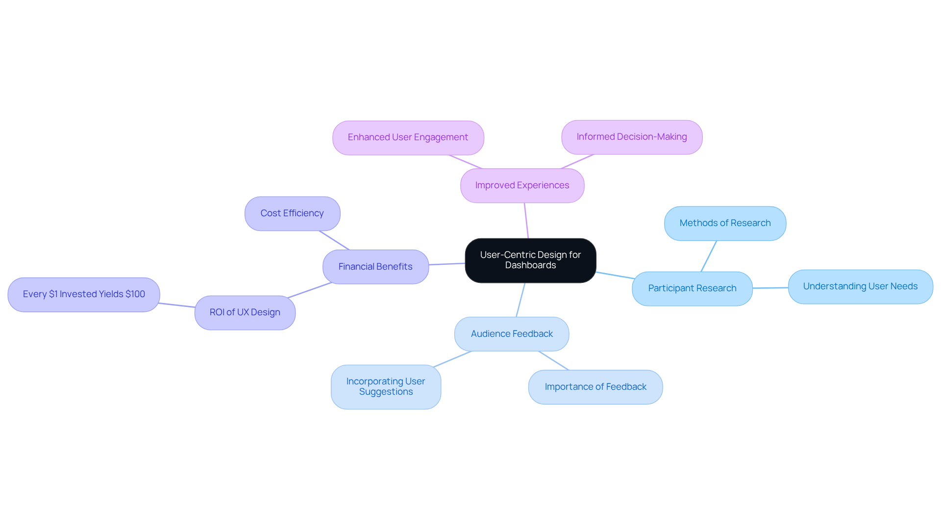
At RNO1, we understand that design focused on individuals is crucial. It’s about ensuring that displays are thoughtfully tailored to meet the specific needs and workflows of each person. This approach begins with extensive participant research, gathering essential insights into how individuals engage with data and identifying what information they find most valuable. By prioritizing these client requirements, we can create interfaces that not only captivate visually but also enhance functionality, ultimately leading to improved experiences and outcomes.
We’ve seen through successful case studies that dashboard user interfaces designed with audience feedback significantly outperform those developed without such insights. This reinforces the idea that effective creation of a dashboard user interface hinges on truly understanding the audience's needs. As Adam Fard, creator of Adam Fard Studio, wisely states, "The information a designer gathers through different research techniques can significantly influence the quality of the creation and the experience of the individual."
Moreover, studies indicate that every $1 invested in enhancing experience yields $100, highlighting the financial benefits of prioritizing human-centered design. This dedication to audience research not only fosters involvement but also enhances decision-making, making it a vital aspect of modern interface development. We invite you to share your experiences with us, as together, we can create solutions that truly resonate with the needs of individuals.
Simplify to Amplify: Streamline Dashboard Elements
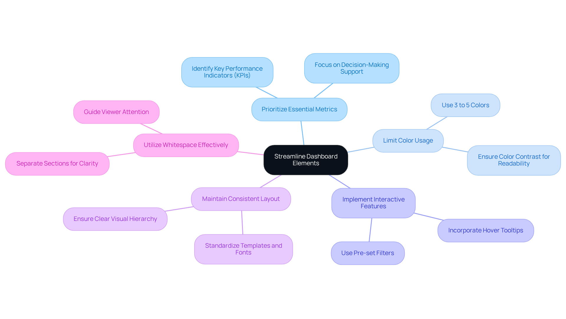
Creating an effective dashboard can feel overwhelming, especially when faced with cluttered layouts that don’t align with your goals. It’s all too easy to become bogged down by unnecessary elements that distract from what truly matters. Simplifying the layout is crucial. By removing those distractions, you can focus on what’s important. Imagine limiting the number of widgets to just 10-15, which helps prevent information overload. Utilizing whitespace can enhance readability, allowing each component to serve a distinct purpose. A well-defined design system is essential to ensure that visualizations remain cohesive and user-friendly. A streamlined interface not only enables easy navigation but also allows you to concentrate on crucial data without distractions.
The impact of streamlined elements on participant engagement is significant. Think about how visual displays that utilize effective typography and refined chart designs enhance clarity, allowing users to swiftly recognize patterns and trends. Consider the effective applications, like operational displays used by firms such as Google Analytics; they illustrate how minimalism can convert intricate data into practical insights, promoting a data-driven culture. Furthermore, effective Business Intelligence (BI) displays enhance collaboration and knowledge-sharing among teams, amplifying their value.
To help you streamline your dashboard elements, here are some best practices to consider:
- Prioritize essential metrics and visualizations that directly support your decision-making.
- Limit color usage to just 3 to 5 colors in a single visualization to maintain clarity and focus.
- Implement intuitive interactive features, such as pre-set filters and hover tooltips, that provide relevant details without cluttering the interface.
- Maintain a consistent layout and aesthetic to reduce cognitive load and enhance familiarity.
By concentrating on these principles, you can develop interfaces that not only satisfy your requirements but also enhance engagement and boost overall usability. Remember, you’re not alone in this journey, and with the right approach, your dashboard can become a powerful tool for insight and decision-making.
Prioritize Insights Over Data: Focus on Key Metrics
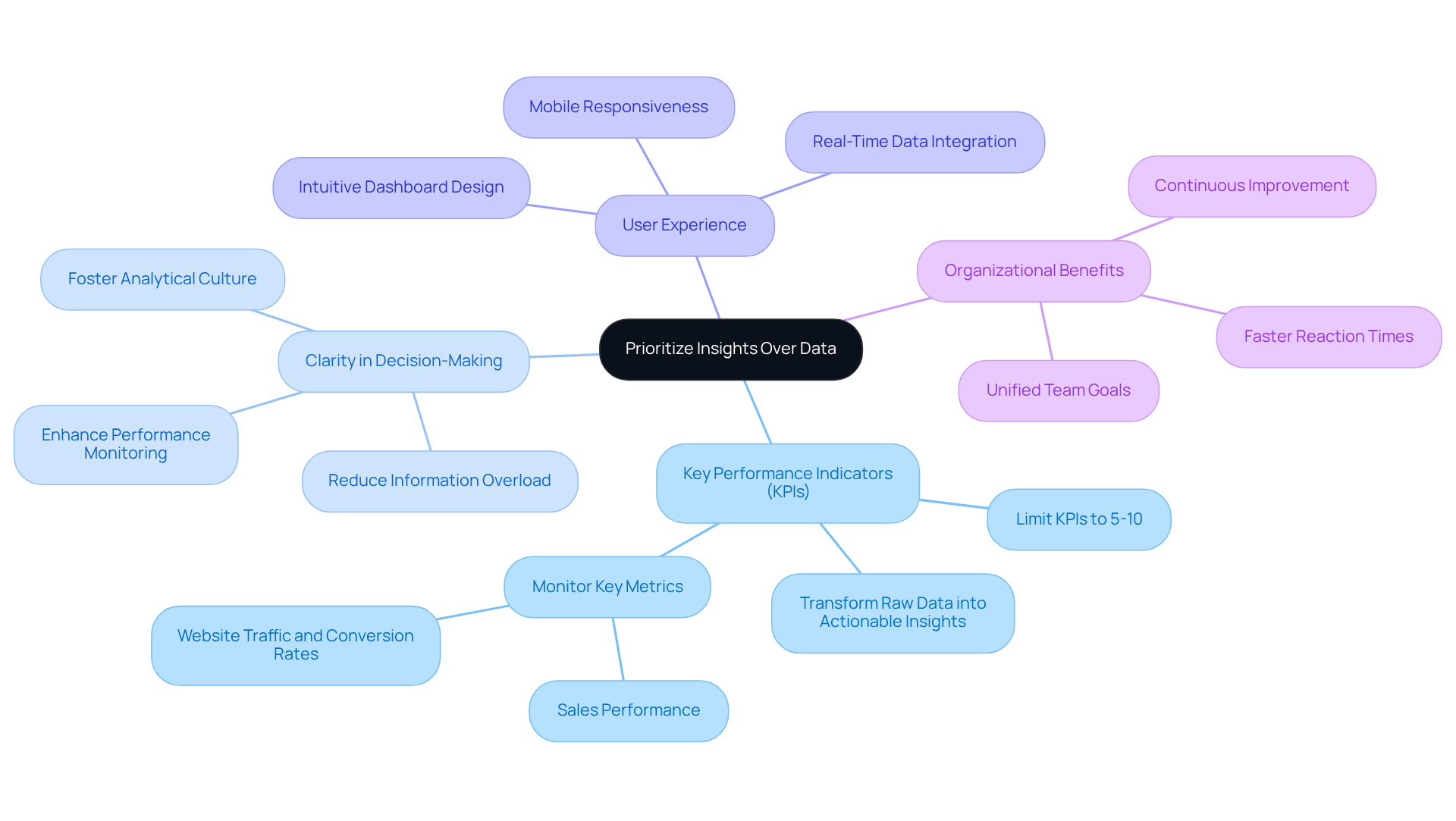
In the realm of dashboard user interface design, it’s vital to focus on the display of key performance indicators (KPIs) that resonate with the goals of your audience. Many of us have experienced the frustration of sifting through overwhelming amounts of data, which can cloud our ability to make informed decisions. By prioritizing the metrics that truly matter, we empower users to quickly assess performance and make data-driven choices, all without the burden of irrelevant information weighing them down.
For instance, consider how sales KPI displays can help identify shortcomings early on, which might otherwise impact financial performance. This illustrates how effective KPI displays can significantly enhance decision-making processes. Organizations embracing KPI displays often share stories of improved performance monitoring and faster responses to emerging challenges.
Experts suggest that the most effective displays focus on a limited range of relevant KPIs—ideally between five to ten—to alleviate information overload and foster clarity. Take a retail firm, for example, that employs a dashboard user interface to showcase sales performance across different regions, emphasizing insights rather than sheer data volume. This approach nurtures a more analytical and results-driven culture within teams.
By centering practical insights in visual display design, organizations can align their decision-making processes with strategic objectives, paving the way for continuous improvement and operational effectiveness. As a helpful takeaway, think about limiting your dashboard user interface to 5-10 KPIs to enhance focus and clarity, nurturing a more effective decision-making environment.
Visualize Effectively: Use Graphs and Charts for Clarity
In the journey of sharing ideas, many tech startup founders face the challenge of presenting information clearly and effectively. This struggle can lead to misunderstandings and missed opportunities. Imagine trying to convey your innovative vision without the right tools to illustrate your points. It's a frustrating situation that can leave you feeling overwhelmed.
To address this, consider utilizing graphs, charts, and other visual aids that can significantly enhance comprehension. Selecting the right type of visualization is crucial:
- Line charts can beautifully illustrate trends over time
- Bar charts allow for meaningful comparisons among different categories
- Pie charts effectively depict proportions
Studies reveal that effective information visualization can greatly enhance user engagement; in fact, 70% of designers believe that visualization improves user experience.
For instance, organizations that embrace visual analytical tools find themselves five times more likely to make quicker decisions than their rivals, as noted by Brain & Company. Moreover, incorporating visuals can shorten business meetings by 24%, according to a study from the Wharton School of Business, highlighting their vital role in facilitating efficient communication.
By focusing on clarity and interactivity, the dashboard user interface can transform complex information into actionable insights, empowering you to make informed decisions. Remember, effective data visualization should be simple, accurate, and tailored to your audience. This approach democratizes information, enabling individuals from all backgrounds to engage with data meaningfully. Together, let’s strive for clarity and connection in our communication.

Ensure Consistency: Maintain Uniform Design Elements
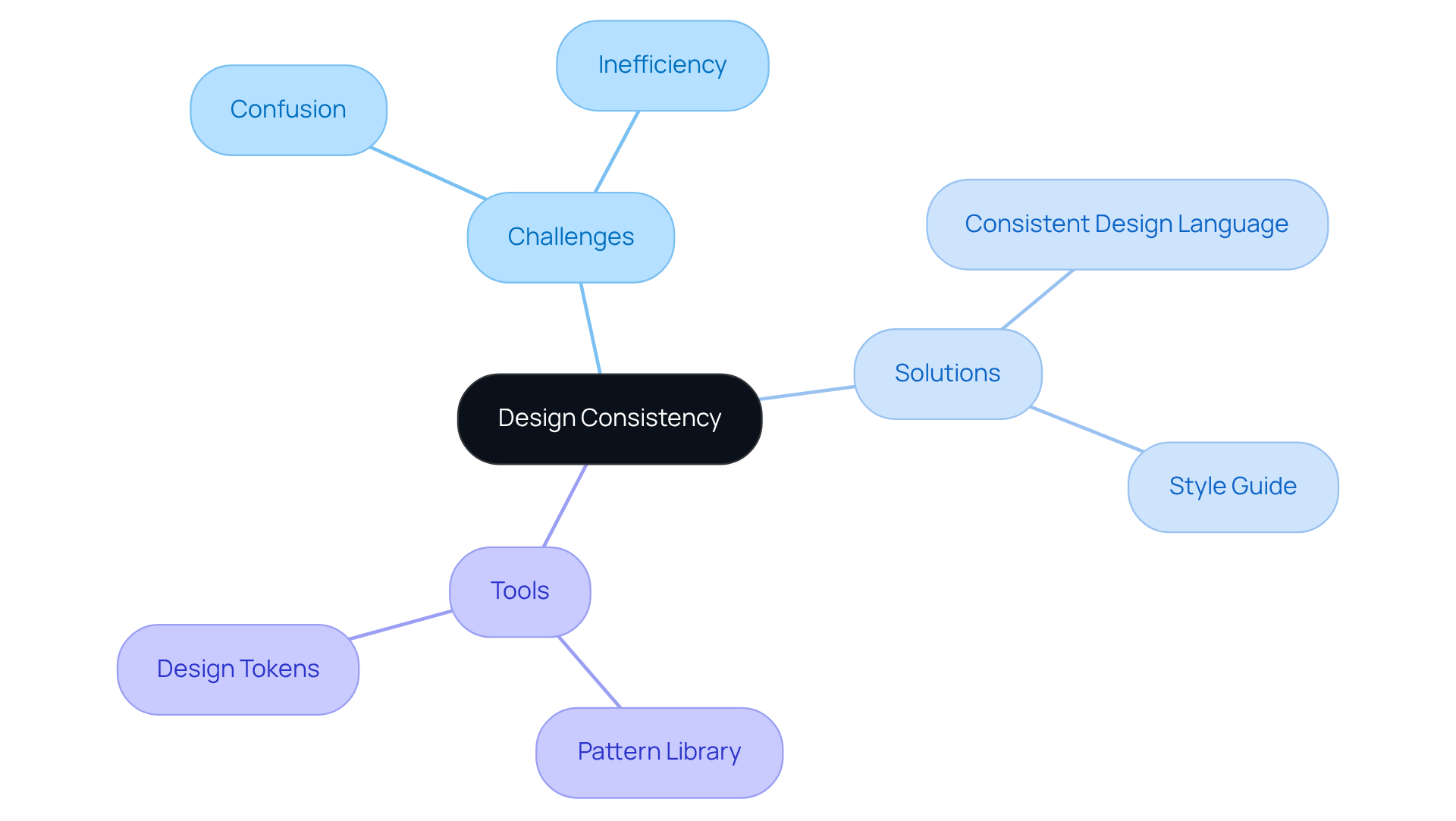
When it comes to creating a user-friendly interface, uniformity in visual elements such as colors, fonts, and button styles can be a significant challenge. Many individuals find themselves struggling with confusion and inefficiency when these elements are inconsistent. This can lead to frustration, as users may not know how to engage effectively with the interface.
However, there is a nurturing solution: by following a consistent design language, you can help users swiftly understand how to interact with your product. This not only enhances their experience but also boosts overall efficiency.
A style guide can be a valuable tool in preserving this consistency across all components of the interface. By implementing such a guide, you can create a supportive environment that fosters clarity and ease of use, ultimately benefiting both your users and your team.
Design for All Devices: Optimize for Mobile and Desktop
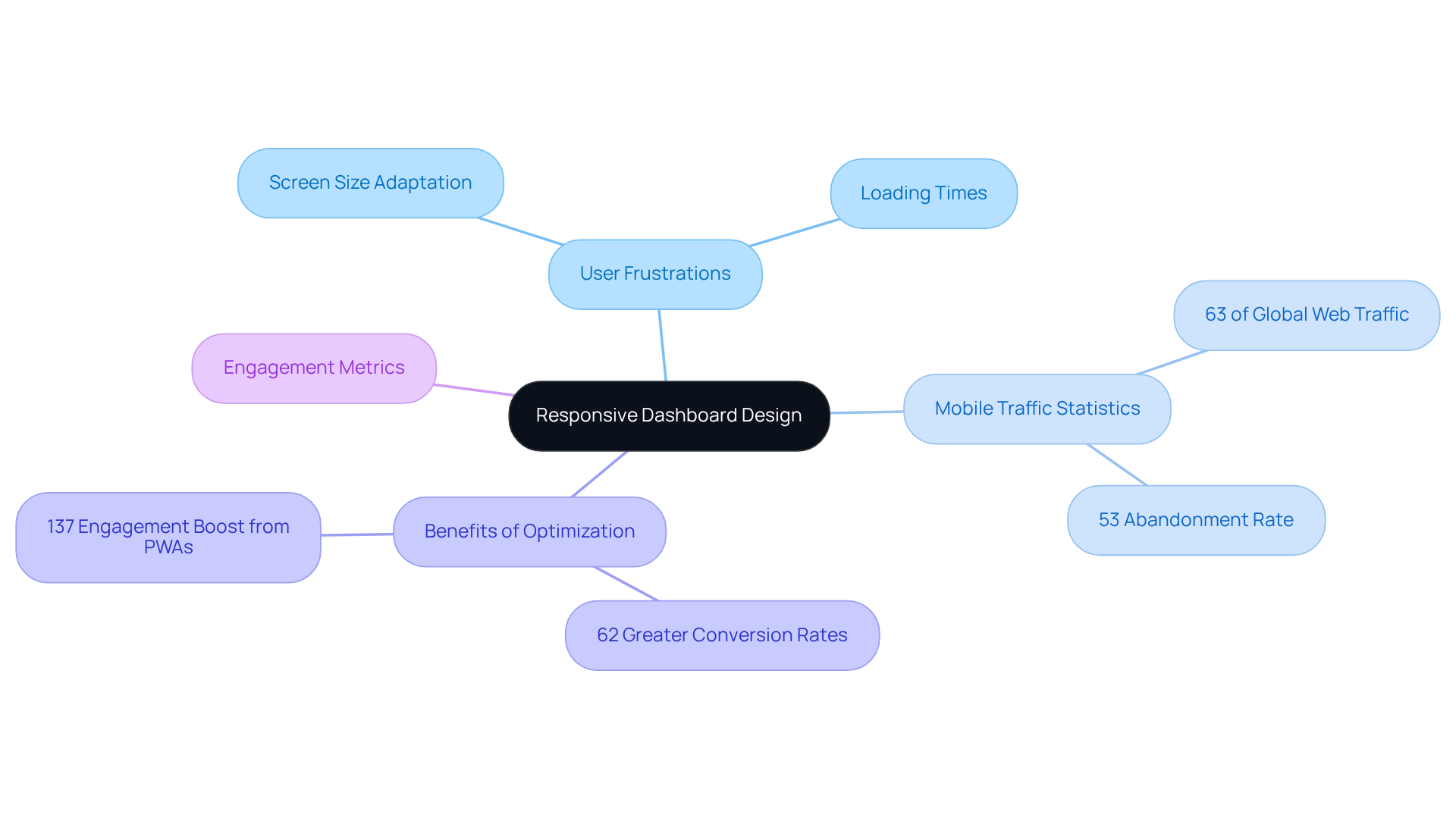
Creating an effective dashboard can often feel overwhelming, especially when considering the diverse devices your users rely on. It's essential to recognize that a responsive design is not just a luxury; it's a necessity. When dashboards fail to perform seamlessly across mobile and desktop devices, they can leave users frustrated and disconnected. Imagine the disappointment of trying to access crucial information on a dashboard that doesn’t adapt to your screen size or orientation. This is where the pain points lie.
With mobile devices now accounting for over 63% of global web traffic, the need for mobile optimization is more critical than ever. If a dashboard isn't mobile-friendly, it risks alienating a significant segment of visitors. In fact, studies show that 53% of mobile website visits are abandoned if pages take longer than three seconds to load. This reality can be disheartening for anyone striving to provide valuable insights to their users. However, there is hope.
By applying responsive design principles, you can enhance the user experience and significantly increase engagement and retention rates. Mobile-optimized sites have been shown to experience 62% greater conversion rates, while Progressive Web Apps (PWAs) can boost engagement by an impressive 137% compared to traditional mobile sites. This demonstrates the undeniable efficiency of mobile-optimized interfaces.
Ultimately, a well-optimized dashboard caters to the diverse needs of all users, ensuring they can efficiently interact with data, regardless of the device they choose. By embracing these design principles, you’re not just improving functionality; you’re nurturing a supportive environment where users feel valued and connected to the information they need.
Engage Through User Research: Understand User Needs
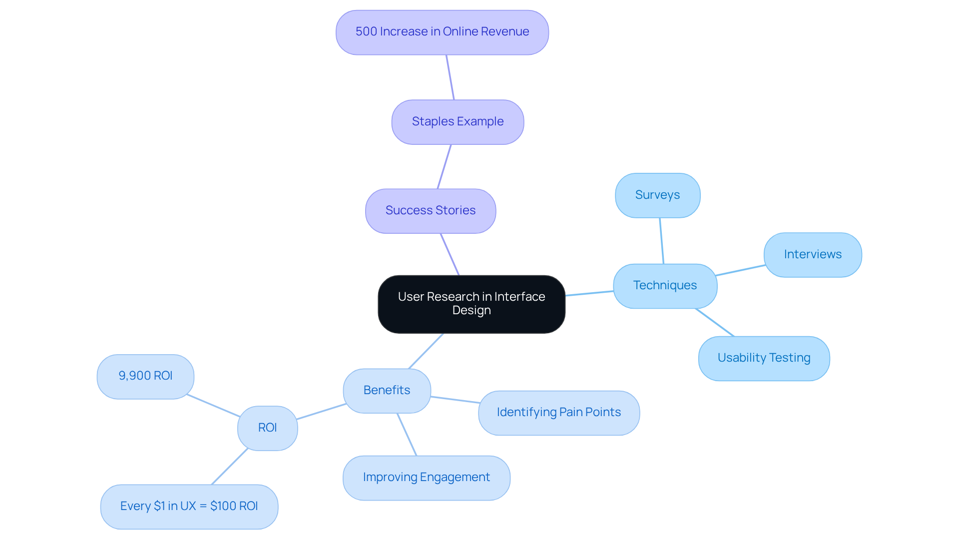
Understanding the unique needs and preferences of your audience is crucial, especially in the realm of interface design. Many tech startup founders struggle with this, often feeling overwhelmed by the challenge of creating user-friendly experiences. By employing techniques such as surveys, interviews, and usability testing, designers can gather invaluable insights into current displays. Engaging directly with users not only helps in identifying pain points but also illuminates areas ripe for improvement. This process ultimately leads to a more effective and personalized dashboard user interface.
Consider the impact of usability testing, which can uncover up to 85% of usability issues. This ensures that the final design resonates closely with what users expect and need. As Steve Krug wisely notes, "If you want a great site, you’ve got to test." When companies prioritize customer experience, they often witness remarkable returns; for instance, every dollar invested in UX can yield up to $100, translating to an astonishing 9,900% ROI. Research shows that organizations focused on UX can see returns ranging from $2 to $100 for every dollar spent.
By truly understanding user needs and incorporating their feedback, designers can craft interfaces that not only meet but exceed expectations, nurturing higher engagement and satisfaction. A compelling example is Staples, which experienced a remarkable 500% increase in online revenue following a UX-centered site overhaul. This success story highlights the profound impact a user-centered approach can have on a business.
We encourage you to reflect on your own experiences and consider how user research can transform your design process, fostering deeper connections with your audience and driving success.
Embrace Progressive Disclosure: Manage Information Flow
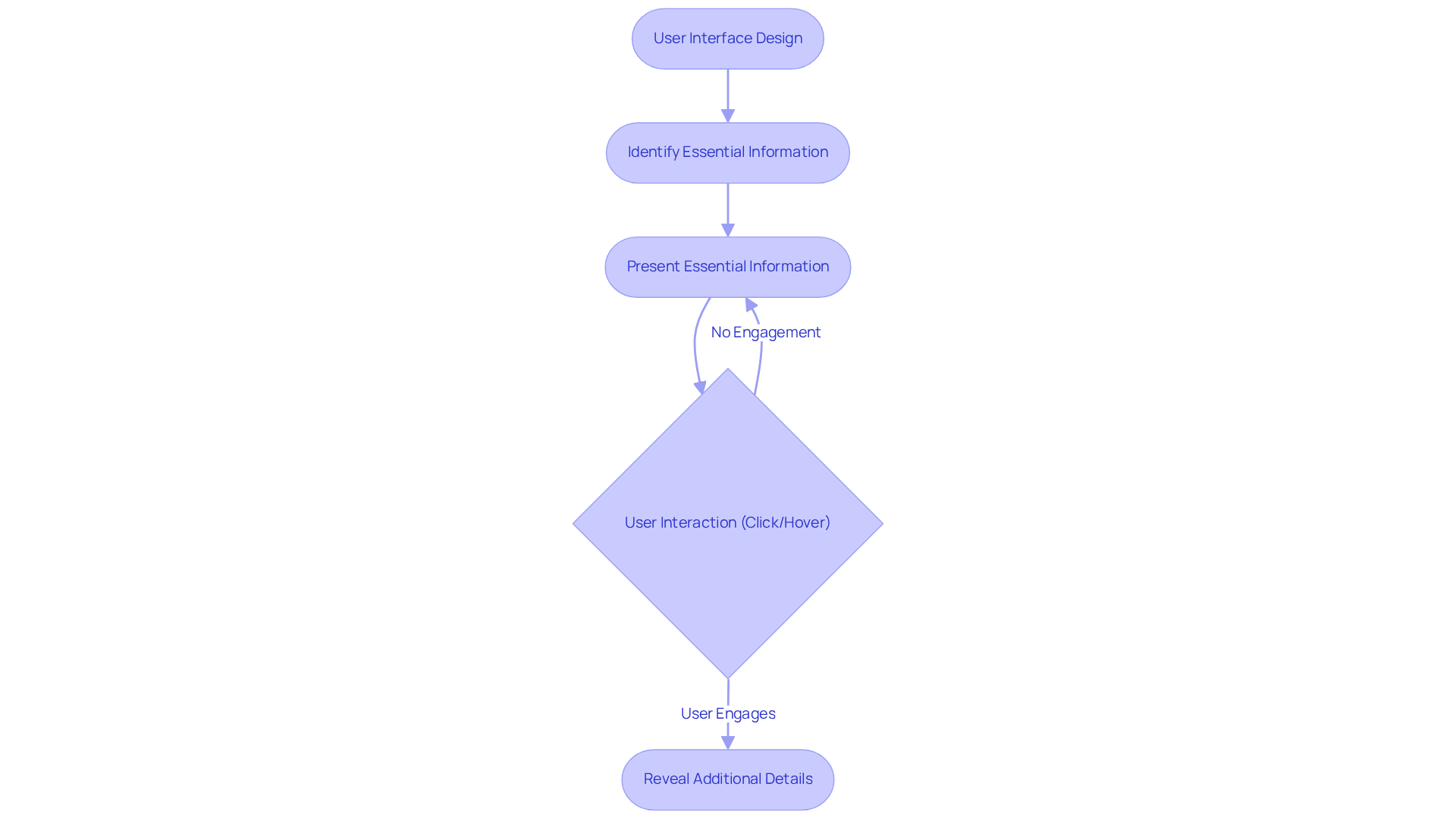
In the fast-paced world of technology, many founders struggle with the challenge of presenting information in a way that doesn’t overwhelm their users. Information overload can lead to frustration, making it difficult for individuals to find what they truly need. This is where progressive disclosure comes into play, offering a nurturing solution that allows users to engage with only the essential information at first. As they interact—whether through clicks or hover actions—they can gradually explore deeper details at their own pace. This thoughtful approach not only simplifies the user experience but also fosters engagement, enabling individuals to focus on what matters most before diving into more complex data.
Consider common UI patterns like modal windows and accordions, which can beautifully enhance this technique by organizing information in a more digestible format. Take inspiration from platforms like Dropbox and Amazon, which effectively reveal additional options as users engage with their interfaces. Google, too, exemplifies this with its search results page, gradually unveiling more information to simplify interactions. By prioritizing clarity and simplicity, you can significantly enhance usability, ensuring that users can efficiently access the information they need without feeling overwhelmed.
To begin applying this compassionate technique, think about conducting research with participants to identify both crucial and advanced content. This thoughtful step ensures that your interface meets user needs effectively, creating a supportive environment where individuals can thrive. Remember, you’re not just designing a dashboard user interface; you’re creating a welcoming space that encourages exploration and understanding.
Clarity Above All: Prioritize Clear Navigation and Labels
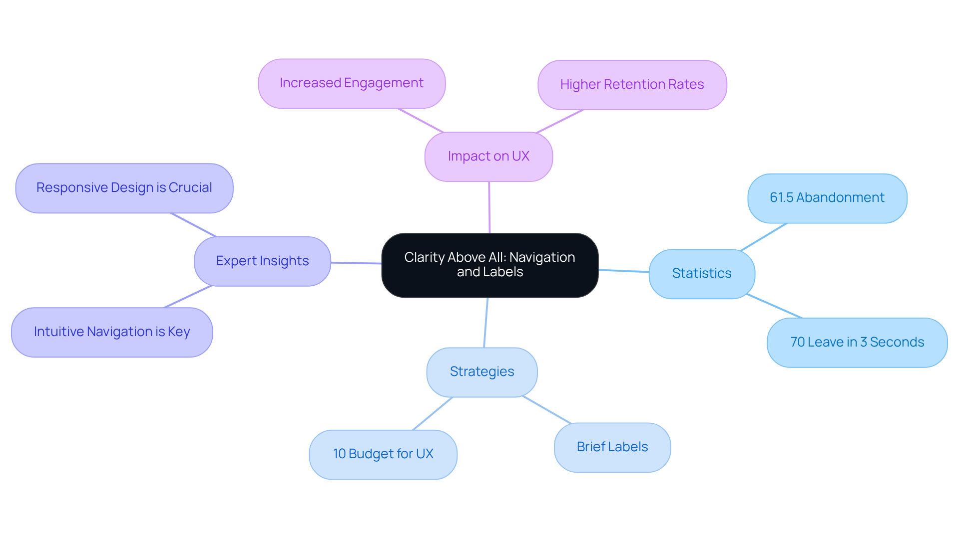
In the realm of dashboard user interface design, intuitive navigation and clear labeling often pose significant challenges. Many individuals find themselves frustrated and overwhelmed when they cannot easily locate the information they need. This confusion can lead to wasted time and lost opportunities, leaving users feeling defeated. Research shows that 61.5% of web designers attribute visitor abandonment to poor navigation, highlighting how critical clarity is in this space. Furthermore, a staggering 70% of online users will leave a page if they cannot find what they are looking for within three seconds. This underscores the urgency for efficient navigation and labeling in design.
To address these issues, adopting optimal strategies is essential. Utilizing brief labels that accurately depict interface components can significantly enhance user engagement. Investing around 10% of your development budget in user experience (UX) can yield an impressive conversion uplift of 83%. This statistic serves as a compelling reason to prioritize intuitive navigation and clear labeling. Moreover, focusing on these elements can lead to a 20% increase in retention rates, demonstrating their profound impact on overall interface usability.
As one expert insightfully noted, 'Intuitive navigation is key - ensuring that the flow of the app is logical for the individual is paramount.' By placing a strong emphasis on these elements and conducting usability testing, designers can create interfaces that not only facilitate a seamless experience but also empower users to make informed decisions and enhance productivity. Together, we can foster an environment where clarity and ease of use reign supreme, ultimately benefiting everyone involved.
Incorporate Usability and Customization: Tailor to User Preferences
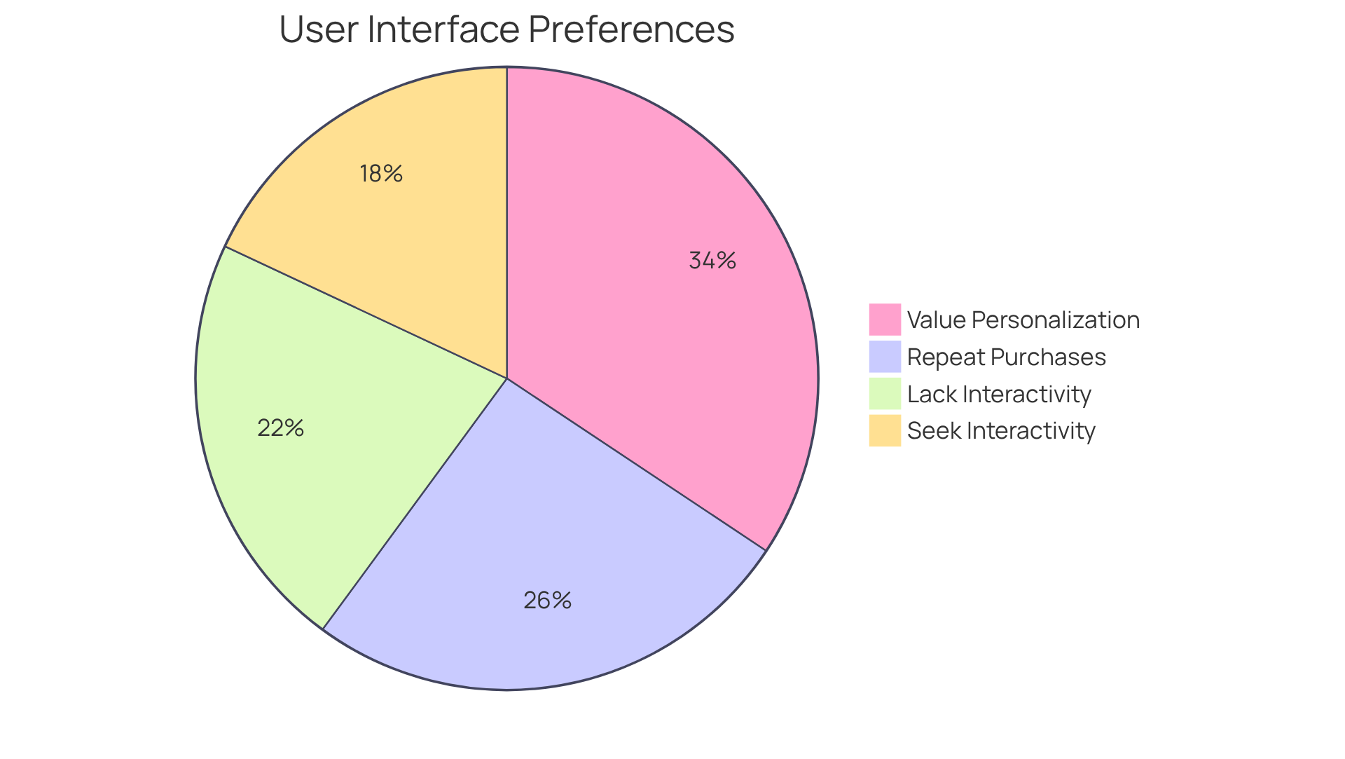
In today's fast-paced digital landscape, many individuals feel frustrated by interfaces that do not cater to their unique needs. The lack of customization options—such as adjustable layouts, theme choices, and the ability to select which metrics to display—can leave users feeling disconnected and dissatisfied. This is more than just a minor inconvenience; it can affect how users interact with technology on a daily basis. Research indicates that:
- 42% of individuals are searching for interfaces that allow them to explore and manipulate information through interactive features.
This statistic underscores the importance of personalization in creating a more engaging experience.
Moreover, a significant:
- 51% of users express that they find many interfaces lacking in interactivity, revealing a gap that can lead to disengagement.
For tech startups, addressing this issue is not just beneficial; it is essential. Companies that prioritize tailored experiences can witness remarkable outcomes, with:
- 80% of consumers acknowledging that personalized interactions increase their likelihood of returning.
- 60% of shoppers believing they are more likely to become repeat buyers after enjoying a personalized shopping experience.
Implementing customizable features in the dashboard user interface is a powerful way to foster user engagement and enhance overall satisfaction. By allowing individuals to manage their interface, these visual displays become important instruments that align with personal requirements. This thoughtful approach not only meets users' emotional needs but also positions tech startups to thrive in a competitive market. Embracing customization in user interface design can be a game-changer, nurturing loyalty and creating lasting connections with customers.
Conclusion
In the realm of dashboard development, prioritizing user-centric design is more than just a choice; it’s a necessity. Many organizations struggle with creating interfaces that engage users and enhance their decision-making processes. This challenge can lead to frustration, as users often find themselves navigating complex and uninviting dashboards. By truly understanding the specific needs and workflows of your audience, you can craft dashboards that are not only visually appealing but also functionally effective, transforming user experiences and fostering satisfaction.
Key strategies to address these challenges include:
- Simplifying dashboard elements
- Focusing on essential metrics
- Ensuring effective visualization
These elements play a crucial role in enhancing user engagement and alleviating the pain points associated with cluttered interfaces. Moreover, the importance of consistency in design, mobile optimization, and incorporating user feedback cannot be overstated. By embracing these principles, you can create intuitive interfaces that promote clarity and ease of use, ultimately leading to improved user satisfaction and performance.
As you embark on this journey towards effective dashboard design, remember that it’s not just about aesthetics; it’s about fostering an environment that promotes understanding and engagement. By adopting a user-centered approach and implementing best practices, your organization can transform dashboards into powerful tools that drive informed decision-making. Embrace the opportunity to engage with users, gather insights, and continuously refine your design strategy. Together, we can ensure that your dashboards not only meet but exceed user expectations, creating a supportive and engaging experience for all.
Frequently Asked Questions
Why is user-centric design important for dashboards?
User-centric design is crucial because it ensures that dashboards are tailored to meet the specific needs and workflows of individuals. This approach leads to improved functionality and better user experiences by incorporating insights from participant research.
How does participant research influence dashboard design?
Participant research gathers essential insights into how individuals engage with data and what information they find valuable. This understanding allows designers to create interfaces that captivate visually and enhance usability, ultimately improving outcomes.
What financial benefits are associated with prioritizing human-centered design?
Studies indicate that every $1 invested in enhancing user experience yields $100, highlighting the significant financial benefits of prioritizing human-centered design in dashboard development.
What strategies can be used to simplify dashboard elements?
To simplify dashboard elements, consider limiting the number of widgets to 10-15, utilizing whitespace for readability, prioritizing essential metrics, limiting color usage to 3-5 colors, implementing intuitive interactive features, and maintaining a consistent layout.
How does a streamlined dashboard impact user engagement?
A streamlined dashboard enhances user engagement by removing distractions, allowing users to focus on crucial data, recognize patterns and trends quickly, and promoting a data-driven culture through effective visual displays.
What is the importance of focusing on key performance indicators (KPIs) in dashboard design?
Focusing on KPIs allows users to quickly assess performance without being overwhelmed by irrelevant data. This approach enhances decision-making processes and supports a more analytical and results-driven culture within organizations.
How many KPIs should be included in a dashboard for optimal clarity?
It is suggested to limit the dashboard to 5-10 relevant KPIs to alleviate information overload and foster clarity, thereby enhancing the decision-making environment.
What is the overall goal of effective dashboard design?
The overall goal of effective dashboard design is to create interfaces that satisfy user requirements, enhance engagement, and support informed decision-making by focusing on key insights rather than excessive data.


