Introduction
Creating an effective dashboard can feel like a daunting task for tech startups, especially when the goal is to enhance user experience in a bustling marketplace. Many founders find themselves grappling with the challenge of ensuring their dashboards are not just functional, but also engaging and user-friendly. It’s a common struggle: how do you keep evolving your dashboard to meet the ever-changing needs of your users without falling into the trap of stagnation?
Imagine pouring your heart into a product, only to see users disengage because the dashboard feels outdated or cumbersome. This can be disheartening, and it’s a pain point that many in the tech startup community share. The implications of this challenge are significant - user engagement and satisfaction can plummet, impacting your startup’s growth and success.
But there’s hope. By focusing on key features like real-time data updates, customization, and intuitive navigation, you can breathe new life into your dashboard. Startups that embrace these elements often see a remarkable improvement in user engagement. It’s about creating a space where users feel valued and understood, and where their needs are met with care and attention.
At RNO1, we understand the journey you’re on. We’re here to support you in crafting dashboards that not only meet user expectations but also foster a sense of community and connection. Let’s work together to ensure your dashboard evolves alongside your users, keeping their experience at the forefront of your mission.
Identify Essential Dashboard Features
Creating a successful interface can feel overwhelming for tech startups. You might be grappling with how to truly meet the needs of your users while also standing out in a competitive landscape. It’s a challenge that many face, and it’s crucial to address these concerns thoughtfully.
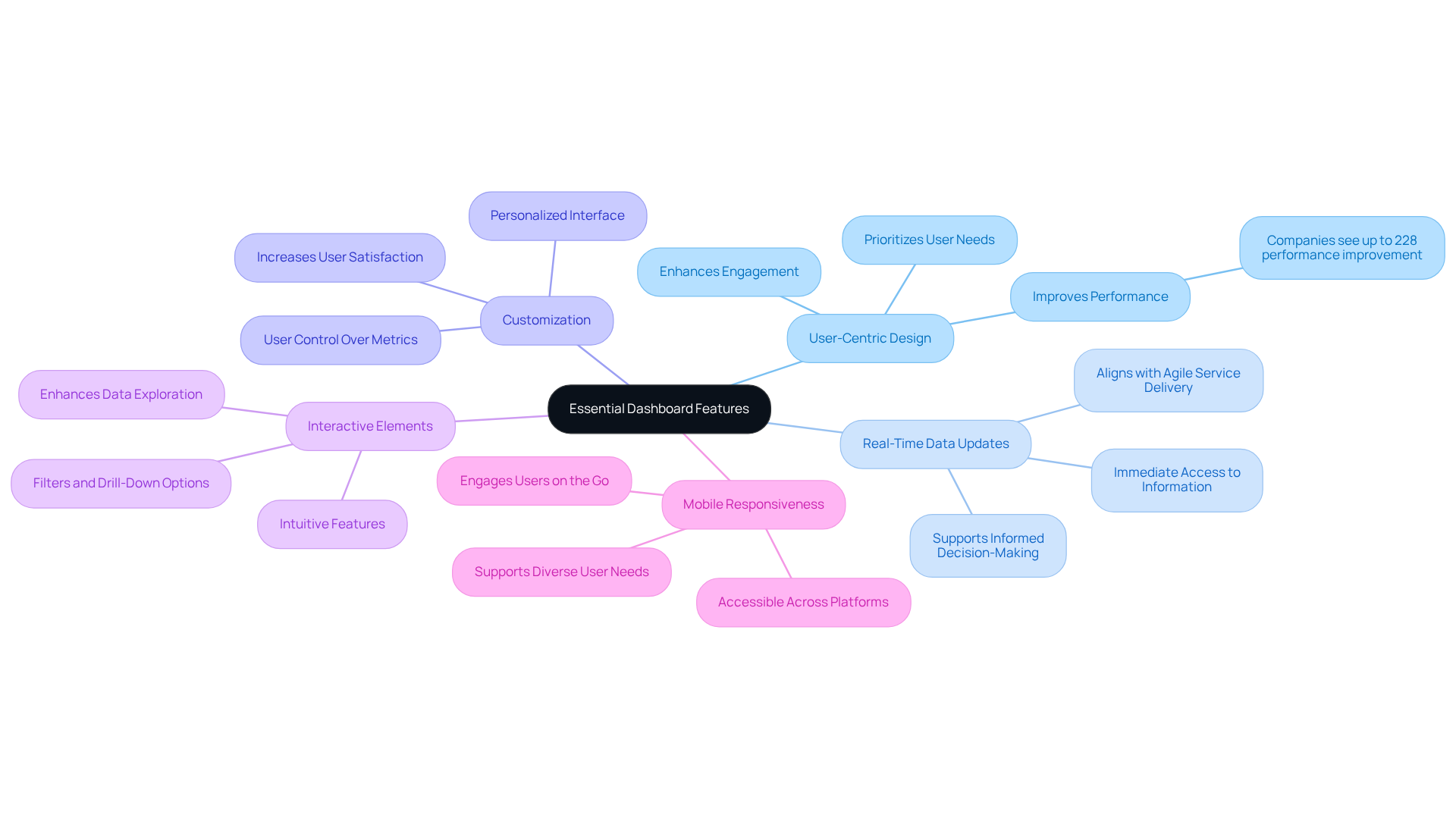
Imagine the best dashboard designed with your users at its heart. A user-centric design isn’t just a nice-to-have; it’s essential. Studies show that companies that prioritize design can see performance improvements of up to 228%. This isn’t just about aesthetics; it’s about creating an engaging experience that resonates with users.
Now, think about the importance of real-time data updates. In today’s fast-paced world, having immediate access to current information can make all the difference. Your users need to make informed decisions quickly, and the best dashboard that provides real-time insights can empower them to do just that. This aligns perfectly with RNO1's real-time billing model, ensuring that your service delivery is agile and responsive.
Customization is another key element. Allowing users to personalize their interface by rearranging widgets and selecting metrics can significantly enhance their satisfaction. When users feel in control of their experience, they’re more likely to engage regularly with the best dashboard.
Interactive elements, like filters and drill-down options, can further enrich this experience. These features should be intuitive and require minimal effort to use, making data exploration accessible and enjoyable. Imagine how much more engaged your users will be when they can easily dive deeper into the information that matters most to them.
And let’s not forget about mobile responsiveness. With so many people relying on their mobile devices, ensuring your interface is accessible across various platforms is vital. A responsive design keeps your audience engaged, no matter where they are.
By focusing on these essential attributes, you can create an interface that not only meets client expectations but also fosters engagement and satisfaction. This approach leads to more informed decision-making and showcases RNO1's commitment to design-oriented solutions in branding and digital growth. Remember, you’re not alone in this journey; we’re here to support you every step of the way.

Enhance User Experience and Accessibility
Enhancing user experience and accessibility in the best dashboard design is crucial for tech startups, and it starts with recognizing a common challenge: navigating complex interfaces can be overwhelming. Many founders have shared their frustrations about how difficult it can be for users to find the information they need quickly. This confusion can lead to missed insights and ultimately impact decision-making.
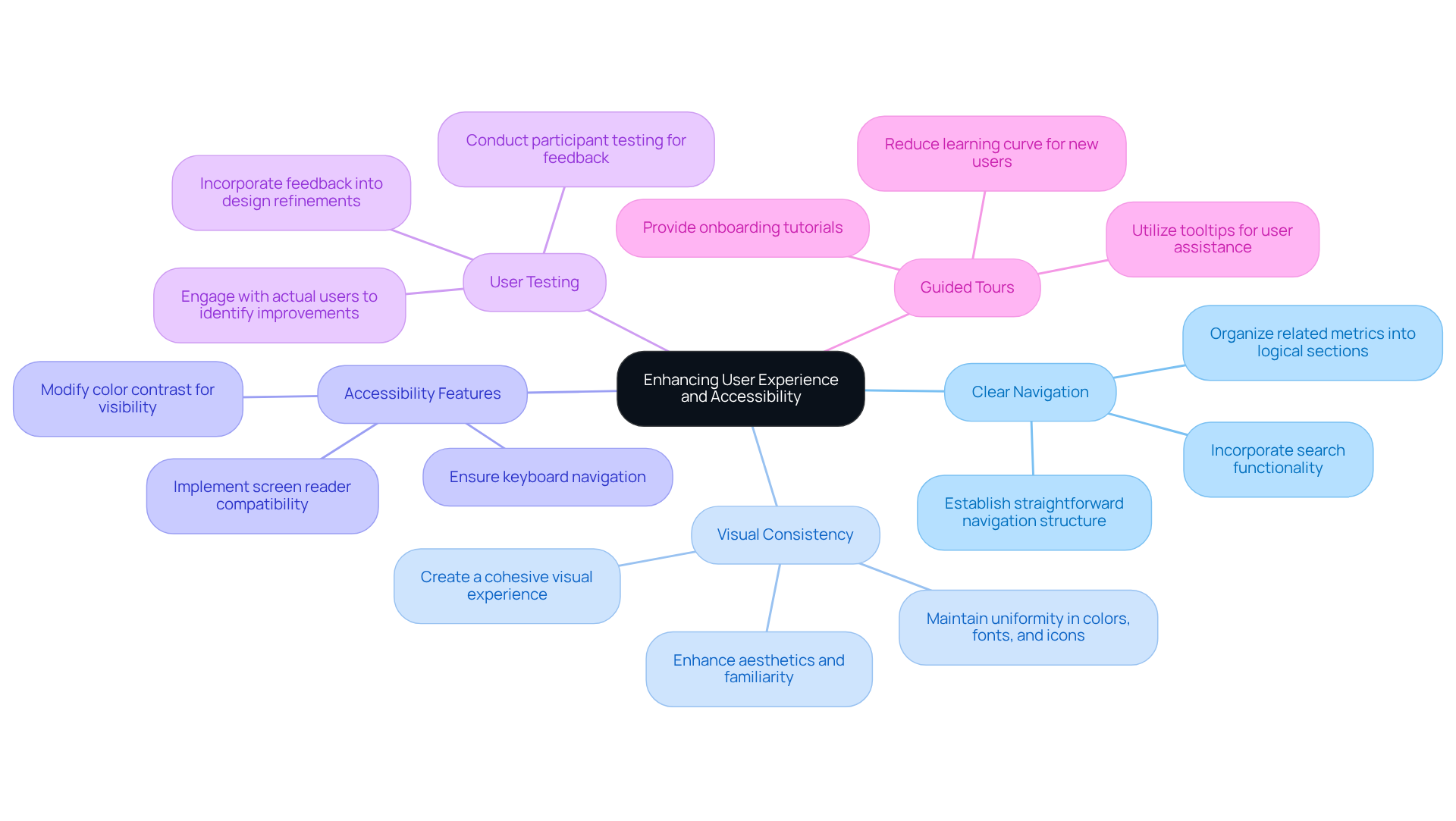
Imagine a user trying to make sense of a cluttered dashboard, feeling lost and frustrated. This is where clear navigation comes into play. Establishing a straightforward navigation structure allows users to locate information efficiently, freeing them to focus on what truly matters. As highlighted in the case study on 'User Experience Improvement through Dashboard Tabs,' organizing related metrics into logical sections not only prevents overcrowding but also enhances the overall navigation experience.
Consistency in visual language is another vital aspect. Maintaining uniformity in colors, fonts, and icons throughout the interface creates a cohesive visual experience. This consistency not only enhances aesthetics but also fosters familiarity, making it easier for users to comprehend insights at a glance. Experts agree that the best dashboard is a well-organized design that minimizes cognitive load, allowing users to engage more effectively.
Accessibility options are essential for reaching a wider audience. Incorporating features like screen reader compatibility, keyboard navigation, and color contrast modifications ensures that individuals with disabilities can also benefit from your dashboard. This commitment to accessibility not only improves usability but also enhances overall satisfaction. The 'AI-powered Cybersecurity Dashboard' case study illustrates how these features can significantly elevate the best dashboard for enhancing user experience.
Conducting participant testing is a powerful way to gather feedback and identify areas for improvement. Engaging with actual users can reveal insights that lead to a more efficient interface, tailored to their needs. As mentioned in the case study 'Test and Refine,' feedback from users can drive meaningful improvements that elevate the overall experience.
Lastly, consider providing guided tours and tooltips. These onboarding tutorials can help users navigate and utilize the interface effectively, reducing the learning curve and fostering a more engaging experience. The significance of guided tours is evident in effective analytics interface design, where onboarding processes help newcomers grasp functionalities with ease.
By embracing these strategies, tech startups can create interfaces that are not just functional but also enjoyable and accessible for everyone. Clear navigation structures, as evidenced in successful case studies, contribute to the best dashboard usability and user satisfaction. Ultimately, this drives better decision-making and performance outcomes. Investing in user-friendly interfaces can yield impressive returns, with companies achieving up to 368% ROI from the best dashboard design. This underscores the importance of prioritizing user experience in your design efforts.

Utilize Effective Data Visualization Techniques
Navigating the world of data can feel overwhelming, especially for tech startup founders striving to make sense of complex information. It’s a common struggle: how do you present intricate details in a way that’s not just digestible, but also meaningful? This challenge can lead to frustration and missed opportunities if not addressed.
Imagine pouring your heart into a project, only to find that the data you’ve gathered isn’t resonating with your audience. It’s disheartening, isn’t it? The implications of ineffective information visualization can ripple through your decision-making process, leaving you feeling lost and unsure. But there’s hope! By employing effective visualization techniques, you can transform your data into powerful insights that drive your decisions.
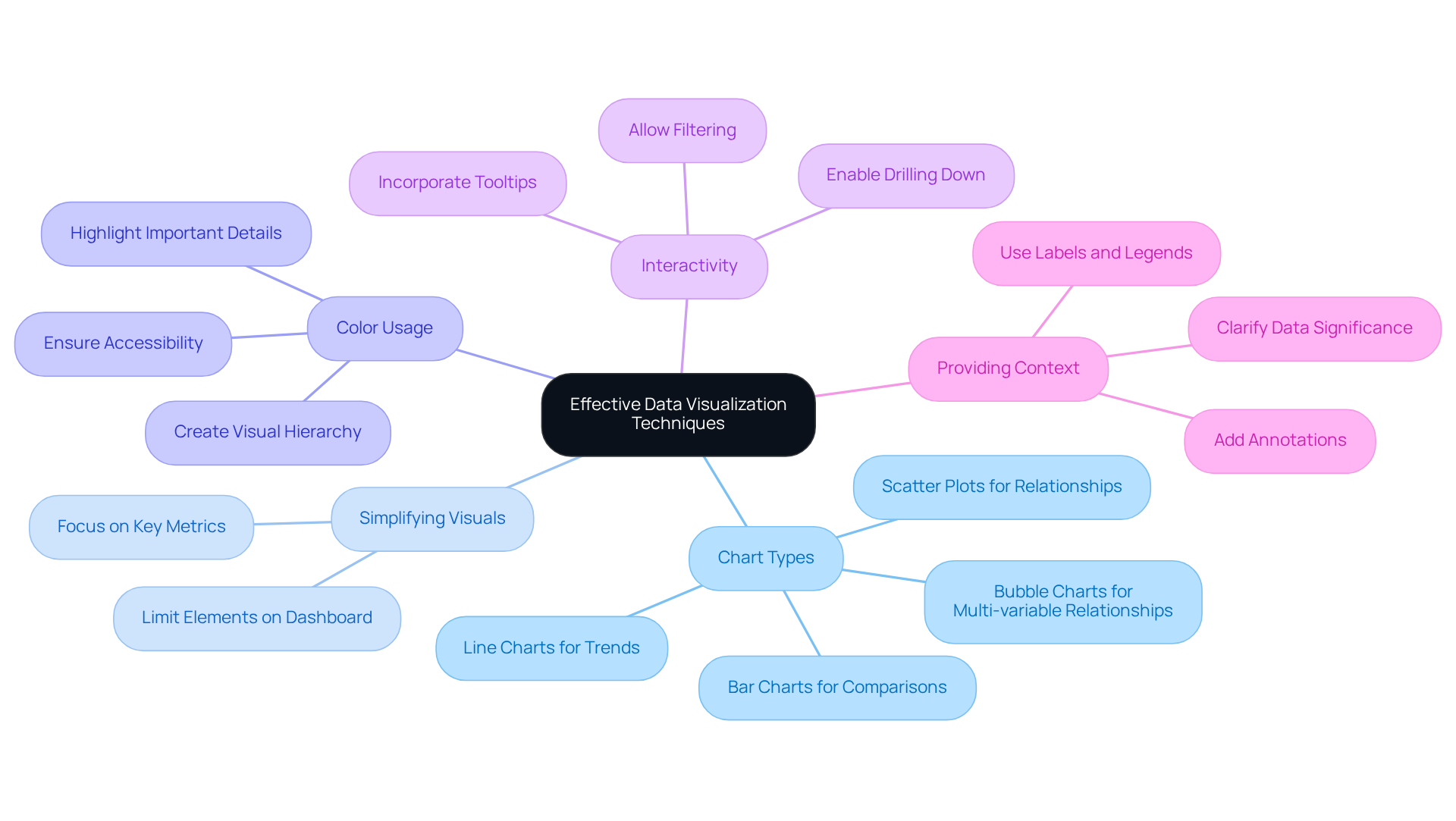
Start by choosing the right chart types. Think about what you want to convey:
- Line charts can beautifully illustrate trends over time.
- Bar charts are perfect for making comparisons.
Simplifying your visuals is equally important; by limiting the number of elements on your dashboard, you can focus on the key metrics that truly matter.
Color plays a crucial role too. Use it wisely to highlight important details and create a visual hierarchy. This way, your audience can quickly identify the critical information they need. And don’t forget to integrate interactive components! Allowing individuals to engage with your visuals - like filtering or drilling down into specific metrics - can significantly boost their involvement and exploration.
Providing context is essential as well. Labels, legends, and annotations can help clarify the data, making it easier for your audience to grasp its significance. By utilizing these visualization techniques, you can create interfaces that not only convey insights but also foster a supportive environment for data-driven decisions.
Remember, you’re not alone in this journey. Many founders face similar challenges, and by sharing experiences and insights, we can all grow together. Let’s embrace the power of effective information visualization and turn our data into a source of strength.

Implement Continuous Improvement Strategies
In the fast-paced world of tech startups, it’s easy to overlook the importance of evolving the best dashboard for success. Many founders face the challenge of creating interfaces that not only serve current needs but also adapt to future demands. This can lead to frustration for both users and creators, as stagnant dashboards can hinder productivity and engagement.
Imagine a user trying to navigate a dashboard that hasn’t changed in months. They might feel lost, overwhelmed, or even discouraged. This emotional strain can impact their overall experience and, ultimately, the success of your startup. It’s crucial to recognize these pain points and address them with empathy and care.
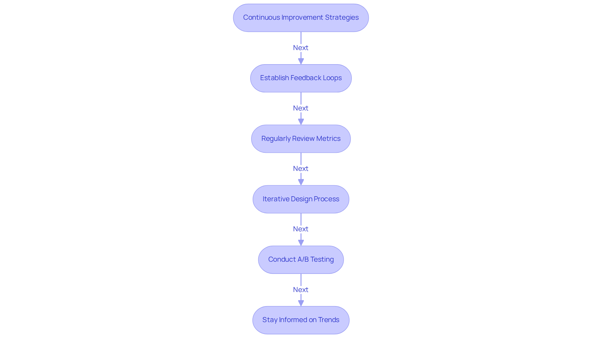
So, how can you ensure your dashboards continuously improve? Here are some nurturing strategies to consider:
- Establish Feedback Loops: Create welcoming channels for users to share their thoughts on dashboard usability. This feedback is invaluable, allowing you to make ongoing enhancements based on real experiences.
- Regularly Review Metrics: Take a moment to analyze usage data. Identify which features resonate most with users and which may need a little extra love or even removal.
- Iterative Design Process: Embrace a cycle of design where you refresh displays based on user feedback and evolving business needs. This approach fosters a sense of collaboration and responsiveness.
- Conduct A/B Testing: Engage users in evaluating different feature designs. Discover which layouts spark greater engagement and satisfaction, making them feel valued in the process.
- Stay Informed on Trends: Keep your finger on the pulse of industry trends and emerging technologies. This knowledge ensures your interface remains competitive and meets the expectations of your audience.
By embracing these continuous improvement strategies, you can create the best dashboard that not only meets the current needs of your users but also adapts gracefully to future challenges and opportunities. Remember, your journey as a tech startup founder is not just about the product; it’s about nurturing a community that thrives together.

Conclusion
Creating an effective dashboard for tech startups can feel overwhelming. It’s not just about functionality; it’s about crafting an engaging user experience that truly resonates with your users. When you prioritize user-centric design, you’re not only enhancing engagement and satisfaction but also empowering better decision-making. A well-designed dashboard can be a game-changer, leading to significant performance improvements and a deeper connection with your audience.
Think about the essential features that matter most:
- Real-time data updates
- Customization options
- Interactive elements that foster engagement
These aren’t just nice-to-haves; they’re vital for creating a dashboard that users love. And let’s not forget the importance of clear navigation, visual consistency, and accessibility. By employing effective data visualization techniques and committing to continuous improvement through feedback loops and iterative design processes, you can adapt to the ever-evolving needs of your users and the industry.
The journey toward creating the best dashboard is ongoing, and it requires a proactive approach. Embracing these best practices isn’t just about meeting current user expectations; it’s about anticipating future demands. By investing in user-friendly interfaces and prioritizing user experience, you can unlock the full potential of your dashboards. This isn’t just about technology; it’s about fostering a culture of informed decision-making and sustained growth. Together, let’s create dashboards that not only serve your needs but also inspire and engage your users.
Frequently Asked Questions
What is the importance of user-centric design in dashboard creation?
User-centric design is essential because it focuses on meeting the needs of users, leading to improved performance. Studies indicate that companies prioritizing design can experience performance improvements of up to 228%.
Why are real-time data updates crucial for dashboards?
Real-time data updates are crucial as they provide users with immediate access to current information, enabling them to make informed decisions quickly. This aligns with agile service delivery models like RNO1's real-time billing.
How does customization enhance user satisfaction in dashboard interfaces?
Customization enhances user satisfaction by allowing users to personalize their interface, such as rearranging widgets and selecting metrics. When users feel in control of their experience, they are more likely to engage regularly with the dashboard.
What role do interactive elements play in dashboard usability?
Interactive elements, like filters and drill-down options, enrich the user experience by making data exploration intuitive and enjoyable. These features allow users to easily access and dive deeper into the information that matters most to them.
Why is mobile responsiveness important for dashboard interfaces?
Mobile responsiveness is important because many users rely on mobile devices for access. Ensuring the interface is accessible across various platforms keeps the audience engaged, regardless of their location.
What overall benefits can focusing on essential dashboard features provide?
Focusing on essential dashboard features can lead to increased client satisfaction, enhanced engagement, more informed decision-making, and demonstrate a commitment to design-oriented solutions in branding and digital growth.


