Overview
Choosing the best font style for your logo involves understanding different typeface categories and aligning your selection with your brand identity and audience. The article outlines a structured approach that includes defining brand personality, researching competitors, and ensuring legibility and scalability, emphasizing that a thoughtful font choice can significantly enhance brand recognition and consumer engagement.
Introduction
In the realm of logo design, the choice of font plays a pivotal role in conveying a brand's identity and values. With various font types available, including:
- serif
- sans-serif
- script
- decorative
each carries its own implications and aesthetic appeal. Understanding these categories is essential for designers aiming to create logos that resonate with their target audience. This article delves into the intricacies of font selection, offering a comprehensive guide that not only outlines the foundational elements of typography but also provides practical steps for choosing the perfect font.
By aligning font choices with brand identity and audience expectations, businesses can enhance their visual presence and foster deeper connections with consumers. Additionally, the importance of legibility and scalability in logo fonts cannot be overstated, ensuring that a logo remains effective across various platforms. As branding continues to evolve, experimenting with font combinations emerges as a powerful strategy to craft unique and memorable logos that stand out in a competitive landscape.
Understanding Font Types: The Foundation of Logo Design
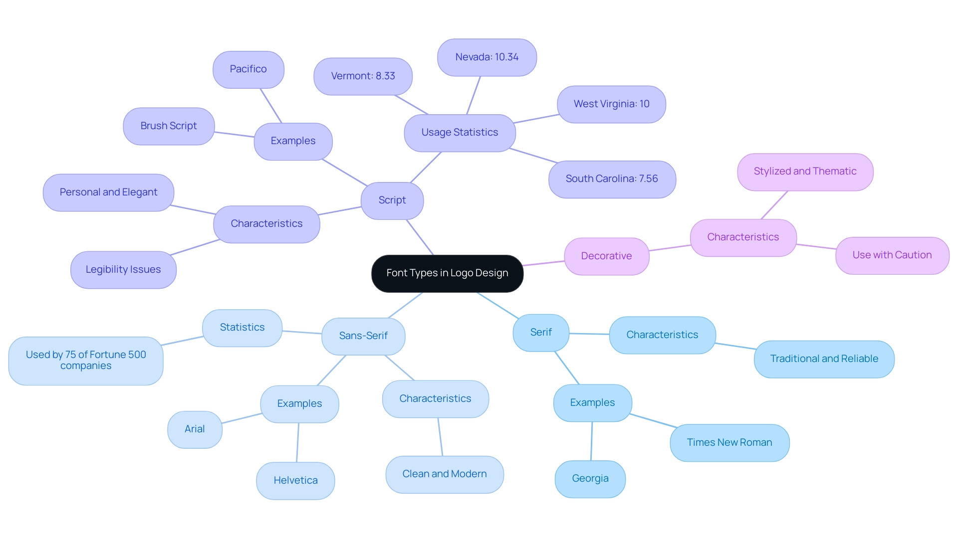
When choosing the best font style for a logo, it is essential to understand the various kinds of typefaces available to ensure your choice effectively communicates your brand's identity. Typefaces can be categorized into four main groups: serif, sans-serif, script, and decorative.
- Serif Typefaces: Recognizable by the small lines or decorative strokes at the ends of letters, serif typefaces evoke a sense of tradition and reliability. Well-known instances include Times New Roman and Georgia, which are frequently linked to established brands.
- Sans-Serif Styles: In contrast, sans-serif styles lack these decorative elements, presenting a clean and modern aesthetic. Typefaces such as Arial and Helvetica are popular choices, making them suitable for brands aiming for a contemporary look. Significantly, select sans serif typefaces for their branding, reflecting broader strategies.
- Script Styles: Emulating handwritten text, script styles introduce a personal and elegant touch to branding. However, their legibility can sometimes be compromised; examples include Brush Script and Pacifico. Notably, Nevada leads in the adoption of script styles, with 10.34% of users opting for these handwriting-like designs, followed by West Virginia (10%), Vermont (8.33%), and South Carolina (7.56%).
- Decorative Styles: These styles are distinctively stylized and often tailored to convey specific themes or moods. While they can add unique charm, their use should be judicious to avoid overwhelming the overall design.
A thoughtful understanding of these type categories not only aids in making informed decisions but also helps in selecting the best font style for a logo that aligns your brand emblem with the broader branding strategies seen among successful companies. Recent research suggests that symbols effectively expressing company identity are 27% more likely to connect with consumers, highlighting the importance of a suitable typeface selection. Furthermore, as marketing identities evolve, it's noteworthy that 10% of symbols are expected to possess real-time updating capabilities by 2026, allowing companies to dynamically adjust their visuals to reflect real-time data or events.

Step-by-Step Guide to Selecting the Perfect Logo Font
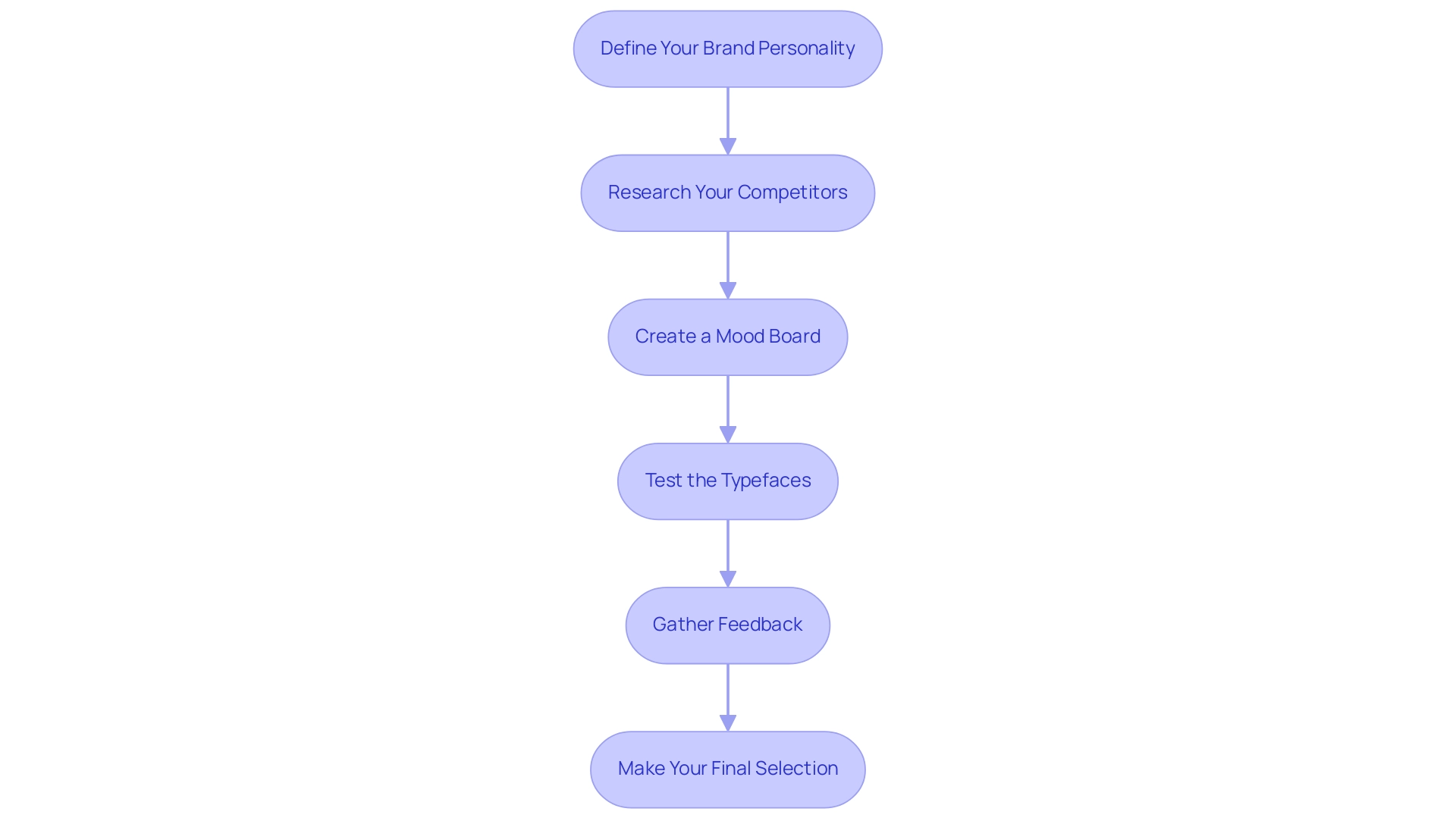
Choosing the best font style for logo is a crucial step in creating a robust identity. To ensure your choice effectively conveys your essence, follow this structured approach:
- Define Your Brand Personality: Start by identifying the core traits you wish to communicate through your logo. Consider whether your brand embodies modernity, elegance, excitement, or playfulness, as these attributes will guide your typeface selection.
- Research Your Competitors: Conduct a thorough analysis of the fonts utilized by competitors within your industry. This research will help you understand current trends and avoid creating a logo that bears too much resemblance to others.
- Create a Mood Board: Develop a mood board that encapsulates your identity. Incorporate visual elements like color palettes and type styles that align with your brand’s personality, offering a unified visual direction. Remember that utilizing too many typefaces can lead to inconsistency and a lack of visual cohesion, so aim for harmony in your selections. Shortlist potential typefaces that you believe represent the best font style for logo, based on your research and mood board, and compile a list of type styles that align with your vision. Aim to select a few options that reflect your identity while maintaining visual harmony.
- Test the Typefaces: Create mockups of your brand using the selected typefaces. This practical application will enable you to assess how each typeface appears in context, ensuring it aligns with your message and image.
- Gather Feedback: Share your design concepts with trusted peers or members of your target audience. Soliciting constructive feedback is essential, as it provides insight into how your designs are perceived.
- Make Your Final Selection: After thoughtful evaluation of feedback and visual impact, choose the font that most effectively represents your identity and resonates with your audience. Keep in mind, a familiar symbol can greatly improve consumer interaction; statistics show that 50% of consumers are more likely to support companies with emblems they recognize. As highlighted by Renderforest, this recognition can impact consumer behavior, making it essential to design a symbol that stands out. Additionally, consider the psychological impact of color in your marketing; for example, red is associated with excitement and energy, as demonstrated by successful companies like Red Bull, KFC, and Ferrari. By following these steps, you can ensure contributes positively to your overall identity.

Aligning Font Choice with Brand Identity and Audience
Choosing the best font style for logo that effectively conveys your business identity is crucial in today’s competitive environment. Consider these essential factors:
- Brand Values: Begin by identifying the fundamental values of your brand. Choose a typeface that embodies these principles; for instance, a tech startup may opt for a sleek, modern sans-serif style to project a sense of innovation and forward-thinking.
- Target Audience: It is critical to understand the preferences and expectations of your intended audience. A playful typeface can resonate well with a younger demographic, while a more conservative serif type may appeal to corporate clients. This alignment can significantly enhance user engagement; in fact, 6 in 10 marketers believe that audiences connect more with user-generated content that matches their expectations, highlighting the importance of typeface selection in branding.
- Cultural Context: Fonts often carry cultural implications that can vary widely. Be mindful of how certain styles may be interpreted in different cultural settings. Making sure that your type selection corresponds suitably with your target market's cultural context can prevent miscommunication and enhance reputation.
Moreover, as highlighted by Website Planet, the visual elements of branding, including type choice, play a significant role in a consumer's first impression, which can account for up to 90% of their perception of your identity. A strategic approach to type selection, as demonstrated by the case study 'Impact of Typeface Choices on ,' reveals that selecting the best font style for logo significantly influences identity perception and user engagement. By carefully matching your type selection with your brand identity and audience expectations, you greatly enhance the chances of creating a memorable and influential design.
Ensuring Legibility and Scalability in Logo Fonts
When selecting a font for your logo, prioritizing legibility and scalability is crucial:
- Legibility: The font must be easily readable across various sizes. Avoid overly intricate designs that may compromise clarity when reduced. Conduct tests of your design in multiple dimensions to confirm its readability.
- Scalability: Choose a typeface that maintains its character across various formats and sizes. An effective symbol should be instantly recognizable, whether displayed on a website, within a mobile application, or in printed materials.
- Contrast: It is essential to ensure sufficient contrast between the text and its background, which significantly enhances readability. This consideration is particularly essential for logos that will be utilized in diverse contexts.
Research indicates a marked preference for sans-serif typefaces, with a recent analysis revealing that 85% of websites favor this style, often opting for larger sizes and heavier weights. Interestingly, in South Carolina, there is for script styles, with 7.56% of users favoring this design. Furthermore, the global type market is projected to exceed $4 billion by 2025, reflecting an increasing investment in custom typefaces and digital typography.
As mentioned, "It should be possible to use personalization to present individual users with text in the style that’s best for them." By concentrating on legibility and scalability, as well as choosing for logo, you can ensure that your design remains effective and recognizable across all platforms and applications. This insight is supported by research published in a visual research journal, underscoring the importance of these elements in effective branding.
Experimenting with Font Combinations for Unique Logo Designs
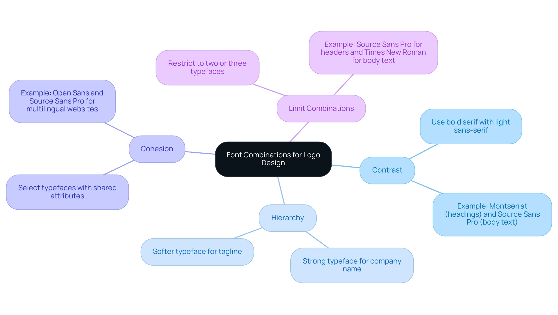
Mixing various typefaces can greatly improve the effect of your design, rendering it distinctive and unforgettable. To attain successful typeface pairing, contemplate the following strategies:
- Contrast: Employ typefaces with differing characteristics, such as a bold serif combined with a light sans-serif, to generate visual appeal and focus attention on crucial aspects of your design. For example, you can observe Montserrat and Source Sans Pro in use on Glow Skincare and Beauty’s home page — with the former applied in headings and the latter for body text.
- Hierarchy: Establish a clear hierarchy by employing different typefaces within your brand mark. For instance, a strong typeface can be used for the company name, while a softer typeface works effectively for the tagline, assisting in conveying the organization's message.
- Cohesion: Ensure that the typefaces you select enhance each other. Look for shared attributes, such as similar x-heights or stroke widths, to create a visually cohesive design that resonates with your audience. Significantly, both perform effectively on multilingual websites translated into Latin, Cyrillic, and Greek alphabets, demonstrating their adaptability.
- Limit Combinations: To preserve simplicity and clarity, restrict your design to two or three typefaces. This restriction not only enhances readability but also helps in solidifying your brand identity, which is why choosing the best font style for logo design is crucial. By thoughtfully experimenting with these font combinations, you can create a logo that is visually appealing while effectively communicating your brand's identity. A successful example of this approach is the pairing of Source Sans Pro for headers with Times New Roman for body text. This combination strikes a good balance between modernity and reliability, making it particularly effective for tech and digital product websites.

Conclusion
Selecting the right font for a logo is a fundamental aspect of establishing a brand's identity. The article highlights the significance of understanding various font types, including:
- serif
- sans-serif
- script
- decorative
Each of which carries unique implications and aesthetic values. By aligning font choices with brand identity and audience expectations, businesses can enhance their visual presence and create a lasting impression.
The structured approach to font selection outlined in the article emphasizes the importance of:
- defining brand personality
- researching competitors
- testing potential fonts
Gathering feedback and ensuring legibility and scalability are critical steps that contribute to a logo's effectiveness across different platforms. Additionally, the strategic use of font combinations can elevate a logo's uniqueness, making it stand out in a crowded marketplace.
Ultimately, font selection is not merely a design choice; it is a reflection of a brand's values and a crucial factor in consumer engagement. By thoughtfully considering these elements, businesses can craft logos that resonate with their audience, foster recognition, and support long-term success in an ever-evolving branding landscape.
Frequently Asked Questions
What are the main categories of typefaces when choosing a font style for a logo?
The main categories of typefaces are serif, sans-serif, script, and decorative.
What are serif typefaces and what do they convey?
Serif typefaces have small lines or decorative strokes at the ends of letters, conveying a sense of tradition and reliability. Examples include Times New Roman and Georgia.
How do sans-serif typefaces differ from serif typefaces?
Sans-serif typefaces lack decorative elements, presenting a clean and modern aesthetic. Popular examples include Arial and Helvetica, which are often chosen by brands aiming for a contemporary look.
What is the significance of script typefaces in branding?
Script typefaces emulate handwritten text, adding a personal and elegant touch to branding. However, their legibility can be compromised. Examples include Brush Script and Pacifico.
When should decorative typefaces be used in logo design?
Decorative typefaces are stylized and tailored to convey specific themes or moods. They should be used judiciously to avoid overwhelming the overall design.
What steps should be followed to choose the best font style for a logo?
The steps include defining your brand personality, researching competitors, creating a mood board, testing typefaces, gathering feedback, and making a final selection.
Why is defining your brand personality important in font selection?
Defining your brand personality helps identify the core traits you wish to communicate, guiding your typeface selection to effectively convey your brand's essence.
How can researching competitors aid in font selection?
Analyzing competitors' fonts helps understand current trends and avoid creating a logo that resembles others too closely.
What is the purpose of creating a mood board in the logo design process?
A mood board encapsulates your brand identity by incorporating visual elements like color palettes and type styles, offering a unified visual direction.
Why is it important to gather feedback on logo designs?
Gathering feedback provides insights into how your designs are perceived, allowing for adjustments to ensure the logo resonates with your target audience.
What impact does a familiar symbol have on consumer behavior?
A recognizable emblem can improve consumer interaction, with statistics showing that 50% of consumers are more likely to support companies with familiar symbols.


