Overview
In the realm of user interface design, many founders face the challenge of creating effective and engaging experiences. The key elements—input controls, navigational components, information components, containers, and visual design elements—can often feel overwhelming. Without intuitive design, clear labeling, and organized layouts, users may struggle to navigate, leading to frustration and disengagement.
This frustration can have significant implications. Research shows that when design is not user-friendly, it can impact user satisfaction and retention, leaving founders feeling disheartened. However, there is hope. By focusing on nurturing design principles, we can enhance user experiences and foster deeper engagement. Emphasizing visual appeal and clarity not only guides users but also creates a welcoming environment.
At RNO1, we understand these challenges deeply. Our approach is rooted in empathy and a commitment to supporting tech startup founders like you. By prioritizing effective design, we can work together to transform user interactions into positive experiences, ultimately leading to greater satisfaction and loyalty.
Introduction
In the world of digital design, user interface (UI) acts as a vital connection between technology and user experience. As digital products become increasingly complex, the significance of well-structured input controls, navigational components, and visual design elements rises.
Have you ever felt overwhelmed by a confusing interface? It can be frustrating when buttons and sliders don't respond as expected, or when menus and breadcrumbs fail to guide you effectively. Each element, from simple buttons to intricate sliders, plays an essential role in ensuring smooth interactions.
Thoughtfully integrating information components like labels and icons can enhance clarity, while containers such as cards and modals help organize content in a way that feels intuitive.
This article explores best practices and emerging trends in UI design, shedding light on how these components not only enhance usability but also nurture user satisfaction and engagement in a competitive digital landscape. Together, we can create experiences that resonate with users, fostering a sense of connection and ease.
Input Controls: Buttons, Checkboxes, and Sliders
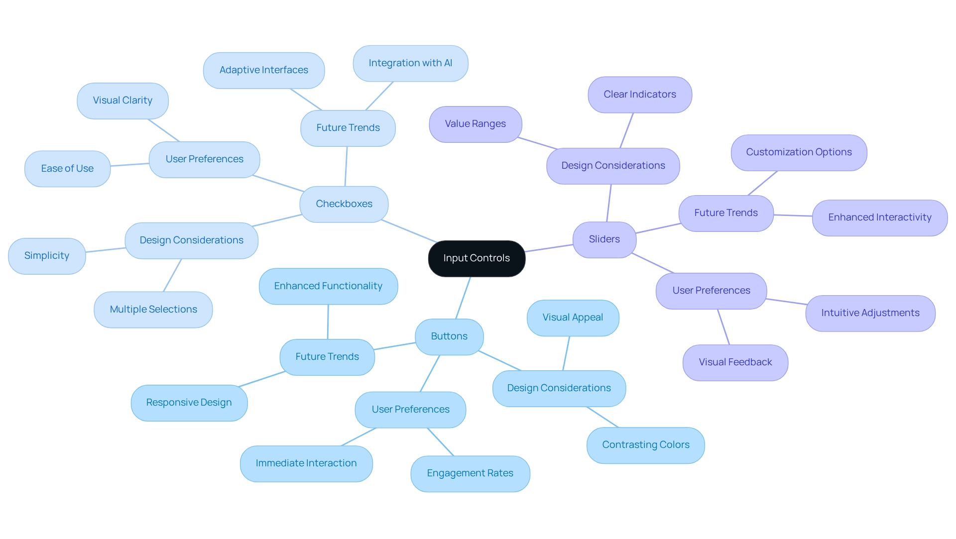
Input controls—like buttons, checkboxes, and sliders—play a crucial role in how we interact with digital interfaces. We often find ourselves frustrated when these elements are not intuitive. Buttons serve as our action triggers—think of the relief when we can easily find 'Submit' or 'Cancel.' Checkboxes offer us the freedom to select multiple options, while sliders help us adjust values within a set range. To truly enhance our experience, these interface elements must be visually distinct, easily reachable, and responsive to our actions.
Imagine this: when buttons are designed with contrasting colors, they stand out, making it easier for us to engage with them. Research shows that we form opinions about a website in just 0.05 seconds, highlighting the importance of immediate visual appeal. Furthermore, 66% of individuals prefer aesthetically pleasing websites for content consumption, underscoring how visual appeal can significantly impact our interactions. Sliders, too, should have clear indicators to show value ranges, allowing us to easily understand our adjustments.
As we look ahead to 2025, current trends in input control design emphasize the need for visual clarity and instinctive interaction. Effective button design is not just a technical requirement; it’s essential for engaging our audience. Studies reveal that well-designed buttons can greatly enhance interaction rates. Successful implementations of checkboxes in web applications simplify choices, further enriching our overall experience. With the web developer and designer workforce projected to reach 228.58 thousand by 2032, embracing these best practices is vital for creating interfaces that attract visitors while fostering trust and satisfaction.
Moreover, we must acknowledge the challenges faced by AI assistants, such as unexpected behaviors that can undermine trust. This illustrates the broader implications of our design decisions on user satisfaction and reliability. By focusing on these elements, we can create a more supportive and engaging digital environment for everyone.

Navigational Components: Menus, Tabs, and Breadcrumbs
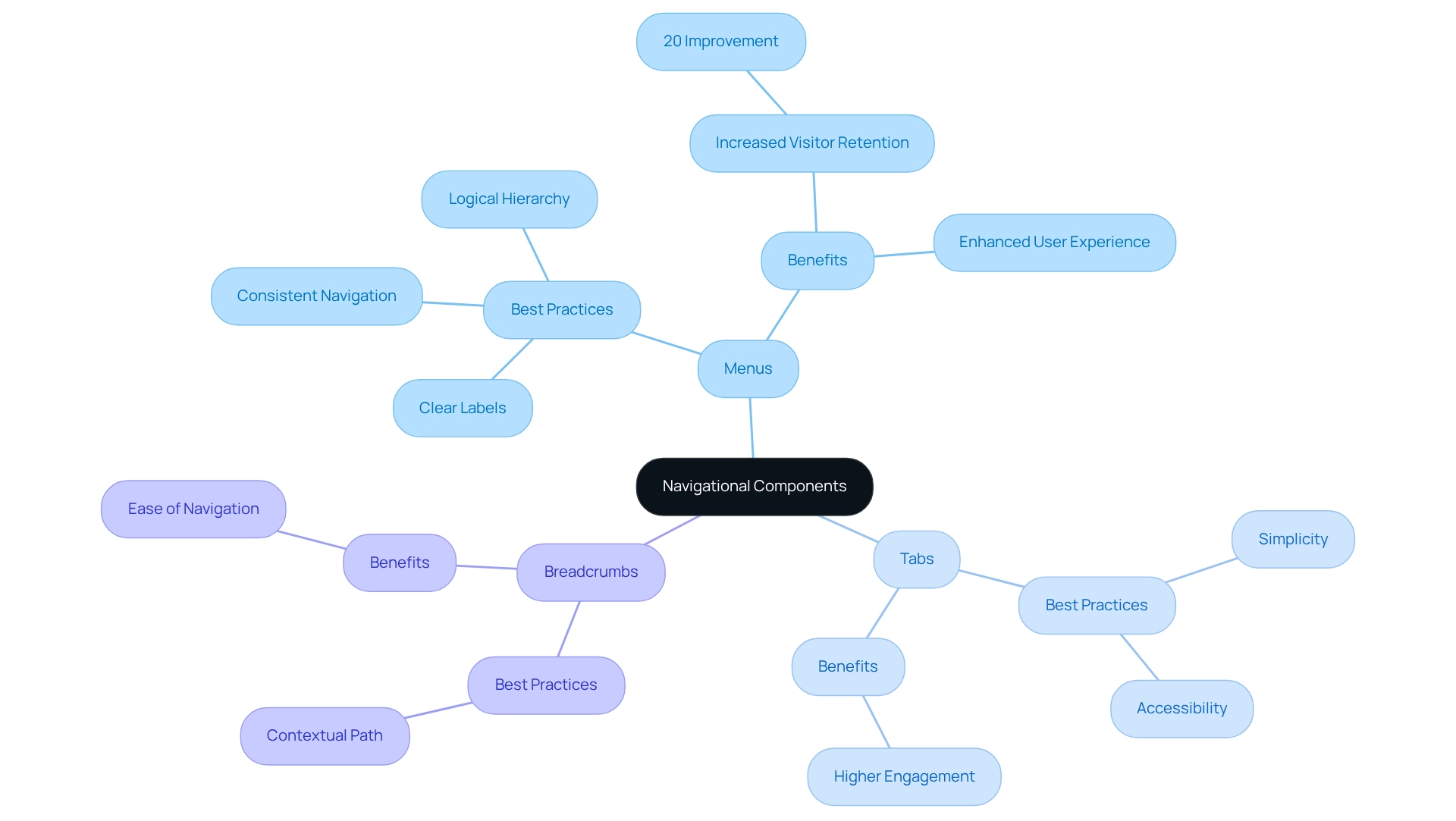
Navigating a website or application can often feel overwhelming. Elements of user interface, such as menus, tabs, and breadcrumbs, play a crucial role in guiding individuals through these digital spaces. Menus act as gateways to various sections, while tabs allow for seamless transitions between related content without the need for page reloads. Breadcrumbs provide a contextual path, making it easy for individuals to return to earlier pages without frustration.
To truly enhance user interface elements, it’s essential to adopt best practices. Maintaining consistent navigation across platforms, using clear and descriptive labels, and establishing a logical hierarchy can make a significant difference. Research shows that simplifying navigation structures can lead to a remarkable 20% increase in visitor retention. This highlights the importance of clarity in design. For instance, think of a well-organized dropdown menu that not only improves navigation but also reduces the time individuals spend searching for information. A case study titled 'Simplifying Navigation to Enhance Experience' revealed that overly complex navigation can lead to frustration, while simplifying menu options significantly enhances the overall experience.
Looking ahead to 2025, innovations in navigational components are shifting towards personalization. This approach can reduce customer acquisition and retention costs by 28%. A/B testing becomes crucial in identifying effective navigation formats that truly boost engagement. UX specialists emphasize the importance of intuitive interfaces, stating, "By concentrating on intuitive layouts, clear labeling, and accessibility, you can develop an application that individuals will wish to revisit repeatedly." This underscores the significance of intuitive navigation in keeping individuals engaged and returning.
Moreover, consistent navigation across platforms not only enhances usability but also reinforces brand identity. Effective tab layouts, characterized by simplicity and accessibility, have proven successful in tech startups, illustrating how careful navigation can positively impact client satisfaction. Ultimately, applying best practices in user interface design is vital for enhancing experiences and fostering long-term engagement. Together, let’s create a digital environment that feels welcoming and intuitive for everyone.

Information Components: Labels, Icons, and Tooltips
Navigating systems can often feel overwhelming, especially when the user interface lacks clarity. Elements like labels, icons, and tooltips play a vital role in providing the context individuals need to move through these systems with confidence. Labels clarify the purpose of input fields, ensuring that users understand what information is required. Thoughtfully designed icons can visually represent actions or categories, greatly enhancing the intuitiveness of the system. For instance, universally recognized symbols allow users to grasp their functions quickly, reducing the need for lengthy explanations.
Tooltips add another layer of support by offering additional information when users hover over elements. This feature clarifies functions without cluttering the interface, helping to maintain a clean and user-friendly design. Studies show that 84.6% of users prefer a tidy layout over a crowded one, highlighting the significance of simplicity in user interfaces. By effectively utilizing labels and icons, we can create a more organized design that facilitates easier navigation and interaction.
The impact of these user interface elements on usability cannot be overstated. Recent research indicates that 82% of companies have dedicated UX researchers, which reflects a strong commitment to understanding client needs. Labels, icons, and tooltips are essential components of this process. By prioritizing product development based on consumer feedback, teams can foster a more intuitive experience and improve outcomes. This ongoing relationship with users is crucial for informing design choices that enhance usability.
Mindfully incorporating these interface elements not only boosts usability but also elevates overall user satisfaction. With 91% of dissatisfied clients who don’t express their concerns simply disappearing, it’s clear that ensuring clarity and ease of use in design is vital for retaining users and enhancing engagement. By focusing on the effectiveness of labels, icons, and tooltips, companies can significantly improve the user experience and, ultimately, customer retention.
Containers: Cards, Panels, and Modals
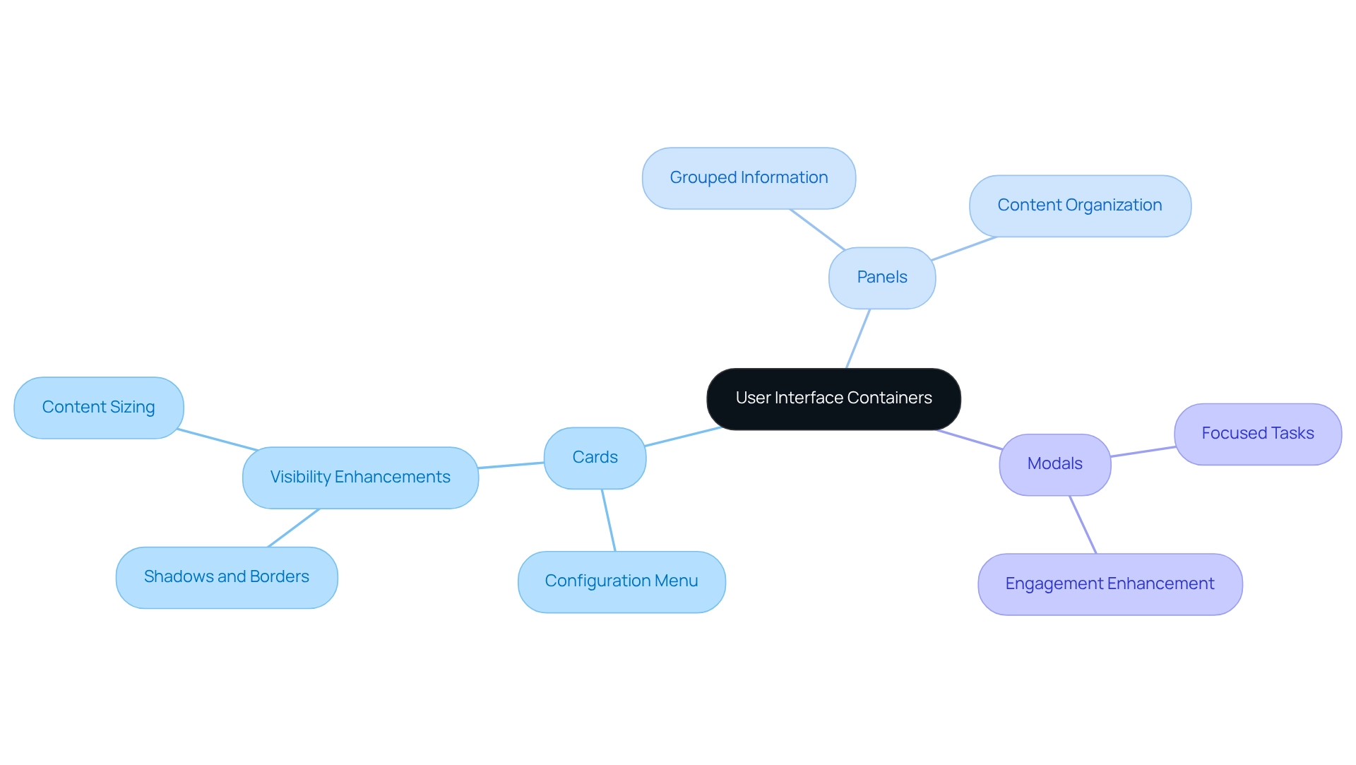
In the world of user interfaces, organizing related content and actions can often feel overwhelming. Containers like cards, panels, and modals play a crucial role in alleviating this challenge. Cards, for instance, are particularly effective at conveying information succinctly, allowing individuals to quickly grasp key details. Each card can feature its own configuration menu, enabling personalized settings that enhance user interaction. Panels offer a broader format for organizing content, making them perfect for displaying grouped information. Meanwhile, modals draw attention to specific tasks or information without requiring users to navigate away from their current page, thereby fostering focus and engagement.
Best practices for utilizing these containers emphasize the importance of visual distinction and appropriate sizing for their content. For example, employing shadows or borders can help separate cards from the background, boosting their visibility and interactivity. As Jefferson Han highlights, successful companies understand the balance between product features and industrial aesthetics, underscoring the significance of thoughtful UI composition in engaging customers.
Expert insights further reinforce the value of these creative elements. Jony Ive once noted, 'Very often aesthetics is the most immediate way of defining what products become in people’s minds.' This perspective strengthens the idea that well-constructed containers are essential components of user interfaces, significantly influencing individual perception and engagement.
In today's web development landscape, effective applications of cards, panels, and modals have been showcased in numerous case studies, including RNO1's collaborations with esteemed clients like Amount and Spring Labs. These partnerships illustrate how RNO1 skillfully employs these creative components to meet client needs and enhance satisfaction. Statistics indicate that individuals are more likely to engage positively with designs that utilize these elements effectively, leading to greater involvement and contentment. By adhering to best practices in container creation, brands can cultivate intuitive and engaging digital experiences that resonate with their audience, nurturing a sense of connection and understanding.

Visual Design Elements: Typography, Colors, and Layout
Creating user interfaces can often feel overwhelming, especially when it comes to visual components like typography, colors, and layout. At RNO1, we understand the challenges you face, and we are here to help. Our design-focused approach ensures that every interaction not only meets functional needs but also resonates emotionally with users, reflecting our commitment to impactful design solutions.
Typography plays a crucial role in this journey. It must be legible and consistent, establishing a clear hierarchy that guides users through content seamlessly. Research indicates that three-quarters of Fortune 500 firms prefer sans serif fonts for their logos, underscoring the significance of font selection in shaping branding and audience perception. We recognize that color schemes should evoke the desired emotional responses while maintaining sufficient contrast for optimal readability. For example, while red and green are complementary colors, their use requires thoughtful consideration to avoid creating visual tension that could distract users.
Equally important is the layout, which determines how elements are arranged on the screen. A well-organized grid layout can facilitate intuitive navigation, making it easier for users to scan and locate information. As we look ahead to 2025, current trends in visual aesthetics emphasize minimalism and striking typography, signaling a shift toward cleaner interfaces that prioritize user experience—an ethos that aligns perfectly with RNO1's dedication to design-focused solutions.
Expert opinions further highlight the emotional influence of color schemes in user interfaces. As Jared M. Spool wisely notes, "Unintentional creation occurs when the organization concentrates on the business or the technology but neglects the customer or experience." This insight reinforces the necessity of making intentional design choices to foster positive interactions. By understanding the delicate interplay of typography, colors, and layout, our designers at RNO1 craft interfaces that not only captivate visually but also enhance user satisfaction and engagement. Ultimately, our Return On Design & Digital (RODD) strategies aim to maximize your brand's marketability, ensuring that your vision is realized with care and expertise.
Conclusion
The exploration of user interface design reveals a pressing challenge: the critical role that various components play in shaping user experience. Many founders have faced the frustration of users struggling to navigate their platforms. Input controls—like buttons, checkboxes, and sliders—are foundational to interaction, and they require our careful attention to ensure they are visually distinct and responsive. Navigational elements, including menus, tabs, and breadcrumbs, are essential for guiding users through digital spaces, highlighting the importance of clarity and consistency to enhance retention and satisfaction.
Information components such as labels, icons, and tooltips provide the essential context that users need, ensuring they can navigate interfaces intuitively without feeling overwhelmed. Additionally, the use of containers—like cards, panels, and modals—organizes content effectively, allowing for focused interactions that enhance user engagement. Lastly, visual design elements—typography, colors, and layout—serve as the backbone of interface aesthetics, impacting perception and emotional response.
In summary, a well-designed user interface transcends mere aesthetics; it is fundamentally about creating seamless and engaging experiences. By prioritizing usability through the thoughtful integration of input controls, navigation, information components, containers, and visual design, we can foster deeper connections with users. As digital landscapes continue to evolve, adhering to these best practices becomes essential for nurturing user satisfaction and loyalty in an increasingly competitive environment. Embracing these principles is vital for any organization aiming to thrive in the digital age, and together, we can navigate this journey with confidence.
Frequently Asked Questions
What are input controls and why are they important?
Input controls, such as buttons, checkboxes, and sliders, are essential for interacting with digital interfaces. They help users perform actions, select multiple options, and adjust values within a range, enhancing the overall user experience.
How can the design of buttons impact user interaction?
Buttons should be visually distinct and easy to reach. When designed with contrasting colors, they stand out, making it easier for users to engage with them. Well-designed buttons can significantly enhance interaction rates.
What role do checkboxes and sliders play in user interfaces?
Checkboxes allow users to select multiple options, providing freedom in decision-making. Sliders help users adjust values within a specified range, and they should have clear indicators to show value ranges for better understanding.
What is the significance of visual appeal in web design?
Visual appeal is crucial as users form opinions about a website in just 0.05 seconds. Research indicates that 66% of individuals prefer aesthetically pleasing websites for content consumption, which can greatly influence their interactions.
What trends are emerging in input control design as we approach 2025?
Current trends emphasize visual clarity and instinctive interaction. There is a focus on effective button design, simplifying choices with checkboxes, and creating interfaces that attract visitors while fostering trust and satisfaction.
How do navigation elements like menus and breadcrumbs enhance user experience?
Menus serve as gateways to various sections, tabs allow seamless transitions without page reloads, and breadcrumbs provide a contextual path for easy navigation back to earlier pages, reducing frustration.
What best practices should be adopted for enhancing user interface navigation?
Best practices include maintaining consistent navigation across platforms, using clear and descriptive labels, and establishing a logical hierarchy, which can significantly improve user experience and increase visitor retention.
How can personalization in navigation impact customer engagement?
Personalization in navigational components can reduce customer acquisition and retention costs by 28%. It helps create intuitive interfaces that encourage users to revisit the application.
What is the importance of A/B testing in navigation design?
A/B testing is crucial for identifying effective navigation formats that boost engagement. It helps UX specialists refine intuitive layouts and clear labeling for better user experiences.
How does consistent navigation reinforce brand identity?
Consistent navigation across platforms enhances usability and reinforces brand identity, leading to improved client satisfaction and a positive overall experience for users.


