Overview
The article addresses a common challenge faced by many designers: the need to enhance web design and user engagement. It can be frustrating when your website lacks that visual appeal, making users feel disconnected. Understanding how to effectively use CSS box shadow effects is crucial in overcoming this hurdle. By focusing on the parameters of the box-shadow property, this guide offers practical examples and troubleshooting tips that can empower designers. These techniques not only improve the aesthetic appeal of web interfaces but also enhance their functionality, creating a more inviting experience for users. Together, we can navigate these challenges and elevate your web design to new heights.
Introduction
CSS box shadows are not merely aesthetic enhancements; they play a vital role in adding depth and interactivity to web designs. As designers, you may find yourselves striving to create visually engaging interfaces, yet mastering the nuances of box shadow properties can feel overwhelming. This challenge is common, and it's understandable to feel frustrated when trying to achieve the desired effect.
How can you, as designers, effectively harness the power of CSS box shadows to craft compelling, user-friendly layouts that truly stand out in an increasingly competitive digital landscape? Together, we can explore solutions that not only enhance your designs but also elevate the overall user experience.
Understand CSS Box Shadow Basics
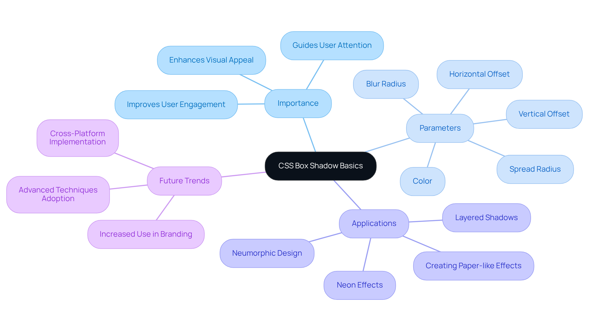
CSS box with shadow effects are a vital component in enhancing web interfaces, offering the depth and dimension that many designers seek. The challenge often lies in creating visually appealing elements that engage users effectively. By utilizing the property for creating outlines, designers can add depth around an element's frame, significantly improving its visual attractiveness and user interaction. This property is defined by several parameters: horizontal offset, vertical offset, blur radius, spread radius, and color. Mastering these parameters is essential for harnessing the full potential of box effects in your designs.
Consider a straightforward box shadow, which can be implemented with the following syntax:
.box {
    box-shadow: 5px 5px 10px rgba(0, 0, 0, 0.5);
}
In this example, the shadow is offset 5 pixels to the right and 5 pixels down, featuring a blur radius of 10 pixels and a semi-transparent black color. This simple yet effective application of a css box with shadow can create a paper-like card appearance, which allows elements to stand out and encourages user engagement.
As we look ahead to 2025, the importance of box effects in web creation continues to grow. They not only enhance aesthetic appeal but also improve usability by guiding users' attention to key elements. Many professionals in the field emphasize that with shadow effects can transform a flat design into a more interactive experience, making these effects essential for contemporary branding approaches. By incorporating advanced techniques such as layered, neon, and neumorphic effects, designers can elevate their projects even further, ensuring they resonate with users in an increasingly competitive digital landscape. Moreover, with browser support for the shadow effect property at just above 74 percent, it becomes crucial for designers to implement this feature effectively across various platforms.
Remember, embracing these box effects not only enhances your designs but also fosters a deeper connection with your audience, making your web presence more inviting and engaging.

Learn the Syntax and Values for Box Shadows
Understanding the intricacies of the can often feel overwhelming, especially for those of us striving to create visually appealing layouts. The challenge lies in grasping how each parameter influences the shadow's appearance, which can lead to frustration when results don't meet our expectations. But don’t worry; you’re not alone in this journey. Many tech startup founders face similar hurdles, and it’s okay to seek guidance.
The syntax for the box-shadow property is structured as follows:
box-shadow: [horizontal-offset] [vertical-offset] [blur-radius] [spread-radius] [color];
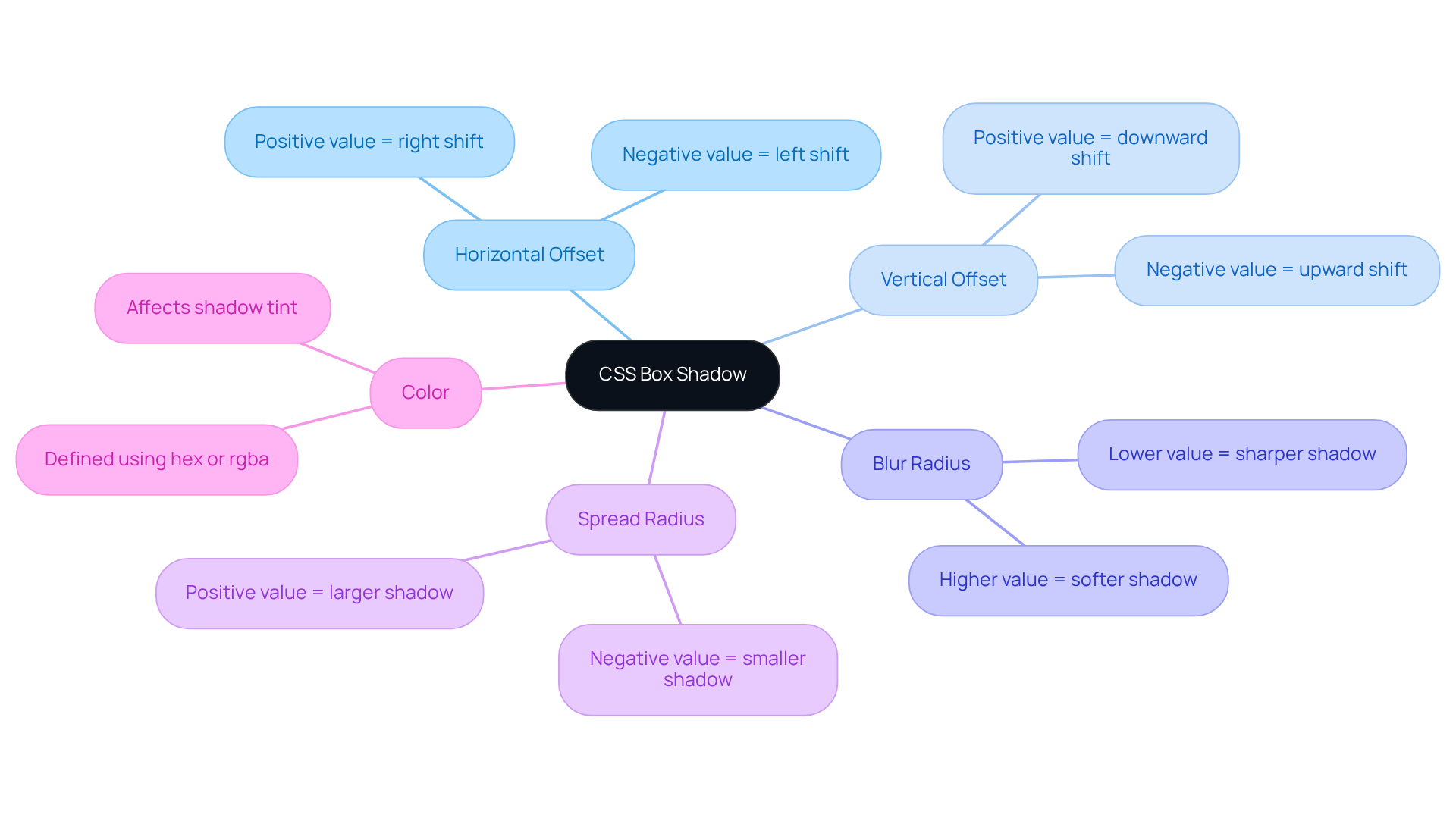
- Horizontal Offset: A positive value shifts the shadow to the right, while a negative value moves it to the left.
- Vertical Offset: Positive values push the cast downwards, whereas negative values lift it upwards.
- Blur Radius: This parameter regulates the softness of the cast; a higher value results in a more diffused effect.
- Spread Radius: This determines the size of the cast. A positive value increases the outline, while a negative value decreases it.
- Hue: The tint of the object can be defined using various formats, such as hex or rgba.
For instance:
.box {
    box-shadow: 10px 10px 5px 0 rgba(0, 0, 0, 0.5);
}
This example generates a shadow that is offset 10 pixels to the right and down, featuring a subtle blur and no spread.
Comprehending these parameters is essential for producing visually attractive layouts. Mastering the css box with shadow effect property not only enhances the visual appeal of web applications but also allows for creative expression in contemporary web creation. As we navigate this learning curve together, remember that the css box with shadow property has been supported since Internet Explorer 9, launched in 2011, underscoring its significance in modern web development.
As Maya Angelou once said, "You may shoot me with your words, You may cut me with your eyes, You may kill me with your hatefulness, But still, like air, I'll rise." This powerful quote resonates with the perseverance required in mastering visual components such as box effects. Additionally, RNO1's partnership with Highline exemplifies how effective design strategies, including the application of box effects, can significantly boost customer interaction and increase sales.
Moreover, don’t forget that multiple box effects can be applied by separating property value groups with commas, allowing for even more creative possibilities. Together, we can embrace these techniques and elevate our designs, fostering a supportive community where we can all thrive.

Explore Examples of Box Shadow Implementations
Many developers face the challenge of creating visually appealing user interfaces that stand out in a crowded digital landscape. This can often feel overwhelming, especially when trying to balance aesthetics with functionality. However, there are [practical solutions that can help you enhance your UI design effortlessly](https://blog.rno1.com/10-essential-ui-ux-strategies-for-tech-startups-to-succeed).
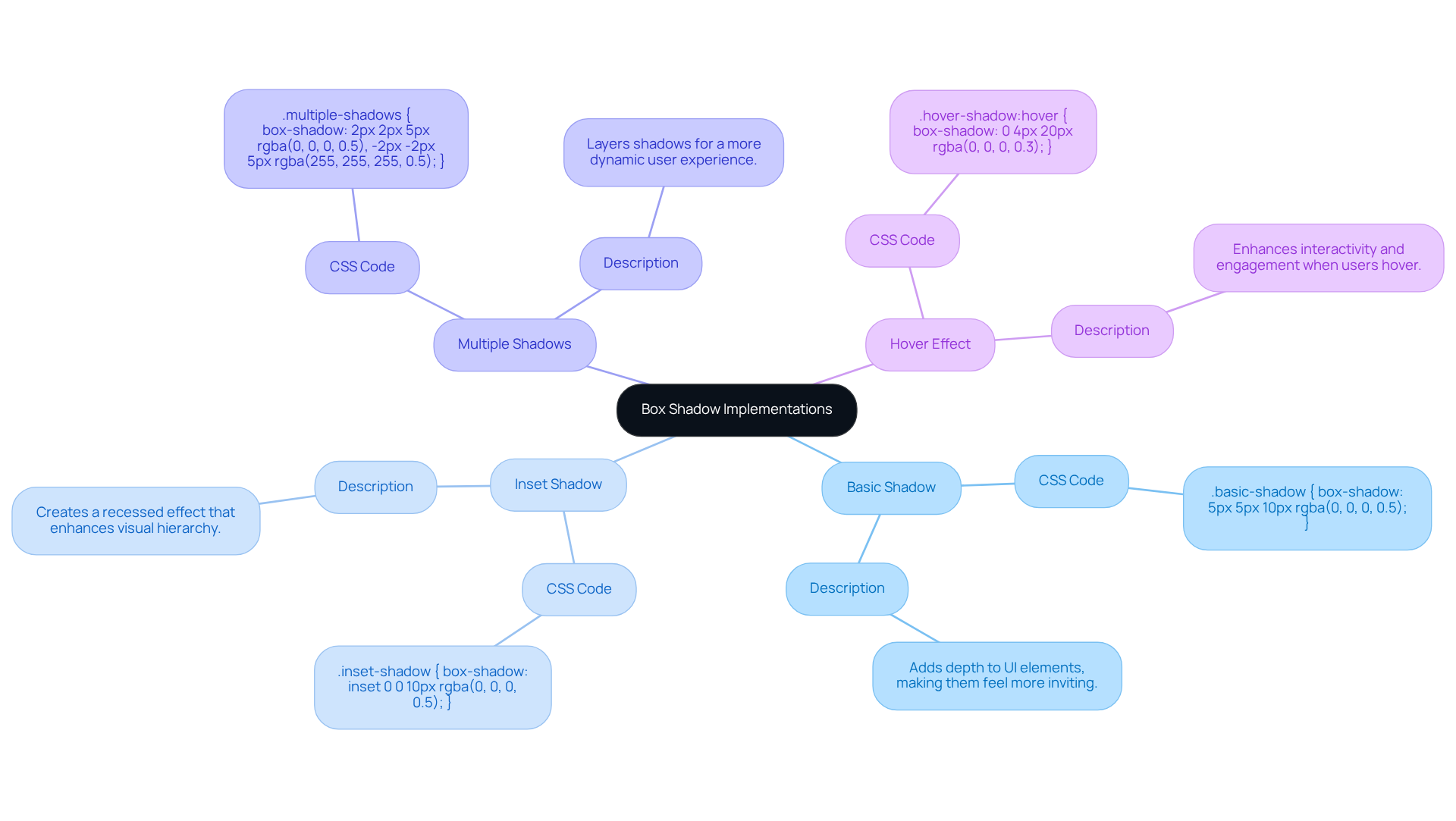
Consider the Basic Shadow:
.basic-shadow {
    box-shadow: 5px 5px 10px rgba(0, 0, 0, 0.5);
}
This simple shadow effect adds depth to UI elements, making them feel more inviting and engaging.
Then, there's the Inset Shadow:
.inset-shadow {
    box-shadow: inset 0 0 10px rgba(0, 0, 0, 0.5);
}
This shadow appears inside the element, creating a recessed effect that can enhance the visual hierarchy of your design, guiding users' attention where it matters most.
For those looking to add complexity, try Multiple Shadows:
.multiple-shadows {
    box-shadow: 2px 2px 5px rgba(0, 0, 0, 0.5), -2px -2px 5px rgba(255, 255, 255, 0.5);
}
This approach demonstrates how to layer shadows, enriching the design and creating a more dynamic user experience.
Lastly, consider a Hover Effect:
.hover-shadow:hover {
    box-shadow: 0 4px 20px rgba(0, 0, 0, 0.3);
}
This shadow appears when users hover over the element, enhancing interactivity and engagement. Such hover effects are widely recognized for their effectiveness in improving user experience, as evidenced by the practices of over 20,000 professional web developers globally who use CSS Scan every day.
These examples illustrate the adaptability of the css box with shadow property, making it a powerful asset for improving UI aesthetics. By experimenting with various shading techniques, you can create visually appealing interfaces that resonate with users. Furthermore, as Konstantin Kichinsky wisely noted, 'Yes, you can animate a css box with shadow property using CSS transitions or animations,' allowing for even more dynamic creations. If you're eager to explore box effects further, online tools like Mozilla's Box-effect generator can provide a hands-on way to experiment before finalizing your designs. Remember, every small detail counts in creating that feels both professional and personal.

Troubleshoot Common Box Shadow Issues
Frequent challenges with the CSS box with shadow effects can often feel overwhelming, but they can usually be resolved with a few thoughtful modifications. Let’s explore some common issues you might encounter along with their solutions:
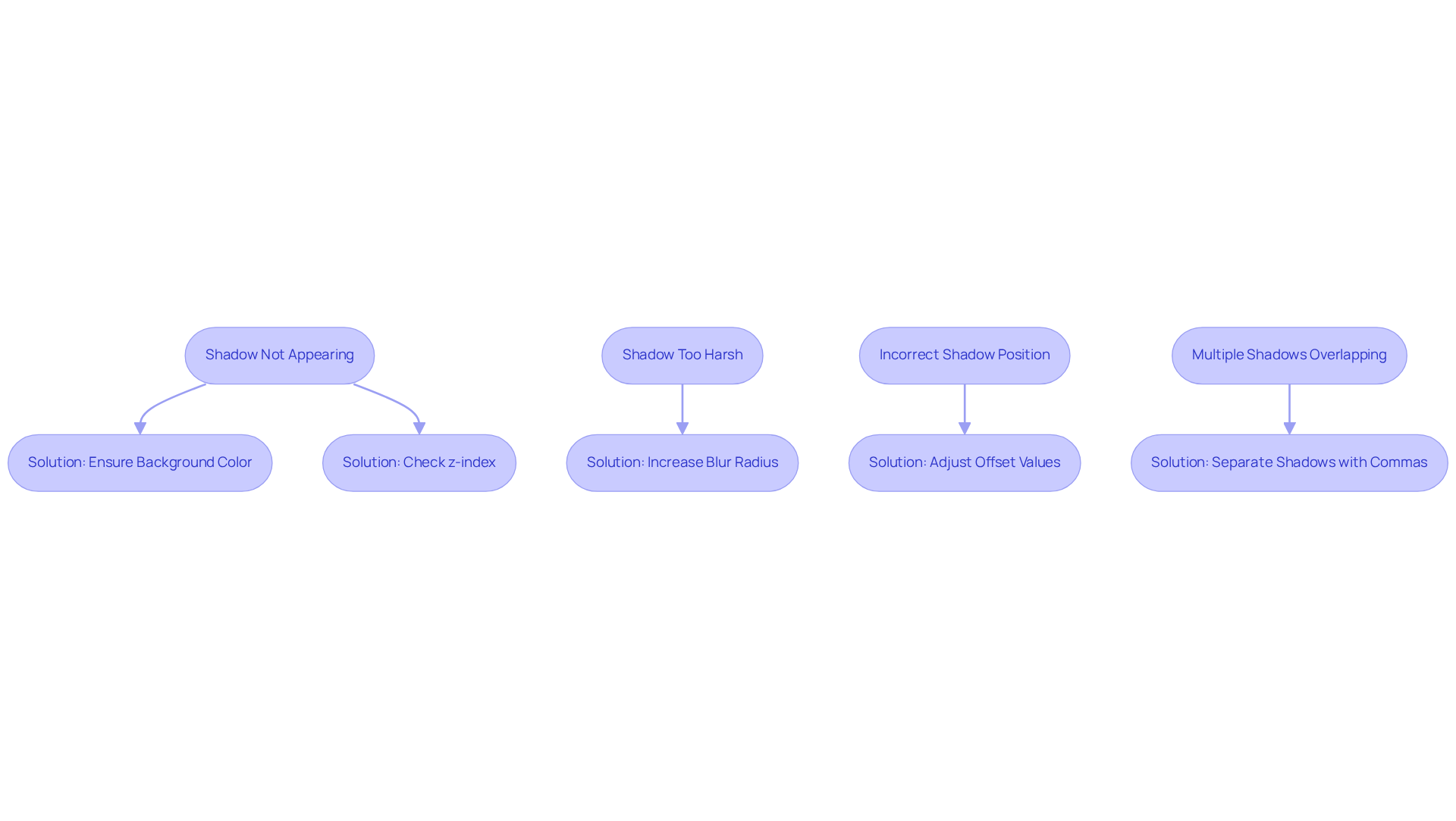
- Shadow Not Appearing: It can be frustrating when shadows don’t show up as expected. Make sure the element has a background color; shadows often vanish on transparent backgrounds. A solid background is crucial for the outline to be visible. Also, check the z-index of the element; if it’s lower than that of overlapping elements, the effect may be hidden from view.
- Shadow Too Harsh: If your shadow feels too intense, try softening it by increasing the blur radius. For example, adjusting
box-shadow: 5px 5px 0 rgba(0, 0, 0, 0.5);tobox-shadow: 5px 5px 10px rgba(0, 0, 0, 0.5);can create a more subtle effect, enhancing the visual appeal without overwhelming your layout. - Incorrect Shadow Position: It’s easy to misplace shadows. Double-check the horizontal and vertical offset values. Tweaking these can help , ensuring it aligns beautifully with your design intentions.
- Multiple Shadows Overlapping: If you’re using multiple shadows, remember to separate them with commas. Pay attention to their individual offsets to avoid unwanted overlaps, which can clutter the overall appearance.
Statistics show that around 30% of CSS code contains errors, underscoring the importance of careful troubleshooting in web development. Many developers highlight the necessity of clear organization and validation tools to manage CSS effectively, as these practices can significantly reduce cross-browser issues by up to 25%. Furthermore, about 80% of web developers utilize tools like JavaScript and CSS to enhance performance. Oscar Jite-Orimiono notes that excessive use of a css box with shadow, especially with large blur values, can negatively impact performance. By embracing these best practices, you can elevate your designs and improve the user experience, fostering a more supportive environment for your audience.

Conclusion
Mastering the CSS box shadow effect is essential for web designers who strive to create visually engaging and interactive interfaces. Many designers grapple with the challenge of making their projects stand out, often feeling overwhelmed by the technicalities involved. However, by understanding the fundamental parameters and their applications, you can significantly enhance the aesthetic appeal and usability of your web projects. The ability to manipulate shadows effectively transforms flat designs into dynamic experiences that resonate with users, fostering a deeper connection.
Throughout this journey, we’ve shared key insights on the syntax and values associated with the box shadow property, along with practical examples of its implementation. From basic shadows to complex hover effects, the versatility of this property opens doors to innovative design solutions that elevate user engagement. We’ve also addressed common troubleshooting issues, providing valuable tips to ensure that shadows appear as intended and contribute positively to your overall design.
Ultimately, embracing the full potential of CSS box shadows not only enriches web aesthetics but also creates a more inviting atmosphere for users. As the digital landscape becomes increasingly competitive, leveraging these techniques is crucial for standing out and delivering memorable user experiences. We encourage you to experiment with these effects and incorporate them into your projects, paving the way for more engaging web interfaces. Remember, you’re not alone in this journey; we’re here to support you every step of the way.
Frequently Asked Questions
What are CSS box shadows and why are they important in web design?
CSS box shadows are effects that enhance web interfaces by adding depth and dimension to elements. They improve visual attractiveness and user interaction, making designs more engaging.
What parameters define a CSS box shadow?
The parameters that define a CSS box shadow include horizontal offset, vertical offset, blur radius, spread radius, and color.
Can you provide an example of a simple CSS box shadow?
Yes, a simple CSS box shadow can be implemented as follows:
.box {
    box-shadow: 5px 5px 10px rgba(0, 0, 0, 0.5);
}
In this example, the shadow is offset 5 pixels to the right and 5 pixels down, with a blur radius of 10 pixels and a semi-transparent black color.
How do box shadows enhance user engagement?
Box shadows create a paper-like card appearance, allowing elements to stand out, which encourages user engagement and guides attention to key features.
What is the future significance of box effects in web design?
As we approach 2025, box effects are expected to become increasingly important for enhancing aesthetics and usability, transforming flat designs into more interactive experiences.
What advanced techniques can be used with CSS box shadows?
Advanced techniques include layered effects, neon shadows, and neumorphic designs, which can further elevate projects and resonate with users.
What is the current browser support for CSS box shadow effects?
Browser support for the shadow effect property is just above 74 percent, making it important for designers to implement this feature effectively across various platforms.
How do box shadows contribute to branding?
Well-executed box shadow effects can enhance branding by creating a more inviting and engaging web presence, fostering a deeper connection with the audience.


