Overview
Mastering font combinator techniques can often feel overwhelming, especially when you're striving to create stunning digital designs that truly communicate your brand's message and engage your audience. Many designers grapple with issues like contrast, hierarchy, and readability, which can lead to frustration when their designs fail to resonate. This is where understanding key principles becomes vital.
By limiting font choices and conducting A/B testing, you can enhance visual cohesion and ensure that your typography speaks to viewers in a meaningful way. Remember, you're not alone in this journey—embracing these strategies can transform your approach and foster a deeper connection with your audience.
Introduction
Mastering the art of font pairing can feel overwhelming for many designers who strive to create visually striking digital designs. The right combination of typefaces is essential, as it not only enhances readability but also captures the audience's attention. However, the vast array of fonts available can make this task daunting, and it’s easy to feel lost in the choices. How can designers select and refine their font choices to effectively communicate their message while also resonating emotionally with their audience? This is a challenge that many face, and it’s completely understandable to feel uncertain.
As you navigate this journey, remember that you are not alone. Many designers have shared similar experiences, expressing their frustrations and triumphs in finding the perfect font pairings. It’s about more than just aesthetics; it’s about creating a connection with your audience through thoughtful design. By taking the time to explore and experiment with different typefaces, you can find combinations that not only look good but also feel right.
The solution lies in a mindful approach to font selection. Consider starting with a few key typefaces that resonate with your brand's identity and values. Test them together, paying attention to how they interact and the emotions they evoke. This process can be both rewarding and enlightening, allowing you to refine your choices and ultimately enhance your designs. Embrace the journey of discovery, and know that each step brings you closer to mastering this essential skill.
Understand the Fundamentals of Font Pairing
Font pairing can often feel overwhelming for designers, as selecting two or more typefaces that complement each other while maintaining visual harmony is no small feat. This challenge can lead to frustration, especially when the results don’t resonate with the intended audience. Understanding the key principles of can alleviate this stress and enhance your design process.
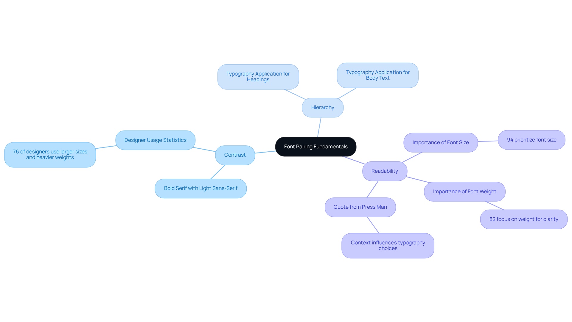
One important principle to consider is Contrast. By —such as pairing a bold serif font with a light sans-serif—you can create visual interest that not only enhances readability but also draws attention to key elements of your design. Research indicates that 76% of designers utilize larger sizes and heavier weights to highlight important text, underscoring the effectiveness of contrast. As Press Man wisely notes, "Value Alignment: This leans towards brand strategy of companies and startups; but in essence, the best and biggest of brands take typography seriously."
Another vital aspect is Hierarchy. is crucial in directing the viewer's attention, ensuring that the most significant information stands out. For instance, using a larger, bolder typeface for headings while opting for a lighter weight for body text can effectively convey your intended message. Douglas Bonneville emphasizes that "the context of your creation should influence your typography selections."
Additionally, Readability is paramount. Legibility across various devices and sizes should not be overlooked. Avoid using overly ornate typefaces for body text, as they can obstruct readability. A study revealed that 94% of creators prioritize font size, while 82% focus on weight to enhance clarity in their works. As Press Man mentions, "Most of the time, the context of your design should affect your font selections."
By mastering these principles, you can with a font combinator that effectively communicate your message and engage your audience. Successful instances of branding often illustrate how a font combinator can enhance a company's . However, it’s essential to be cautious of common pitfalls, like using too many typefaces from the same category, which can lead to a cluttered appearance. Ultimately, the right typeface selection not only improves readability but also significantly influences audience perception and brand identity. Remember, you’re not alone in navigating this journey; embracing these principles can transform your design experience and foster a deeper connection with your audience.

Implement Effective Font Combinations
When it comes to implementing effective , many founders face the challenge of creating a . It’s easy to feel overwhelmed by the multitude of typefaces available, and this can lead to confusion and a diluted message. The good news is that by adopting a few thoughtful strategies, you can achieve visual harmony that resonates with your audience.
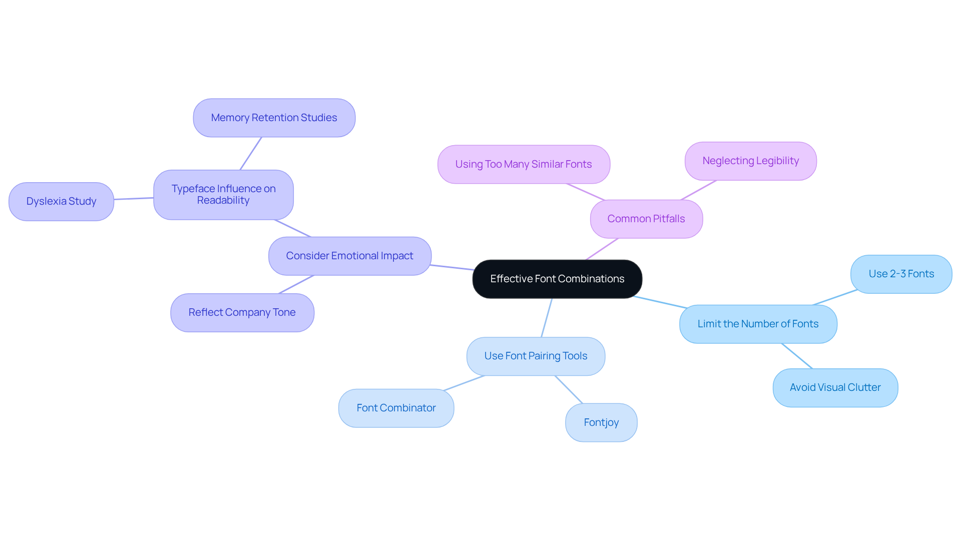
- Limit the Number of Fonts: Aim to use just two or three fonts in your designs. This limitation helps maintain visual cohesion and prevents disorder. Remember, as many style leaders have pointed out, restricting your font options is crucial for achieving that sense of balance and clarity in your work.
- Use : Wonderful online resources like Fontjoy or the Font Combinator can help you explore various font combinations. These tools can open up a world of unique pairings that enhance your creation. Many successful companies have turned to these resources to craft striking designs that truly resonate with their audience.
- Consider : The typefaces you choose should reflect your company's emotional tone. For instance, if you’re a technology startup, sleek and contemporary typefaces might communicate innovation effectively. Conversely, a luxury brand may opt for refined serif styles to convey sophistication. Research shows that typeface selection can significantly influence readability and memory retention; for example, studies have found that students with dyslexia performed 19% better when reading in a more challenging typeface.
By following these principles, you can create a visual identity that serves as a font combinator, effectively speaking to your audience. For instance, pairing a bold display typeface for headlines with a simple sans-serif for body text can create a striking contrast, capturing attention while ensuring readability. However, it’s important to be mindful of common pitfalls, such as using too many similar typefaces, which can lead to visual confusion.
Remember, you are not alone in this journey. Many brands have successfully navigated these challenges, and with a little guidance, you can too. Embrace the process and allow your unique vision to shine through.

Test and Refine Your Font Choices
To effectively test and refine your , it’s essential to consider the challenges you may face during this process.
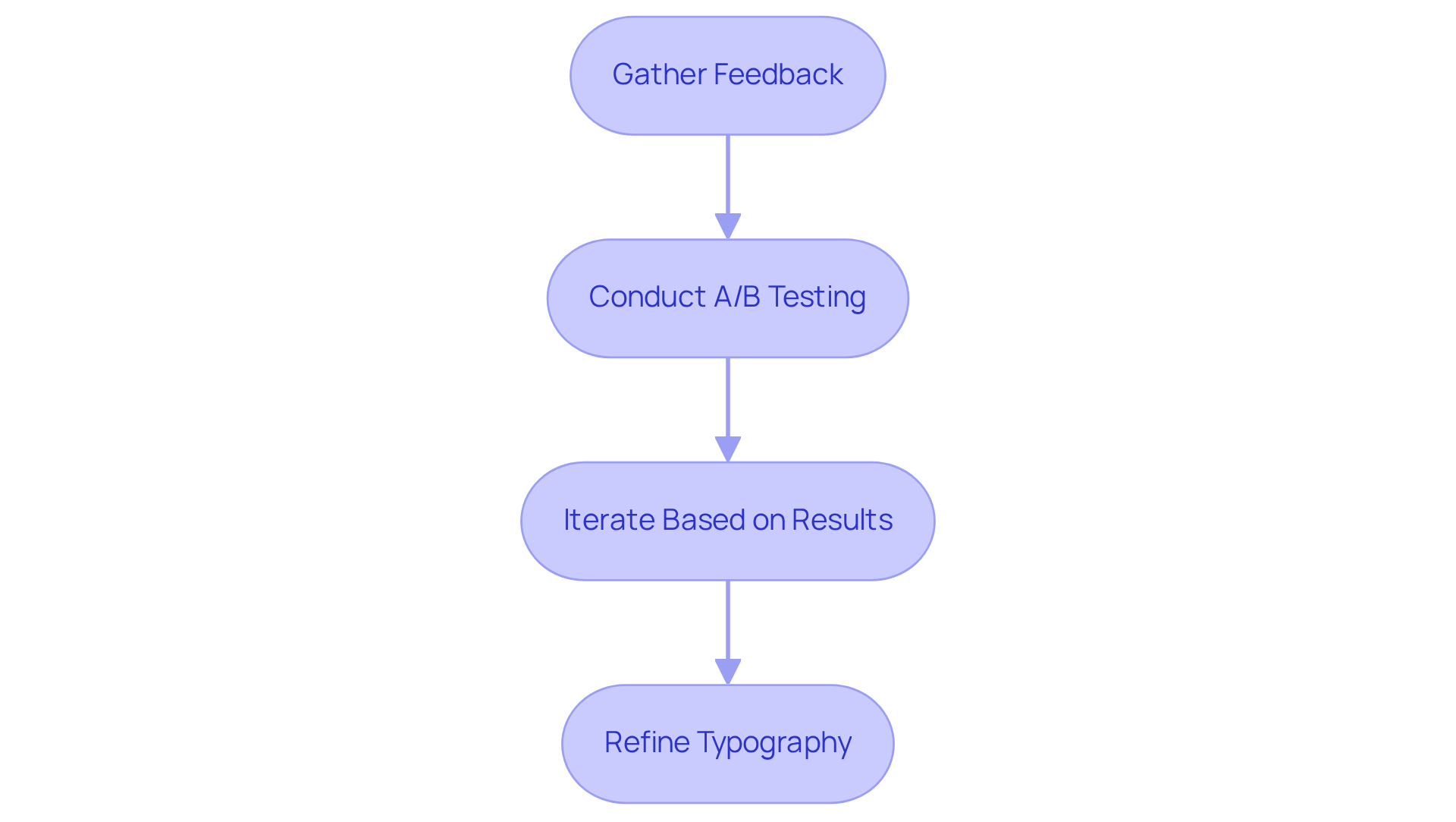
- Gather Feedback: Sharing your designs with colleagues or target users can provide invaluable insights into readability and aesthetic appeal. Engaging in surveys or informal discussions allows you to collect diverse opinions, which is crucial for shaping effective typography. As Jared Spool wisely notes, "Good design, when it’s done well, becomes invisible. It’s only when it’s done poorly that we notice it."
- : Conducting [A/B testing](https://vwo.com/blog/ab-testing-statistics) on your website or promotional materials is a powerful way to compare various combinations using a font combinator. This method enables you to examine , revealing which typefaces resonate more effectively with your audience. It’s noteworthy that are already leveraging A/B testing to optimize various elements of their digital presence. Companies like Dell have even reported a remarkable 300% increase in conversion rates through effective A/B testing.
- Iterate Based on Results: Utilize the feedback and insights gathered to make informed modifications to your typeface combinations. This might involve adjusting sizes, weights, or even changing typefaces entirely. Ongoing refinement driven by user involvement can significantly enhance the impact of your text design when utilizing a font combinator, ensuring it not only appears attractive but also conveys your company's message efficiently. Be mindful of common pitfalls, such as overcomplicating type selections or neglecting to test on various devices.
By consistently testing and refining your font choices, you can create typography that not only captivates your audience but also strengthens your brand identity. Remember, you’re not alone in this journey; many others share similar challenges, and together, we can find solutions that resonate.

Conclusion
Mastering the art of font combinator techniques can feel daunting for any designer striving to craft visually compelling digital designs. Many face the challenge of ensuring their typefaces not only complement each other but also enhance the overall message of their work. This struggle can leave designers feeling overwhelmed. However, by understanding the principles of contrast, hierarchy, and readability, you can empower yourself to engage your audience effectively and elevate your designs to new heights.
Key insights from the article remind us of the importance of:
- Limiting the number of fonts used
- Utilizing font pairing tools
- Considering the emotional impact of typefaces
Implementing these strategies can lead to visual harmony and clarity in your projects. Moreover, by testing and refining your font choices through feedback and A/B testing, you ensure that your final typography resonates well with your intended audience, ultimately strengthening your brand identity.
The journey of mastering font combinations is both challenging and rewarding. Embracing these best practices not only enhances your design skills but also contributes to a broader understanding of how typography influences communication. As you continue to explore and refine your font selections, remember that you play a crucial role in shaping the visual landscape of digital media. Your informed choices can resonate deeply with audiences and elevate your creative expressions. Together, let's foster a community where we support one another in this beautiful journey of design.
Frequently Asked Questions
What is font pairing and why is it important for designers?
Font pairing involves selecting two or more typefaces that complement each other while maintaining visual harmony. It is important for designers because it enhances the design process and helps create designs that resonate with the intended audience.
What is the principle of Contrast in font pairing?
Contrast refers to employing contrasting styles, such as pairing a bold serif font with a light sans-serif, to create visual interest and enhance readability. This principle helps draw attention to key elements of a design.
How does Hierarchy play a role in font pairing?
Hierarchy is crucial for directing the viewer's attention and ensuring that the most significant information stands out. This can be achieved by using a larger, bolder typeface for headings and a lighter weight for body text.
Why is Readability important in font selection?
Readability is vital because legibility across various devices and sizes should not be overlooked. Overly ornate typefaces can obstruct readability, making it important to prioritize font size and weight to enhance clarity.
What common pitfalls should be avoided in font pairing?
One common pitfall is using too many typefaces from the same category, which can lead to a cluttered appearance. It's essential to select typefaces thoughtfully to maintain visual clarity and coherence.
How can mastering font pairing principles benefit a designer's work?
By mastering font pairing principles, designers can create captivating text designs that effectively communicate their message and engage the audience, ultimately enhancing the visual identity of a brand.


