Introduction
In today’s digital landscape, crafting a mobile-friendly website is no longer just an option for startups; it has become a necessity. Many founders may feel overwhelmed by the staggering reality that 70% of smartphone users abandon sites that take longer than three seconds to load. This statistic underscores the high stakes for those striving to create engaging online experiences.
As you navigate this challenge, it’s essential to understand the implications of user behavior and the importance of:
- Responsive design techniques
- Accessibility considerations
- Performance optimization
How can you, as a startup founder, effectively meet these expectations while also distinguishing yourself in a competitive market? This article is here to guide you through best practices for mobile web design, offering insights and support as you embark on this crucial journey.
Understand Mobile User Behavior and Needs
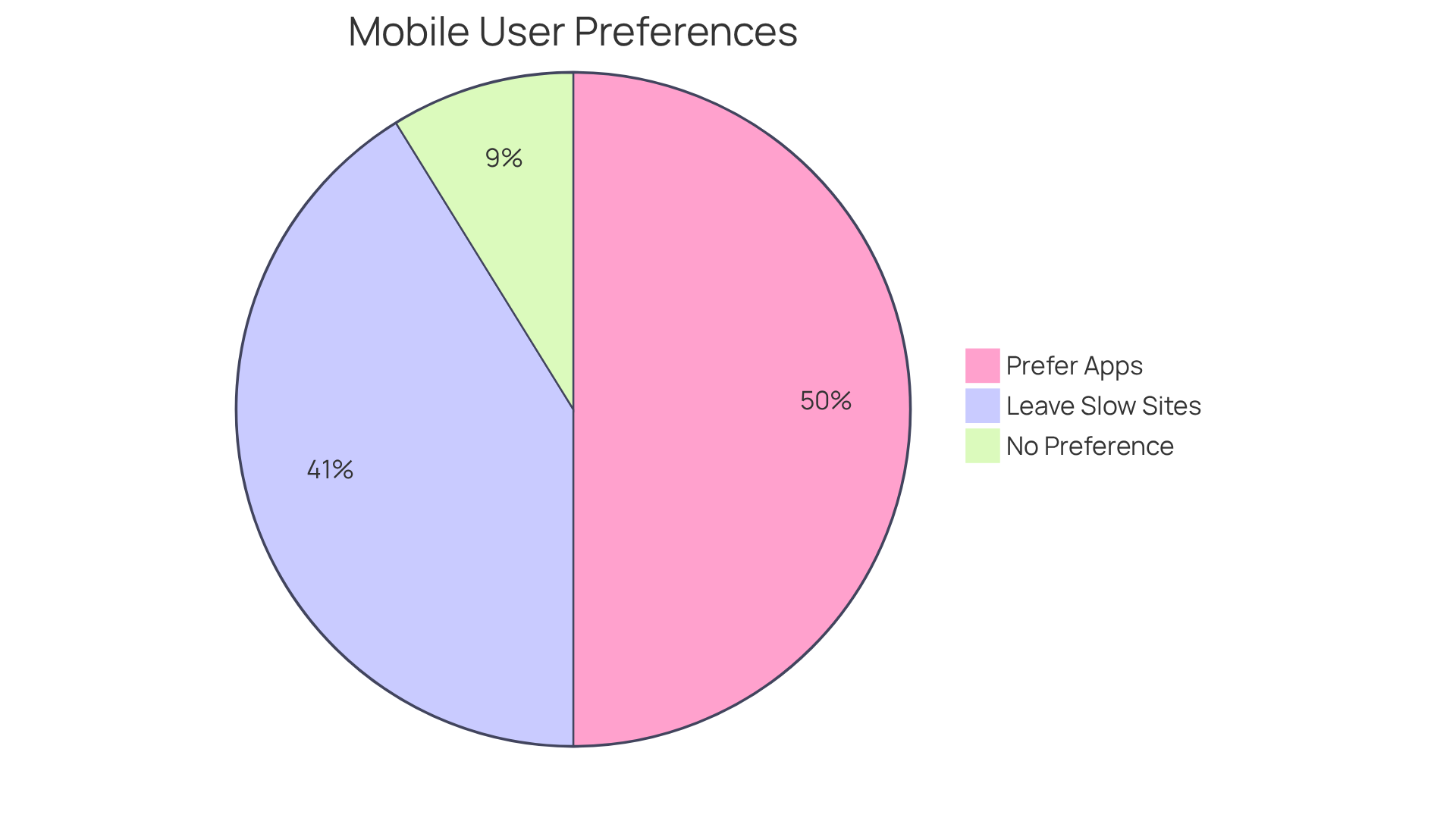
To create effective web design for mobile phones, startups must first understand the behavior and requirements of their smartphone clients. Mobile individuals prioritize quick access to information, intuitive navigation, and seamless interactions, which are essential aspects of web design for mobile phones. It’s concerning that studies show 70% of smartphone owners leave websites that take longer than three seconds to load. This highlights the critical need for speed in web design for mobile phones. Additionally, 85% of U.S. smartphone shoppers prefer using applications over online sites, emphasizing the importance of enhancing digital experiences.
Conducting user research is essential to determine target audience preferences, including favored content formats—such as videos or articles—and the typical tasks performed on mobile devices. Tools like Google Analytics can help , guiding design decisions that align with user expectations and enhance engagement.
Moreover, considering the context in which visitors access your site is vital. Many smartphone owners are on-the-move, often with limited time and attention. To significantly boost satisfaction and retention rates, effective web design for mobile phones should focus on quick interactions and straightforward access to crucial information.
For instance, the Allianz'ım application, which allows individuals to manage various insurance policies in one place, reported a remarkable 92% increase in digital penetration and a 35% growth in active users after focusing on user-centered design principles. This underscores the importance of understanding audience needs and improving mobile experiences. Allianz Turkey's approach involved conducting 400 surveys and 20 interviews with clients to grasp customer needs, showcasing effective research practices.

Implement Responsive Design Techniques
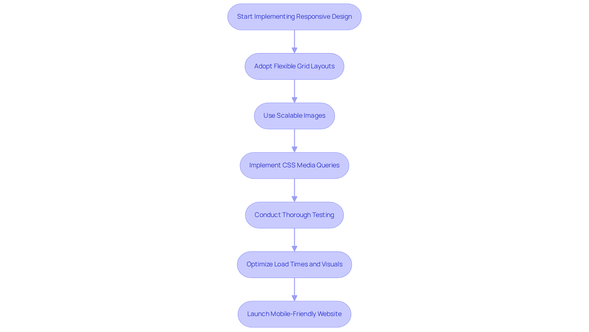
For many startups, creating a mobile-friendly website through web design for mobile phones can feel overwhelming, especially in today’s fast-paced digital landscape. It’s essential to recognize that web design for mobile phones includes responsive strategies, which are not just technical requirements but are vital for meeting the needs of users who expect seamless experiences on any device. By adopting flexible grid layouts, scalable images, and CSS media queries, your site can adapt beautifully to various screen sizes, enhancing user satisfaction.
Embracing a mobile-first approach can significantly improve your site’s usability and SEO. When you prioritize web design for mobile phones, you’re not just catering to a trend; you’re ensuring that your website is optimized for the devices most people use. This is crucial, as search engines favor web design for mobile phones, which can lead to increased visibility and engagement.
Utilizing frameworks like Bootstrap or Foundation can simplify this process, making it easier for you to implement responsive layouts efficiently. However, it’s not just about the tools; thorough testing across different devices and screen dimensions is essential. This step reveals usability issues and helps create a seamless experience for all users. Tools such as Google PageSpeed Insights and Adobe Photoshop can be invaluable in optimizing load times and visuals, ensuring that your website is both appealing and high-performing.
Consider the inspiring case of Destination Magic. Their commitment to responsiveness led to a significant overhaul, resulting in improved load times and greater client engagement. This dedication not only enhances audience involvement but also sets the stage for success in an increasingly mobile-focused digital world, emphasizing the . By avoiding common pitfalls—like neglecting thorough testing or failing to optimize visuals—you can enhance your online presence and foster client satisfaction.
Remember, you’re not alone in this journey. Many founders face these challenges, and by sharing experiences and learning from one another, we can build a supportive community that thrives together.

Prioritize Accessibility in Mobile Design
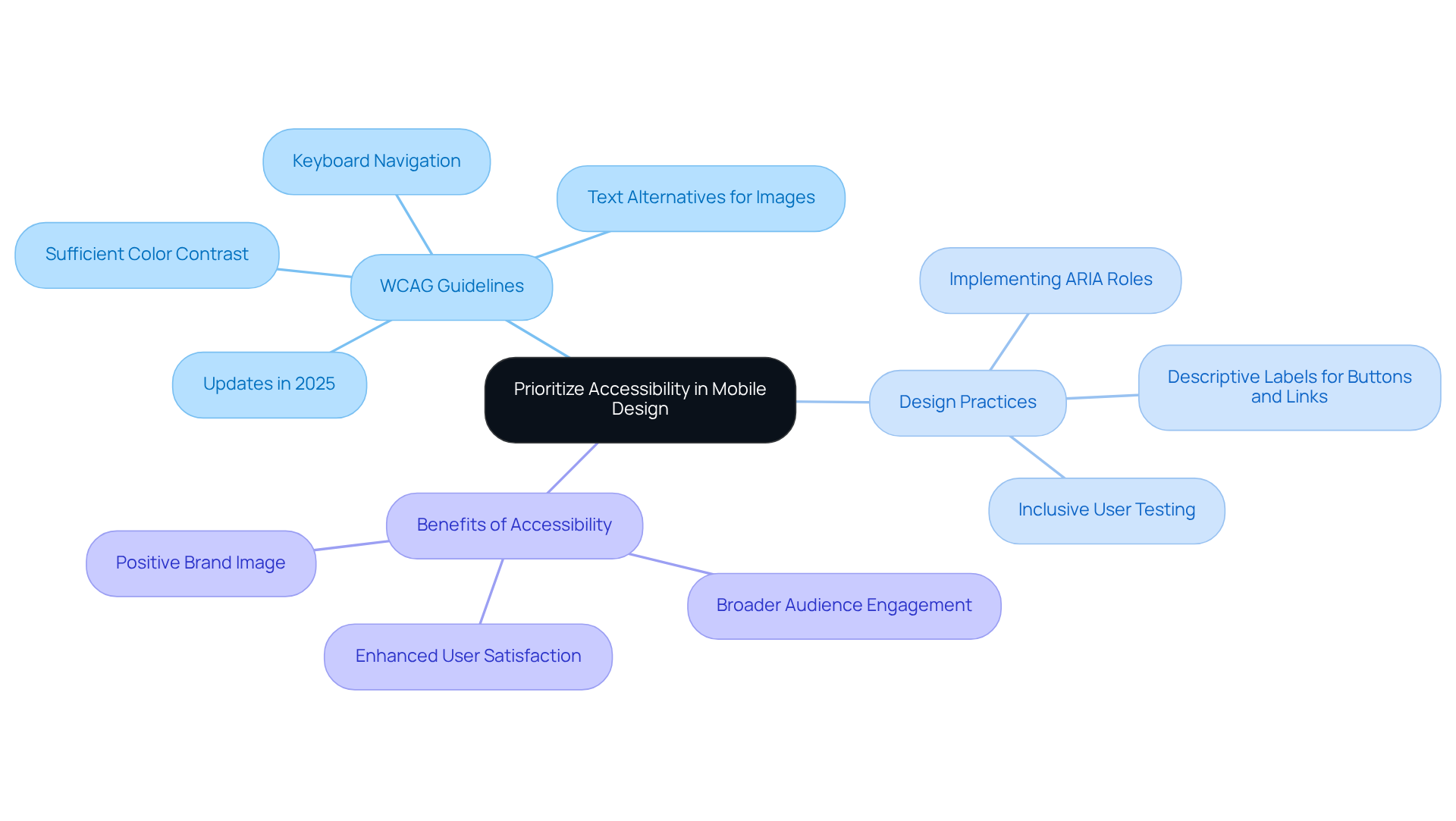
Prioritizing accessibility in mobile development is essential for creating inclusive digital experiences that resonate with everyone. Many startups face the challenge of ensuring their websites are accessible to individuals with disabilities, which is where adherence to the [Web Content Accessibility Guidelines (WCAG)](https://buffer.com/resources/accessibility-quotes) becomes crucial. Imagine the frustration of a potential customer who cannot navigate your site due to inadequate design. By maintaining sufficient color contrast, providing text alternatives for images, and ensuring all interactive elements are navigable via keyboard, you can alleviate this pain and open doors for many.
Implementing ARIA (Accessible Rich Internet Applications) roles can significantly enhance accessibility, offering vital context to assistive technologies. For example, using clear and descriptive labels for buttons and links can make a world of difference for individuals who rely on screen readers. By weaving accessibility into your creation process, you not only meet regulatory requirements but also cultivate a positive brand image that resonates with a wider audience, ultimately expanding your customer base.
The recent updates to the WCAG in 2025 highlight the necessity for guidelines in web design for mobile phones, reinforcing the in our increasingly mobile-first world. Embracing these guidelines is not just about compliance; it's about fostering better engagement. Accessible design has been shown to attract a broader audience and enhance overall satisfaction. By taking these steps, you can create a more inclusive environment that welcomes everyone, reflecting your commitment to understanding and supporting their needs.

Optimize Performance for Mobile Devices
Improving performance for handheld devices is crucial for [web design for mobile phones](https://shortpixel.com/blog/optimize-your-wordpress-site-for-mobile), as it helps keep individuals engaged and enhances their overall experience. Many startup founders might find it frustrating when users abandon their sites due to slow load times. This is a common issue that can significantly impact user satisfaction and conversion rates. Startups should prioritize minimizing page load times through effective strategies such as:
- Compressing images
- Leveraging browser caching
- Reducing server response times
Tools like can be invaluable for identifying performance bottlenecks and offering actionable recommendations to improve site speed. Did you know that reducing mobile site speed by just 0.1 seconds can lead to an 8% increase in conversions? This statistic underscores the importance of swift loading times for your success.
Implementing lazy loading for images and videos can dramatically enhance initial load times by ensuring that content loads only as it enters the viewer's viewport. Imagine the relief your users will feel when they can access content quickly! Furthermore, employing a Content Delivery Network (CDN) facilitates efficient content distribution across different geographical areas, guaranteeing individuals have quicker access no matter their location. Optimizing images for the web is equally essential, as it can significantly boost load speeds while maintaining visual quality. Startups should also concentrate on web design for mobile phones by creating mobile-friendly meta descriptions and succinct content to engage visitors effectively and enhance search visibility. By focusing on these [performance optimization techniques](https://codeconspirators.com/mobile-mastery-optimizing-your-website-for-seamless-device-experiences), startups can create a more satisfying user experience that fosters repeat visits and boosts conversion rates.
Neglecting web design for mobile phones can lead to higher bounce rates and lost conversions, making it imperative for startups to prioritize these strategies. After all, your users deserve a seamless experience, and by addressing these challenges, you can foster a supportive environment that encourages engagement and growth.

Conclusion
Navigating the complexities of mobile web design can feel overwhelming for startups striving to succeed in a digital world where smartphone users reign. It’s crucial to prioritize user behavior, implement responsive design, ensure accessibility, and optimize performance. By doing so, startups can craft websites that not only meet but exceed user expectations. This comprehensive approach is essential for nurturing engagement and driving conversions in a competitive landscape.
Many founders recognize the pressing need to address mobile user demands, such as the desire for speed and seamless navigation. By embracing responsive design techniques, your website can adapt effortlessly across various devices, while a focus on accessibility opens doors to a broader audience. Moreover, optimizing performance through strategies like image compression and lazy loading can significantly elevate user satisfaction and retention.
The importance of effective mobile web design truly cannot be overstated. Startups that adopt these best practices will not only enhance their online presence but also foster a loyal customer base. By taking proactive steps to enrich mobile experiences, you can position your business for success in an ever-evolving digital landscape, ensuring you remain relevant and competitive. Remember, you are not alone in this journey; together, we can create impactful solutions that resonate with your audience.
Frequently Asked Questions
Why is it important for startups to understand mobile user behavior?
Understanding mobile user behavior is crucial for startups because it allows them to create effective web designs that prioritize quick access to information, intuitive navigation, and seamless interactions, all of which are essential for engaging smartphone clients.
What do mobile users prioritize when using websites?
Mobile users prioritize quick access to information, intuitive navigation, and seamless interactions when using websites.
How does website loading speed affect mobile users?
Studies show that 70% of smartphone owners leave websites that take longer than three seconds to load, highlighting the critical need for speed in mobile web design.
What do most U.S. smartphone shoppers prefer when shopping online?
85% of U.S. smartphone shoppers prefer using applications over online sites, emphasizing the importance of enhancing digital experiences.
How can startups determine their target audience's preferences?
Startups can determine their target audience's preferences by conducting user research, which includes identifying favored content formats (like videos or articles) and the typical tasks performed on mobile devices. Tools like Google Analytics can also help monitor user behavior.
Why is the context of access important in mobile web design?
The context of access is important because many smartphone owners are on-the-move, often with limited time and attention. Effective mobile web design should focus on quick interactions and straightforward access to crucial information to enhance user satisfaction and retention.
Can you provide an example of successful mobile design based on user needs?
The Allianz'ım application is an example of successful mobile design. After focusing on user-centered design principles, it reported a 92% increase in digital penetration and a 35% growth in active users. This success was achieved through effective research practices, including conducting 400 surveys and 20 interviews with clients to understand their needs.


