Introduction
Many startups begin their digital journey filled with optimism, yet they often face the harsh reality of poor web design that can alienate users and hinder growth. This article explores ten significant examples of bad web design that every startup should avoid. By highlighting the critical elements that can make or break a user’s experience, we aim to illuminate the path forward.
What lessons can we draw from these design missteps? How can startups transform their online presence to nurture engagement and foster loyalty? Together, let’s navigate these challenges and discover supportive solutions that can enhance your digital journey.
RNO1: Transforming Bad Web Design into Engaging Digital Experiences
Many tech startup founders face the challenge of , which can hinder their ability to connect with their audience. This issue not only affects but can also be attributed to , leaving lasting negative impressions on potential customers. At RNO1, we understand how bad design web flaws can negatively impact your brand's success and community engagement. Our team is dedicated to recognizing and correcting these design shortcomings, leveraging our extensive knowledge of to create captivating digital interactions that truly resonate with individuals.
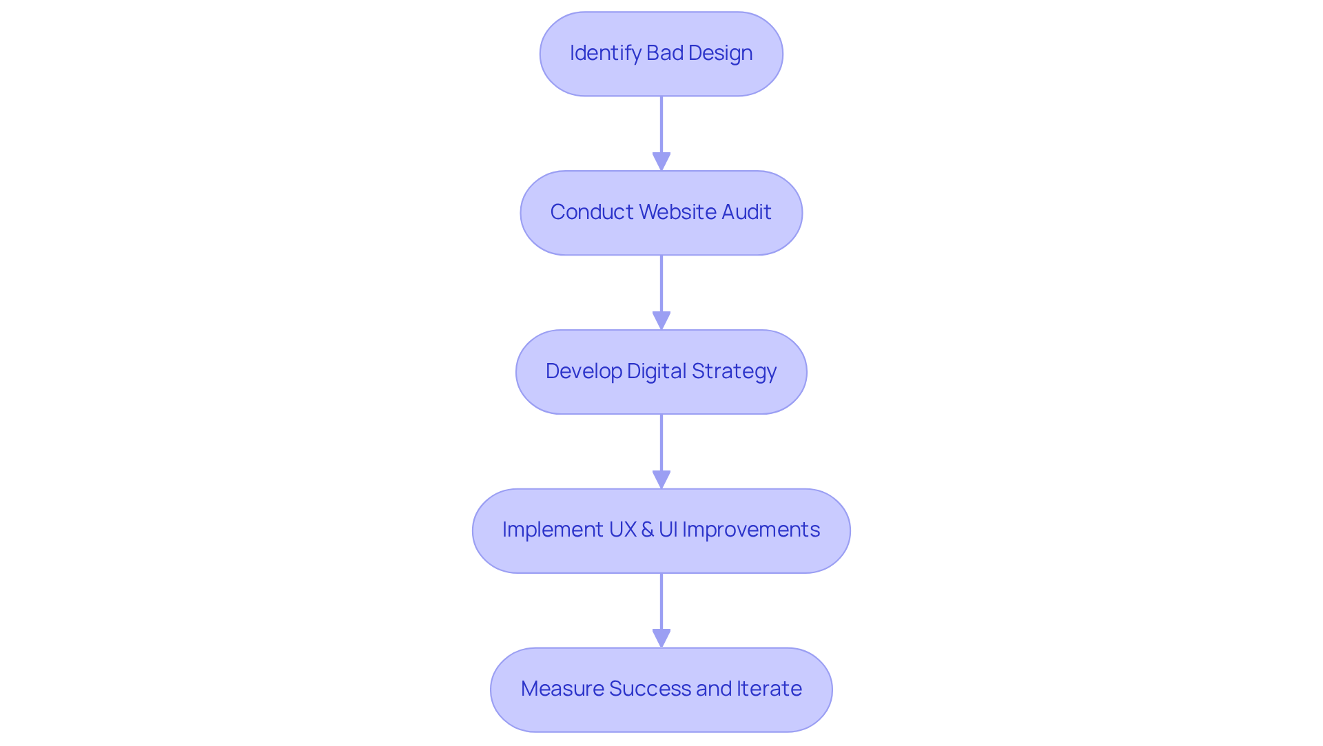
By adopting a user-centric approach, we craft that are not only purposeful but also profitable, empowering both brands and their communities. Our process includes thorough audits of existing websites, paying close attention to essential elements like navigation, color schemes, and overall usability. We offer a range of services, including:
- Digital Strategy
- UX & UI Design
- SEO Strategy & Systems
All designed to transform your online presence.
This transformation leads to enhanced customer satisfaction and drives business growth by improving brand perception and fostering loyalty. For instance, our strategic rebranding efforts, exemplified by the success of Founder's Haven, showcase our commitment to empowering modern founders on their journey toward . We invite you to share your experiences with us, as we are here to .
Pacific Northwest X-Ray Inc.: A Case Study in Unpleasant Color Schemes
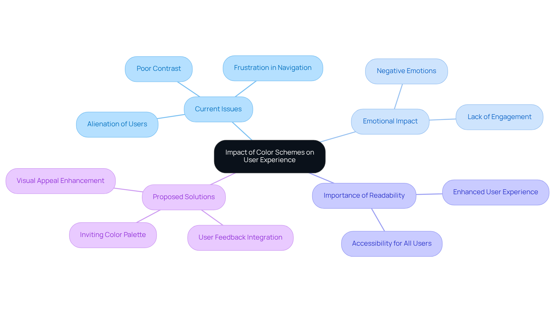
At Pacific Northwest X-Ray Inc., we understand how an unappealing color scheme can create a sense of alienation for users. The current website, with its gradient dark blue layout, is an example of as it unfortunately lacks contrast, making the text challenging to read. This choice can lead to frustration for individuals trying to navigate the site, which is not what we want for our visitors. Effective but also evoke positive emotions, and we recognize that this site exemplifies bad design web in that regard.
We empathize with the challenges this presents and want to assure you that there are solutions available. By prioritizing a more inviting color palette, we can create a website that is not only but also . Together, we can , ensuring that everyone feels welcomed and supported while navigating the site. Your feedback is invaluable, and we invite you to share your thoughts as we work towards a more .
Ling's Cars: Cluttered Layout and Confusing Navigation Issues
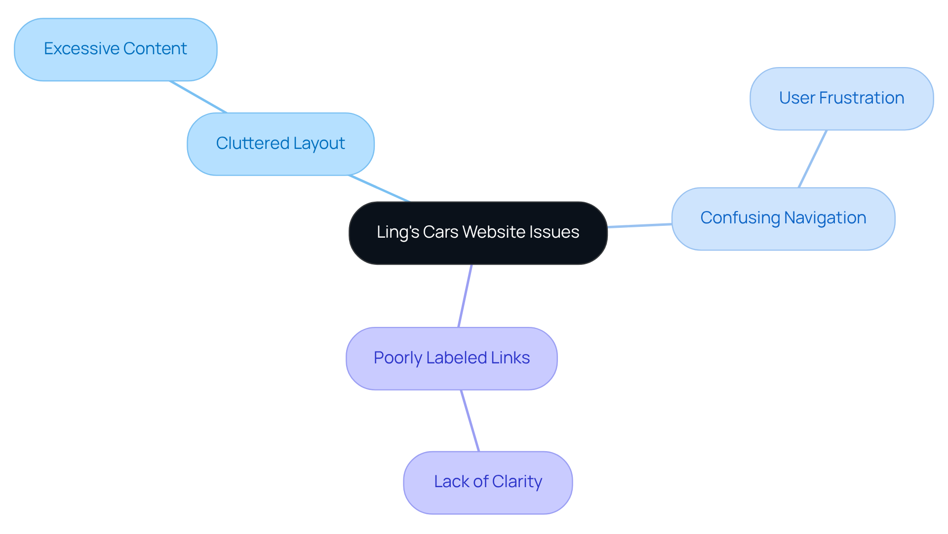
Ling's Cars presents a significant challenge for visitors, as its chaotic arrangement exemplifies that can feel overwhelming. Many users find themselves scrolling through excessive content caused by , which complicates the search for essential information. This convoluted navigation, a result of bad design web with poorly labeled links, often leads to . It’s easy to understand how frustrating this experience can be due to bad design web. A with is not just a luxury; it’s . By creating an environment where visitors can easily access the information they need, we can truly support their journey. Together, we can work towards a solution that , ensuring that every visitor feels welcomed and understood.
Arngren.net: A Lesson in Chaotic Web Design
Arngren.net serves as a classic example of , where listings seem haphazardly thrown together without any clear structure. This disarray can make it incredibly challenging for individuals to locate specific information, often resulting in frustration and high bounce rates. Many startup founders can relate to this struggle, as it reflects a deeper issue: the importance of a that guides visitors effortlessly through content. By prioritizing aesthetics in every interaction, companies can transform the from chaotic to cohesive, ensuring that individuals can easily find what they seek.
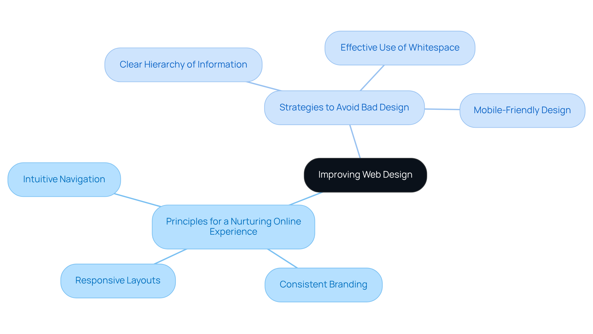
To foster a more nurturing online experience, organizations can adopt principles such as:
These strategies not only enhance user interaction but also promote greater engagement. Startups can avoid the pitfalls of , as seen in Arngren.net, by focusing on:
- Creating a clear hierarchy of information
- Utilizing whitespace effectively
- Ensuring that their website is mobile-friendly
By taking these steps, they can create a supportive digital environment that resonates with users and encourages them to explore further.
The Big Ugly Website: An Example of Poor User Experience
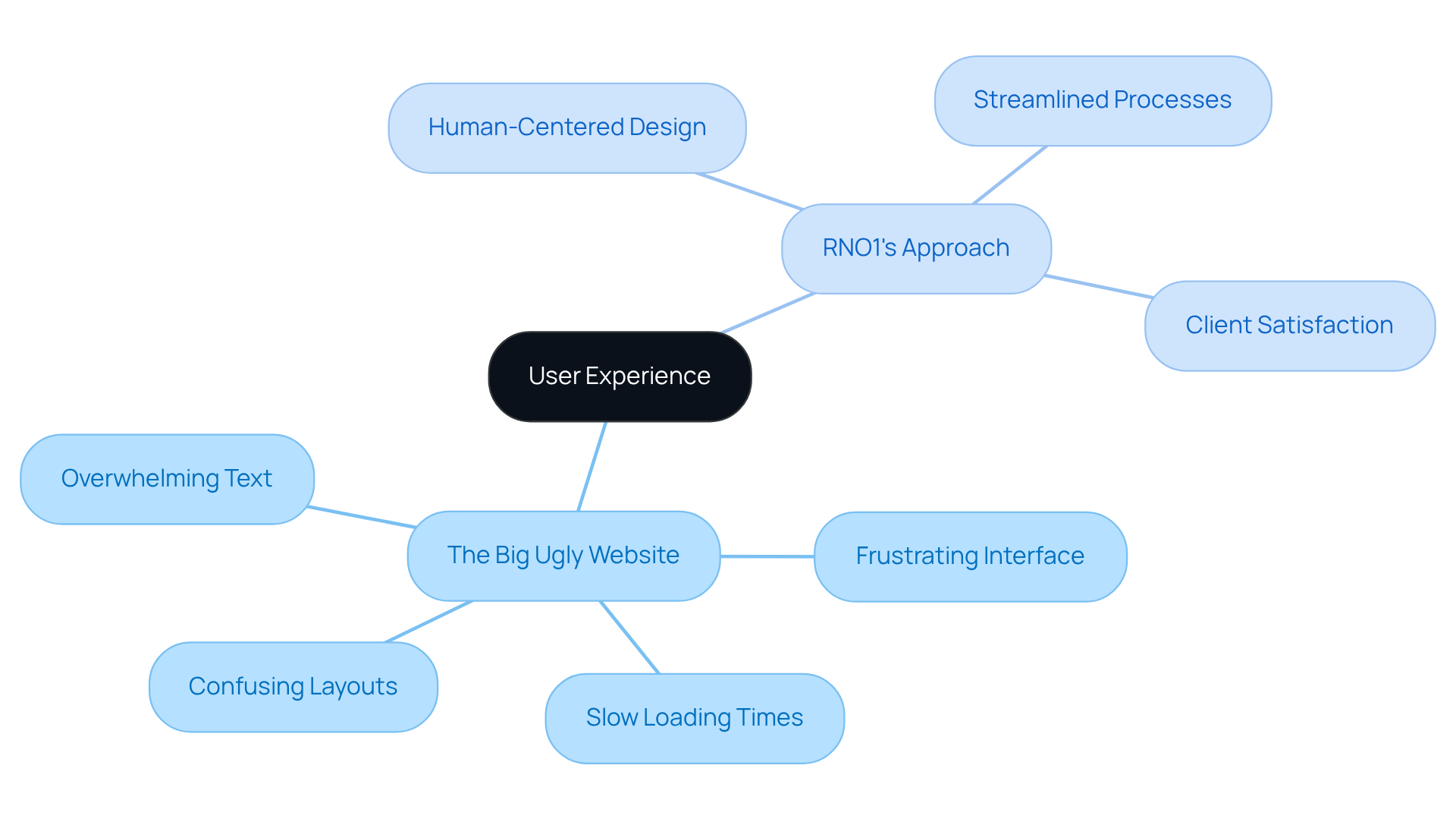
The Big Ugly Website is a prime example of , presenting a common struggle for many users with its frustrating interface, slow loading times, confusing layouts, and overwhelming amounts of text. It’s disheartening when users leave the site out of frustration, feeling lost in the cluttered pages caused by . This experience can be all too familiar, highlighting a significant problem in caused by bad design web.
In stark contrast, have transformed interactions for various clients, emphasizing the importance of . For example, through partnerships with firms like Figure, RNO1 has demonstrated how thoughtful UX design can streamline processes and enhance .
An effective website should truly prioritize the visitor experience, ensuring , clear layouts, and concise content that guides individuals effortlessly. This approach mirrors the evident in RNO1's case studies, offering a nurturing solution that not only addresses user frustrations but also fosters a sense of community and support among tech startup founders.
Gates N Fences: Ineffective Navigation and User Frustration
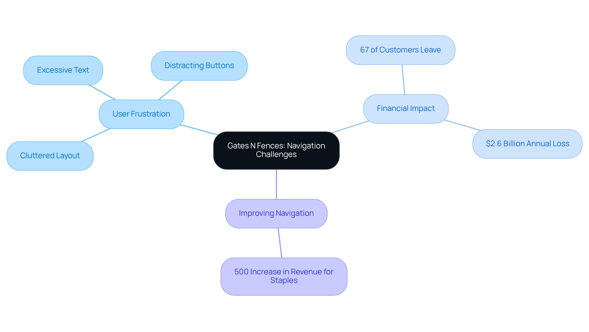
Gates N Fences presents a challenge that many of us can relate to: can make it incredibly difficult to find essential information. When visitors encounter a characterized by a cluttered layout filled with excessive text and distracting buttons, it can feel overwhelming rather than helpful. Imagine how frustrating it is to search for something important, only to be met with confusion. A is not just a luxury; it’s a necessity. It should be intuitive and simple, allowing individuals to access information quickly and effectively.
Consider this: studies show that , which often arise from bad design web and inadequate navigation. This isn’t just a statistic; it’s a real pain point for many businesses. As Sandip Bhandari points out, the is staggering, with businesses losing a total of $2.6 billion annually because of subpar interactions. This loss is not just numbers on a page; it represents missed opportunities and the disappointment of customers seeking a seamless experience.
By prioritizing , Gates N Fences has the potential to significantly enhance user satisfaction and retention. This aligns perfectly with current trends that emphasize . Monique emphasizes that not only reduces frustration but also fosters a more engaging interaction. Ultimately, this can lead to and greater customer loyalty. For instance, Staples saw a remarkable 500% increase in their online revenue after implementing a UX-focused site redesign. This showcases the , and it’s a reminder that investing in can yield incredible returns.
Let’s embrace the opportunity to create a more user-friendly environment together. By making thoughtful changes to navigation, we can transform the experience for everyone involved.
The Wedding Lens: The Dangers of Non-Responsive Design
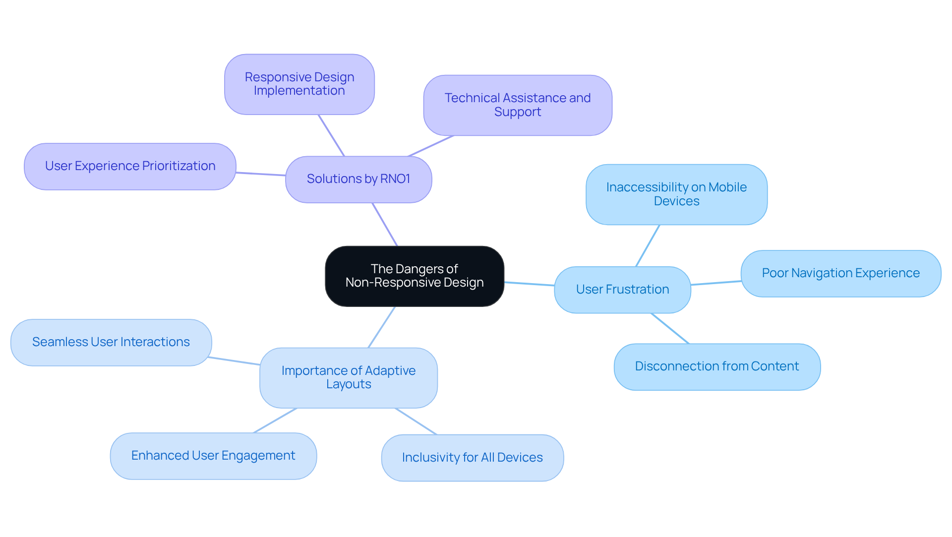
The Wedding Lens highlights a significant issue related to : . Imagine being a user trying to navigate the site on a mobile device, only to encounter elements that are a result of , stubbornly refusing to resize or rearrange. It's a often attributed to bad design web that can leave anyone feeling disconnected.
In our fast-paced digital world, where we all strive for , are not just a luxury—they are essential. They ensure that every individual, regardless of the device they use, can enjoy a smooth and engaging experience.
At that prioritize , fostering a more inclusive for everyone.
Stephen Fry's Website: Outdated Design Elements That Deter Users
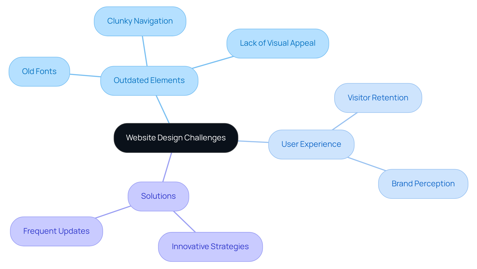
Many visitors to Stephen Fry's website may feel disheartened by the and its outdated aesthetic components. The old-fashioned fonts, clunky navigation, and lack of visual appeal result in a that creates a disengaging experience and discourages exploration. This is a common challenge, one that many tech startup founders can relate to, as a website's design plays a crucial role in attracting and retaining interest.
At RNO1, we understand the pain points that come with a less engaging . When a website suffers from bad design web, it not only affects visitor retention but can also diminish the overall perception of a brand. We believe that contemporary web creation should avoid bad design web by not only focusing on functionality but also emphasizing aesthetics, ensuring that individuals are drawn in and motivated to delve deeper into the content.
Our commitment to shines through in our collaborations. We have successfully transformed brands by implementing innovative strategies that breathe new life into their . Frequent updates to are essential for maintaining participant interest and involvement, a principle we uphold in our partnerships with clients like RentMethod and Spring Labs. Through these collaborations, we elevate s to new heights, fostering engagement and connection.
We invite you to reflect on your own experiences with and consider how they impact your audience. At RNO1, we are here to support you in creating a digital environment that resonates with visitors, encouraging them to explore and engage with your content. Together, we can transform your online presence into a vibrant and inviting space that truly reflects your brand's essence.
Yale University School of Art: Confusing Layout and Poor Usability
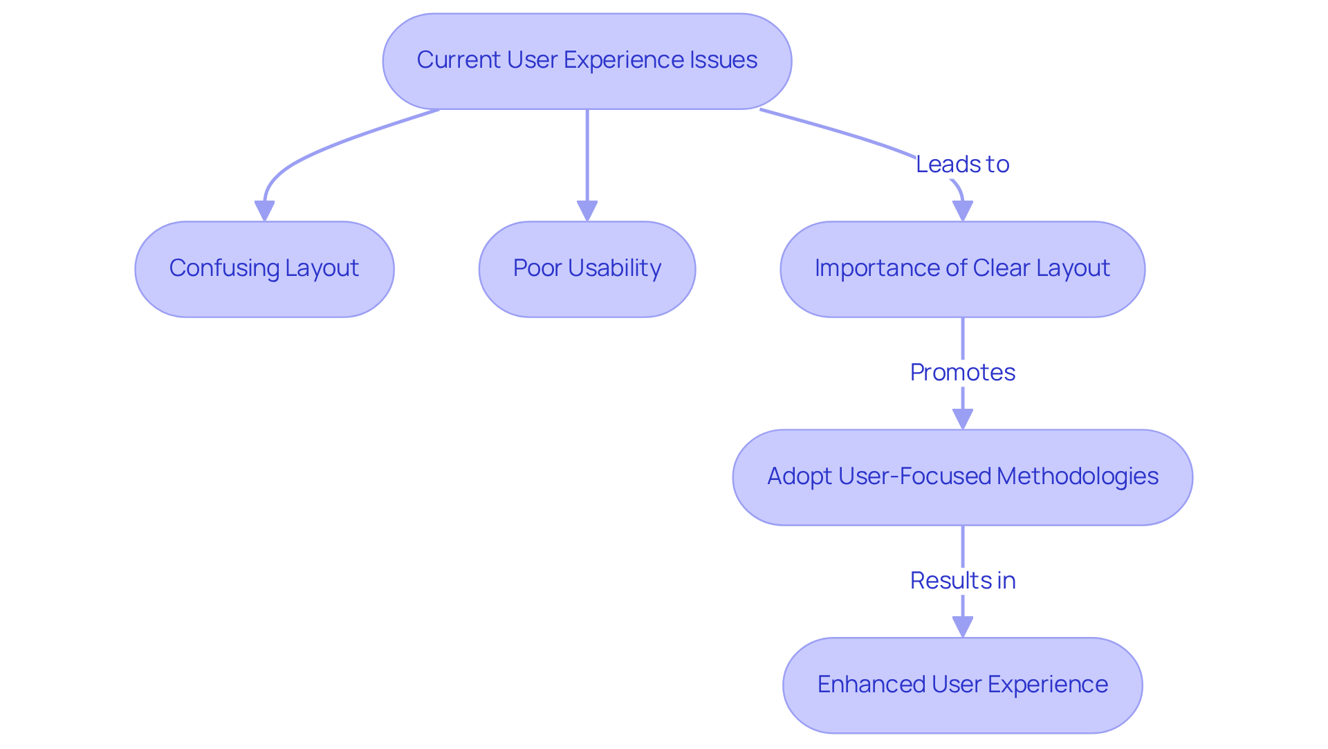
The Yale University School of Art website presents a challenge that many can relate to: a confusing layout indicative of that significantly hampers usability. Users often find themselves struggling to navigate through dense content and sections due to , which can lead to feelings of frustration and disengagement.
It’s essential to recognize that a clear and logical layout is not just a design choice; it’s crucial for guiding visitors through a website, ensuring they can easily find the information they seek and feel welcomed.
By adopting a more , similar to the employed by the agency in their collaborations, the functionality of the Yale website could see a meaningful improvement.
Thoughtful design not only enhances client satisfaction but also fosters deeper engagement. This is evident in the successes observed in with companies like Figure, where enhancing is paramount.
Together, we can create spaces that are not only navigable but also inviting, encouraging users to .
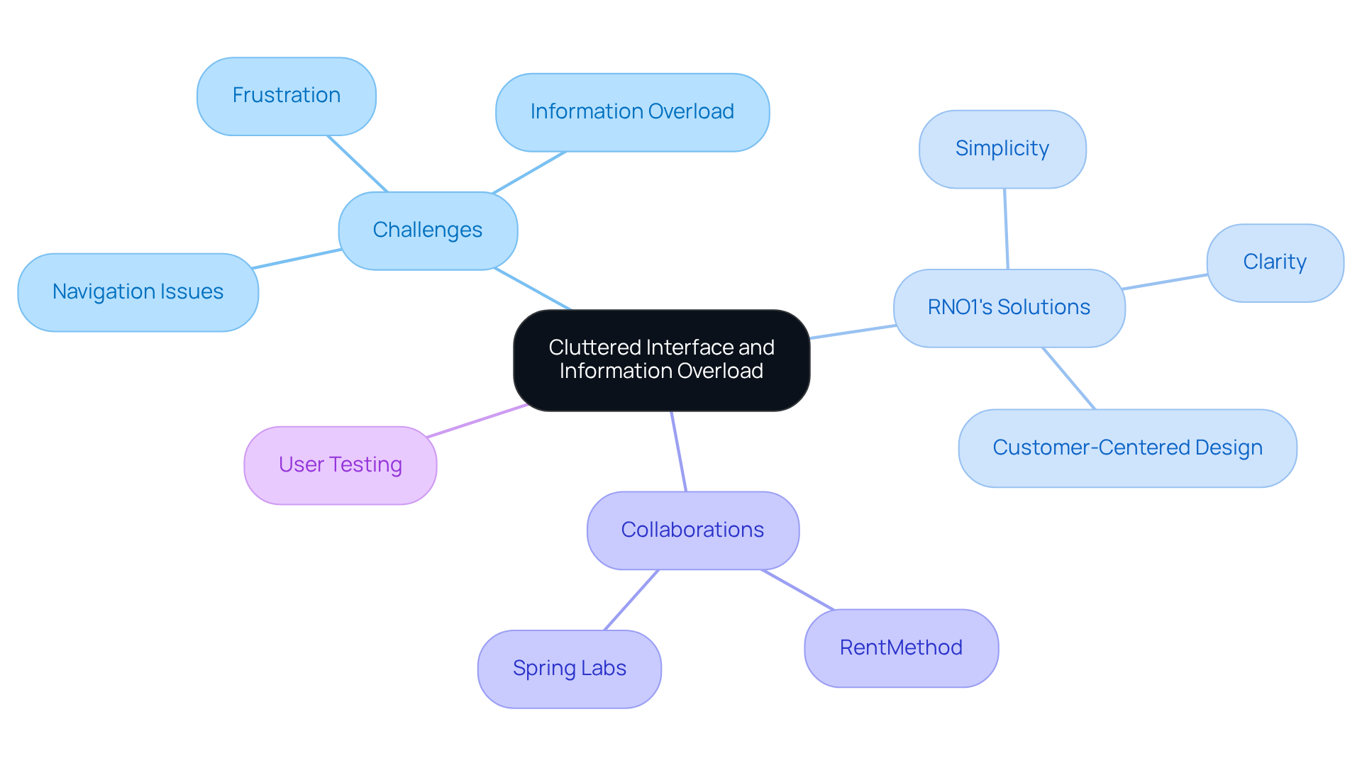
Drudge Report: Cluttered Interface and Information Overload
Navigating chaotic websites like the Drudge Report can be incredibly frustrating. With an overwhelming amount of content and a cluttered interface, makes it easy to feel lost and unable to focus on what truly matters. This challenge is not just an inconvenience; it can hinder your ability to find essential information when you need it most. At RNO1, we understand these struggles and believe that should prioritize clarity and simplicity. Our design-driven strategy transforms , making it easier for users to navigate and absorb content.
We’ve had the privilege of collaborating with companies such as:
- RentMethod
- Spring Labs
showcasing our commitment to enhancing s through efficient layouts and creative solutions. By focusing on , we help brands avoid the pitfalls of , ultimately improving and retention.
To embrace , we encourage you to consider user testing. This approach can reveal areas of confusion and help streamline your website's layout, ensuring that your audience feels supported and engaged. Together, we can that not only meets professional standards but also nurtures the emotional needs of your users.
Conclusion
The exploration of bad web design examples serves as a critical reminder for startups about the significant impact design choices can have on user experience and brand perception. It’s all too easy to overlook how these decisions affect your audience. By understanding and avoiding these common pitfalls, businesses can create a more engaging and effective online presence that truly resonates with their users.
Throughout this article, various case studies illustrate the detrimental effects of poor design elements, such as cluttered layouts, confusing navigation, and outdated aesthetics. From the chaotic arrangement of Ling's Cars to the frustrating interface of The Big Ugly Website, each example highlights the importance of user-centered design principles. These stories remind us that prioritizing clarity, responsiveness, and emotional engagement can transform digital environments into welcoming spaces that encourage exploration and connection.
Ultimately, the message is clear: investing in thoughtful web design is not merely an aesthetic choice but a strategic necessity. We encourage startups to reflect on their own digital experiences and consider how improvements can lead to increased user satisfaction and loyalty. Embracing effective design practices can pave the way for success, ensuring that every visitor feels valued and supported in their online journey. Remember, you are not alone in this; together, we can create experiences that matter.
Frequently Asked Questions
What challenges do tech startup founders face regarding web design?
Tech startup founders often struggle with bad web design, which can hinder their ability to connect with their audience and negatively impact user experience, leading to lasting negative impressions on potential customers.
How does RNO1 address issues related to bad web design?
RNO1 recognizes and corrects design shortcomings by leveraging extensive knowledge of UX and branding to create engaging digital experiences. They adopt a user-centric approach to craft purposeful and profitable eCommerce experiences.
What services does RNO1 offer to improve web design?
RNO1 offers a range of services including Digital Strategy, UX & UI Design, and SEO Strategy & Systems, all aimed at transforming online presence and enhancing customer satisfaction.
What is the impact of bad design web on brand perception?
Bad design web can negatively affect brand perception, leading to decreased customer satisfaction and loyalty. RNO1’s transformation efforts aim to improve these aspects and drive business growth.
What specific design issues are highlighted in the case study of Pacific Northwest X-Ray Inc.?
The website of Pacific Northwest X-Ray Inc. features an unappealing color scheme that lacks contrast, making text difficult to read. This bad design can create frustration for users navigating the site.
How can color schemes affect user experience?
Effective color schemes enhance readability and evoke positive emotions. A poor color palette can lead to feelings of alienation for users, while a more inviting color scheme can create a visually appealing and user-friendly website.
What problems does Ling's Cars face in its web design?
Ling's Cars has a cluttered layout and confusing navigation, making it overwhelming for visitors. Poorly labeled links and excessive content complicate the search for essential information, leading to user frustration.
What solutions can improve the user experience for websites like Ling's Cars?
A streamlined layout with intuitive navigation is essential to improve user experience. By creating an organized environment where visitors can easily access information, websites can foster clarity and support users effectively.


