

Introduction
In the world of modern web design, gradients have become a defining element, seamlessly blending colors to create depth and visual interest. Yet, as designers strive to captivate users and enhance their experiences, a challenge emerges: how to implement these beautiful color transitions effectively without overwhelming the viewer. This is a common concern among many in the design community. The desire to beautify a site can sometimes lead to choices that distract rather than engage.
Imagine a potential user landing on a website filled with vibrant gradients, only to feel lost in a sea of colors. This experience can lead to frustration and disengagement, which is the last thing any designer wants. It’s essential to understand the nuances of gradient types and their applications to avoid this pitfall. The good news is that by harnessing the power of color transitions thoughtfully, designers can not only enhance the aesthetic appeal of their sites but also drive user engagement and interaction.
At RNO1, we believe that with the right approach, gradients can be a source of joy and connection, not confusion. By focusing on simplicity and clarity in design, we can create spaces that invite users in, encouraging them to explore and interact. Together, let’s embrace the beauty of gradients while ensuring they serve a purpose, enhancing the user experience rather than detracting from it.
Understand Gradients: Definition and Types
are visual effects that create a smooth transition between two or more colors, and they play a crucial role in modern web design. For many designers, the challenge lies in selecting the right gradient that not only enhance aesthetics but also improve usability. As we look toward 2025, gradients are increasingly favored for their ability to add depth, contrast, and texture to websites. It's anticipated that approximately 80% of designers will incorporate gradients in their projects, reflecting their growing popularity.
However, understanding the different types of gradients can feel overwhelming. Let's explore the categories together:
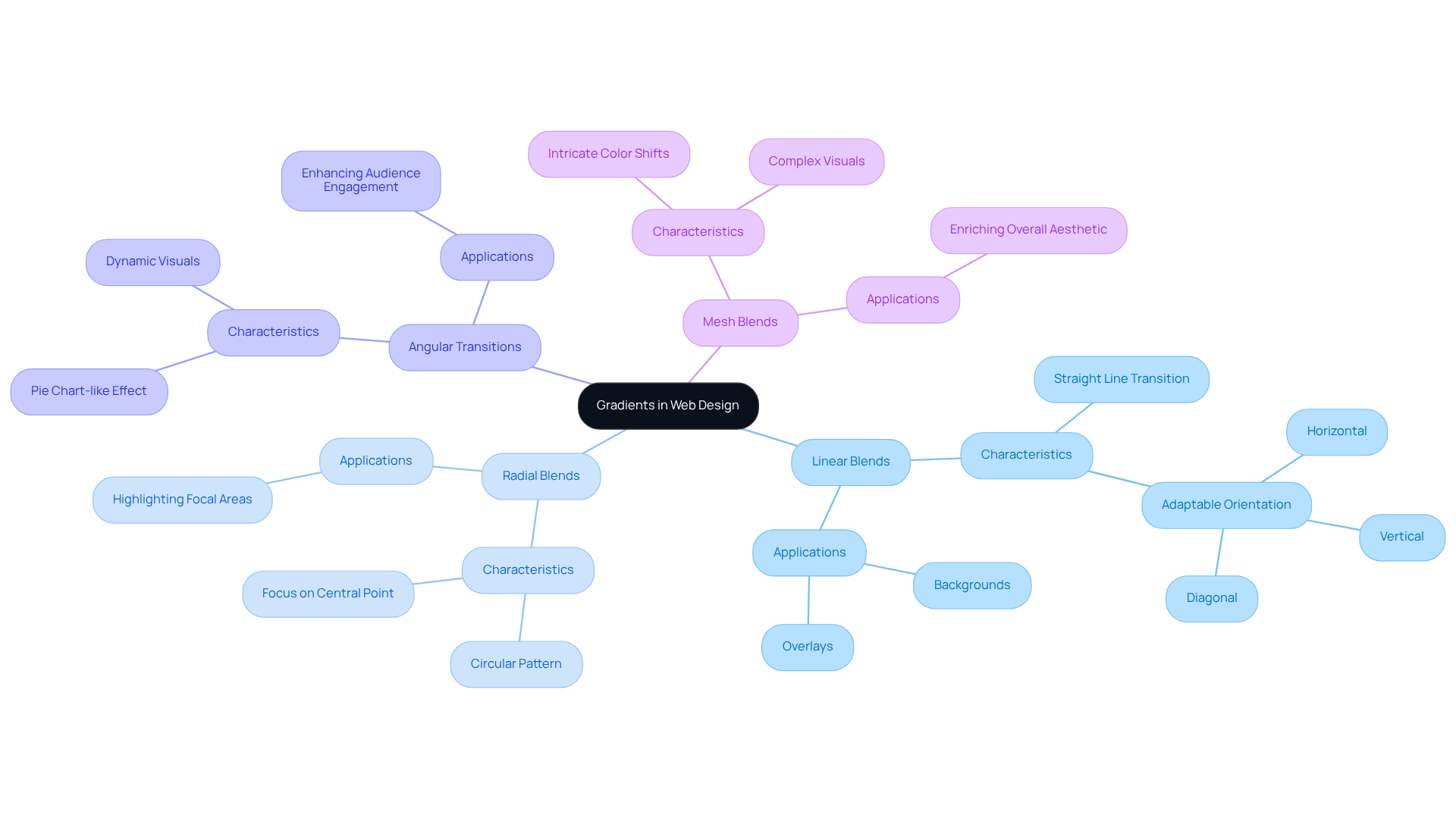
- Linear Blends: These blends transition hues along a straight line, adaptable for backgrounds and overlays, whether oriented horizontally, vertically, or diagonally.
- Radial Blends: Radiating from a central point, these blends create a circular pattern that naturally draws attention to focal areas on a webpage.
- Angular Transitions: Similar to pie charts, these transitions shift hues around a central point, providing a lively visual effect that can enhance audience engagement.
- Mesh Blends: These intricate blends enable various color shifts throughout a specified region, offering elaborate visuals that can enrich the overall aesthetic.
Comprehending these categories is crucial for creators to choose the suitable color transition that aligns with their objectives and enhances the experience for users. As branding specialists often highlight, mastering gradients is essential for developing brand identity. For instance, Andrian Valeanu, a skilled web designer, emphasizes that "following these mainstreams is crucial for businesses and designers alike."
The efficient application of gradients can greatly enhance audience interaction, rendering them an essential design element. Brands like Be The Buzz have successfully utilized gradients to create dynamic and engaging website experiences, enhancing visual interest and depth.
Yet, it's important to remain mindful of pitfalls, such as overusing gradients or choosing clashing hues, which can detract from the overall experience. Ultimately, gradients not only enhance aesthetics but also guide attention and foster interaction on digital platforms. Together, we can navigate these choices, ensuring that your designs resonate deeply with your audience.
Leverage Gradients for Enhanced User Engagement
can often feel like a daunting challenge for tech startup founders. It's not just about attracting attention; it’s about creating meaningful interactions that resonate with users. A common struggle is ensuring that crucial elements on a website truly stand out, guiding visitors toward important actions. Gradients can be a nurturing solution to this problem, effectively creating a visual hierarchy that draws attention to essential components like buttons. Imagine a lively color transition making a button pop against a soft background, gently directing users where they need to go. This approach is not just a design choice; studies reveal that strategically placed CTAs can lead to an impressive 304% increase in conversions, underscoring the importance of this technique.
Moreover, the psychology of color cannot be overlooked. Different hues evoke a spectrum of feelings—warm shades like reds and oranges can spark excitement, while cool tones such as blues and greens can cultivate a sense of calm. Aligning color choices with the emotional tone of your brand is vital in enhancing user experience and fostering deeper connections. Research indicates that color can influence a person's initial opinion of a product within just 90 seconds, highlighting the significance of this alignment.
Readability is another crucial aspect of design. Gradients can serve as gentle overlays on images or backgrounds, ensuring that text remains legible and inviting. A subtle transition can help text stand out without overwhelming the viewer, enhancing overall readability. This consideration is especially important, as 40% of individuals may leave a page if it takes more than three seconds to load. Clear and accessible content is essential for retaining visitors, especially when using gradients. Additionally, optimizing transitions for mobile devices is critical, as mobile visitors are more likely to disengage from a site that isn’t tailored to their needs.
By thoughtfully applying gradients, designers can create a more captivating and aesthetically pleasing website. This not only boosts engagement but also enhances conversion rates. Engaging with UX designers on the emotional effects of hue transitions and observing brands that successfully utilize these strategies can further enrich this discussion. Together, let’s explore how gradients can transform user interactions and foster a supportive community around your brand.
Implement Gradients: Best Practices and Techniques
To implement gradients effectively, it’s important to consider some best practices that can truly enhance your design:
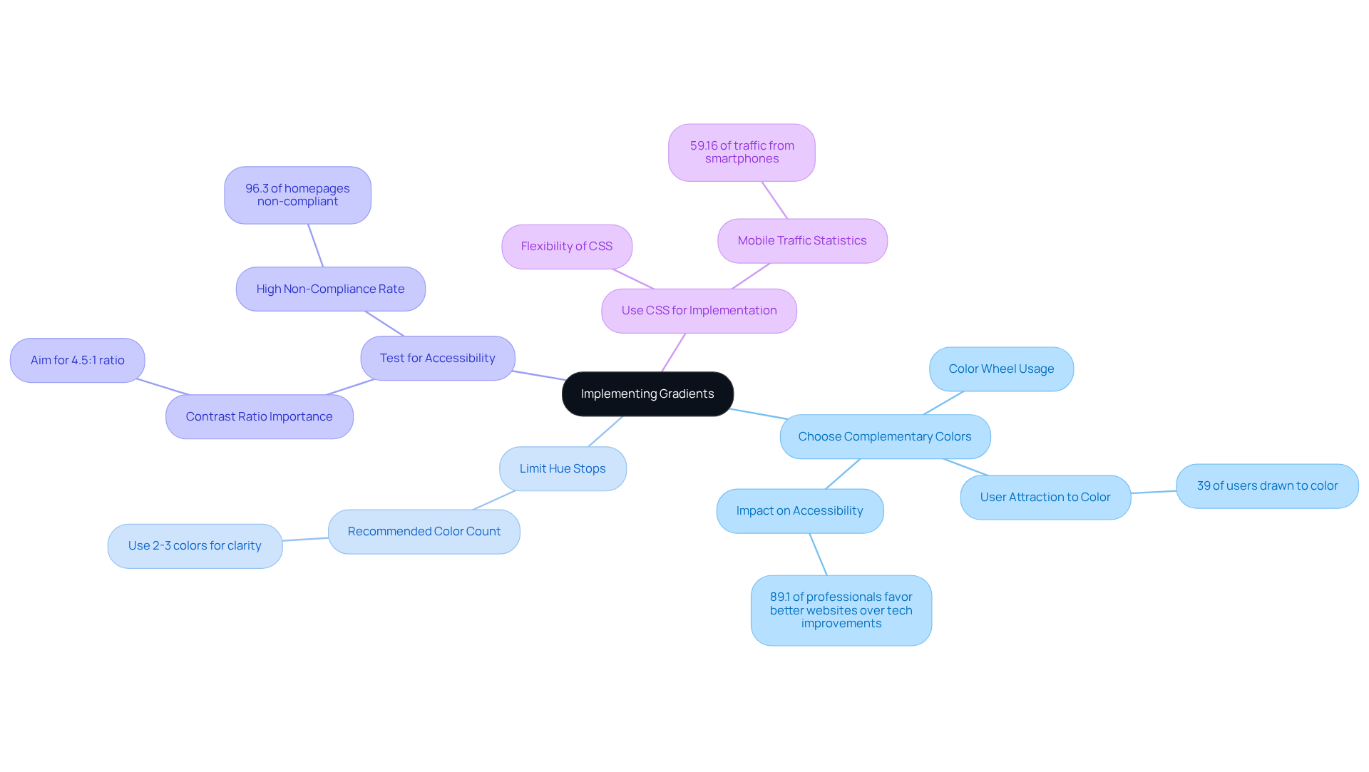
- Choose Complementary Colors: Think about how colors work together. A color wheel can be a helpful tool to find hues that harmonize beautifully. When you select complementary colors, you create designs that not only look appealing but also enhance the overall feel of your site. Remember, studies indicate that 39% of internet users are drawn to color more than any other visual component. This makes color selection vital for engaging your audience. As specialists have noted, "that improved websites would have a greater effect on accessibility than enhanced assistive technology and browsers in 2021." This underscores the importance of making thoughtful hue selections.
- Limit Hue Stops: It’s easy to get carried away with colors, but too many can overwhelm your viewers. Generally, sticking to two or three colors is enough to create a smooth transition, ensuring that your design remains clear and focused.
- Test for Accessibility: Ensuring that your gradients provide enough contrast with text and other elements is crucial. With color choices, using contrast checkers can help confirm that your layout is accessible to everyone, including those with visual impairments. Aim for a ratio as a guiding principle in your selections. This urgency is highlighted by the statistic that "96.3% of homepages were reported as non-compliant with accessibility standards."
- Use CSS: CSS are a fantastic way to implement gradients simply and flexibly. This approach allows for quick adjustments and adaptable layouts, ensuring your designs look great on all devices. This flexibility is essential, especially since 59.16% of global website traffic comes from smartphones. Your layouts need to be responsive.
By following these practices, you can create designs that enhance visual appeal while also improving the functionality and accessibility of your websites. Consider successful hue combinations like blue to green or orange to pink—these have proven effective in various web designs. Remember, you’re not alone in this journey; as you explore color, think of it as a step towards creating a more inviting and accessible online space for everyone.
Test and Optimize: Ensure Consistency Across Devices
To ensure gradients are consistent across devices, it’s essential to address a common challenge many designers face. Inconsistent gradients can lead to frustration, as they affect how users perceive your site. Imagine a potential customer visiting your site only to find that colors appear differently on their device. This not only impacts their experience but can also influence their perception of your brand.
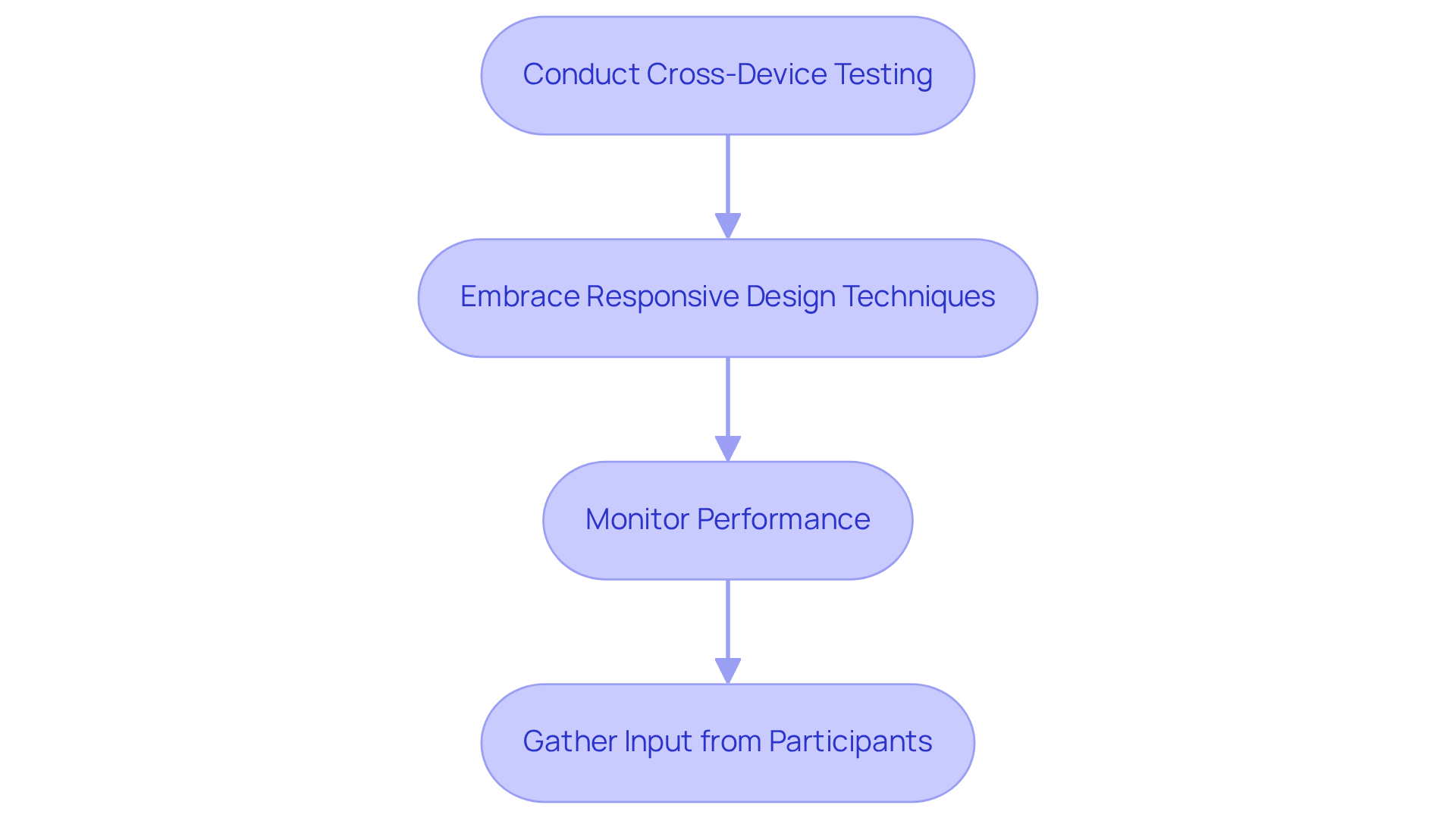
To tackle this issue, consider conducting tests. Regularly testing your gradients on various devices and screen sizes allows you to see how they render. Pay close attention to hue shifts and readability, as these elements can significantly affect user satisfaction.
Next, embrace flexibility. Implementing these principles ensures that gradients adapt well to different screen sizes. This may involve modifying slope angles or color stops based on the device, creating a more cohesive experience for all users.
It’s also important to monitor performance. Gradients, especially complex ones, can impact loading times. By optimizing assets, you can ensure that gradients do not hinder your website's performance, allowing users to enjoy a seamless experience.
Lastly, gather feedback. Collecting insights from individuals about their experiences with gradients on various devices can provide valuable feedback and highlight areas for improvement. By listening to your audience, you foster a sense of community and support.
By testing and optimizing gradients, designers can ensure a seamless and visually appealing experience for all users, regardless of the device they are using. Remember, your dedication to creating a quality experience reflects your commitment to your audience, nurturing their connection to your brand.
Conclusion
Website gradients are not just aesthetic choices; they serve as powerful tools that can significantly enhance user engagement and improve the overall experience on digital platforms. Many designers face the challenge of creating visually appealing and functional websites that resonate with users. By understanding the different types of gradients and their applications, you can overcome this hurdle and create a more inviting online space.
Throughout this article, we've highlighted key practices for implementing effective gradients. Choosing complementary colors, limiting hue stops, ensuring accessibility, and optimizing for various devices are crucial elements that contribute to a seamless user experience. Each of these practices plays a vital role in captivating and retaining visitors. It's important to remember that the emotional impact of color transitions and the importance of readability directly influence user perceptions and interactions.
In conclusion, the thoughtful application of gradients is essential for modern web design. As the landscape continues to evolve, embracing these best practices will not only enhance visual appeal but also foster deeper connections with users. We encourage you to experiment with color transitions, optimize for accessibility, and consistently test across devices. By doing so, you can transform user interactions and elevate your digital presence in an increasingly competitive environment. Together, we can create engaging and inviting online spaces that resonate with our audience.
Frequently Asked Questions
What are website gradients?
Website gradients are visual effects that create a smooth transition between two or more colors, enhancing aesthetics and improving user experience in modern web design.
Why are color transitions important in web design?
Color transitions add depth, contrast, and texture to digital experiences, making them visually appealing and engaging for users.
What types of gradients are commonly used in web design?
The common types of gradients include: - Linear Blends: Transition hues along a straight line. - Radial Blends: Create a circular pattern radiating from a central point. - Angular Transitions: Shift hues around a central point like pie charts. - Mesh Blends: Enable various color shifts throughout a specified region for intricate visuals.
How can gradients enhance audience interaction?
Effective application of gradients can increase audience interaction by making designs more dynamic and visually interesting, guiding attention, and fostering engagement.
What are some pitfalls to avoid when using gradients?
Common pitfalls include overusing color transitions and choosing clashing hues, which can detract from the overall user experience.
What is the anticipated trend for web designers regarding gradients by 2025?
It is anticipated that approximately 70% of web designers will embrace color transitions in their projects, reflecting their growing popularity.
How can gradients impact branding strategies?
Mastering color transitions is essential for developing visually attractive and impactful branding strategies, as they can enhance the overall aesthetic of a brand's digital presence.
List of Sources
- Understand Gradients: Definition and Types
- designmodo.com (https://designmodo.com/web-design-trends)
- geniusee.com (https://geniusee.com/single-blog/web-design-trends)
- clutch.co (https://clutch.co/resources/web-design-stats)
- designrush.com (https://designrush.com/agency/website-design-development/trends/web-design-trends)
- 70+ Key Web Design Statistics for 2026 | VWO (https://vwo.com/blog/web-design-statistics)
- Leverage Gradients for Enhanced User Engagement
- mountaintopwebdesign.com (https://mountaintopwebdesign.com/the-impact-of-color-psychology-on-web-design-and-user-engagement)
- 70+ Key Web Design Statistics for 2026 | VWO (https://vwo.com/blog/web-design-statistics)
- owdt.com (https://owdt.com/article/the-impact-of-website-design-on-user-engagement-and-conversion-rates)
- influencermarketinghub.com (https://influencermarketinghub.com/web-design-statistics)
- wowmakers.com (https://wowmakers.com/blog/ux-statistics)
- Implement Gradients: Best Practices and Techniques
- highervisibility.com (https://highervisibility.com/website-design/learn/web-design-stats)
- ddiy.co (https://ddiy.co/web-accessibility-statistics)
- loopexdigital.com (https://loopexdigital.com/blog/web-design-statistics)
- 70+ Key Web Design Statistics for 2026 | VWO (https://vwo.com/blog/web-design-statistics)
- elasticpath.com (https://elasticpath.com/studio/blog/web-design-statistics)
- Test and Optimize: Ensure Consistency Across Devices
- browserstack.com (https://browserstack.com/guide/important-stats-every-app-tester-should-know)
- 20+ Interesting Website Speed Statistics (2026) (https://sitebuilderreport.com/website-speed-statistics)
- designrush.com (https://designrush.com/agency/website-design-development/trends/web-design-statistics)
- marketingdive.com (https://marketingdive.com/news/google-53-of-mobile-users-abandon-sites-that-take-over-3-seconds-to-load/426070)


