

Introduction
In a world where first impressions matter, the right typography can either elevate a brand or leave it unnoticed. The Wisdom Script font, with its elegant and approachable characteristics, offers a unique opportunity for designers to create memorable connections with their audiences.
Many designers have faced the challenge of making their typography choices resonate, often learning through trial and error. However, effectively harnessing its potential requires a nuanced understanding of best practices to avoid common pitfalls.
Have you ever wondered how to make your typography choices truly connect with your audience? By understanding how to use Wisdom Script effectively, designers can forge deeper connections with their audiences, ensuring their brand stands out in a sea of competition.
Understand the Characteristics of Wisdom Script Font
Have you ever felt overwhelmed by the challenge of selecting the perfect typeface for your project? The meticulously crafted typeface created by James T. Edmonton, known as Font Wisdom Script, beautifully captures elegance and personality, making it a favorite among designers who want to connect with their audience. This typeface excels in conveying a sense of warmth and approachability, which is essential in today’s design landscape.
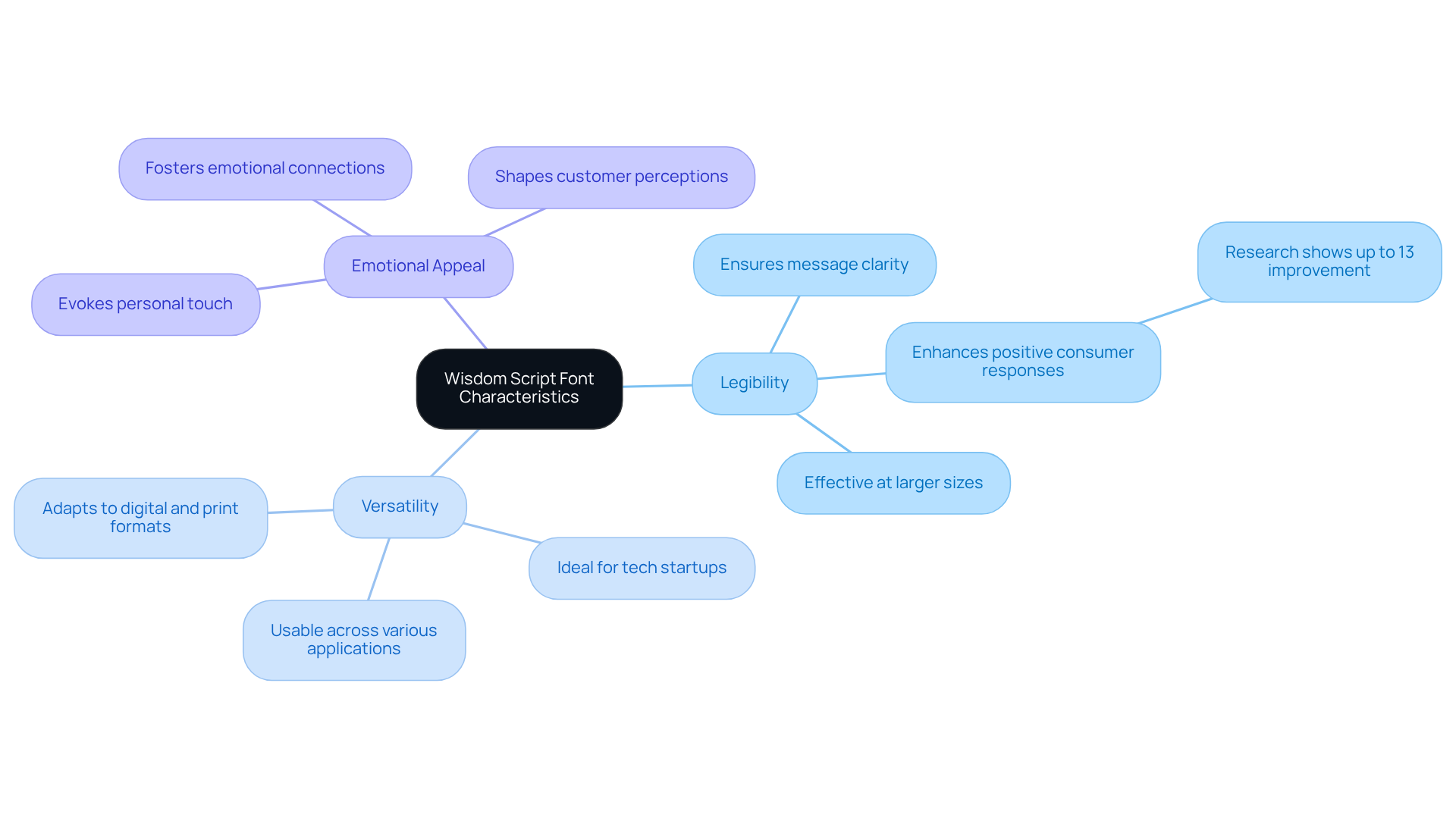
Let’s explore some key characteristics that make the font Wisdom Script a standout choice for designers:
- Its legibility ensures your message shines through, particularly at larger sizes, allowing your audience to engage with your content effortlessly. Research shows that typeface choices can enhance positive consumer responses by up to 13%, underscoring the importance of clarity in branding.
- Its versatility is another significant advantage. Wisdom Script adapts seamlessly to both digital and print formats, enhancing its usability across various applications. This adaptability is crucial for tech startups looking to establish a strong market presence and connect with their audience on multiple platforms.
- Moreover, the handwritten style of the font Wisdom Script evokes a personal touch, making it ideal for projects aimed at fostering emotional connections. Typography is a powerful branding tool that shapes customer perceptions, and the unique characteristics of the font Wisdom Script can significantly influence how audiences perceive a brand.
However, it’s essential to understand these characteristics to utilize the typeface's strengths effectively while steering clear of common pitfalls. Many designers struggle to find a typeface that balances style with clarity, often leading to confusion in their branding efforts. Excessive use of script and display typefaces can diminish clarity and professionalism, so it’s crucial to apply this type judiciously to preserve its effect.
By choosing the right typeface, designers can enhance brand perception and foster deeper connections with their audience. Incorporating successful case studies of RNO1 in branding can further illustrate its effectiveness, providing practical insights for designers aiming to create radical digital experiences. Choosing the right typeface can transform your brand's identity and create lasting connections with your audience.
Apply Wisdom Script in Diverse Digital Design Contexts
Have you ever felt overwhelmed by the challenge of creating a brand that truly resonates with your audience? Navigating the world of digital design can be daunting, especially when every choice you make can either connect you with your audience or leave them feeling distant. That's where RNO1 comes in, ready to support you in enhancing your brand's identity and user interaction.
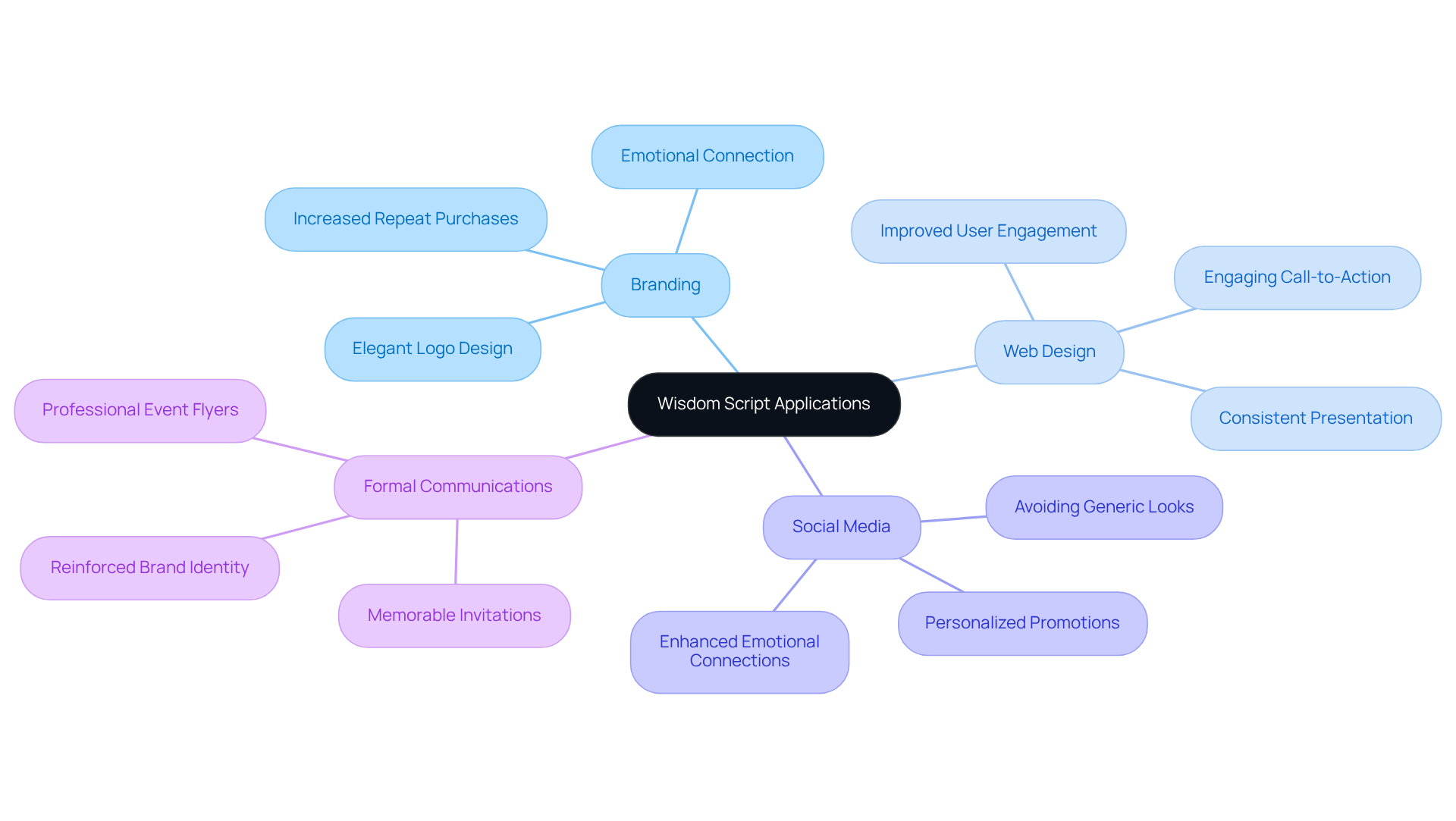
For branding, think about how a beautifully crafted logo can evoke feelings of elegance and personality - using font Wisdom Script can help you achieve just that. Pair it with a clean sans-serif typeface, and you create a striking contrast that enhances readability and visual appeal. When you create that emotional connection, you’re not just selling a product; you’re building a relationship that can lead to 65% more repeat purchases than traditional rewards ever could.
In web design, integrating Insight Text in headers or call-to-action buttons can attract attention and maintain user engagement. Just ensure legibility against the background color to facilitate navigation. Consistent use of this font across platforms can lead to a 10-20% increase in revenue, as entities that maintain a cohesive presentation are more likely to build trust and recognition among consumers.
When it comes to social media graphics, incorporating the font Wisdom Script in your promotional materials adds a personal touch that resonates with audiences. This approach can foster emotional connections, as 80% of consumers prefer personalized entities that deliver tailored content and experiences. However, be cautious of overusing script styles, as this can lead to a generic look that detracts from your unique identity.
Lastly, the elegant style of the font Wisdom Script makes it ideal for wedding invitations, event flyers, and other formal communications, reinforcing your identity in a memorable way. By embracing these practices, you can foster deeper connections with your audience, ultimately leading to greater success and fulfillment in your journey.
Ensure Brand Consistency with Wisdom Script Usage
Have you ever felt overwhelmed by the challenge of maintaining a consistent brand identity? To help you navigate this, here are some best practices for using the font Wisdom Script effectively.
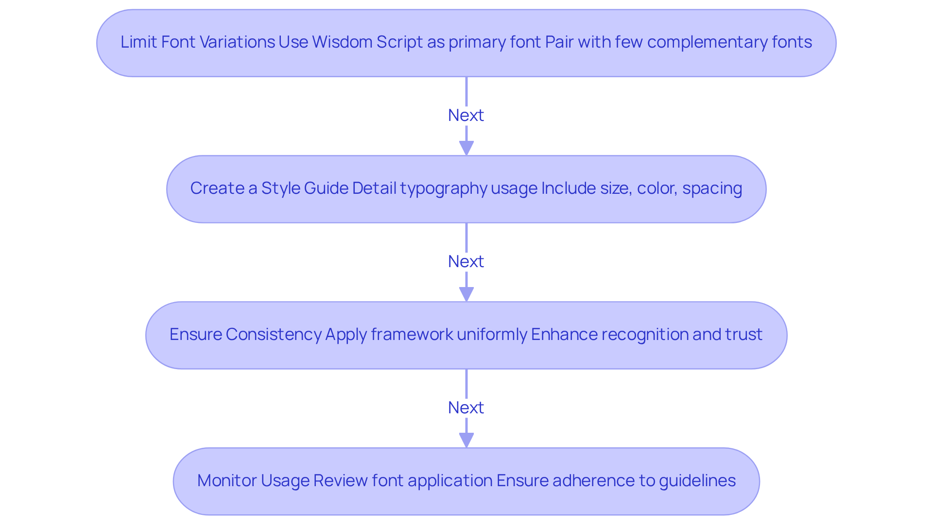
- First, limit font variations. By using the font Wisdom Script as your primary font and pairing it with just a few complementary fonts, you can avoid visual clutter and ensure clarity. Think of this guide as your friendly companion, helping you keep your brand consistent across all platforms.
- Next, create a style guide. This comprehensive manual should detail how to use your unique typography, including specifications for size, color, and spacing. It’s a valuable reference that can help you maintain uniformity and strengthen your brand identity.
- Consistency is key. Make sure the framework is applied uniformly across all marketing materials, whether digital or print. When your typography is consistent, it not only enhances recognition but also builds trust with your audience. Many founders worry that mixed messages can confuse their audience, and they’re right to be concerned. Studies show that uniform presentation can increase revenue by 10-33%.
- Lastly, monitor usage regularly. By reviewing how the font Wisdom Script is applied in various contexts, you can ensure adherence to your guidelines. This proactive approach helps maintain integrity and prevents inconsistencies that could confuse your audience. When you embrace these practices, you’re not just enhancing your brand; you’re building lasting connections with your audience. Effective typography plays a crucial role in creating unforgettable experiences, as 94% of first impressions are design-related. Consistent use of typography not only enhances recognition but also contributes to your brand's overall success in a competitive market.
Implement Technical Best Practices for Wisdom Script in Digital Platforms
Have you ever felt overwhelmed by the technical demands of ensuring your digital designs truly resonate with users? It’s a common struggle for many designers, and it can feel daunting to navigate the best practices that enhance user experience.
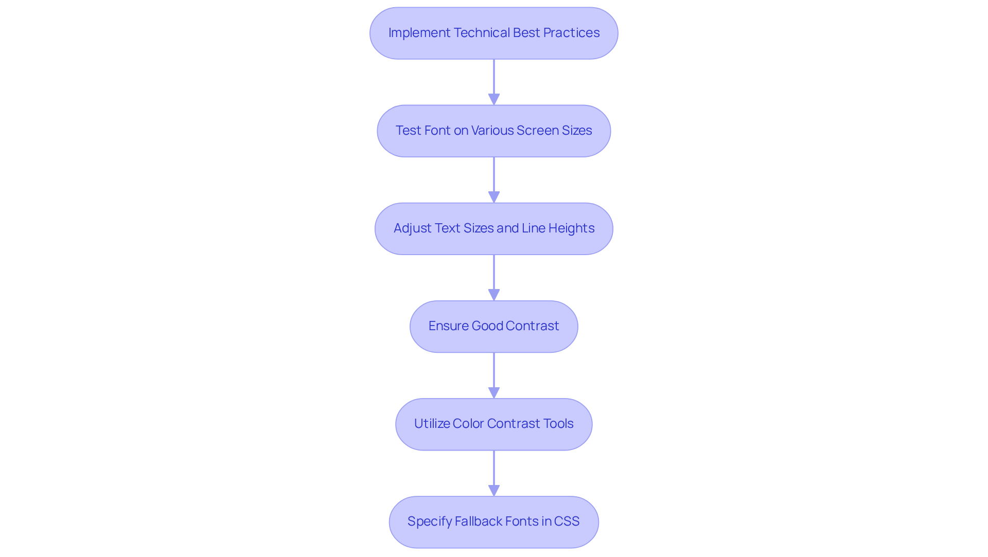
Imagine your users struggling to read your content on their devices; testing the font wisdom script on various screen sizes can help ensure they have a smooth experience. Adjusting text sizes and line heights, especially for mobile devices, is crucial for maintaining clarity. Remember, a seamless experience can make all the difference in keeping users engaged.
Think about how frustrating it can be for users to read text that blends into the background; ensuring good contrast can significantly enhance readability. Utilizing tools to assess color contrast ratios is a simple yet effective way to prioritize accessibility. As Jakob Nielsen emphasizes, usability is essential for retaining users, and good design should always prioritize clarity.
It’s always a good idea to think ahead; specifying fallback fonts in your CSS can keep your text readable, even if the font wisdom script doesn’t load as expected. This practice not only mitigates potential disruptions in user experience but also aligns with best practices for maintaining a cohesive design.
By prioritizing these best practices, you not only enhance user experience but also foster a deeper connection with your audience, paving the way for lasting success.
Conclusion
Have you ever felt that your brand's voice isn't quite coming through in your design choices? The Wisdom Script font isn’t just a typeface; it’s a way to elevate your brand’s identity and invite your audience in. Many designers struggle to find a font that not only looks good but also resonates with their audience. When you understand the unique characteristics of the Wisdom Script font, you can create digital experiences that truly connect with your users.
These practices ensure clarity and consistency, helping you build stronger relationships with your audience. When your brand maintains clarity, it makes your audience feel valued and recognized. Thoughtfully incorporating the Wisdom Script font can truly transform the way your brand communicates with its audience.
As the digital world evolves, using typography effectively will be key to creating memorable connections with your audience. Embracing the right typography can be the difference between being heard and being overlooked in a crowded digital space.
Frequently Asked Questions
What is Wisdom Script font and who created it?
Wisdom Script is a meticulously crafted typeface created by James T. Edmonton. It captures elegance and personality, making it a favorite among designers.
What are the key characteristics of Wisdom Script font?
The key characteristics of Wisdom Script include its legibility, versatility, and handwritten style. It ensures clarity in messaging, adapts well to both digital and print formats, and evokes a personal touch.
How does the legibility of Wisdom Script impact design?
The legibility of Wisdom Script ensures that messages shine through, particularly at larger sizes, allowing audiences to engage with content effortlessly. Research indicates that typeface choices can enhance positive consumer responses by up to 13%.
In what contexts can Wisdom Script be used effectively?
Wisdom Script is versatile and can be used effectively in both digital and print formats, making it suitable for various applications, especially for tech startups looking to establish a strong market presence.
Why is the handwritten style of Wisdom Script significant?
The handwritten style of Wisdom Script evokes a personal touch, making it ideal for projects aimed at fostering emotional connections with audiences. Typography plays a crucial role in shaping customer perceptions.
What should designers be cautious about when using Wisdom Script?
Designers should be cautious about excessive use of script and display typefaces, as it can diminish clarity and professionalism. It's important to apply Wisdom Script judiciously to preserve its intended effect.
How can choosing the right typeface, like Wisdom Script, impact brand perception?
Choosing the right typeface can enhance brand perception and foster deeper connections with audiences. It can transform a brand's identity and create lasting impressions.
How can case studies of RNO1 illustrate the effectiveness of typography in branding?
Incorporating successful case studies of RNO1 in branding can provide practical insights for designers, showcasing how effective typography, including fonts like Wisdom Script, contributes to creating radical digital experiences.
List of Sources
- Understand the Characteristics of Wisdom Script Font
- How Typeface and Fonts Affect Your Customers’ Perception of Your Brand - etereo (https://etereomedia.com/how-typeface-and-fonts-affect-your-customers-perception-of-your-brand)
- How Font Styles Influence Brand Perception (https://logodesign.net/blog/impact-of-font-styles-on-brand-perception)
- The Impact of Typography on Brand Perception — Riley Yahr Creative Studio (https://rileyyahr.com/blog/typography)
- The Psychology of Font Choice and Brand Personality | Hennes Communications (https://crisiscommunications.com/the-psychology-of-font-choice-and-brand-personality)
- Best Fonts for Motivational Quotes That Stand Out (https://nihstudio.com/motivational-quotes-fonts)
- Apply Wisdom Script in Diverse Digital Design Contexts
- 30+ Branding Statistics That Reveal the Trends Shaping 2026 (https://arounda.agency/blog/branding-statistics)
- 85+ Branding Statistics for 2025: Top Insights and Trends (https://learn.g2.com/branding-statistics)
- The truth about script fonts and personal brands | Priscilla Pomaa Duah (https://linkedin.com/posts/priscillapomaaduah_personalbranding-typography-brandidentity-activity-7385231345691815936-bXMe)
- Script fonts: When and how to use them in branding.
Script fonts mimic handwriting styles, varying from elegant calligraphy to casual brush lettering.
They evoke feelings of: → warmth →… | Sara Khan | 34 comments (https://linkedin.com/posts/sarakhan20_script-fonts-when-and-how-to-use-them-in-activity-7257270048510148609-T7N3)
- Font Statistics (Key Trends and Insights 2024) (https://tonerbuzz.com/blog/font-statistics?srsltid=AYCX9vJhnIgWvY-REytH3RHE5c3NZhllukSCRA4-S-bybaX57PkNRdYu)
- Ensure Brand Consistency with Wisdom Script Usage
- 20 Stats That Will Remind You of the Importance of Your Branding (https://info.zimmercommunications.com/blog/20-stats-that-will-remind-you-of-the-importance-of-your-branding)
- Brand Consistency Statistics (2026): 52+ Data Points on Revenue, Trust, and AI Visibility (https://omnibound.ai/blog/brand-consistency-statistics)
- The ROI of Branding: Building Brand Value, Backed by Stats (https://fuelforbrands.com/the-roi-of-branding-a-story-of-building-brand-value-backed-by-statistics)
- 26 Fresh Statistics On the Importance of Branding (https://huddlecreative.com/blog/statistics-on-the-importance-of-branding)
- Branding statistics you need to know in 2026 (https://dash.app/blog/branding-statistics)
- Implement Technical Best Practices for Wisdom Script in Digital Platforms
- More than you ever wanted to know about font loading on the web (https://industrialempathy.com/posts/high-performance-web-font-loading)
- Optimizing Web Font Rendering Performance (https://igvita.com/2014/01/31/optimizing-web-font-rendering-performance)
- 30 Eternal Quotes from Design Experts (https://design4users.com/30-eternal-quotes-from-design-experts)
- Web performance: Optimising font loading - Fasterize (https://fasterize.com/en/blog/web-performance-optimising-loading)


