

Introduction
Many designers struggle to create interfaces that truly resonate with users, often feeling overwhelmed by the complexity of user needs. As I’ve seen in my own journey, understanding the principles of effective interface design is crucial for connecting with users and fostering meaningful interactions.
In this article, I’ll share best practices that have helped many designers enhance user engagement while prioritizing accessibility and inclusivity, ensuring that every user feels valued.
I often wonder how designers can strike the perfect balance between aesthetics and usability while continuously adapting to user feedback. From my experience, the answers lie in a thoughtful approach to design that embraces both innovation and user-centered principles.
Understand User Needs and Design Principles
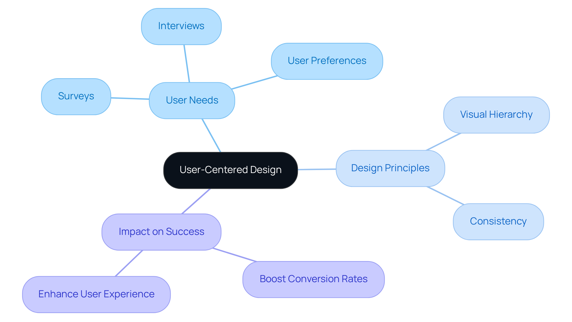
Have you ever felt overwhelmed trying to create an interface that truly resonates with your users? To build effective interfaces, it’s vital to start with a deep understanding of your audience's needs, preferences, and behaviors. When you dive into research-like surveys or interviews-you’ll uncover insights that really matter to your users. Understanding layout principles-like hierarchy and consistency-helps you create an intuitive and user-friendly project that feels familiar to your audience. For instance, a clear visual hierarchy allows for effortless navigation, while consistent elements promote trust among users. By combining insights from real people with established design principles, you can develop interfaces that not only meet expectations but also enhance the overall experience.
Did you know that over half of global website traffic comes from mobile devices? This really shows how crucial it is to design responsive and intuitive mobile interfaces that cater to your users' needs. Moreover, a well-crafted interface can boost conversion rates by as much as 200%, while enhanced UX can achieve rates up to 400%. By prioritizing user-centered design, you’re not just meeting expectations; you’re creating a connection that can transform your startup’s success.
Balance Aesthetics and Usability in Design
Have you ever been drawn to a beautifully designed website, only to feel lost navigating it? Finding the right balance between modern interface design and usability can feel like a daunting task, but it’s essential for connecting with your audience. While an aesthetically pleasing design can attract individuals, modern interface design must also facilitate easy navigation and interaction. Start by emphasizing simplicity; steer clear of clutter and unnecessary components that can divert attention. Use whitespace effectively to create a clean layout that directs attention to key actions. Additionally, ensure that your visual elements, such as buttons and icons, are intuitive and easy to understand. For instance, using familiar icons can help individuals quickly grasp their functions.
It’s interesting to note that people often overlook small usability issues when a design is visually appealing. According to a study, 83% of consumers view an attractive and modern UX experience as essential, emphasizing the considerable impact of aesthetics on perceptions. Investing time in modern interface design to create a harmonious experience that captivates individuals while ensuring functionality is crucial.
Recent trends indicate that by 2026:
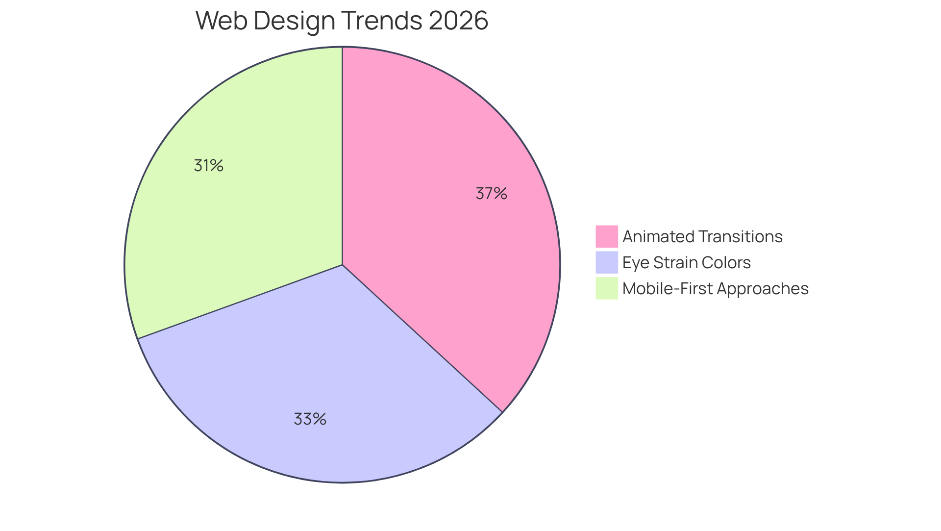
- 70% of websites will utilize animated transitions to enhance engagement, aligning with best practices for balancing aesthetics and usability.
- 58% of websites will prioritize mobile-first approaches, catering to the growing number of individuals accessing sites through mobile devices.
- 62% of websites are anticipated to utilize color schemes that minimize eye strain, indicating a rising awareness of comfort for individuals.
Case studies show that organizations implementing continuous UX testing can experience revenue retention enhancements of up to 10.8% over three years, highlighting the significance of iterative processes.
Here are some friendly tips to help you find that sweet spot between aesthetics and usability:
- Prioritize mobile-first design to cater to the increasing number of users accessing sites via mobile devices.
- Implement intuitive navigation structures that minimize effort and enhance the overall experience.
- Utilize high-quality visuals and interactive elements to engage individuals without overwhelming them.
- Regularly test designs with actual participants to gather feedback and make informed adjustments.
By concentrating on these strategies, designers can create modern interface designs that not only captivate individuals but also deliver a gratifying and effective interaction, ultimately enhancing engagement and conversions. When you blend beauty with functionality, you’re not just creating a website; you’re crafting an experience that resonates with your users and keeps them coming back.
Prioritize Accessibility and Inclusivity
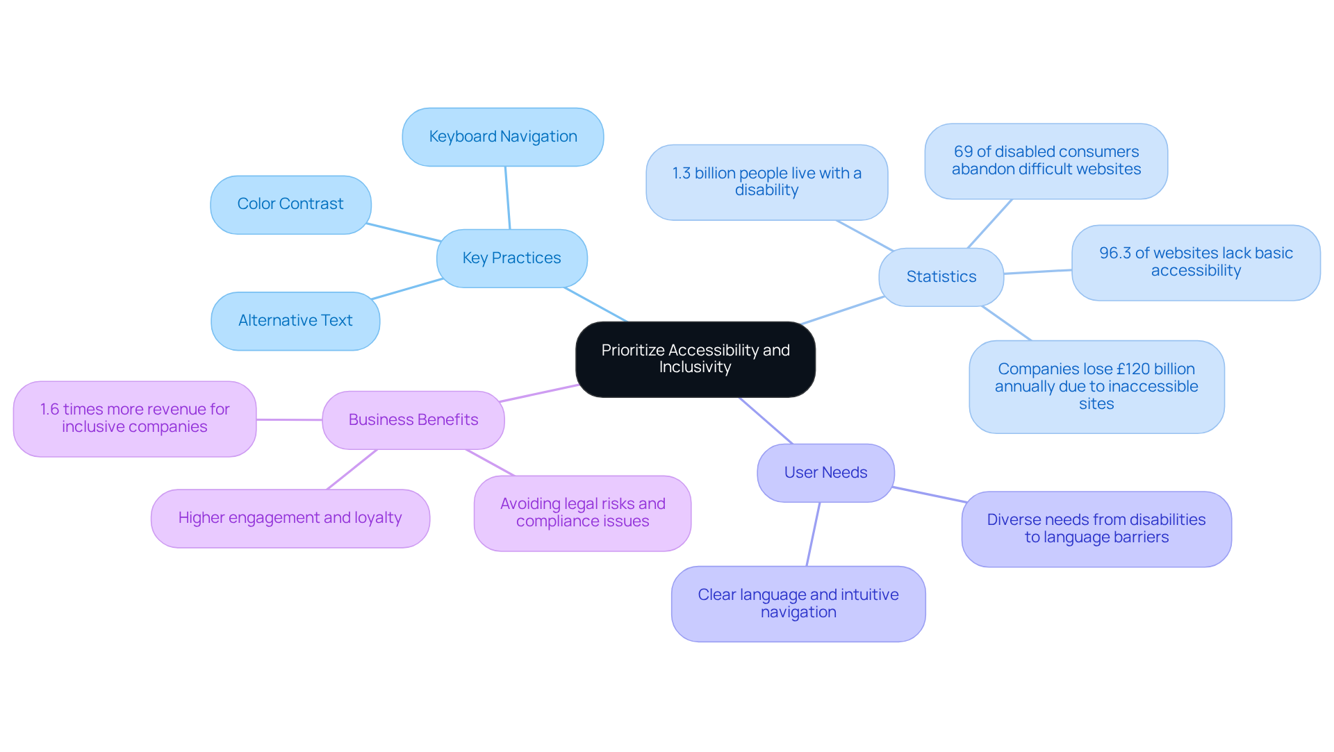
Have you ever felt frustrated trying to access a website that just doesn’t seem to understand your needs? Creating accessible and inclusive experiences isn’t just about following the law; it’s about ensuring everyone feels welcome and valued. Following the Web Content Accessibility Guidelines (WCAG) is crucial; it’s our roadmap to creating digital spaces that everyone can enjoy. Key practices include:
- Ensuring adequate color contrast
- Offering alternative text for images
- Facilitating keyboard navigation
Understanding the diverse needs of users-ranging from those with disabilities to individuals facing language barriers or varying tech-savviness-is essential. For example, using clear language and intuitive navigation can significantly enhance engagement across all demographics.
Did you know that a staggering 96.3% of websites still miss the mark on basic accessibility? This presents a heartfelt opportunity for us to do better. Companies that lead in disability inclusion generate 1.6 times more revenue and 2.6 times more net income than their peers, highlighting the financial benefits of creating accessible digital environments.
Case studies reveal the real-world implications of accessibility. For instance, 69% of disabled online consumers abandon websites they find difficult to use due to their disability, leading to significant revenue losses for businesses. When you make accessibility a priority, you’re not just ticking boxes; you’re crafting a welcoming environment where everyone can feel valued and included. Organizations that invest in accessibility not only comply with regulations but also foster a nurturing atmosphere that drives higher engagement and loyalty. By prioritizing accessibility, RNO1 collaborates with brands to create transformative digital experiences that resonate with all individuals, ultimately enhancing brand loyalty and market presence. By embracing accessibility, you’re not just following the rules; you’re opening doors to a world where everyone can thrive together.
Implement Iterative Design and User Feedback
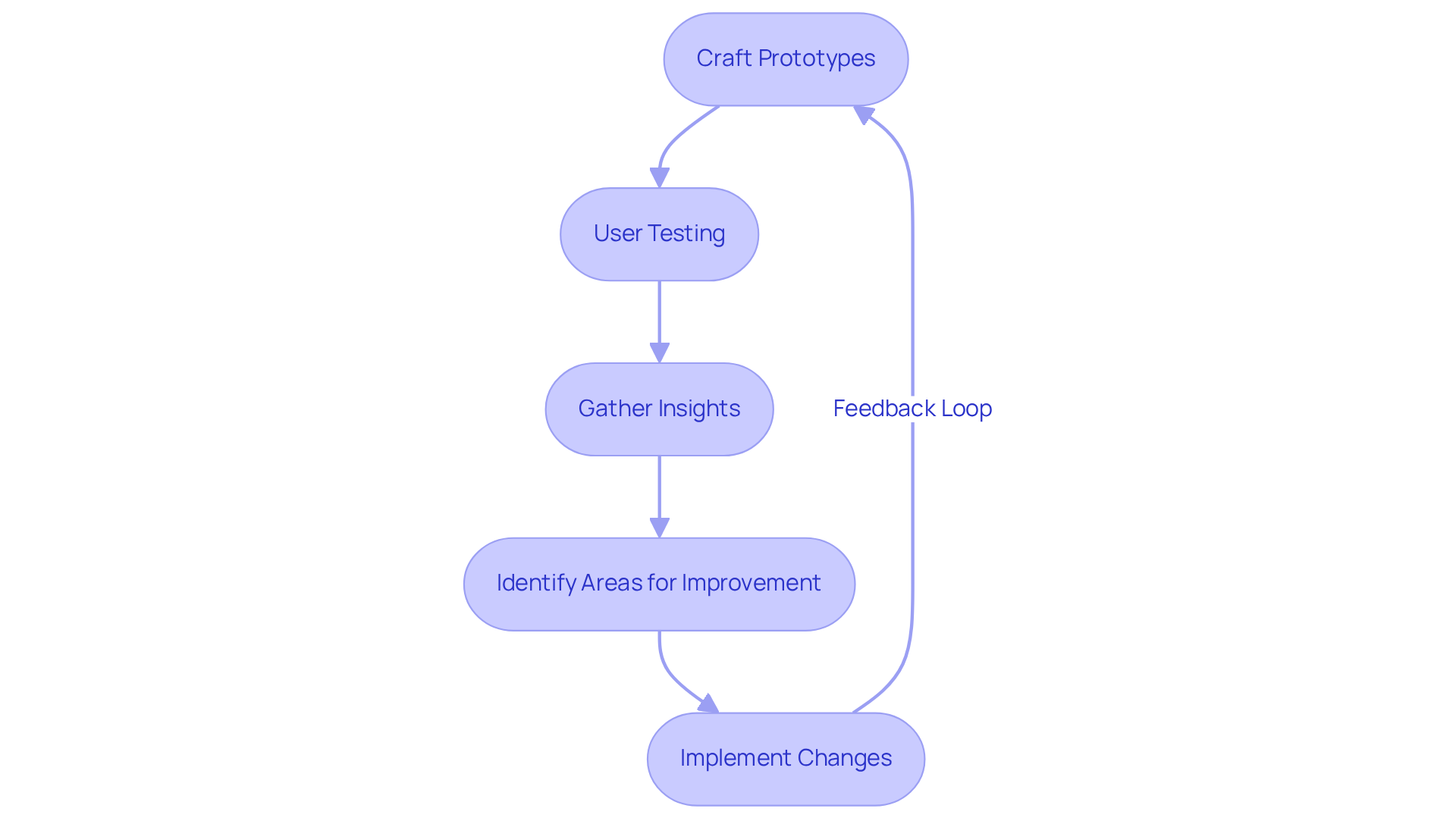
Have you ever felt overwhelmed by the challenge of creating an interface that truly meets user needs? Iterative development can feel daunting, but it’s a powerful way to enhance your product based on real feedback and testing. Start by crafting prototypes and testing them to gather insights on how users interact with your creation. This feedback is essential for pinpointing areas that need improvement, like simplifying navigation or adding helpful tooltips. Establishing a strong feedback loop encourages users to share their experiences regularly, whether through surveys, interviews, or analytics tools that track behavior.
I’ve seen firsthand how iterative approaches can lead to remarkable usability improvements. For instance, one case study revealed that a targeted KPI surged by 233% over six iterations, showcasing the effectiveness of refining concepts based on user feedback. Companies that embrace these practices often experience growth rates that are twice as fast as industry benchmarks.
To make the most of your iterative process, consider using parallel methods. This means generating multiple alternatives at once, allowing you to compare 3-4 versions side by side. Insights from this competitive testing can guide your development choices, ensuring that the final product aligns closely with the needs and preferences of your users.
Engaging participants in testing 2-3 versions is crucial. This approach helps avoid fatigue and provides diverse feedback, which is invaluable for refining your interface. By adopting an iterative method, you can create a product that features modern interface design, evolving to meet user requirements effectively and leading to a more engaging and fulfilling interaction. Imagine the satisfaction of seeing your users thrive as your product evolves to meet their needs, creating a lasting impact in their lives. RNO1 exemplifies this approach through its collaborations, such as with the EOS Network Foundation, where they redefined the digital brand and customer interaction to encourage innovation. By working closely with clients, RNO1 ensures that the design process is not just about aesthetics but about creating meaningful, user-centered experiences that drive success.
Conclusion
Have you ever felt overwhelmed by the challenge of creating interfaces that truly resonate with users? It’s a journey that requires understanding their needs, balancing beauty with usability, and ensuring everyone can access your designs. By focusing on these core principles, designers can craft experiences that not only attract users but also foster lasting connections.
Many designers struggle to balance user needs with aesthetic appeal, often leading to frustration and disengagement. The importance of iterative design processes and integrating user feedback cannot be overstated. By continuously refining designs based on real user interactions, organizations can significantly enhance usability and satisfaction. The statistics presented underscore the tangible benefits of prioritizing accessibility and inclusivity, revealing that businesses that embrace these practices not only comply with regulations but also unlock new revenue opportunities and foster brand loyalty.
Without prioritizing user engagement, brands risk losing their audience and falling behind competitors. Our journey toward effective interface design is about coming together and sparking innovation. By adopting best practices that emphasize user engagement, organizations can create digital experiences that are not only visually appealing but also functional and inclusive. Embracing these principles will elevate the user experience and position brands for success in an increasingly competitive landscape. Engaging with partners like RNO1 can further enhance this journey, ensuring that design efforts are aligned with user needs and market demands, ultimately leading to transformative digital experiences.
Frequently Asked Questions
Why is it important to understand user needs when designing interfaces?
Understanding user needs is crucial because it helps create interfaces that resonate with users, ensuring that their preferences and behaviors are taken into account. This leads to more effective and user-friendly designs.
What methods can be used to gather insights about users?
Insights can be gathered through research methods such as surveys and interviews, which help uncover what truly matters to users.
How do design principles like hierarchy and consistency impact user experience?
Design principles such as visual hierarchy facilitate effortless navigation, while consistency in design elements fosters trust among users, contributing to a more intuitive and user-friendly experience.
What is the significance of mobile interface design?
With over half of global website traffic coming from mobile devices, designing responsive and intuitive mobile interfaces is essential to cater to users' needs effectively.
How can a well-crafted interface affect conversion rates?
A well-crafted interface can boost conversion rates by as much as 200%, while enhanced user experience (UX) can achieve rates up to 400%, highlighting the importance of user-centered design.
What is the overall benefit of prioritizing user-centered design?
Prioritizing user-centered design not only meets user expectations but also creates a meaningful connection that can significantly enhance a startup's success.
List of Sources
- Understand User Needs and Design Principles
- 40+ UX Statistics (from 200,000 hours of UX Research) (https://baymard.com/blog/ux-statistics)
- 14 UX Statistics to Prove that Design Matters (https://eleken.co/blog-posts/14-impressive-ux-statistics-to-prove-the-value-of-great-design)
- Predictive Modeling & AI Decision Support for Healthcare | Intechnic (https://intechnic.com/blog/100-ux-statistics-every-user-experience-professional-needs-to-know)
- 40+ Key UX Stats for 2026 (https://maze.co/blog/ux-statistics)
- 15 UX Statistics You Need to Know | HatchWorks AI (https://hatchworks.com/blog/product-design/user-experience-statistics)
- Balance Aesthetics and Usability in Design
- Effects of Design Aesthetics on the Perceived Value of a Product - PMC (https://pmc.ncbi.nlm.nih.gov/articles/PMC8359925)
- 210 web design statistics: gamification, user experience, and future trends (https://linearity.io/blog/web-design-statistics)
- 15 mind-blowing stats about user experience design (https://blog.adobe.com/en/publish/2020/12/17/mind-blowing-stats-user-experience-design)
- 40+ Key UX Stats for 2026 (https://maze.co/blog/ux-statistics)
- Prioritize Accessibility and Inclusivity
- Important Web Accessibility Statistics to Know in 2026 (https://wearetenet.com/blog/web-accessibility-statistics)
- Leading Accessibility Widget for ADA & WCAG Compliance - Accessibly (https://accessiblyapp.com/blog/web-accessibility-statistics)
- 2026 Web Accessibility Statistics: Compliance, Lawsuits & Trends (https://beaccessible.com/post/web-accessibility-statistics)
- Web Accessibility Statistics (2026): Research & Data from AudioEye (https://audioeye.com/post/accessibility-statistics)
- WebAIM: The WebAIM Million - The 2026 report on the accessibility of the top 1,000,000 home pages (https://webaim.org/projects/million)
- Implement Iterative Design and User Feedback
- Parallel & Iterative Design + Competitive Testing = High Usability (https://nngroup.com/articles/parallel-and-iterative-design)
- 50+ UX Statistics To Convince Stakeholders 2025 (https://uxcam.com/blog/ux-statistics)
- 40+ UX Statistics (from 200,000 hours of UX Research) (https://baymard.com/blog/ux-statistics)
- What Is an Iterative Design Process? A Practical Guide for Product Founders | Gembah (https://gembah.com/blog/iterative-design-process)


