

Introduction
Have you ever felt overwhelmed by the challenge of creating a mobile application that truly connects with users? In today’s world, where expectations for seamless experiences are sky-high, this task can feel daunting. Responsive design is crucial for mobile apps; it shapes how users engage and stay connected with your product. This article explores four best practices that not only enhance usability but also ensure that applications are optimized for a variety of devices and screen sizes. What if you could implement strategies that make your app not just intuitive, but also a joy for users to interact with?
Implement Flexible Layouts and Adaptive Grids
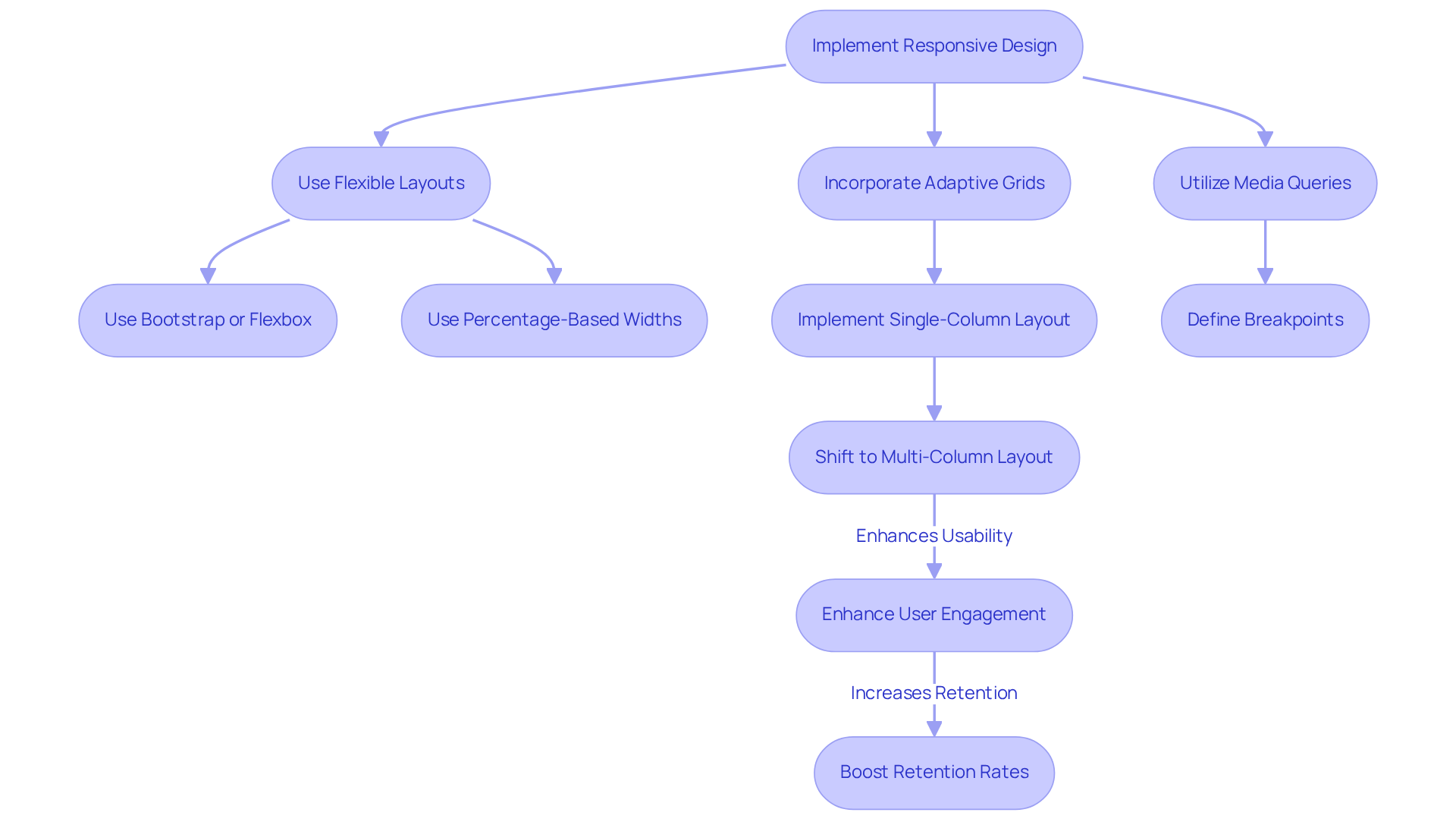
Have you ever felt frustrated when an app doesn’t work well on your device? Creating a mobile application responsive design can help alleviate that frustration. Implementing mobile application responsive design with flexible layouts and adaptive grids is essential to ensure your users have a seamless experience. Using tools like Bootstrap or Flexbox can improve your mobile application responsive design, making your app feel more user-friendly by adjusting smoothly to any screen size. For example, when you use percentage-based widths instead of fixed pixel values, your elements resize proportionally, enhancing usability across devices.
Imagine boosting your user engagement by 20% just by making your app easier to use! Incorporating media queries to define breakpoints is essential for achieving mobile application responsive design, ensuring that your content is optimally displayed on a range of devices, from smartphones to tablets. A practical approach is to implement mobile application responsive design by utilizing a single-column layout for mobile devices that shifts to a multi-column layout for larger screens, greatly enhancing readability and overall experience. This not only enhances engagement but also boosts retention rates, as individuals are more likely to interact with content that is easy to navigate.
And don’t forget about push notifications - they can be a gentle reminder that keeps users coming back! Individuals who choose to receive notifications demonstrate nearly double the retention rates compared to those who do not. By adopting these strategies, you’re not just meeting expectations; you’re building a lasting connection with your users.
Optimize Images and Media for Mobile Performance
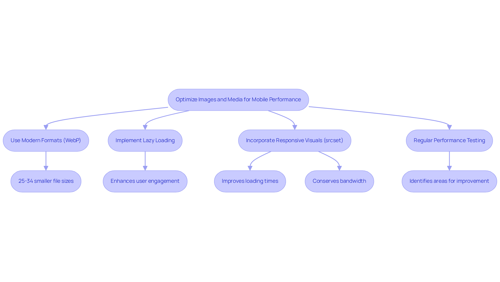
Have you ever felt the frustration of a slow-loading mobile app, watching potential users slip away? Optimizing visuals and media is a key step to avoid this pain. Utilizing modern formats like WebP can significantly enhance loading speeds, as these formats offer superior compression, reducing file sizes by 25-34% compared to JPEGs and around 26% compared to PNGs - without compromising quality. Imagine your users eagerly waiting for your app to load, only to be met with a frustrating delay. By using lazy loading, you can ensure visuals appear just when they’re needed, keeping users engaged and happy. As Michelle Lim observes, 'Lazy loading postpones the loading of visuals and essential elements that are not currently needed on mobile, emphasizing its importance for mobile application responsive design and overall performance.'
Incorporating responsive visuals using the 'srcset' attribute is essential for mobile application responsive design, as it allows the browser to select the appropriate size based on the device's resolution. For example, high-resolution visuals can be provided to tablets and desktops, while smaller versions are sent to smartphones, conserving bandwidth and improving efficiency. Regular performance testing with tools like Google PageSpeed Insights can help identify areas for improvement, ensuring that your app remains competitive in a fast-paced digital landscape.
Case studies demonstrate the effectiveness of these strategies:
- Facebook reported an 80% reduction in PNG file sizes after switching to WebP, leading to faster load times and enhanced satisfaction among its audience.
- Implementing mobile application responsive design to optimize visuals for smartphones can improve Core Web Vitals scores, which are essential for search engine rankings.
- With smartphone subscribers expected to soar to 7.516 billion by 2026, optimizing your visuals isn’t just a smart move; it’s essential for capturing the attention of a vast audience and ensuring your app thrives.
Ensure Touch-Friendly Interactions for Enhanced Usability
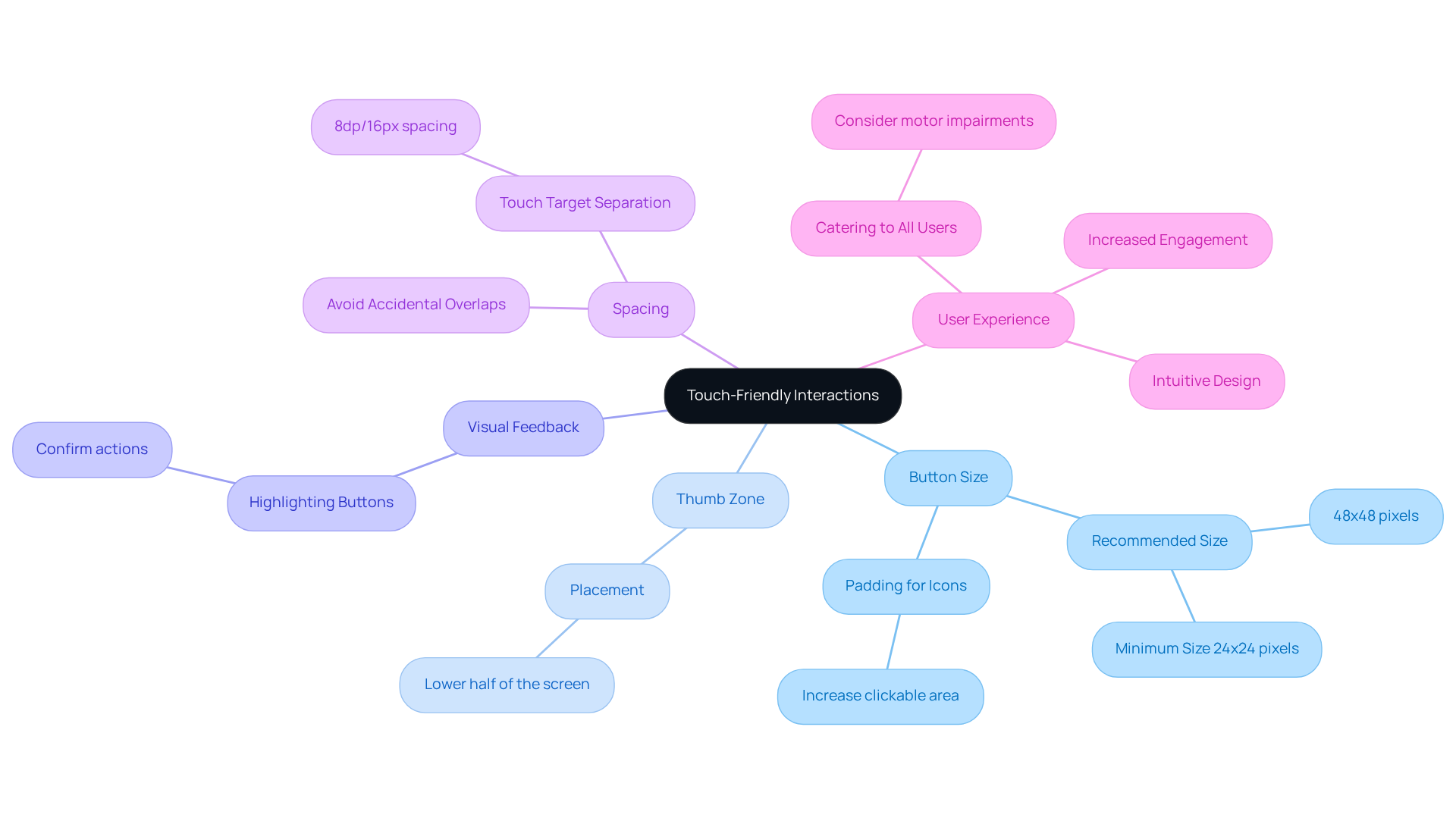
Have you ever felt frustrated trying to tap a tiny button on your phone? To create a user-friendly mobile application responsive design, it is crucial to ensure touch-friendly interactions. It’s important to make buttons and links at least 48x48 pixels, so they’re easy to tap with your finger. Try to place important actions in the 'thumb zone' - the lower half of the screen - so users can easily reach them. Think about how much easier it is to swipe through photos or pinch to zoom; these gestures make navigation feel natural and engaging.
Providing visual feedback, like highlighting buttons when tapped, can really enhance usability by confirming actions taken by users. Research from MIT's Touch Lab shows that for those with motor impairments, tapping small targets can be really challenging, leading to error rates that are 75% higher. That’s why it’s essential to space touch targets apart by at least 8dp/16px to prevent accidental overlaps, improving the overall experience.
When you focus on mobile application responsive design, you’re not just making things easier; you’re demonstrating to users that you care about their experience. Users are more likely to return to an app that feels intuitive and responsive, ultimately driving engagement and loyalty. By embracing touch-friendly design, you’re not just improving usability; you’re creating a welcoming space that users will want to return to time and again.
Support Cross-Platform Compatibility for Wider Reach
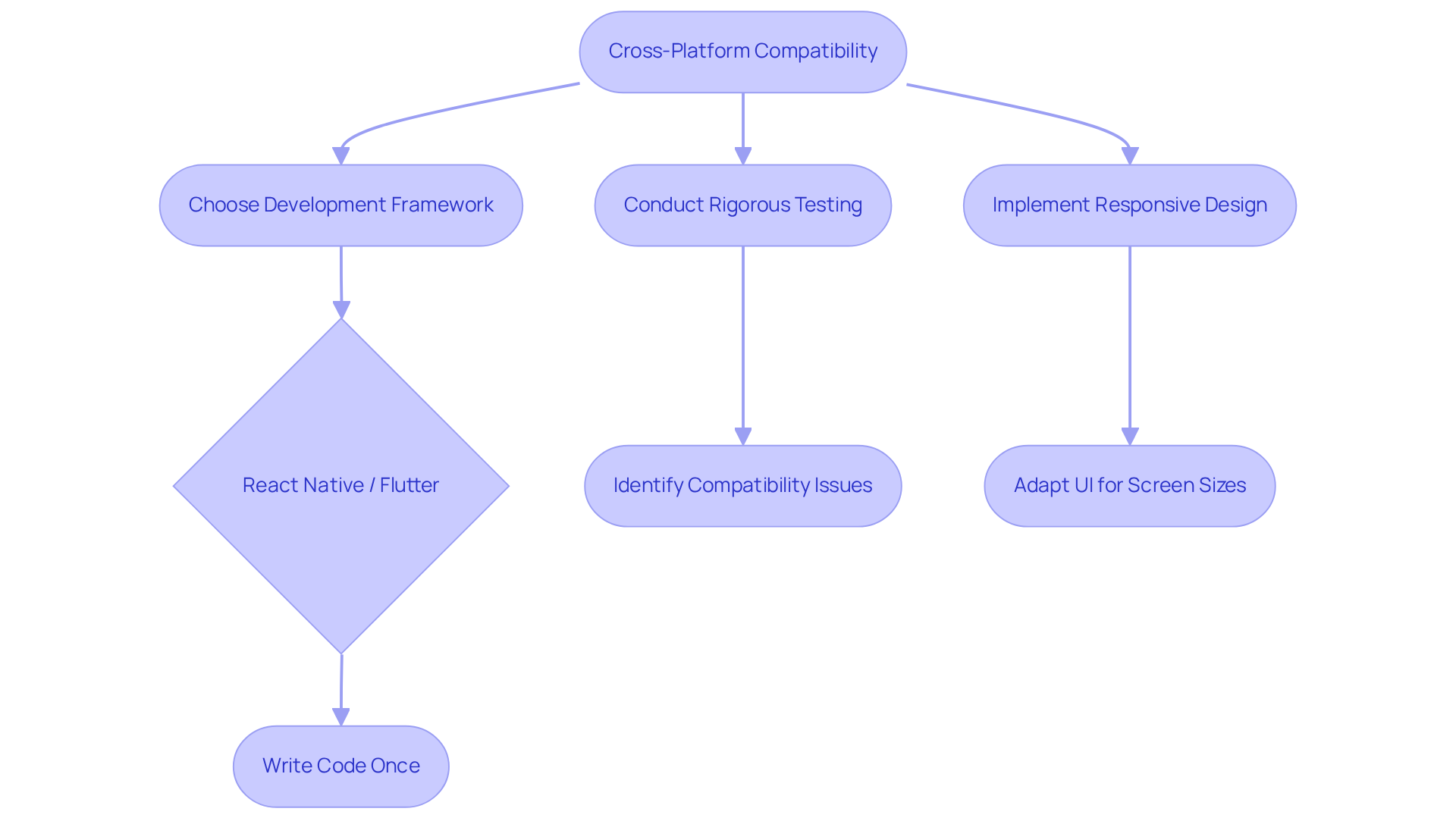
Are you feeling the pressure of making your mobile app accessible to everyone, regardless of their device? Many founders struggle with the daunting task of ensuring their app works seamlessly across different devices, often feeling overwhelmed by the complexities involved. Frameworks like React Native and Flutter can be a game-changer, allowing you to write code once and deploy it across both iOS and Android platforms. This approach can save you precious time and resources, cutting initial build costs significantly while ensuring your users enjoy a seamless experience, no matter their device.
Rigorous testing on multiple platforms is crucial to identify and resolve compatibility issues, ensuring optimal app performance regardless of the operating system. For instance, Discord achieved a remarkable 99% crash-free rate after transitioning to React Native, showcasing the benefits of thorough testing and performance optimization. A startup that launched its app on both platforms at the same time experienced a 30% increase in acquisition compared to a staggered release.
Additionally, implementing responsive design principles allows the user interface to adapt to various screen sizes and orientations, further enhancing usability. By embracing cross-platform development, you not only alleviate these pressures but also open doors to a wider audience, fostering growth and success for your startup. The cross-platform app development framework market is projected to reach US$ 369.2 million by 2032, underscoring the increasing relevance and demand for such solutions in the industry. Imagine the relief of knowing your app can reach users everywhere, paving the way for your startup's success in a competitive market.
Conclusion
Have you ever felt frustrated when an app doesn’t work well on your device? You're not alone. Responsive design is key to creating a great user experience. When you use flexible layouts and optimize media, you’re not just improving your app; you’re making it easier for users to engage and enjoy their experience.
Key strategies include:
- Adaptive grids that adjust seamlessly to various screen sizes
- Optimizing images for faster loading times
- Ensuring touch-friendly design to enhance usability
Embracing cross-platform development frameworks can also help your app reach a broader audience while maintaining high performance across devices. These insights highlight the multifaceted approach required to create a truly responsive mobile application.
In today’s fast-paced digital world, focusing on responsive design can make all the difference for your startup. When you embrace these best practices, you’re not just boosting your app’s performance; you’re creating an experience that users will love. As the demand for mobile applications continues to grow, prioritizing responsive design will help you build a loyal community of users who feel valued and understood.
Frequently Asked Questions
What is mobile application responsive design?
Mobile application responsive design is the practice of creating apps that provide a seamless user experience across various devices by adjusting the layout and content to fit different screen sizes.
Why is it important to implement flexible layouts and adaptive grids in mobile apps?
Implementing flexible layouts and adaptive grids is essential to ensure that users have a smooth experience, as it allows the app to adjust to any screen size, enhancing usability and engagement.
What tools can be used to improve mobile application responsive design?
Tools like Bootstrap and Flexbox can be utilized to enhance mobile application responsive design by allowing for flexible layouts that adapt to different screen sizes.
How can using percentage-based widths improve mobile app usability?
Using percentage-based widths instead of fixed pixel values allows elements to resize proportionally, which enhances usability across devices by ensuring that content is displayed optimally.
What role do media queries play in mobile application responsive design?
Media queries are used to define breakpoints in responsive design, ensuring that content is displayed appropriately on a range of devices, from smartphones to tablets.
What is a practical approach to implementing responsive design for mobile devices?
A practical approach is to use a single-column layout for mobile devices that shifts to a multi-column layout for larger screens, which improves readability and overall user experience.
How can push notifications impact user retention rates?
Push notifications can significantly enhance user retention, as individuals who opt to receive them demonstrate nearly double the retention rates compared to those who do not.
What are the benefits of adopting mobile application responsive design strategies?
Adopting these strategies not only meets user expectations but also builds a lasting connection with users, potentially boosting user engagement and retention rates.
List of Sources
- Implement Flexible Layouts and Adaptive Grids
- Adapt layouts | Mobile | Android Developers (https://developer.android.com/design/ui/mobile/guides/layout-and-content/adapt-layout)
- 7 Mobile Engagement Stats that Show How Push Notifications Boost ROI (https://airship.com/blog/7-mobile-engagement-statistics-that-show-how-push-notifications-boost-roi)
- 13 Must-Read Quotes for Every UI/UX Designer in 2025 | Kamrul Islam Maruf (https://linkedin.com/posts/kamrulmaruf_13-must-read-quotes-for-every-uiux-designer-activity-7313523216407265280-xsUr)
- How Responsive Websites Improve Engagement & Conversions (https://midriffinfosolution.org/how-responsive-websites-improve-user-engagement-and-conversions)
- Deloitte Digital | Digital Creative & Marketing Consultancy (https://deloittedigital.com/us/en/insights/perspective/mobile-app-best-practices.html)
- Optimize Images and Media for Mobile Performance
- Using modern image formats to improve performance - Mario Hernandez (https://mariohernandez.io/blog/using-modern-image-formats-to-improve-performance)
- Pros and Cons of WebP Images: 2026 Update (https://tinify.com/blog/pros-and-cons-of-webp-images-2026-update)
- The Significance And The Advantages of WebP Image Format - ThatWare (https://thatware.co/webp-image-benefits)
- Image Optimization for Mobile Devices Quick Wins (https://scaleflex.com/insights/en/image-optimization-for-mobile)
- (PDF) Web Image Formats: Assessment of Their Real-World-Usage and Performance Across Popular Web Browsers (https://researchgate.net/publication/376169205_Web_Image_Formats_Assessment_of_Their_Real-World-Usage_and_Performance_Across_Popular_Web_Browsers)
- Ensure Touch-Friendly Interactions for Enhanced Usability
- Size matters! Accessibility and Touch Targets (https://medium.com/@zacdicko/size-matters-accessibility-and-touch-targets-56e942adc0cc)
- Accessible tap targets | web.dev (https://web.dev/articles/accessible-tap-targets)
- What Is the WCAG 2.5.8 Target Size Minimum and How Do You Meet It? | TestParty (https://testparty.ai/blog/wcag-target-size-guide)
- Minimum touch target for apps (https://ux.stackexchange.com/questions/147222/minimum-touch-target-for-apps)
- Touch Targets on Touchscreens (https://nngroup.com/articles/touch-target-size)
- Support Cross-Platform Compatibility for Wider Reach
- Cross-Platform App Development Statistics: Trends & Market Growth (https://ripenapps.com/blog/cross-platform-app-development-statistics)
- Cross Platform App Development Framework Market Size & Share, 2032 (https://persistencemarketresearch.com/market-research/cross-platform-app-development-framework-market.asp)
- Cross platform mobile development in 2026: 5 frameworks compared honestly (https://drizz.dev/post/cross-platform-mobile-development)
- 70+ Mobile App Development Statistics: Market Intelligence for Product Leaders, Founders, and Growth Teams (https://designrush.com/agency/mobile-app-design-development/trends/app-development-statistics)
- Mobile App Statistics, Latest Trends & Insights for 2026 (https://itransition.com/services/application/development/mobile/statistics)


