

Introduction
In today’s digital world, creating user experiences that truly captivate and engage is more important than ever. We all know how a first impression can make or break a brand, and it’s a challenge that many face. Understanding user needs through thoughtful research, applying effective visual design principles, and embracing iterative processes can feel overwhelming. It’s easy to get lost in the myriad of methods available, leaving designers wondering: how can we not just meet, but exceed user expectations?
This article explores the best practices that empower creators like you to craft beautifully designed user experiences. We’ll delve into techniques that elevate your projects and foster lasting connections with your audience. By sharing insights and experiences, we hope to create a supportive space where you can feel inspired and equipped to tackle these challenges head-on. Let’s embark on this journey together, exploring how to transform ordinary interactions into extraordinary ones.
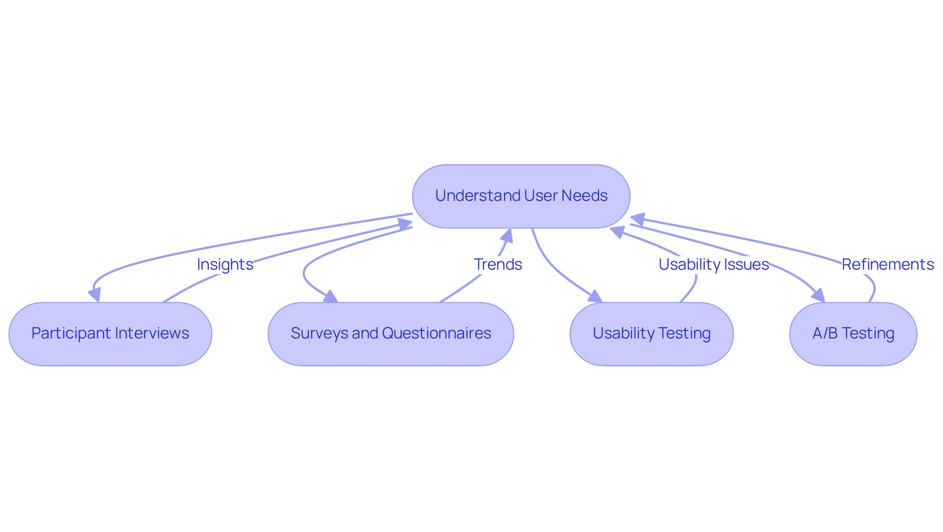
Understand User Needs Through Research
Creating interactions that truly resonate with users starts with understanding their needs. Many tech startup founders face the challenge of grasping what their clients really want. This lack of insight can lead to frustrating experiences for users, which is something we all want to avoid. Did you know that user feedback is essential for product development? This statistic highlights just how crucial it is to see things from the customer’s perspective. Furthermore, as we look ahead, user-centered design is showing a growing commitment to improving experiences.
So, how can we bridge this gap? Here are some effective methods:
- Participant Interviews: Engaging in one-on-one conversations allows you to uncover user needs, motivations, and pain points. This approach not only uncovers valuable information but also fosters a connection with your audience.
- Surveys and Questionnaires: By utilizing online surveys, you can reach a larger audience and collect quantitative data. This helps identify trends and common challenges, giving you a broader understanding of your users’ experiences.
- Usability Testing: Watching users interact with your product can reveal issues that might not be apparent otherwise. Research shows that usability improvements can significantly enhance user satisfaction, which emphasizes the importance of user feedback. Remember, businesses can lose up to 35% of sales due to poor user experiences, translating to a staggering $1.4 trillion in lost revenue.
- A/B Testing: This method allows you to compare different layout variations to see which one resonates more with your audience. It’s an iterative process that helps refine designs based on real interactions.
By embracing these techniques, you can gather essential insights that guide your decisions, ensuring that the final product is beautifully designed to exceed expectations. Together, let’s create experiences that truly connect with users.
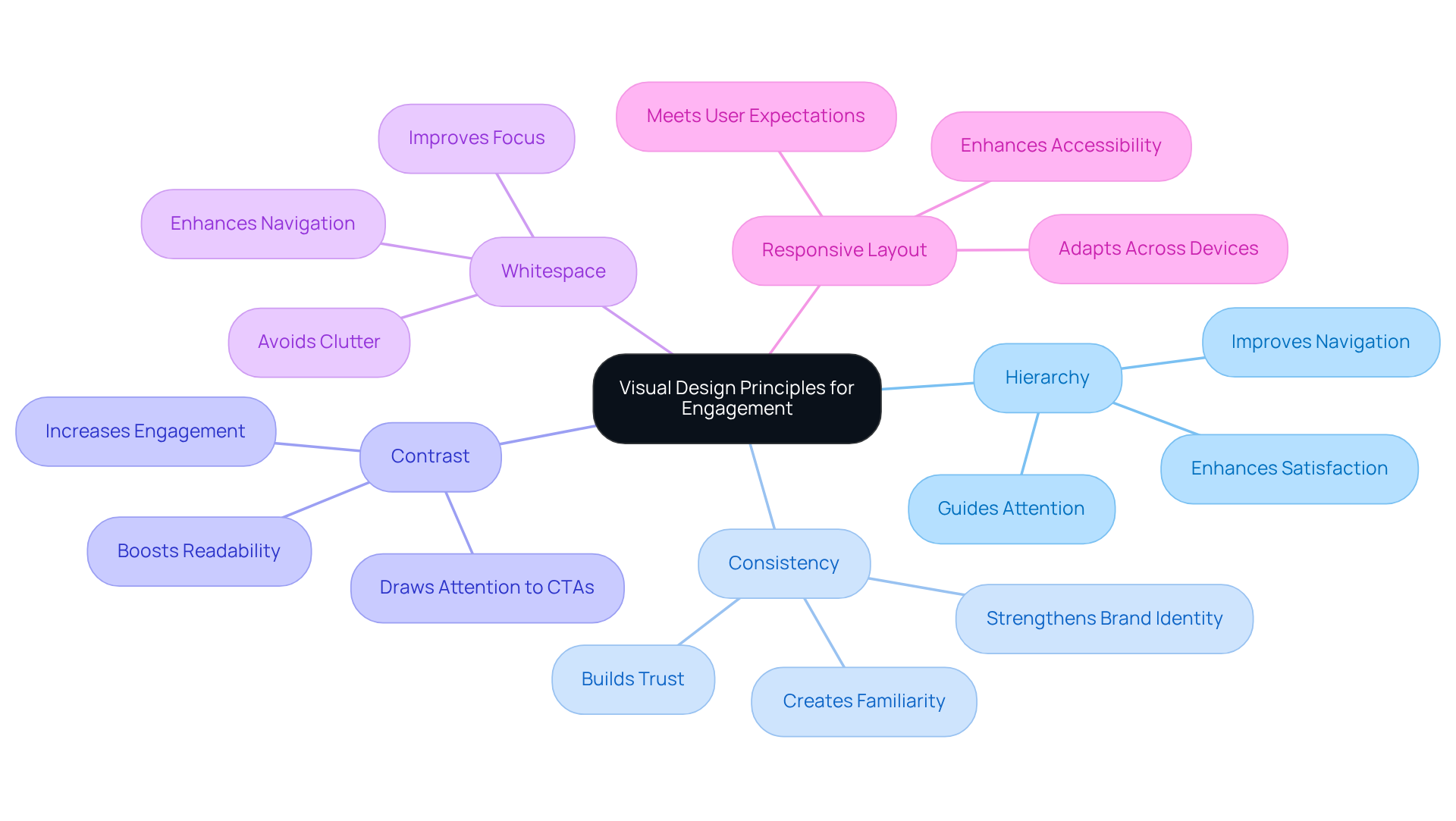
Apply Visual Design Principles for Engagement
plays a vital role in enhancing user experience, and it’s something we all can relate to. Have you ever landed on a website that felt overwhelming or confusing? It’s frustrating, isn’t it? This is where the principles of visual design come into play, and understanding them can truly make a difference.
- Hierarchy is one of the first things to consider. Establishing a clear hierarchy helps guide attention where it’s needed most. By adjusting size, color, and placement, designers can signal the importance of different elements on the page. Research shows that a well-structured hierarchy can significantly improve navigation and overall satisfaction. Imagine how much easier it would be for your audience to find what they’re looking for!
- Then there’s consistency. Maintaining uniform design elements across your interface creates a cohesive experience. Think about it: when color schemes, typography, and button designs are consistent, it strengthens your brand identity and makes users feel more at home. It’s all about familiarity and trust.
- Contrast is another essential principle. Using contrast effectively makes important elements pop. High contrast not only boosts readability but also draws attention to key information, which can lead to increased engagement and conversion rates. Studies suggest that well-contrasted elements can enhance engagement by up to 200%. Just imagine the impact that could have on your business!
- Let’s not forget about whitespace. Strategically incorporating whitespace is crucial to avoid clutter and improve focus. When there’s enough space between elements, it not only enhances the overall look but also makes navigation more intuitive. It’s about creating a pleasant experience for your users.
- Lastly, consider the adaptive layout. In today’s world, ensuring your layout adapts seamlessly across devices is critical. An adaptive layout enhances accessibility and functionality, catering to the 85% of users who expect mobile sites to perform just as well as, if not better than, their desktop counterparts. With mobile devices generating 54.5% of global website traffic in 2021, prioritizing mobile optimization is essential.
By embracing these principles, you can create beautifully designed interfaces that are not only visually appealing but also foster meaningful interactions and satisfaction. Investing in user experience is not just a good idea; it’s financially smart. The Nielsen Norman Group found that allocating about 10% of your development budget to UX can lead to an 83% increase in conversions. Plus, 81% of clients are willing to pay more for a better experience. It’s a clear reminder of how important effective visual presentation is.
And remember, 32% of users would stop engaging with a brand they love after just one negative experience. This highlights the importance of maintaining quality design. Let’s work together to ensure your audience feels valued and engaged every step of the way.
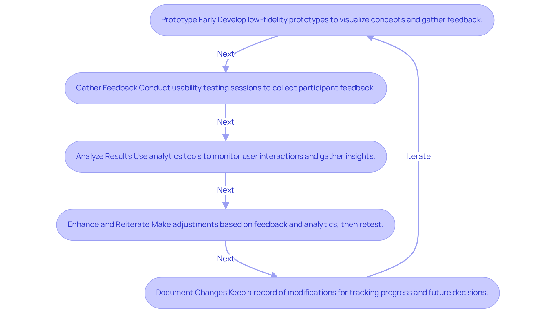
Embrace Iterative Design for Continuous Improvement
can feel overwhelming, can’t it? It’s a dynamic process that involves design principles. Many founders struggle with this, feeling the pressure to get it right the first time. But there’s hope! Here are some best practices to help you embrace this journey:
- Prototype Early: Start by developing low-fidelity prototypes. This allows you to quickly visualize your ideas and gather feedback early on. It’s a chance to make changes before you invest too much time in high-fidelity designs.
- Gather Feedback: After each iteration, hold a session to collect feedback from participants. This input is invaluable for identifying areas that need improvement. As Jared Spool wisely said, "It’s only when it’s done poorly that we notice it." Let’s strive for that invisibility!
- Analyze Results: Use analytics with your product. This data can reveal insights that guide your decisions and highlight areas for enhancement. For instance, Duolingo’s gamification approach led to a remarkable 40% increase in seven-day retention for new learners. It’s a testament to how effective design development can boost engagement.
- Enhance and Reiterate: With the feedback and analytics in hand, make the necessary adjustments to your layout. Repeating the testing process ensures that your changes positively impact user interaction. It’s all about refining and improving together.
- Document Changes: Keep a record of the modifications made during each iteration. This documentation helps you track progress and informs future development decisions. It’s like having a roadmap for your journey.
By embracing an iterative approach, you can create products that evolve continuously, leading to better user experiences. Remember, companies that prioritize aesthetics often see significant benefits. In fact, 84% of businesses that enhance their design report positive outcomes. This methodology not only improves user satisfaction but also aligns your creative goals with business objectives, giving you a competitive edge in the market.
Let’s support each other in this journey of growth and development!
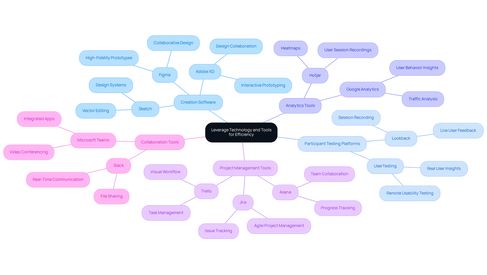
Leverage Technology and Tools for Efficiency
Creating a successful design process can often feel overwhelming, especially when teams struggle with collaboration and the ever-looming threat of scope creep. It’s a challenge many face, and it can lead to frustration and missed opportunities. But there’s hope! By embracing technology, you can streamline your creation process and foster a collaborative environment that nurtures creativity.
Creation Software: Consider tools like Figma, Sketch, and Adobe XD. These platforms are not just about producing high-fidelity layouts and prototypes; they also focus on features that bring your team together. These beautifully designed tools, featuring collaborative elements that allow multiple members to work simultaneously, enhance creativity and efficiency - key elements for successful projects.
Participant Testing Platforms: Platforms such as UserTesting and Lookback are invaluable for conducting user research. They empower designers to gather insights from real participants, which can significantly improve the quality of designs. By aligning your products more closely with consumer needs, you can avoid the pitfalls of scope creep. Early feedback ensures that your layout meets expectations right from the start, as shown by case studies that highlight increased engagement and satisfaction.
Analytics Tools: Google Analytics and Hotjar provide essential insights into user behavior. Understanding how individuals interact with your products allows designers to pinpoint areas for improvement. This data, beautifully designed, not only enhances user experience but also helps RNO1 continuously refine its creations, steering clear of unnecessary project expansions.
Project Management Tools: Tools like Trello, Asana, or Jira are crucial for managing tasks and tracking progress. They help ensure that everyone is aligned on project goals, which is vital in fast-paced environments. Effective project management, when beautifully designed, keeps the momentum going and helps meet deadlines, ultimately preventing scope creep through clear communication and collaboration.
Collaboration Tools: Platforms such as Slack and Microsoft Teams make it easier for team members to share ideas and feedback in real-time. This partnership is essential for fostering innovation and ensuring that every voice is heard in the development process, reflecting RNO1's commitment to teamwork.
By leveraging these technologies and tools, design teams can not only enhance their efficiency but also create superior products that truly resonate with their target audiences. Remember, you’re not alone in this journey - embracing the right tools can make all the difference.
Conclusion
Creating beautifully designed user experiences is more than just a goal; it’s a necessity. Many startups struggle to truly understand their users, leading to designs that miss the mark. This disconnect can leave users feeling frustrated and disengaged, which is the last thing any founder wants.
Imagine pouring your heart into a product, only to find that users don’t connect with it. It’s disheartening, isn’t it? But there’s hope. By prioritizing research and truly listening to user needs through interviews, surveys, and usability testing, you can align your products with what users genuinely expect. This isn’t just about aesthetics; it’s about creating meaningful interactions that resonate deeply with your audience.
Visual design principles like hierarchy, consistency, contrast, and whitespace play a crucial role in enhancing user engagement. When these elements come together, they create an inviting atmosphere that encourages users to explore and interact. And let’s not forget the power of an iterative design process. By embracing feedback and analytics, you can continuously improve your offerings, ensuring they evolve alongside your users’ needs.
In today’s competitive landscape, the importance of user experience cannot be overstated. As more companies recognize the value of investing in user-centered design, adopting these best practices will not only set you apart but also pave the way for long-term success. Prioritizing user needs and design quality isn’t just a trend; it’s a fundamental approach that fosters stronger connections with your audience.
So, let’s embrace these insights together. By focusing on creating user experiences that are not only beautiful but also impactful, you can build lasting relationships with your users. Remember, you’re not alone in this journey. We’re here to support you every step of the way.
Frequently Asked Questions
Why is understanding user needs important for tech startups?
Understanding user needs is crucial for tech startups because it helps avoid frustrating experiences for users. A lack of insight into what clients really want can lead to negative experiences, with 88% of online consumers less likely to return to a site after such an experience.
What percentage of companies are planning to hire UX positions by 2025?
By 2025, 70% of companies are planning to hire at least one UX position, indicating a growing commitment to user-centered design principles.
What are some effective methods to understand user needs?
Effective methods include participant interviews, surveys and questionnaires, usability testing, and A/B testing.
How do participant interviews help in understanding user needs?
Participant interviews involve one-on-one conversations that gather deep insights into users’ behaviors, motivations, and pain points while fostering a connection with the audience.
What is the benefit of using surveys and questionnaires?
Surveys and questionnaires allow you to reach a larger audience and collect quantitative data, helping identify trends and common challenges in users’ experiences.
Why is usability testing important?
Usability testing is important because it reveals usability issues that may not be apparent otherwise. Research indicates that 70% of online businesses fail due to poor usability, and bad UX can lead to a loss of up to 35% of sales.
What is A/B testing and how does it help?
A/B testing is a method that compares different layout variations to determine which one resonates more with the audience. It is an iterative process that refines user experiences based on real interactions.
What can businesses lose due to poor user experience (UX)?
Businesses can lose up to 35% of sales due to bad UX, which translates to an estimated $1.4 trillion in lost revenue.
List of Sources
- Understand User Needs Through Research
- blog.uxtweak.com (https://blog.uxtweak.com/ux-quotes)
- 70+ Memorable UX Research Quotes to Inspire Your Team (https://userinterviews.com/blog/user-research-and-ux-quotes-to-inspire-you-your-team)
- vwo.com (https://vwo.com/blog/usability-testing-statistics)
- userguiding.com (https://userguiding.com/blog/ux-statistics-trends)
- userinterviews.com (https://userinterviews.com/state-of-user-research-report)
- Apply Visual Design Principles for Engagement
- 120 Design Statistics: Design Principles, Technological Trends, and Sustainable Design (https://linearity.io/blog/design-statistics)
- 14 UX Statistics to Prove that Design Matters (https://eleken.co/blog-posts/14-impressive-ux-statistics-to-prove-the-value-of-great-design)
- 70+ Key Web Design Statistics for 2026 | VWO (https://vwo.com/blog/web-design-statistics)
- interaction-design.org (https://interaction-design.org/literature/article/ux-quotes?srsltid=AfmBOopmvsaTr4lxWA_QrENrj3-vRkrT5kX1jQU7mdaMb48yZBk3FTzP)
- userguiding.com (https://userguiding.com/blog/ux-statistics-trends)
- Embrace Iterative Design for Continuous Improvement
- 40+ Product Design Statistics: UX Metrics, ROI Benchmarks & Data for 2026 (https://designrush.com/agency/product-design/trends/product-design-statistics)
- nngroup.com (https://nngroup.com/articles/iterative-design)
- userlytics.com (https://userlytics.com/ux-quotes)
- blog.uxtweak.com (https://blog.uxtweak.com/ux-quotes)
- interaction-design.org (https://interaction-design.org/literature/article/ux-quotes?srsltid=AfmBOop2tlHttrRFTc4BAvYXguWhCIN4vE5uonu9kc9XC1CRKbTsKJGK)
- Leverage Technology and Tools for Efficiency
- mindinventory.com (https://mindinventory.com/blog/ui-ux-design-statistics)
- 50+ UX Statistics To Convince Stakeholders 2025 (https://uxcam.com/blog/ux-statistics)
- 40+ Key UX Stats for 2026 (https://maze.co/blog/ux-statistics)
- userguiding.com (https://userguiding.com/blog/ux-statistics-trends)
- 70+ Key Web Design Statistics for 2026 | VWO (https://vwo.com/blog/web-design-statistics)


