

Introduction
Have you ever felt overwhelmed by the choices in web design, especially when it comes to colors? Understanding the role of primary colors - red, blue, and yellow - in web design is crucial for creating digital experiences that truly connect with users. These colors are more than just basic hues; they form the foundation of color theory, influencing emotions and interactions in profound ways. By mastering these colors, you can craft visually appealing websites that resonate with your audience and enhance your brand identity.
Let’s explore how you can thoughtfully combine these colors to create a web presence that truly resonates with your audience. This guide delves into the significance of primary colors, offering insights and strategies to elevate your web design through careful color selection and application.
Define Primary Colors and Their Importance in Web Design
Have you ever felt overwhelmed by the choices of colors in web design? It’s a common struggle for many designers. In web design, which color is considered a primary color? The primary hues - red, blue, and yellow - are more than just colors; they’re the foundation of color theory. Understanding these hues is crucial because they help create a harmonious palette that can evoke emotions, enhance usability, and strengthen your brand identity.
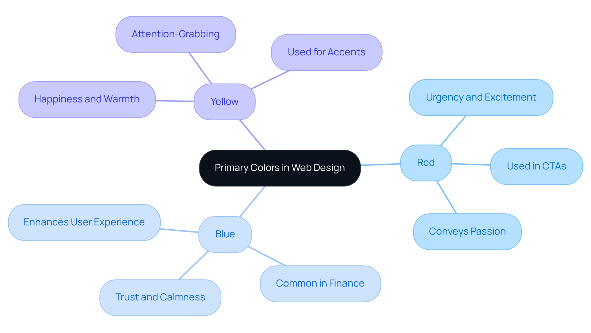
For instance, think about how red can convey urgency and excitement, while blue often represents trust and calmness. Yellow, on the other hand, can bring about feelings of happiness and warmth. When designers truly understand in web design, which color is considered a primary color, they can craft web experiences that not only look beautiful but also resonate deeply with their audience, fostering genuine engagement.
So, if you’re feeling uncertain about your color choices, remember that mastering these foundational colors can be the key to unlocking a more engaging and effective web presence that truly connects with your audience.
Identify the Primary Colors: Red, Blue, and Yellow
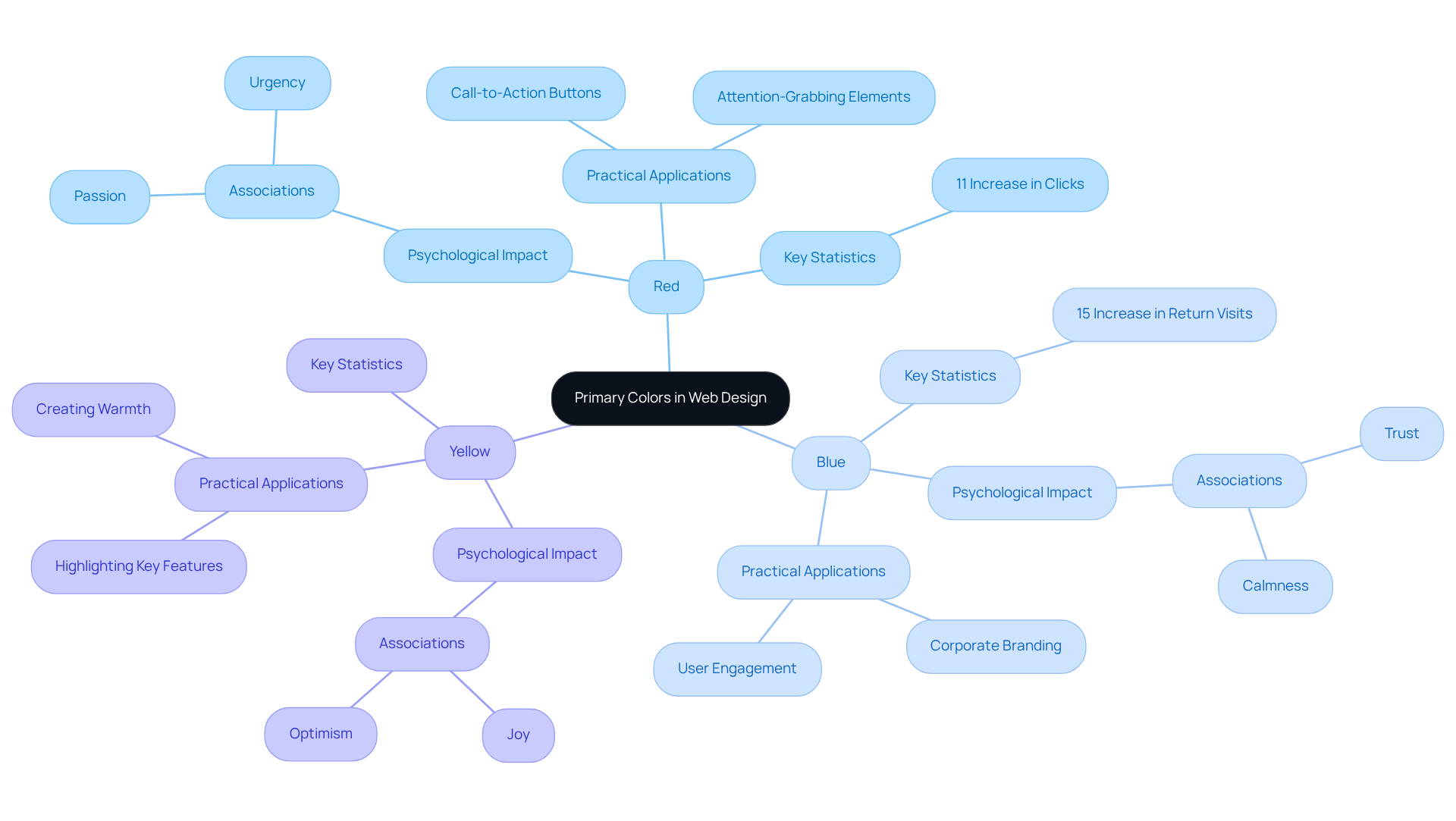
Have you ever felt overwhelmed by the choices of colors when designing your website? It’s a common struggle for many startup founders. The vibrant color red, for instance, is often linked to passion and urgency. It can draw attention to critical elements like call-to-action buttons. Imagine the rush of excitement you feel when you see a vibrant red button calling you to take action. That’s the power of color! However, it’s important to use red thoughtfully; too much can overwhelm and even evoke negative feelings. It’s disheartening to think that nearly 40% of visitors might leave your site simply because it doesn’t feel inviting. A case study by Maxymiser revealed an 11% rise in clicks to checkout areas simply by testing variations of red in aesthetics, showcasing its potential when applied thoughtfully.
Now, let’s talk about blue. This color is widely recognized for its associations with trust and professionalism. It creates a calming atmosphere that can make users feel secure. Think about it: people are 15% more likely to return to a blue-themed store compared to an orange-themed one. This statistic highlights how blue fosters customer loyalty and engagement, making it a staple in corporate branding.
Then there’s yellow, a color that radiates joy and hope. It can enhance your design and evoke feelings of happiness. When used as an accent, yellow effectively highlights key features or messages. But, just like with red, moderation is key; too much yellow can lead to eye strain. When utilized strategically, yellow can attract attention and inspire warmth, making it a valuable asset in web development.
By understanding the psychological impacts of these primary hues, you can make informed choices that enhance user experience and drive engagement, especially when considering in web design, which color is considered a primary color? Remember, with 93% of consumers emphasizing visual elements when purchasing, the right hue becomes a crucial component of your web strategy. Understanding the emotional impact of color can transform your website into a welcoming space that keeps visitors coming back for more.
Select and Combine Primary Colors for Effective Web Design
Choosing the right colors for your brand can feel overwhelming, especially when you know that first impressions are formed in just 90 seconds. Start by selecting a primary shade that embodies your brand's essence and the emotions you wish to evoke; in web design, which color is considered a primary color? This dominant hue should cover about 60% of your design, laying a strong foundation for your visual identity. Did you know that people often make snap judgments about products in just 90 seconds? That’s why your color choice is so important!
Next, think about creating contrast. Use the remaining hues to enhance visual interest. For example, in web design, which color is considered a primary color? If your dominant color is red, pairing it with blue and yellow as secondary and accent colors can really make a difference. Using contrast in your colors can help draw attention to what matters most, making it easier for your audience to engage with your content.
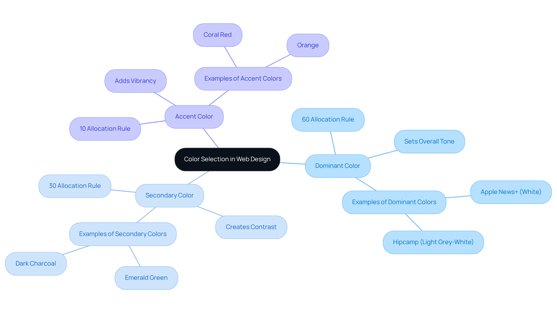
Now, let’s talk about the 60-30-10 rule. This widely recognized principle suggests allocating 60% of your layout to the dominant hue, 30% to a secondary shade, and 10% to an accent tone. This balanced approach promotes a harmonious aesthetic while addressing the question of in web design, which color is considered a primary color, ensuring the dominant hue remains the focal point of your design. As Nikhil Prabha wisely points out, finding that visual balance is about more than just looking good - it’s about connecting with your audience.
Don’t forget to test combinations! Experiment with various primary hues to see how they interact. Tools like Adobe Color and Coolors can help visualize these combinations, ensuring they complement each other and align with your brand's identity. Also, consider using WebAIM's Contrast Checker to make sure your hue selections meet accessibility standards, adhering to the WCAG minimum contrast ratio for normal text.
Let’s look at some inspiring examples of how color choices have made a real difference for brands. For instance, Apple News+ uses a pure white dominant hue, dark charcoal as a secondary shade, and coral-pink as an accent, effectively guiding attention to key actions. Similarly, Hipcamp's website employs a light grey-white dominant hue, green as the secondary, and orange as the accent, creating a visually appealing and functional layout that resonates with its nature-focused identity. By carefully choosing and blending hues, creators can craft impactful web experiences that not only resonate with individuals but also enhance brand identity, fostering a deeper connection with the audience, especially when considering in web design, which color is considered a primary color?
Utilize Tools and Resources for Color Selection
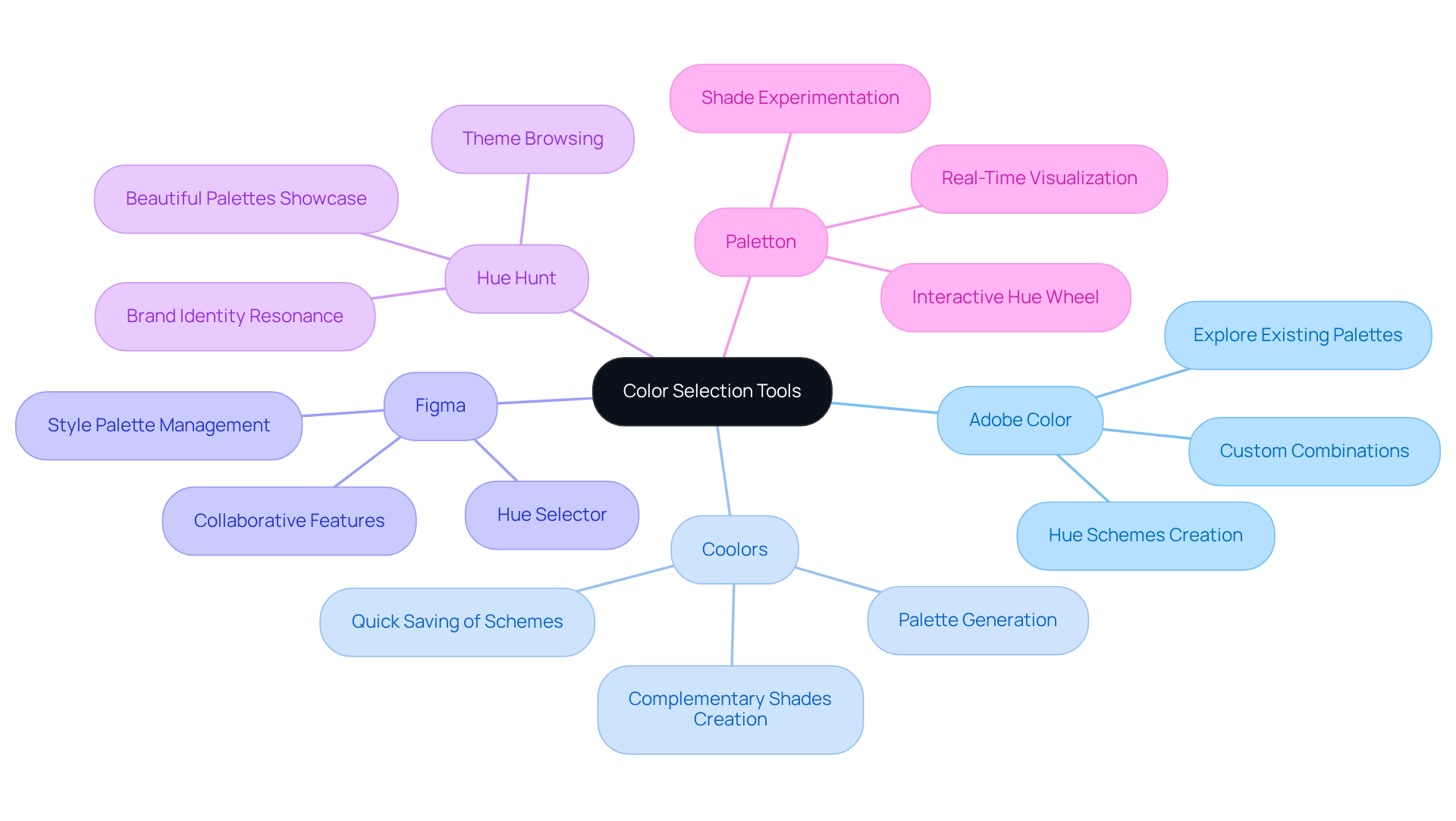
Many designers struggle to find the perfect color combinations that resonate with their audience and enhance their projects. Adobe Color is a powerful tool that helps you craft hue schemes using the wheel, allowing you to explore existing palettes or create custom combinations. As the web design industry continues to evolve, many designers feel the pressure to keep up with new tools like Adobe Color that can help them thrive. By choosing a primary hue, in web design, which color is considered a primary color, you can create complementary tones that truly enhance your creations.
Coolors is another fantastic option. This highly intuitive palette generator lets you quickly create and save schemes. You can easily secure your favorite hue and create complementary shades, simplifying the task of discovering the perfect combination for your projects. This efficiency is crucial, especially since websites that minimize user frustration see 4.5 times less visitor churn.
Then there's Figma, celebrated for its collaborative features. It provides a hue selector and the capability to create and manage style palettes within your projects. This guarantees uniformity across your creations and promotes collaboration, making it an essential tool for contemporary workflows. Figma’s collaborative features resonate with our mission at RNO1 to work hand-in-hand with brands for innovative solutions.
Hue Hunt showcases beautiful palettes that can inspire your design choices. You can browse various themes to find palettes that resonate with your brand identity, fostering creativity and innovation in your projects. Thoughtful hue selections can truly transform a brand, as seen in the inspiring case of Majestic Wine, which achieved a 201% increase in 'Enquiry Form' submissions after redesigning its category page with effective strategies for visual application.
Lastly, Paletton offers an interactive hue wheel that enables you to visualize combinations in real-time. This tool is especially beneficial for experimenting with various shades and tones, assisting you in refining selections that align with your branding objectives. As Paul Gauguin observed, hue can elicit profound emotional reactions, making it an essential element, especially in web design, which color is considered a primary color?
By utilizing these tools, you can improve your workflows, ensuring that your hue selections are not only effective but also aligned with your branding objectives. Additionally, with 94.8% of the top one million homepages failing to meet WCAG accessibility standards, it’s crucial to choose colors that are both aesthetically pleasing and accessible to all users. By embracing these tools, you not only elevate your designs but also create a more inclusive experience for all users.
Conclusion
Have you ever wondered why some websites resonate with you while others fall flat? Mastering primary colors in web design is essential for creating impactful and engaging digital experiences. When designers grasp the basics of red, blue, and yellow, they can tap into emotions, improve usability, and build a stronger brand identity. These colors are not just pretty visuals; they’re tools that can shape how users feel and interact with your site.
Throughout this article, we’ve explored the psychological impacts of primary colors and the importance of selecting and combining them effectively. Red can convey urgency, blue fosters trust, and yellow radiates warmth, each playing a crucial role in how users perceive and engage with a website. The 60-30-10 rule and various color selection tools like Adobe Color and Coolors were highlighted as essential strategies for achieving a harmonious and effective design.
It’s clear that primary colors play a crucial role in web design. They are vital in crafting a visual identity that resonates with audiences and drives engagement. By leveraging these insights and tools, designers can create compelling web experiences that not only attract visitors but also foster lasting connections. By embracing the emotional power of primary colors, you can transform your web design into a meaningful experience that truly connects with your audience.
Frequently Asked Questions
What are the primary colors in web design?
The primary colors in web design are red, blue, and yellow.
Why are primary colors important in web design?
Primary colors are important because they form the foundation of color theory, helping designers create harmonious palettes that evoke emotions, enhance usability, and strengthen brand identity.
How does the color red affect web design?
Red can convey urgency and excitement, making it effective for calls to action or elements that require immediate attention.
What emotions does the color blue evoke in web design?
Blue often represents trust and calmness, making it a popular choice for brands that want to convey reliability and professionalism.
What feelings does the color yellow bring in web design?
Yellow can evoke feelings of happiness and warmth, making it suitable for creating a cheerful and inviting atmosphere.
How can understanding primary colors improve web design?
By mastering primary colors, designers can craft web experiences that not only look beautiful but also resonate deeply with their audience, fostering genuine engagement.
List of Sources
- Define Primary Colors and Their Importance in Web Design
- How Color Psychology Shapes Web Design & User Experience (https://xtapps.us/the-importance-of-color-psychology-in-web-design)
- 10 Key Stats Why Design Plays an Important Role in Marketing Your Business (https://pixteller.com/blog/10-key-stats-why-design-plays-an-important-role-in-marketing-your-business-192)
- 25+ Web Design Statistics that Are Essential to Know in 2023 (https://blog.hubspot.com/marketing/web-design-stats-for-2020)
- 50+ Website Color Statistics: Best Colors for Websites (2026) - Colorlib (https://colorlib.com/wp/website-color-statistics)
- Primary Colors in Design: Complete Guide to Meaning, Psychology, Branding & Digital Use - Digital Nasir Siddiqui (https://digitalnasirsiddiqui.com/primary-colors-in-design)
- Identify the Primary Colors: Red, Blue, and Yellow
- 70+ Color Psychology Statistics & Facts (2026 Data) - Colorlib (https://colorlib.com/wp/color-psychology-facts)
- The Psychology of Color in Web Design (https://usersnap.com/blog/color-web-design)
- The Psychology of Color and Graphic Design - Platt College San Diego (https://platt.edu/blog/psychology-color-graphic-design)
- The Subtle Yet Powerful Effects of Color in Web Design | Web Design in Michigan | Digital Marketing | Smart Link Solutions (https://smartlinksolutions.com/effects-of-color-in-web-design)
- Select and Combine Primary Colors for Effective Web Design
- What Is the 60-30-10 Rule in Web Design? (https://pixpa.com/blog/60-30-10-rule-in-web-design)
- The 60/30/10 Rule in Web Design: How to Use It (With Examples) (https://wpmayor.com/the-60-30-10-rule-made-our-website-designs-infinitely-better)
- 60-30-10 Color Rule: How to Use It (and When to Break It!) (https://jasminealley.com/60-30-10-color-rule)
- What is the 60-30-10 Colour Rule and How to Apply It in Web Design? - Supernova (https://supernovasites.com/60-30-10-color-rule)
- Web design color theory: How to build brands and improve UX with color (https://penpot.app/blog/web-design-color-theory-how-to-build-brands-and-improve-ux-with-color)
- Utilize Tools and Resources for Color Selection
- 60+ Web Design Statistics for 2026 | Figma (https://figma.com/resource-library/web-design-statistics)
- 60 Great Quotes On Color - John Paul Caponigro (https://johnpaulcaponigro.com/blog/16588/60-great-quotes-on-color)
- 20+ web design statistics to keep you up-to-date (https://wix.com/blog/web-design-statistics)
- 70+ Key Web Design Statistics for 2026 | VWO (https://vwo.com/blog/web-design-statistics)
- 25 Web Design Statistics Every Business Owner Should Know (https://designforce.co/blog/web-design-statistics)


