Overview
In today's digital landscape, many tech startup founders face the challenge of ensuring their websites provide an optimal user experience. The problem is clear: without responsive web design (RWD), websites struggle to adapt across various devices, leading to frustration for users. This not only hampers accessibility but can also diminish user satisfaction, making it harder for businesses to thrive.
Imagine a potential customer visiting your site on their phone, only to find that the layout is messy and difficult to navigate. This experience can drive them away, affecting not just their perception of your brand, but also your search engine rankings and conversion rates. It’s disheartening to think that a simple design flaw could impact customer loyalty and your business's success in such a competitive environment.
However, there is hope. Implementing a well-thought-out RWD strategy can make a significant difference. Not only does it enhance accessibility and user satisfaction, but it also fosters a sense of trust and loyalty among customers. By embracing responsive design, you can create a seamless experience that resonates with users, ultimately leading to improved search engine visibility and higher conversion rates.
At RNO1, we understand the importance of this journey and are here to support you every step of the way. Together, we can ensure that your website not only meets the needs of your users but also stands out in a crowded digital space. Let’s work together to create a responsive design that truly reflects your brand's commitment to excellence.
Introduction
In today’s digital landscape, where user expectations soar higher than ever, the importance of responsive web design (RWD) is truly significant. As you navigate through a multitude of devices—from smartphones to desktops—the ability of your website to adapt seamlessly is not just a feature; it’s a crucial factor in ensuring user satisfaction and retention.
This article aims to explore the essential principles and best practices of responsive design, offering insights that can genuinely transform how tech startups like yours approach their web presence. Yet, we understand that with so many challenges to overcome, you might wonder: how can your business effectively implement RWD to not only meet but exceed those user expectations?
We’re here to guide you through this journey.
Define Responsive Web Design and Its Importance
In today’s fast-paced digital world, many tech startup founders face a significant challenge: ensuring their websites are responsive. This issue is particularly pressing as individuals increasingly access the internet through a variety of devices, from smartphones to tablets and desktops. The reality is that if a website does not automatically adjust its layout and content, it can lead to frustrated visitors and lost opportunities. Imagine the disappointment of a potential customer who struggles to navigate a site on their mobile device. This can diminish their satisfaction and even harm the company’s reputation.
The importance of responsive design web design (RWD) cannot be overstated. Studies reveal that:
- 83% of mobile users expect a seamless experience across all devices, highlighting the need for adaptive layouts.
- A website that adjusts effectively not only enhances user satisfaction but also boosts accessibility and improves search engine rankings.
- With 63% of organic search traffic stemming from mobile phones, optimizing for mobile is crucial for enhancing SEO performance.
- can lead to distrust; 60% of individuals are likely to question a company’s credibility if its website isn’t mobile-friendly, which can create a barrier to trust.
Moreover, the stakes are high when it comes to conversion rates. More than 70% of customers will abandon their shopping carts if their experience is lacking. This stark reality underscores the direct impact that a negative experience can have on a business’s bottom line. Yet, there is hope. Organizations that have embraced RWD report significant improvements in audience retention and engagement. For instance, companies that prioritize mobile optimization see a remarkable 74% likelihood of visitors returning after a positive mobile interaction. This connection between responsive design web design and customer loyalty emphasizes the need for brands to invest in responsive design web design as a vital component of their digital strategy.
In conclusion, adaptive web layout transcends mere technical necessity; it is a strategic imperative that enhances user experience, fosters accessibility, and bolsters SEO performance. As the digital landscape evolves, adopting responsive design web design will be essential for brands striving to flourish in a competitive environment. Investing in quality user experience can yield substantial returns, with every dollar spent on UX potentially generating up to $100 in ROI. Let’s take this journey together, ensuring that your startup not only meets but exceeds the expectations of your audience.
Explore Core Principles and Techniques of Responsive Design
In the world of web creation, many tech startup founders face a common challenge: how to implement responsive design web design to ensure their websites look great on every device. This problem can feel overwhelming, especially when considering the diverse range of screen sizes and resolutions that users encounter. But don’t worry; there are effective strategies to help you navigate this issue with ease.
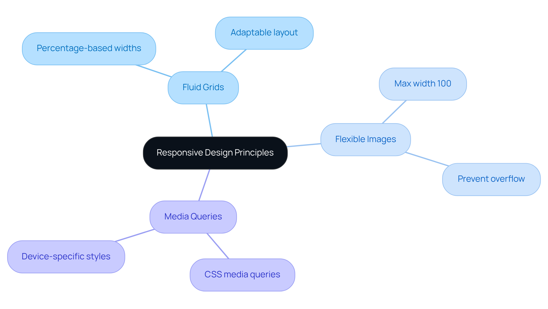
- Fluid Grids are a fantastic starting point. By using percentage-based widths instead of fixed pixel values, you allow your layout to adapt seamlessly to different screen sizes. This approach ensures that your website remains visually appealing and functional, no matter where it’s viewed.
- Next, consider Flexible Images. Setting images to a maximum width of 100% ensures they resize within their containing elements. This not only prevents overflow but also helps maintain the integrity of your layout. Imagine the relief of knowing your images will always fit perfectly, enhancing the overall user experience.
- Finally, Media Queries are essential tools in your arsenal. By utilizing CSS media queries, you can apply different styles based on the device's characteristics, such as width, height, and orientation. This allows you to customize interactions across devices, creating a smoother experience for your users. For instance, a tech startup might choose to hide certain elements on mobile devices, streamlining navigation and enhancing usability.
By implementing these concepts of responsive design web design, you can alleviate the stress of ensuring your website meets the needs of all users. Remember, you’re not alone in this journey; many have faced similar challenges and emerged successful. Embrace these solutions, and watch flourish.

Implement Best Practices for Effective Responsive Design
Implementing an effective responsive layout can often feel overwhelming. struggle with ensuring their websites provide a seamless experience across various devices. This challenge can lead to frustration, especially when essential content is overlooked or when users encounter delays. But there’s hope! Here are some nurturing best practices to guide you through this process:
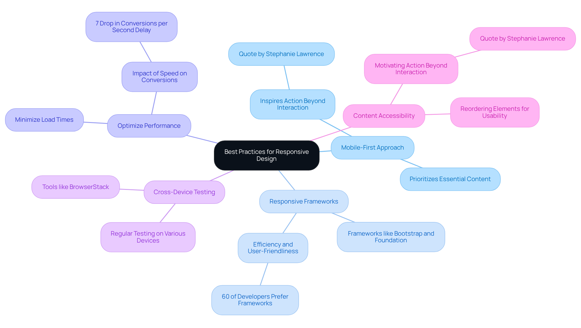
- Adopt a Mobile-First Approach: Start by designing for smaller screens, gradually enhancing for larger devices. This strategy prioritizes essential content, ensuring a smooth experience for everyone. As Stephanie Lawrence wisely points out, 'effective creation' should inspire action beyond simple interaction, making this method vital for successfully engaging your audience.
- Utilize Responsive Frameworks: Frameworks like Bootstrap and Foundation offer integrated responsive functionalities, making your development process more manageable and saving you precious time. It’s reassuring to know that over 60% of developers lean towards these frameworks for their efficiency and user-friendliness.
- Optimize Performance: A quick-loading site can significantly enhance user experience. By minimizing load times through image compression and efficient coding practices, you can create a welcoming environment. Remember, studies indicate that even a one-second delay can result in a 7% drop in conversions, highlighting the importance of speed.
- : Regularly testing your website on various devices and screen sizes is crucial for maintaining consistent performance. Tools like BrowserStack can simplify this process, allowing you to ensure your site functions beautifully across multiple platforms.
- Prioritize Content Accessibility: Make sure that key content is easily accessible on all devices. This might involve reordering elements based on screen size, which not only enhances usability but also aligns with the idea that effective creation should motivate action beyond mere interaction.
Additionally, remember that encountering errors is a natural part of the creation process. Embracing these moments allows for ongoing enhancement and adjustment. By following these supportive methods, you can craft an adaptable layout that meets the needs of your audience while embodying RNO1's design-first philosophy.

Test and Optimize for Diverse User Experiences
To ensure your adaptive layout aligns with client expectations, it’s essential to recognize the challenges you may face. Many startup founders struggle to meet these expectations, which can lead to frustration and missed opportunities. Implementing can help alleviate these concerns.
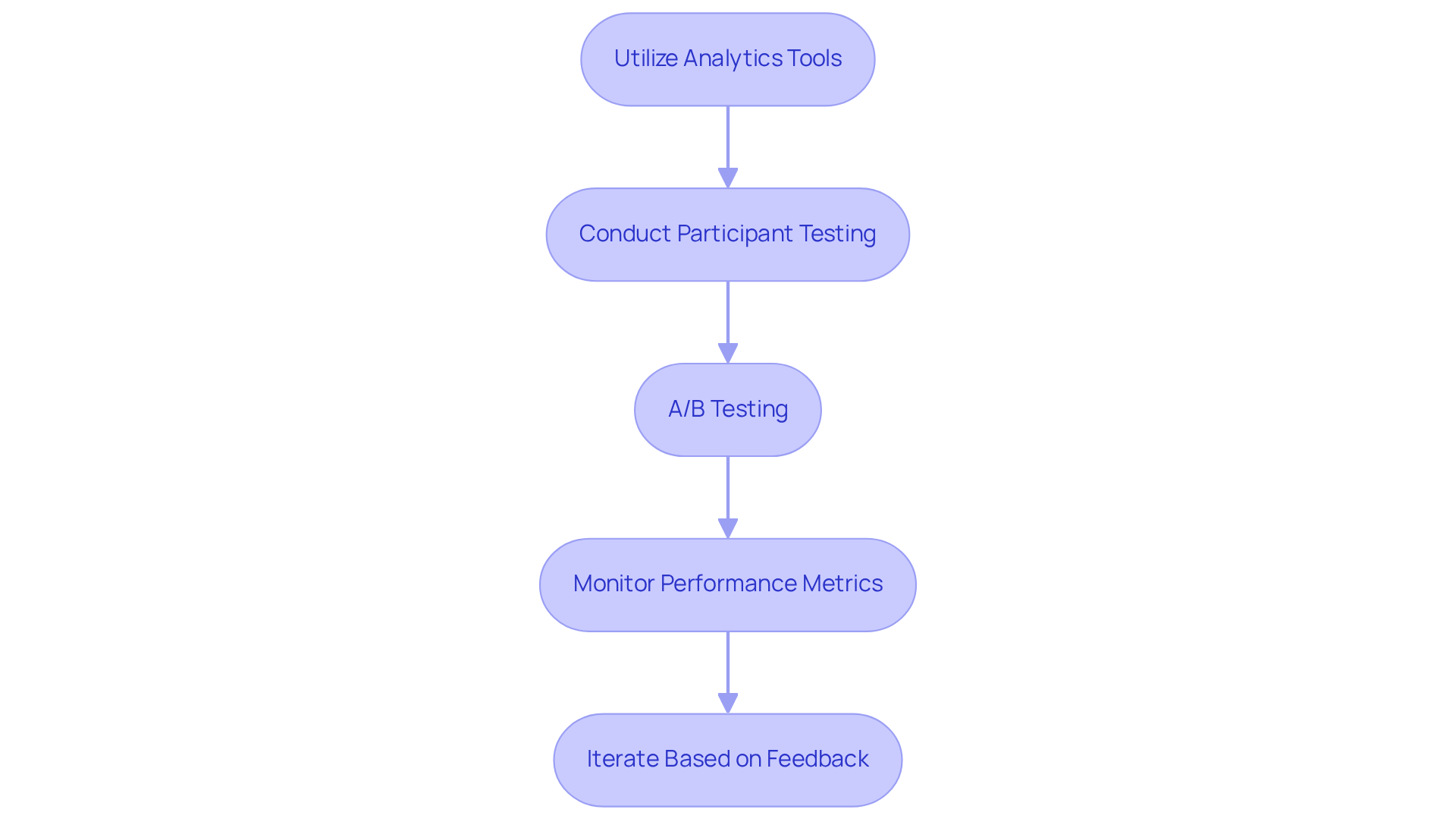
- Utilize Analytics Tools: Consider leveraging tools like Google Analytics to monitor visitor behavior, bounce rates, and conversion rates. As W. Edwards Deming wisely stated, "Without data, you're just another person with an opinion." This data is crucial for informing design adjustments and ensuring you’re on the right track.
- Conduct Participant Testing: Gathering insights from real participants can illuminate pain points and areas needing enhancement. Through surveys or usability testing sessions, you can better understand the needs of your users. Steve Krug emphasizes, "If you want a great site, you’ve got to test."
- A/B Testing: Evaluating different layouts and arrangements allows you to ascertain which options produce improved engagement and conversion rates. This method empowers you to make data-driven decisions that resonate with your audience.
- Monitor Performance Metrics: Regularly assessing site speed and responsiveness across devices is vital. Tools like GTmetrix can assist in recognizing optimization opportunities, ensuring a smooth experience for your users.
- Iterate Based on Feedback: Utilize the insights gained from testing to make iterative enhancements to your creation. This user-centric approach not only boosts effectiveness but also fosters a sense of connection with your audience.
By concentrating on these strategies, brands can develop adaptive formats that not only satisfy but surpass consumer expectations. For instance, RNO1's partnership with Highline led to enhanced customer engagement and higher sales, demonstrating the positive impact of efficient testing and analytics.
However, it's important to remain aware of common pitfalls in testing, such as neglecting feedback from participants or failing to adjust designs based on insights. Ultimately, embracing responsive design web design practices can significantly enhance user experience and drive business success, creating a supportive environment for your startup to thrive.

Conclusion
Responsive web design is not merely a technical requirement; it has evolved into a strategic necessity for businesses striving to flourish in a digital landscape where users engage through various devices. The shift towards mobile-first interactions highlights a pressing problem: websites must adapt fluidly to different screen sizes to ensure a seamless and satisfying user experience. When these design principles are overlooked, it can lead to frustrated users and a decline in brand credibility, which can be painful for any startup founder to witness.
Throughout this article, we’ve explored key strategies for implementing responsive design, such as the significance of fluid grids, flexible images, and media queries. Best practices like adopting a mobile-first approach, utilizing responsive frameworks, and conducting thorough testing have emerged as essential for optimizing user experience. Moreover, embracing analytics and user feedback can inform iterative improvements, ultimately fostering engagement and conversions. These insights can feel overwhelming, but they are crucial for your success.
In a time when user expectations are at an all-time high, investing in responsive web design is not just important; it’s vital. Brands that prioritize this approach not only enhance accessibility and satisfaction but also position themselves for greater success in a competitive marketplace. By committing to these practices, startups can transform their web presence, ensuring they not only meet but exceed the needs of their audience. This commitment paves the way for lasting customer loyalty and business growth, which is the ultimate goal we all share. Let’s embrace this journey together, knowing that each step taken towards responsive design is a step towards a brighter future for your business.
Frequently Asked Questions
What is responsive web design (RWD)?
Responsive web design (RWD) is an approach that ensures websites automatically adjust their layout and content based on the device being used, such as smartphones, tablets, or desktops.
Why is responsive web design important?
RWD is important because it enhances user satisfaction, boosts accessibility, improves search engine rankings, and helps maintain a company's reputation by providing a seamless experience across all devices.
What percentage of mobile users expect a seamless experience across devices?
Studies reveal that 83% of mobile users expect a seamless experience across all devices.
How does responsive design impact search engine optimization (SEO)?
With 63% of organic search traffic coming from mobile phones, optimizing websites for mobile through responsive design is crucial for enhancing SEO performance.
What are the consequences of a poor mobile experience on a company's credibility?
60% of individuals are likely to question a company’s credibility if its website isn’t mobile-friendly, which can create a barrier to trust.
How do conversion rates relate to user experience in responsive design?
More than 70% of customers will abandon their shopping carts if their experience is lacking, highlighting the direct impact of user experience on conversion rates.
What benefits do organizations report after adopting responsive web design?
Organizations that embrace RWD report significant improvements in audience retention and engagement, with a 74% likelihood of visitors returning after a positive mobile interaction.
What is the potential return on investment (ROI) from investing in user experience (UX)?
Investing in quality user experience can yield substantial returns, with every dollar spent on UX potentially generating up to $100 in ROI.


