

Introduction
Have you ever felt lost navigating a website? For startups, understanding the pitfalls of website design is essential to capturing and retaining user attention in a crowded digital space. Many startups struggle to keep users engaged due to overwhelming design choices, as seen in the confusing layouts of MySpace and eBay, or the cluttered interfaces of Yahoo and CNN.
Let’s explore ten notorious cases of bad website design together, uncovering valuable lessons that can help us avoid similar pitfalls. By learning from these missteps, startups can create user-friendly experiences that not only attract but also retain loyal customers.
MySpace: Lessons from a Social Media Giant's Design Failures
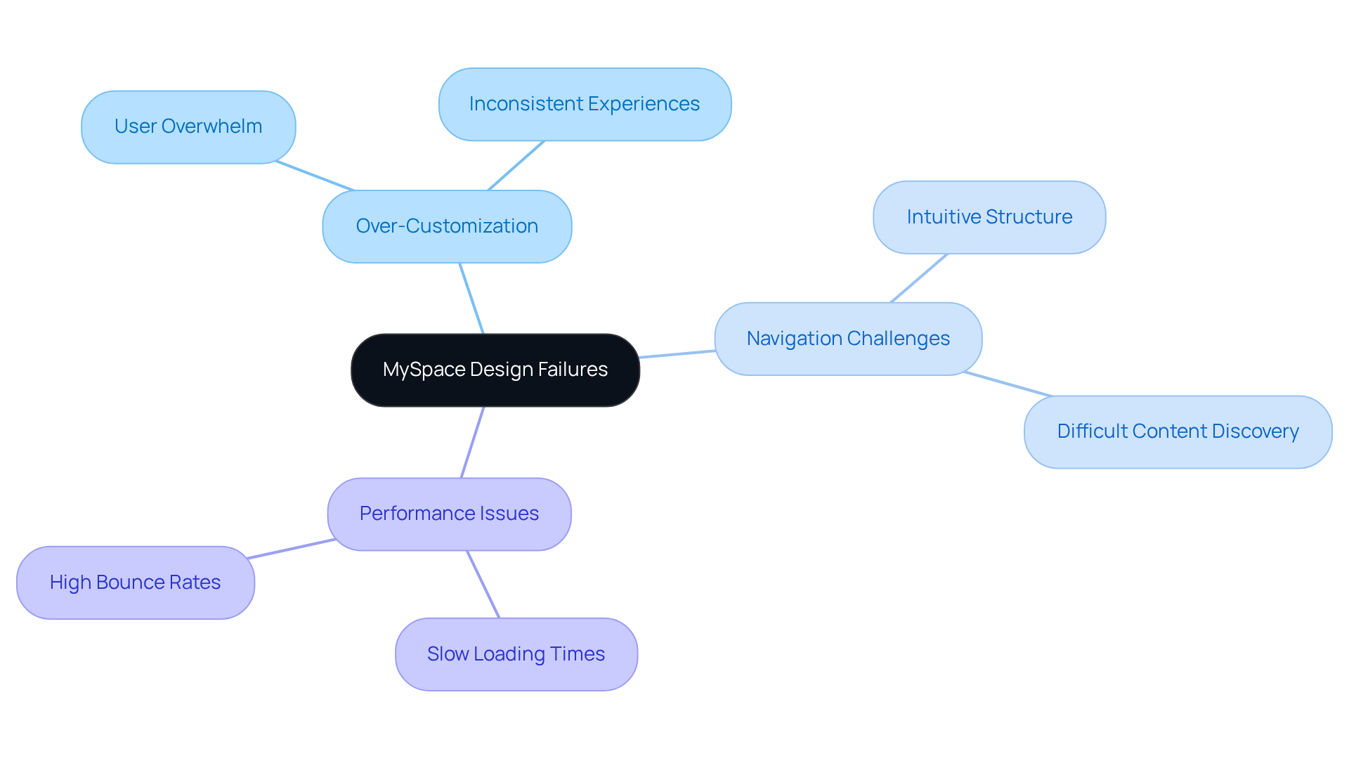
Remember when MySpace was the go-to social media platform? Its rise and fall offer valuable lessons for anyone looking to create a successful website today. MySpace's complex and cluttered interface serves as an example of a bad website that frustrated many users, prompting them to seek simpler alternatives like Facebook. This experience serves as a cautionary tale for tech startup founders.
One key lesson from MySpace's design failures is that it is an example of a bad website due to the danger of over-customization. While the platform offered users a plethora of options, it ultimately overwhelmed them, leading to inconsistent experiences across profiles. This lack of uniformity is an example of a bad website that not only detracted from usability but also diminished user engagement.
Another significant issue was navigation challenges. MySpace's structure was anything but intuitive, making it hard for users to find content quickly. Effective navigation is essential; for instance, an example bad website demonstrates how poor navigation can negatively impact user experience, with 94% of individuals ranking it as the most beneficial aspect of a website. This reinforces the need for intuitive site structures that guide users effortlessly.
Performance issues also plagued MySpace. Slow loading times, exacerbated by heavy graphics and animations, irritated users and contributed to high bounce rates. Studies show that 88% of internet visitors are unlikely to return after a negative interaction. As the Tenet Editorial Team wisely noted, an example bad website would feature subpar interaction, slow site speed, and non-responsive layouts, leading to high bounce rates and lost revenue.
As you embark on your startup journey, think about how prioritizing simplicity and speed can not only enhance customer retention but also help you avoid the pitfalls that led to MySpace's decline. It's worth noting that many startups are redesigning their websites to focus on usability, showing just how crucial it is to create a design that truly puts your customers first. By learning from MySpace's mistakes, you can create a user-friendly experience that keeps your audience coming back for more.
eBay: Understanding User Frustration Through Poor Navigation Design
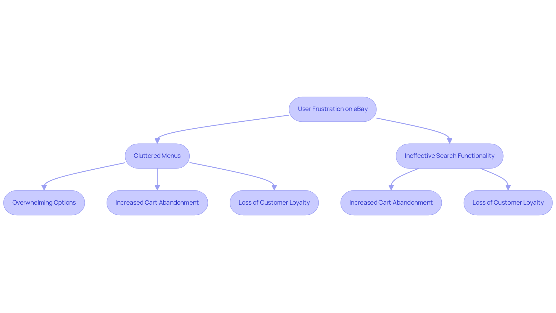
Have you ever felt overwhelmed while shopping online, unsure of where to turn next? The confusing layout of eBay serves as an example of a bad website, which has left many users feeling frustrated and has led to more abandoned carts. Key issues include:
- Cluttered Menus: Users often struggle to find products due to overwhelming menu options, contributing to a frustrating shopping experience. Imagine the frustration of searching for a product only to feel lost in a maze of options. In reality, 40% of consumers will turn to a rival after leaving a cart, underscoring the significance of efficient guidance to prevent an example bad website. An example bad website can demonstrate how inconsistent layouts, with frequent changes, can disorient returning visitors and make navigation feel unpredictable. According to PriceWaterhouseCoopers, 32% of customers would leave a brand they loved after just one example of a bad website experience. This not only impacts your bottom line but can also become an example of a bad website, damaging the trust your customers have in your brand.
- Search Functionality: An example of a bad website is one with ineffective search features, leading to customer dissatisfaction as individuals may find it challenging to locate desired items quickly. With the average cart abandonment rate at 70.19%, improving search functionality is crucial for retaining customers on an example bad website.
As a startup, focusing on clear and consistent navigation can truly enhance your customers' experience, while neglecting this aspect can create an example of a bad website. Implementing insights such as guest checkout and providing clearer shipping information can further reduce cart abandonment and enhance the overall experience for customers. By prioritizing user-friendly navigation, you can prevent your site from becoming an example bad website, transforming frustration into loyalty and ensuring your customers return time and again.
Yahoo: The Impact of Cluttered Interfaces on User Retention
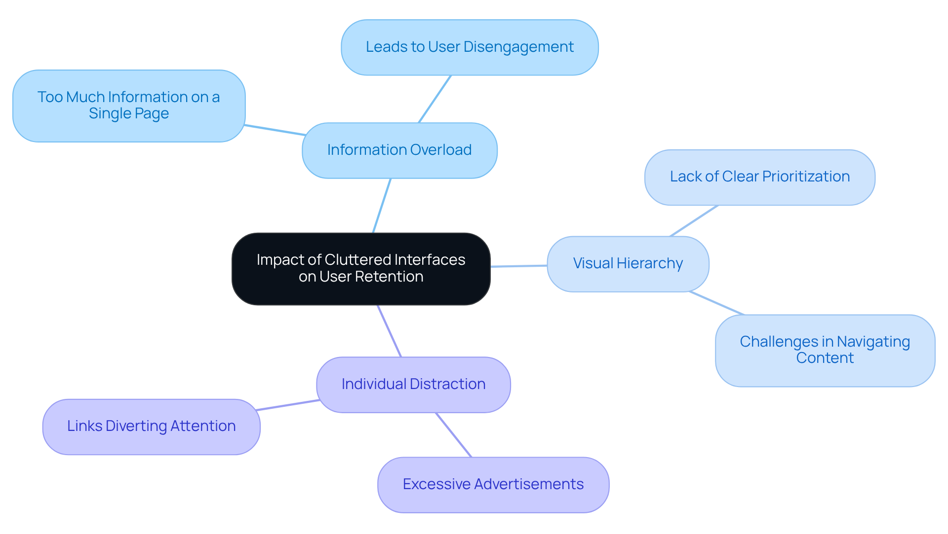
Have you ever felt overwhelmed by a website that seems to throw too much at you all at once? Many users find themselves overwhelmed by Yahoo's cluttered interface, which is an example of a bad website that can lead to frustration and a loss of interest. This situation highlights some important lessons for startups:
- Information Overload: Too much information on a single page can overwhelm users, leading to disengagement.
- Visual Hierarchy: A lack of clear visual hierarchy makes it challenging for individuals to prioritize information.
- Individual Distraction: Excessive advertisements and links can divert individuals from their primary objectives.
Consider how a clean and organized layout can guide your visitors gently through your content, making their experience more enjoyable. By creating a more inviting and organized space, you can help your visitors feel at home and encourage them to stay longer.
CNN: The Consequences of Overwhelming Users with Information
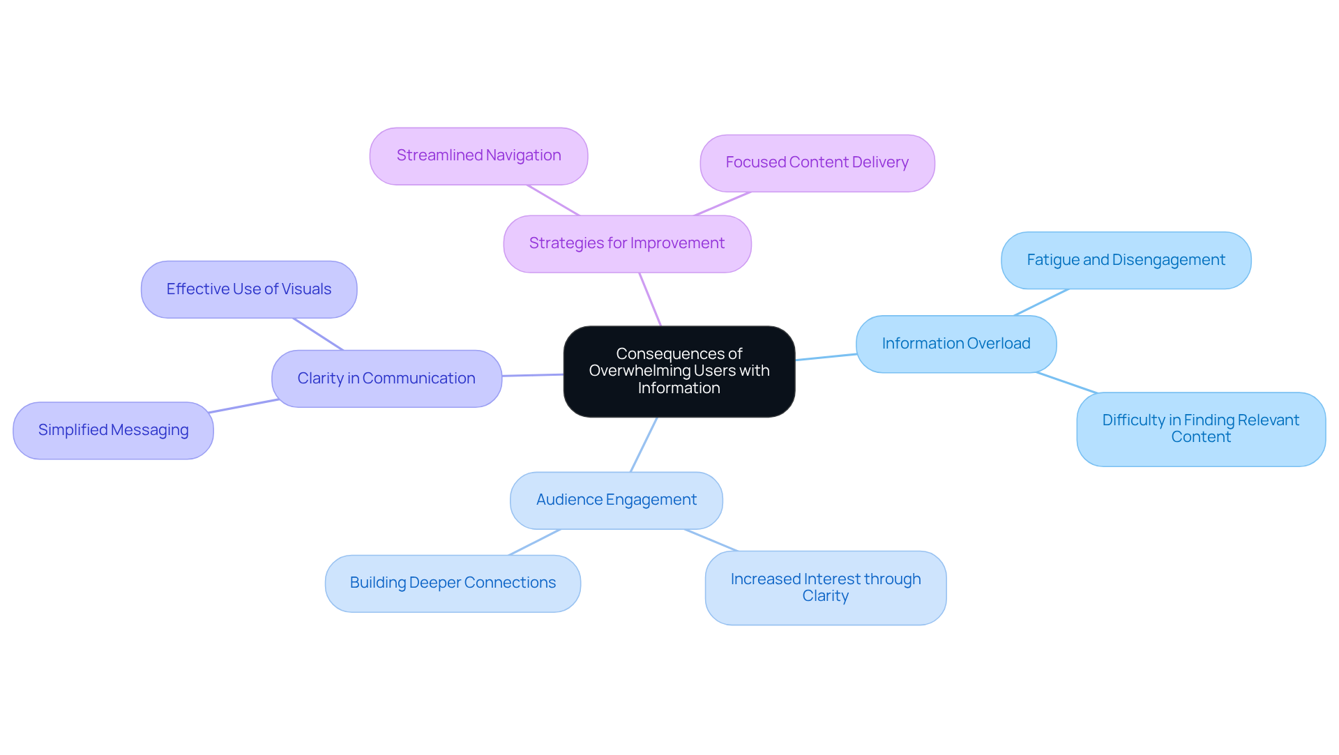
Have you ever felt overwhelmed by too much information, leaving you unsure of what to focus on? CNN's method of delivering news often inundates audiences with content, leading to fatigue and disengagement. Imagine how much more engaged your audience could be if they could easily find what truly matters to them.
By prioritizing clarity, startups can avoid overwhelming their audience, aligning with RNO1's commitment to delivering measurable success through focused strategies that cut through the noise. Navigating through complex information can feel like searching for a needle in a haystack.
RNO1's collaborative project management approach highlights the importance of clear communication, helping startups streamline their website navigation and directly addressing the challenges faced by CNN. By embracing clarity and focus, you can create a more engaging experience for your audience, fostering deeper connections and understanding.
Facebook: Mobile App Design Missteps and User Experience Lessons
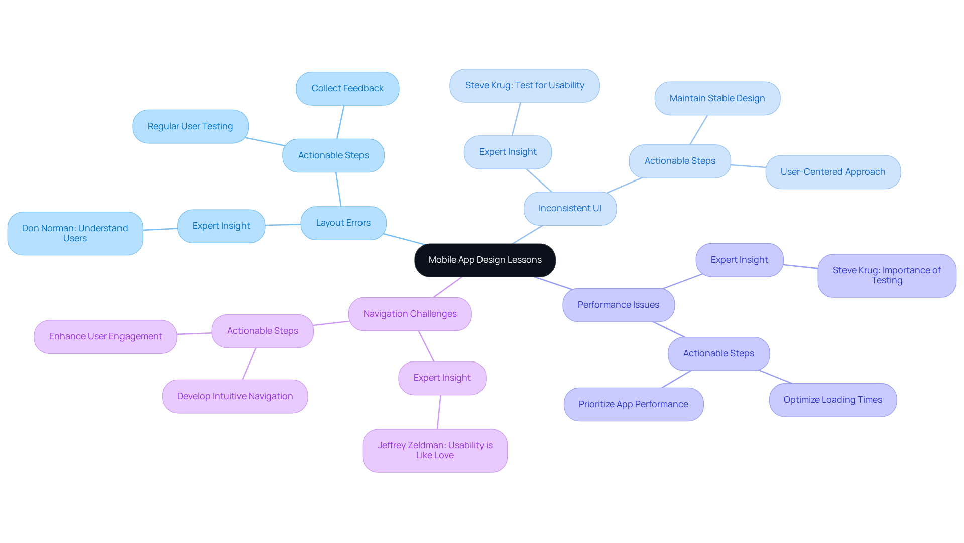
Have you ever felt frustrated trying to use an app that just doesn’t seem to work right? Facebook's mobile application has faced criticism for several layout errors that impact user interaction.
Imagine trying to navigate an app that keeps changing its layout; it’s frustrating and can leave users feeling lost. Inconsistent UI can confuse users and disrupt their experience. As Don Norman wisely states, "If you want to create a great product, you have to start by understanding the people who will use it." Maintaining a stable and recognizable design is essential for startups.
When users encounter slow loading times, they may decide to abandon the app altogether, leading to lost opportunities for startups. Research shows that performance issues can significantly increase abandonment rates, emphasizing the need for startups to prioritize app performance. Steve Krug emphasizes this necessity, stating, "If you want a great site, you’ve got to test."
Navigating through a cluttered app can feel overwhelming, leaving users frustrated and disengaged. Startups should concentrate on developing a seamless, intuitive navigation framework to boost engagement. As Jeffrey Zeldman notes, "Usability is like love. You have to care, you have to listen, and you have to be willing to change."
By focusing on these key areas, you can create a mobile experience that not only meets user needs but also builds lasting relationships with your customers. To apply these lessons, consider performing regular testing with your users and collecting feedback to continuously enhance your application structure.
Amazon: Checkout Design Pitfalls and Their Effects on Sales
Have you ever felt the frustration of a complicated checkout process that makes you want to give up on your purchase? Many tech startup founders face this challenge, especially when it comes to their online sales.
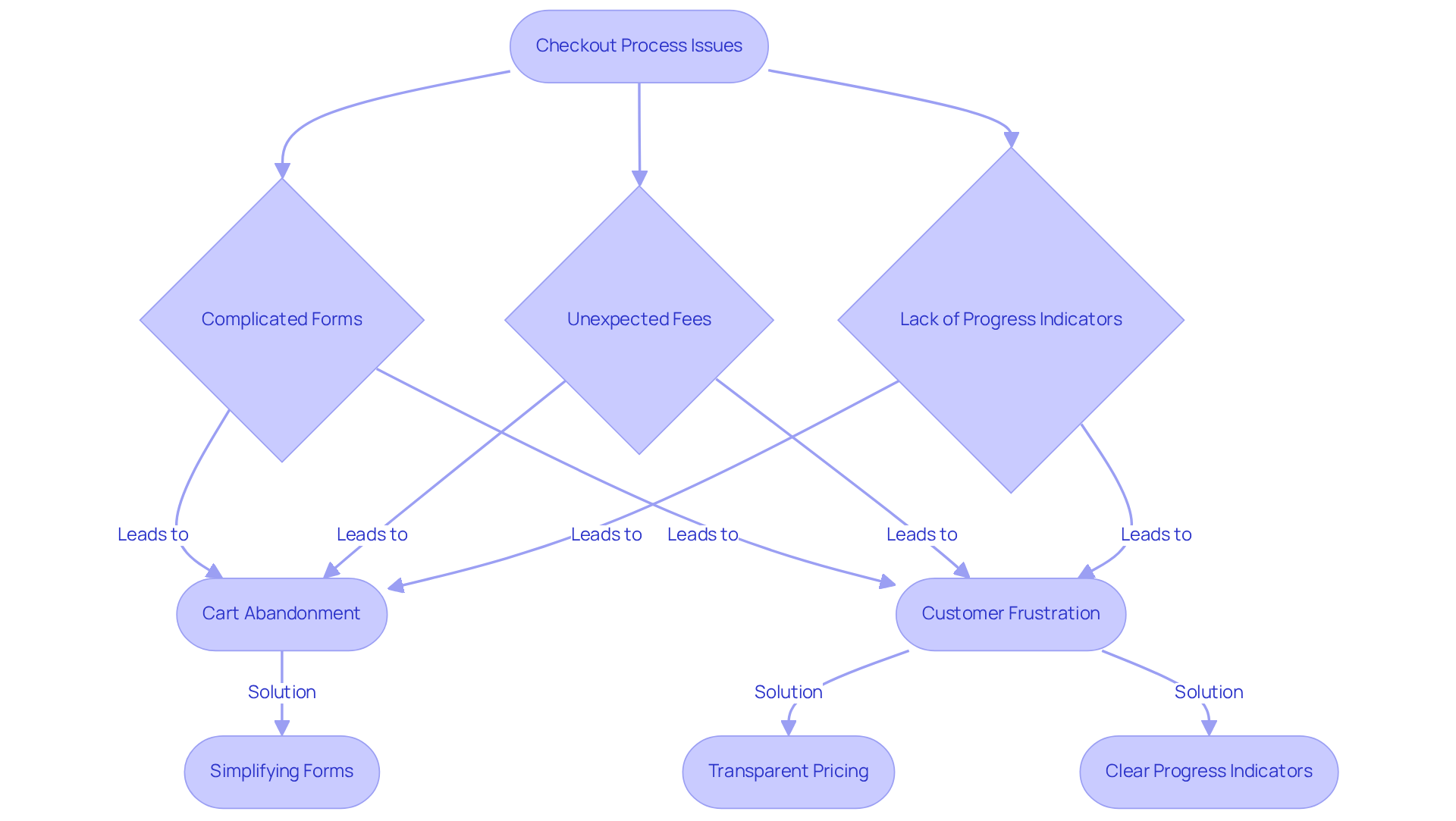
Imagine spending time filling out a lengthy form only to be hit with unexpected fees at the end. It’s frustrating and can make anyone abandon their cart. Research shows that the average checkout flow consists of 5.1 steps and includes 11.3 form fields, which can overwhelm customers. A mere 0.1-second improvement in load time can boost ecommerce conversions by 8.4%, highlighting the need for simplicity.
Unexpected fees are another major contributor to cart abandonment, with 48% of U.S. customers citing them as a primary reason for leaving their carts. Transparency in pricing is crucial; businesses can recover significant lost sales by addressing these hidden costs. In fact, 40% of shoppers will switch to a competitor after experiencing issues on a site, emphasizing the urgency for startups to optimize their checkout processes.
Without clear indicators of checkout progress, individuals may feel disoriented and uncertain about their transaction status. This lack of guidance can lead to frustration and ultimately result in cart abandonment.
By addressing these issues, startups can not only reduce cart abandonment but also create a smoother shopping experience that keeps customers coming back. Simplifying forms, being open about expenses, and offering clear progress indicators can significantly enhance satisfaction and drive sales. When you prioritize a seamless checkout experience, you’re not just improving sales; you’re building lasting relationships with your customers.
Khan Academy: The Importance of Clear Navigation in Educational Websites
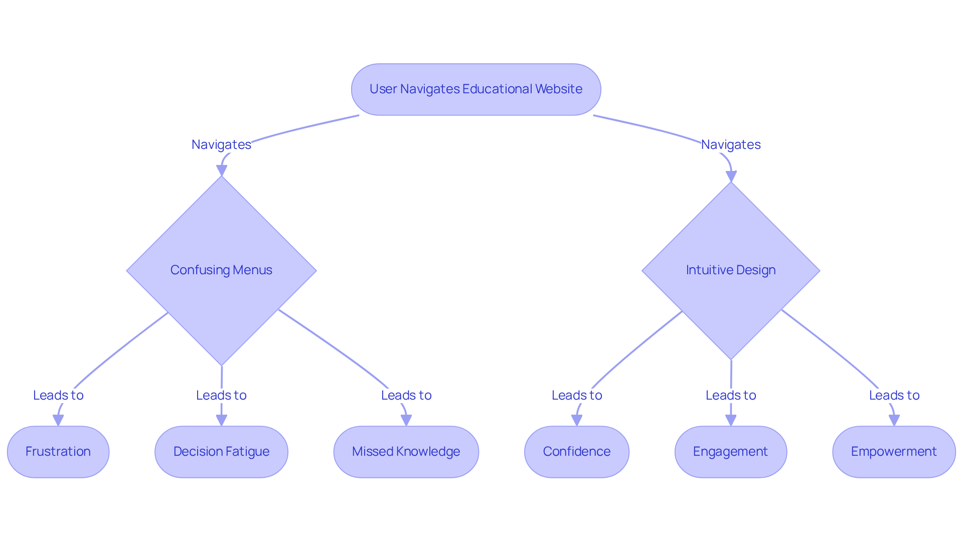
Navigating online learning platforms can sometimes feel like wandering through a maze, especially when the layout isn’t user-friendly. Many users find themselves frustrated by confusing menus, struggling to locate the courses they need. Imagine feeling lost in a sea of options, unsure of where to turn next. This overwhelming content can lead to decision fatigue, making it even harder for learners to engage with the material. Without proper guidance, learners may miss out on valuable knowledge and skills.
Startups have a unique opportunity to create a more nurturing learning environment. By focusing on intuitive design, they can create a supportive atmosphere that empowers learners to thrive. Clear, straightforward navigation can make all the difference, helping users feel confident and capable as they explore new subjects.
Expedia: Trust Issues Arising from Confusing Design Elements
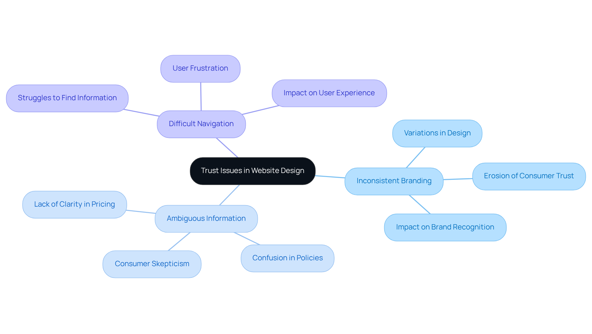
Have you ever felt lost while trying to navigate a website? Many people have shared their frustrations with Expedia's layout, and they often point to it as an example of a bad website, finding some elements confusing, which can really shake their trust. Let’s take a closer look at some key insights that highlight these challenges:
- Inconsistent Branding: Variations in design can create confusion about the brand's identity.
- Ambiguous Information: Lack of clarity in pricing and policies can lead to consumer skepticism.
- Difficult Navigation: Users may struggle to find essential information, leading to frustration.
By prioritizing a cohesive and transparent design, startups can avoid creating an example of a bad website that undermines trust and fails to create a welcoming environment for their users.
BuzzFeed: Readability Challenges and User Engagement Lessons
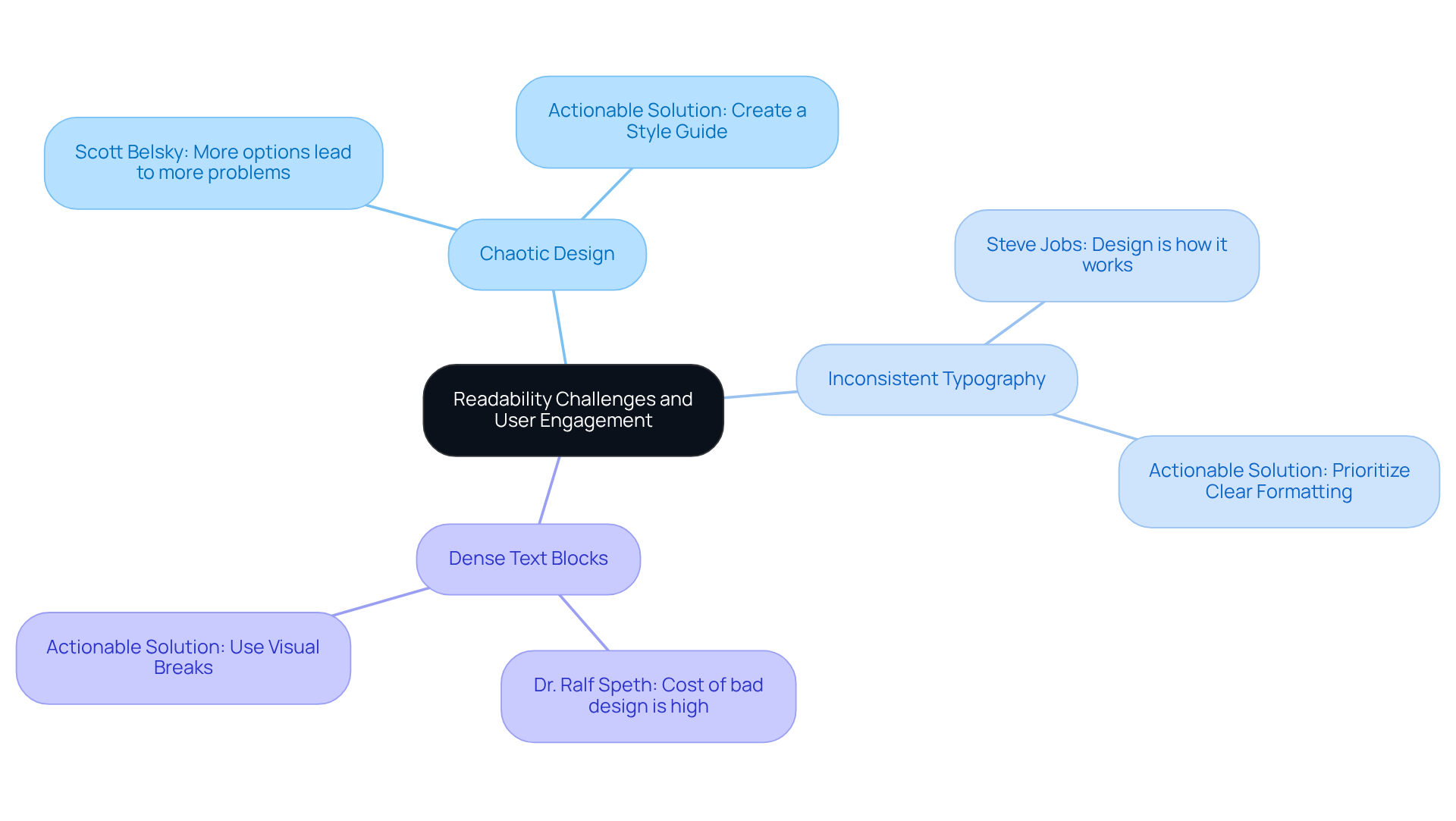
Have you ever encountered an example bad website with a chaotic design that made it difficult to find the information you need? It's a common experience, and it can really impact how engaged you feel with the content. Imagine trying to read an article, only to be distracted by a chaotic layout that pulls your focus away from the message. As Scott Belsky wisely points out, 'more options lead to more problems,' and this can leave you feeling frustrated and disconnected.
Think about the last time you encountered a website where the fonts were all over the place; it can be so disorienting, right? Inconsistent typography can confuse users and hinder readability, making it hard to absorb the information presented. Steve Jobs emphasized that 'design is not just what it looks like and feels like. Creation is how it operates.' This highlights the importance of functional design that truly serves the user.
We've all been there-facing a wall of text that makes you want to give up before you even start reading. Dense blocks of text can overwhelm readers, leading to disengagement. Dr. Ralf Speth reminds us that while the cost of good design may seem high, the cost of bad design can be far more costly.
So, what can you do? Startups should prioritize clear, consistent formatting to enhance content readability and audience engagement. By creating a style guide that defines typography, layout, and visual breaks, you can ensure a cohesive experience that invites your audience to engage fully. By prioritizing clear and consistent formatting, you can create a welcoming space that invites your audience to engage fully.
Netflix: User Interface Missteps and Their Impact on Viewer Retention
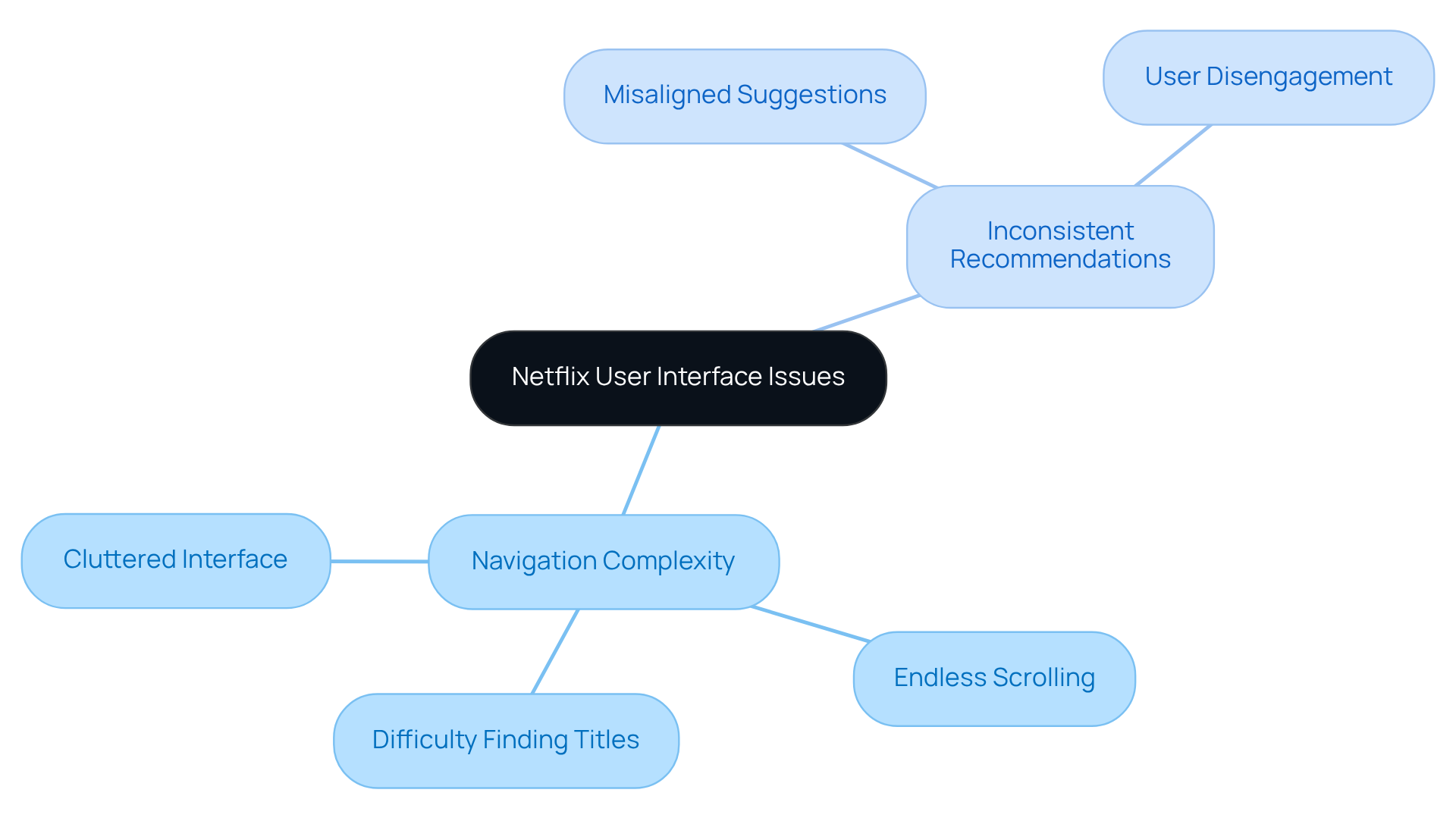
Have you ever felt frustrated trying to find something to watch on Netflix? Imagine scrolling endlessly, feeling lost in a sea of options, only to leave without finding what you wanted. This experience is all too common, and it highlights a significant issue: overly complex navigation. When users encounter a cluttered interface, it can lead to confusion and ultimately, disengagement.
Moreover, inconsistent recommendations can add to this frustration. When the suggestions don’t resonate, it feels like the platform doesn’t understand your preferences. This disconnect can leave viewers feeling unvalued and less likely to return. When you search for a specific title, only to be met with endless scrolling and no results, it can be disheartening.
For startups, the key to enhancing viewer retention lies in creating a seamless, intuitive interface. By prioritizing user experience, you can not only retain viewers but also foster a loyal community around your content. Remember, a user-friendly interface is not just a feature; it’s a vital part of building lasting relationships with your audience.
Conclusion
Have you ever felt overwhelmed by a website that just didn’t make sense? By looking at the design failures of well-known sites like MySpace, eBay, and Yahoo, we can see how poor design can frustrate users and drive them away. It’s a tough reality for many startups, especially when you’ve invested so much into your vision.
Imagine pouring your heart into a startup, only to have users leave in frustration due to confusing design. Over-customization, cluttered interfaces, and tricky navigation can lead to high bounce rates and abandoned carts. Just think about MySpace’s overwhelming options or eBay’s confusing layouts - these design pitfalls can alienate users and make them feel lost.
On the flip side, clear communication and user-friendly interfaces, like those of CNN, Facebook, and Amazon, show us the way forward. Startups must prioritize user needs in their design strategy to create a welcoming environment.
When you prioritize user-friendly design, you’re not just enhancing satisfaction; you’re building a community that will support your startup’s journey. By focusing on creating a seamless, engaging user experience, you can foster loyalty and encourage repeat visits. Embracing these principles not only enhances user satisfaction but also positions your business for long-term growth in a competitive digital landscape.
Frequently Asked Questions
What lessons can be learned from MySpace's design failures?
MySpace's design failures highlight the dangers of over-customization, navigation challenges, and performance issues. Over-customization overwhelmed users, leading to inconsistent experiences. Poor navigation made it hard for users to find content, and slow loading times contributed to high bounce rates.
How did MySpace's interface contribute to its decline?
MySpace's complex and cluttered interface frustrated users, prompting them to seek simpler alternatives like Facebook. This experience serves as a cautionary tale for tech startups about the importance of user-friendly design.
What navigation issues did MySpace face?
MySpace had a non-intuitive structure that made it difficult for users to locate content quickly. Effective navigation is essential for user experience, as 94% of individuals rank it as the most beneficial aspect of a website.
What performance issues were prevalent on MySpace?
MySpace suffered from slow loading times due to heavy graphics and animations, which irritated users and led to high bounce rates. Studies indicate that 88% of internet visitors are unlikely to return after a negative interaction.
What can startups learn from MySpace's mistakes?
Startups should prioritize simplicity and speed in their website design to enhance customer retention and avoid the pitfalls that led to MySpace's decline.
What issues does eBay's design present for users?
eBay's confusing layout features cluttered menus and ineffective search functionality, leading to user frustration and increased cart abandonment. 40% of consumers may turn to a rival after leaving a cart due to navigation challenges.
How does poor navigation affect user experience on eBay?
Inconsistent layouts and overwhelming menu options disorient returning visitors, making navigation unpredictable. 32% of customers would leave a brand after just one bad website experience, impacting trust and loyalty.
What strategies can improve user experience on eBay?
Focusing on clear and consistent navigation, implementing guest checkout, and providing clearer shipping information can enhance the overall experience for customers and reduce cart abandonment.
What problems does Yahoo's interface present?
Yahoo's cluttered interface leads to information overload, a lack of clear visual hierarchy, and excessive distractions from advertisements and links, which can overwhelm users and result in disengagement.
How can startups create a better user experience based on Yahoo's lessons?
Startups can benefit from creating clean and organized layouts that guide visitors through content, making their experience more enjoyable and encouraging them to stay longer.
List of Sources
- MySpace: Lessons from a Social Media Giant's Design Failures
- These 90+ Web Design Statistics Show Why Most Websites Fail (https://wearetenet.com/blog/web-design-statistics)
- eBay: Understanding User Frustration Through Poor Navigation Design
- 40+ UX Statistics (from 200,000 hours of UX Research) – Baymard (https://baymard.com/learn/ux-statistics)
- Ecommerce: 15 Insightful Stats on Shopping Cart Abandonment (https://contentsquare.com/guides/cart-abandonment/stats)
- Yahoo: The Impact of Cluttered Interfaces on User Retention
- 40+ Key UX Stats for 2026 (https://maze.co/blog/ux-statistics)
- 15 Inspiring UX Quotes for Innovation and Design (https://ixdf.org/literature/article/ux-quotes)
- Facebook: Mobile App Design Missteps and User Experience Lessons
- 20 Inspiring UX Quotes You Should Remember (https://blog.uxtweak.com/ux-quotes)
- 20 User Research and UX Quotes to Inspire You | User testing and UX research platform (https://sharewell.eu/20-user-research-and-ux-quotes-to-inspire-you)
- Amazon: Checkout Design Pitfalls and Their Effects on Sales
- Ecommerce: 15 Insightful Stats on Shopping Cart Abandonment (https://contentsquare.com/guides/cart-abandonment/stats)
- Expedia: Trust Issues Arising from Confusing Design Elements
- The Importance Of Consistency In Branding (https://forbes.com/councils/forbescommunicationscouncil/2024/12/30/the-importance-of-consistency-in-branding)
- Branding Statistics 2026: 98+ Stats & Insights [Expert Analysis] - Marketing LTB (https://marketingltb.com/blog/statistics/branding-statistics)
- BuzzFeed: Readability Challenges and User Engagement Lessons
- 15 Inspiring UX Quotes for Innovation and Design (https://ixdf.org/literature/article/ux-quotes)


