Overview
Creating a box with shadow effects in web design can feel overwhelming, especially for beginners. Many may struggle with the technical aspects, feeling lost and unsure of where to start. This can lead to frustration, as the visual appeal of a website is crucial for engaging users. However, there is hope! This article offers a comprehensive, step-by-step guide designed specifically for those who may be feeling daunted by the process.
In this guide, we will walk you through the necessary tools, coding instructions, and troubleshooting tips to help you implement box shadows effectively. We understand that every small detail matters in creating an inviting user experience, and we are here to support you every step of the way.
As you embark on this journey, remember that you are not alone. Many others have faced similar challenges, and by sharing our experiences, we can foster a sense of community. Let’s explore how box shadows can enhance your web design and make your projects stand out. Together, we can transform your vision into reality, one box shadow at a time.
Introduction
Creating visually appealing web designs can often feel overwhelming, especially when it comes to effectively using depth and dimension. Many designers find themselves grappling with the complexities of box shadows, a powerful tool that can truly elevate a website's aesthetic. It's understandable to feel frustrated when trying to master these techniques, as they can sometimes seem riddled with challenges and technical nuances.
But you're not alone in this journey. What if there were essential steps and tools that could help you create stunning box shadows, enhancing user engagement and directing attention to key elements on your webpage, all while ensuring performance remains uncompromised? Together, we can explore these solutions and make this process a little easier for you.
Understand Box Shadows: Definition and Importance
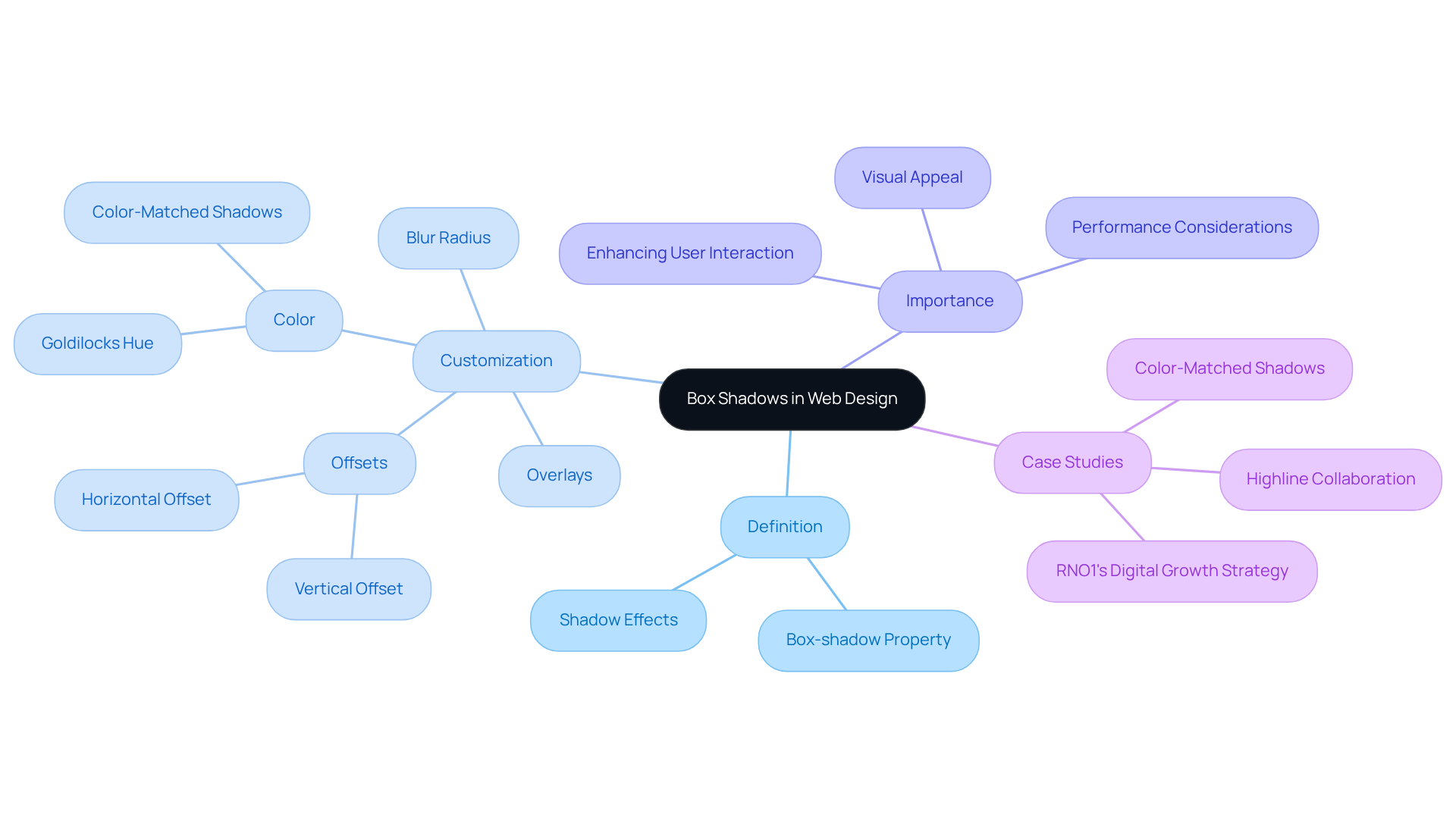
The use of a box with shadow effects can be a game changer for enhancing user interaction on your website, adding depth and dimension to elements that truly matter. Imagine a darkened effect wrapping around an element's border, drawing your users' eyes to what’s essential. The box with shadow property is incredibly flexible, allowing you to customize aspects like horizontal and vertical offsets, blur radius, spread radius, and color. It’s interesting to note that the vertical offset often doubles the horizontal one, creating a more lifelike appearance. For instance, a vertical offset of 4px combined with a horizontal offset of 2px can subtly simulate elevation, making buttons and cards pop out beautifully.
Now, consider using color-coordinated overlays instead of the usual semi-transparent black. This simple shift can infuse your design with vibrancy and prevent that washed-out look. Take, for example, the Goldilocks hue, hsl(220deg 60% 50%), which shows how exploring tint colors can lead to delightful design outcomes. Layering multiple overlays can further enrich your design, but it’s important to be mindful of the potential strain on older devices, especially when it comes to performance. Case studies reveal that a consistent use of depth across web elements creates a harmonious visual experience, as seen in RNO1's collaborations with brands like Highline and Cirkul, where tailored digital experiences significantly boosted customer engagement and sales.
Thoughtfully integrating a box with shadow effects not only beautifies your website but also enhances the overall user experience. By playing with tint hues and ensuring consistency, you can craft engaging interfaces that truly resonate with your audience, fostering interaction and satisfaction. However, it’s crucial to find a balance with contrasts; overdoing it can lead to performance issues that no one wants to face.

Gather Necessary Tools and Software for Box Shadow Creation
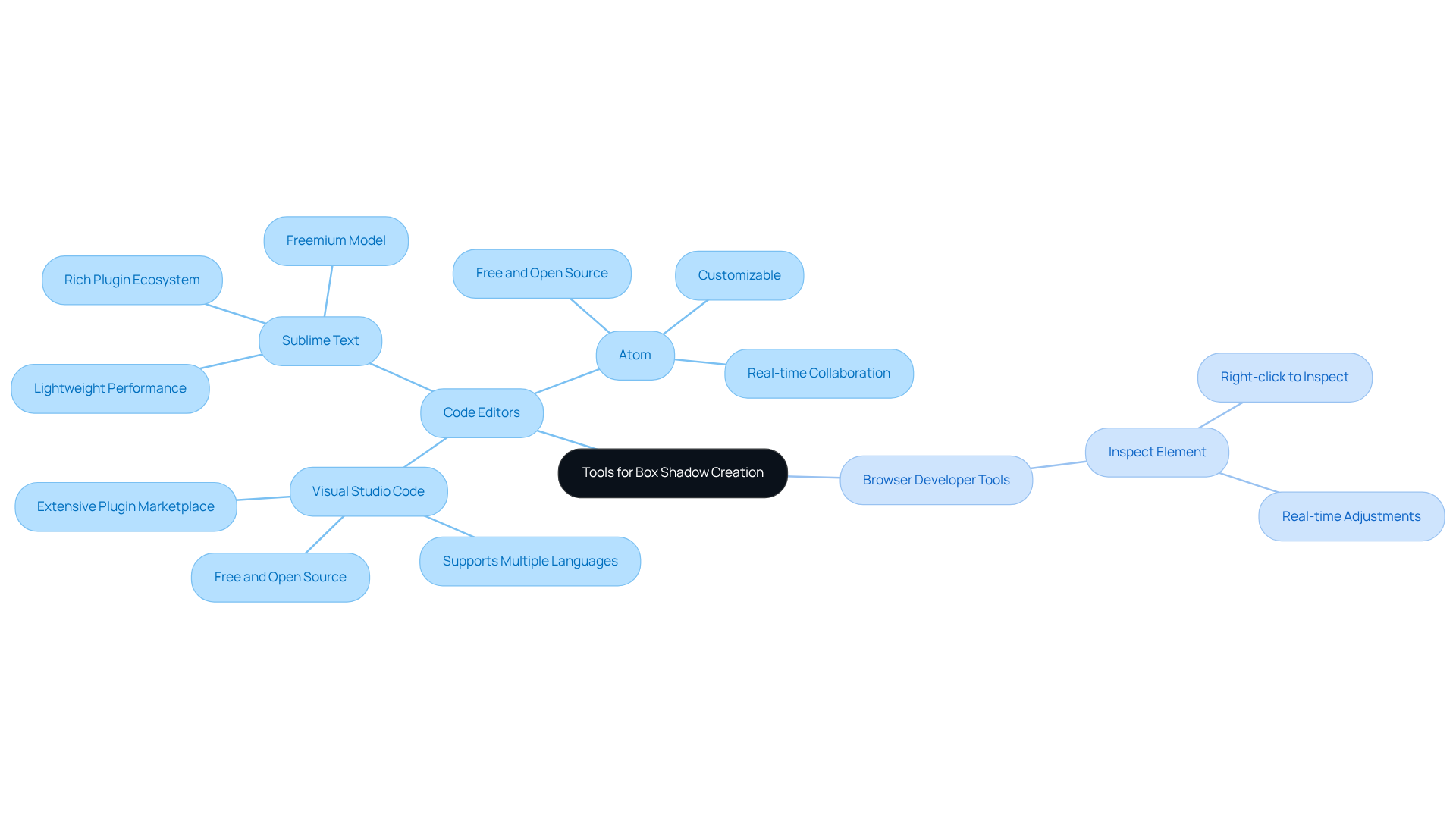
If you're feeling overwhelmed by the task of creating a box with shadow effects, you're not alone. Many startup founders find it challenging to navigate the technical aspects of design. The good news is that there are tools available to make this process easier and more enjoyable. To get started, you'll need a reliable code editor and a web browser. Popular options include:
- Visual Studio Code
- Sublime Text
- Atom
These tools can help you write and edit your CSS code with ease. They are designed to enhance your coding experience, making it more efficient and less frustrating.
Additionally, don't forget about the power of your browser's developer tools. By right-clicking on a webpage and selecting 'Inspect,' you can test and adjust your box with shadow effects in real-time. This hands-on approach allows you to see the changes immediately, helping you feel more in control of your design process.
Familiarizing yourself with these resources can truly transform your experience, making coding feel less like a chore and more like an exciting opportunity to express your creativity. Remember, you're not in this alone—embracing these tools can streamline your design journey and empower you to create beautiful, functional effects like a box with shadow.

Follow Step-by-Step Instructions to Create a Box with Shadow
-
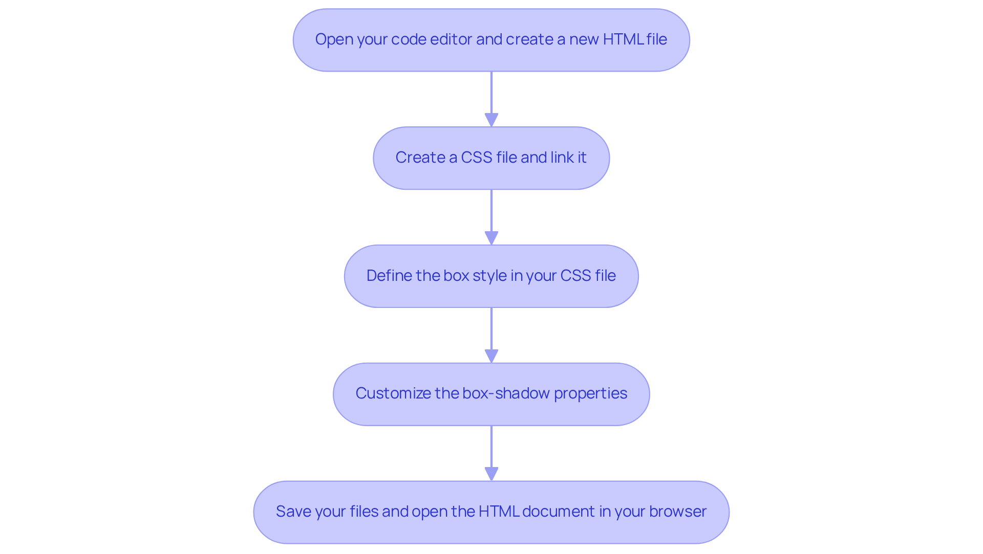
Open your code editor and create a new HTML file with the following basic structure:
<!DOCTYPE html> <html lang="en"> <head> <meta charset="UTF-8"> <meta name="viewport" content="width=device-width, initial-scale=1.0"> <title>Box Shadow Example</title> <link rel="stylesheet" href="styles.css"> </head> <body> <div class="box"></div> </body> </html> -
Create a CSS file named
styles.cssand link it to your HTML file. This step is crucial for ensuring your styles take effect, allowing your creativity to shine through. -
Define the box style in your CSS file:
.box {
    width: 200px;
    height: 200px;
    background-color: #3498db;
    box-shadow: 5px 5px 15px rgba(0, 0, 0, 0.5);
}
This code generates a square box with a blue background and a shadow effect, enhancing user engagement by creating depth in the design. It’s a small change that can make a big difference in how users perceive your site.
-
Customize the box-shadow properties to refine your design:
- Horizontal offset: Adjusts the shadow's position left or right, allowing you to create the perfect look.
- Vertical offset: Moves the cast effect up or down, giving you control over the shadow's placement.
- Blur radius: Regulates the softness of the edges, with higher values producing a more diffused effect, creating a gentle, inviting appearance.
- Spread radius: Expands or contracts the size of the cast, allowing for further customization.
- Color: Specifies the hue of the darkness, enabling artistic expression and personal touch.
-
Save your files and open the HTML document in your web browser to view the box with a dark outline. This straightforward implementation can greatly improve the visual attractiveness of your web elements. Research indicates that websites employing a box with shadow effects can boost user interaction by creating a more inviting interface. Furthermore, it's crucial to recognize that approximately 30% of CSS code includes mistakes, so meticulous coding is vital when applying box effects. Remember, with browser support for the box-shadow property just above 74%, ensuring compatibility is essential. If you ever feel stuck, know that CSS generators can be a helpful tool in creating box effects effectively. You’re not alone in this journey, and support is always available.

Troubleshoot Common Issues in Box Shadow Implementation
-
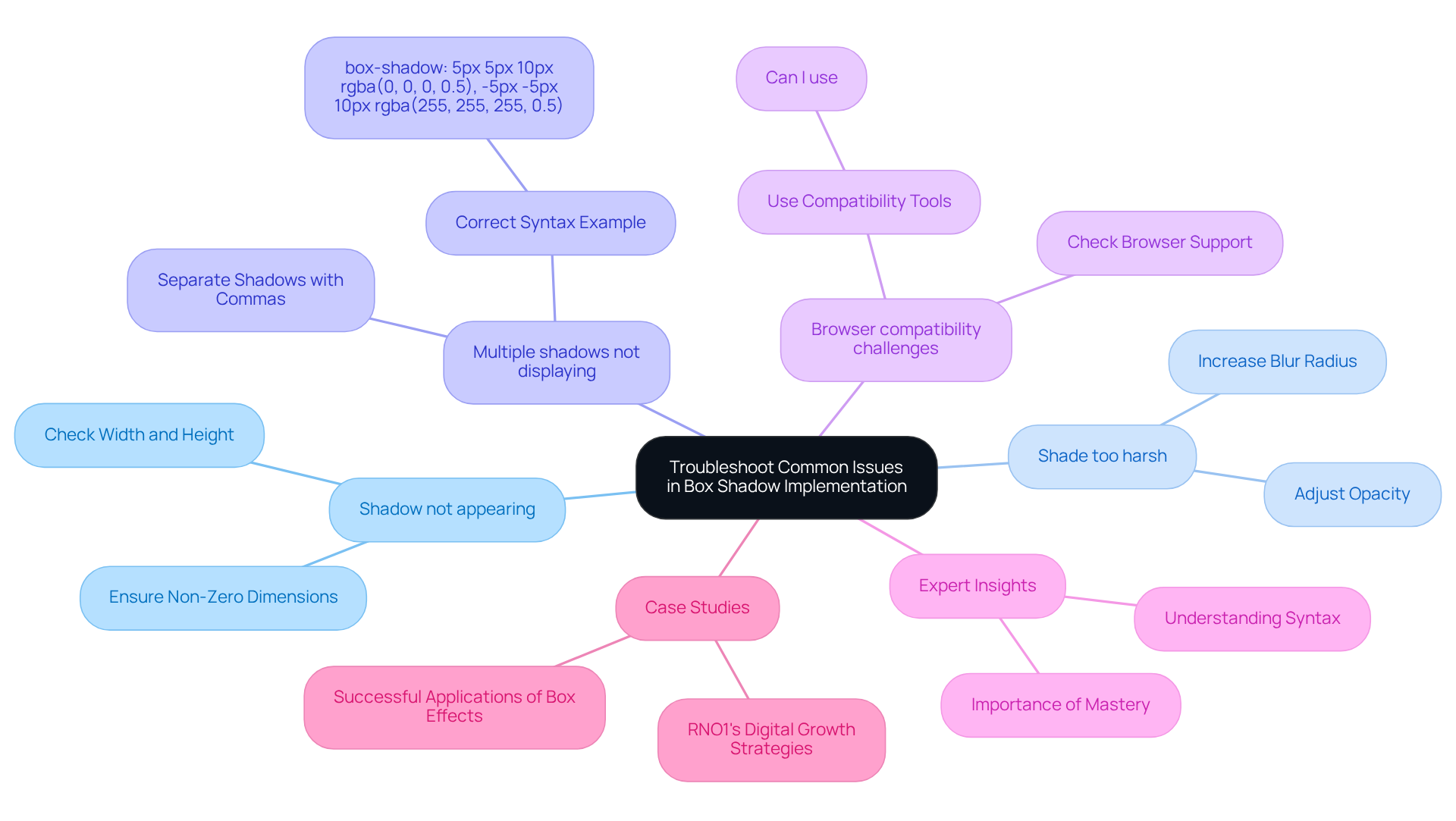
Shadow not appearing: It can be frustrating when your shadow doesn’t show up as expected. To ensure visibility, please check that the box has a defined width and height. If these dimensions are set to zero, the silhouette simply won’t be visible.
-
Shade too harsh: If the shade seems too dark or sharp, you’re not alone in this experience. Consider increasing the blur radius or adjusting the opacity in the rgba color value. This small tweak can make a significant difference in achieving the desired softness.
-
Multiple shadows not displaying: When working with multiple shadows, it’s essential to separate them with commas in your shadow specification. For example:
box-shadow: 5px 5px 10px rgba(0, 0, 0, 0.5), -5px -5px 10px rgba(255, 255, 255, 0.5);. This ensures that each shadow is recognized and displayed correctly. -
Browser compatibility challenges: It’s important to consider whether your browser supports the shadow effect feature. Most modern browsers do, but older versions may not. For instance, Chrome supports shadow effects starting from version 10.0, Firefox from version 4.0, and Safari from version 5.1. Tools like Can I use can help you verify compatibility. Understanding these nuances can alleviate potential frustrations.
-
Expert Insights: As SheCodes Athena wisely points out, "The shadow effect in CSS can be intricate because of its numerous values, but grasping its syntax can ease your design process." This insight underscores the importance of mastering the box with shadow property for effective web design, and it’s a journey worth taking.
-
Case Studies: You might find comfort in knowing that successful applications of box effects can be observed in various projects. For instance, RNO1's digital growth strategies illustrate how tailored digital experiences enhance customer engagement. This demonstrates the practical application of the box with shadow in real-world scenarios, showing that you’re not alone in your pursuit of effective design.

Conclusion
Creating a box with shadow effects in web design can feel daunting, yet it holds the key to enhancing visual appeal and improving user interaction. Many designers struggle to capture users’ attention effectively, often feeling overwhelmed by the myriad of design choices available. However, by mastering the nuances of box shadows, you can add depth and dimension to your elements, guiding users toward what truly matters. This guide has illuminated the importance of mastering the box-shadow property, showcasing its incredible flexibility and customization potential.
Throughout this article, we have explored essential aspects such as:
- Defining box shadows
- The necessary tools for implementation
- Step-by-step instructions
- Common troubleshooting tips
By leveraging reliable code editors and browser developer tools, you can streamline your creative process and achieve stunning results. The discussion on color overlays and the importance of maintaining balance in design further reinforces how thoughtful application of box shadows can elevate user experience.
Embracing the techniques outlined in this guide can lead to a more engaging and aesthetically pleasing web presence. Whether you are just starting out or are an experienced developer, the journey toward mastering box shadows is both rewarding and impactful. Remember, it’s essential to keep experimenting, learning, and refining your skills in this area. The right shadow effects can transform a simple design into a captivating digital experience, making your work not only visually appealing but also deeply resonant with users.
Frequently Asked Questions
What is a box shadow effect and why is it important?
A box shadow effect enhances user interaction on a website by adding depth and dimension to important elements, drawing users' attention to what matters.
What customizable aspects can be adjusted in a box shadow?
The box shadow property allows customization of horizontal and vertical offsets, blur radius, spread radius, and color.
How does the vertical offset typically relate to the horizontal offset?
The vertical offset often doubles the horizontal offset, creating a more lifelike appearance in the shadow effect.
Can you provide an example of how offsets can simulate elevation?
For instance, a vertical offset of 4px combined with a horizontal offset of 2px can subtly simulate elevation, making elements like buttons and cards stand out.
What alternative to semi-transparent black can be used for overlays?
Color-coordinated overlays can be used instead of semi-transparent black to add vibrancy and prevent a washed-out look.
What is an example of a tint color that can enhance design?
The Goldilocks hue, represented as hsl(220deg 60% 50%), is an example of a tint color that can lead to delightful design outcomes.
What should be considered when layering multiple overlays?
It's important to be mindful of potential performance strain on older devices when layering multiple overlays.
How does consistent use of depth across web elements affect user experience?
Consistent use of depth creates a harmonious visual experience, which can significantly boost customer engagement and sales, as demonstrated in collaborations with brands like Highline and Cirkul.
What is the overall benefit of integrating box shadow effects thoughtfully?
Thoughtfully integrating box shadow effects beautifies a website and enhances the overall user experience, fostering interaction and satisfaction.
What balance should be maintained when using box shadows and overlays?
It's crucial to find a balance with contrasts, as overdoing it can lead to performance issues that negatively impact user experience.


