

Introduction
Many startups feel overwhelmed by the fast-paced changes in mobile technology and the pressure to keep up with user expectations. When startups take the time to understand mobile app responsive design, they can truly enhance the user experience, making sure their applications work smoothly on all devices.
With so many design techniques and trends popping up, it’s natural for startups to wonder how they can effectively implement these strategies to truly stand out in a crowded market.
In this article, we’ll explore best practices for mobile app responsive design, sharing insights and techniques that can help startups not just survive, but thrive in today’s fast-paced digital world.
Understand the Fundamentals of Responsive Design
Have you ever felt frustrated when an app doesn’t work well on your device? It’s a common issue that many startups face. A mobile app responsive design is essential for ensuring that applications operate smoothly across various devices and display sizes.
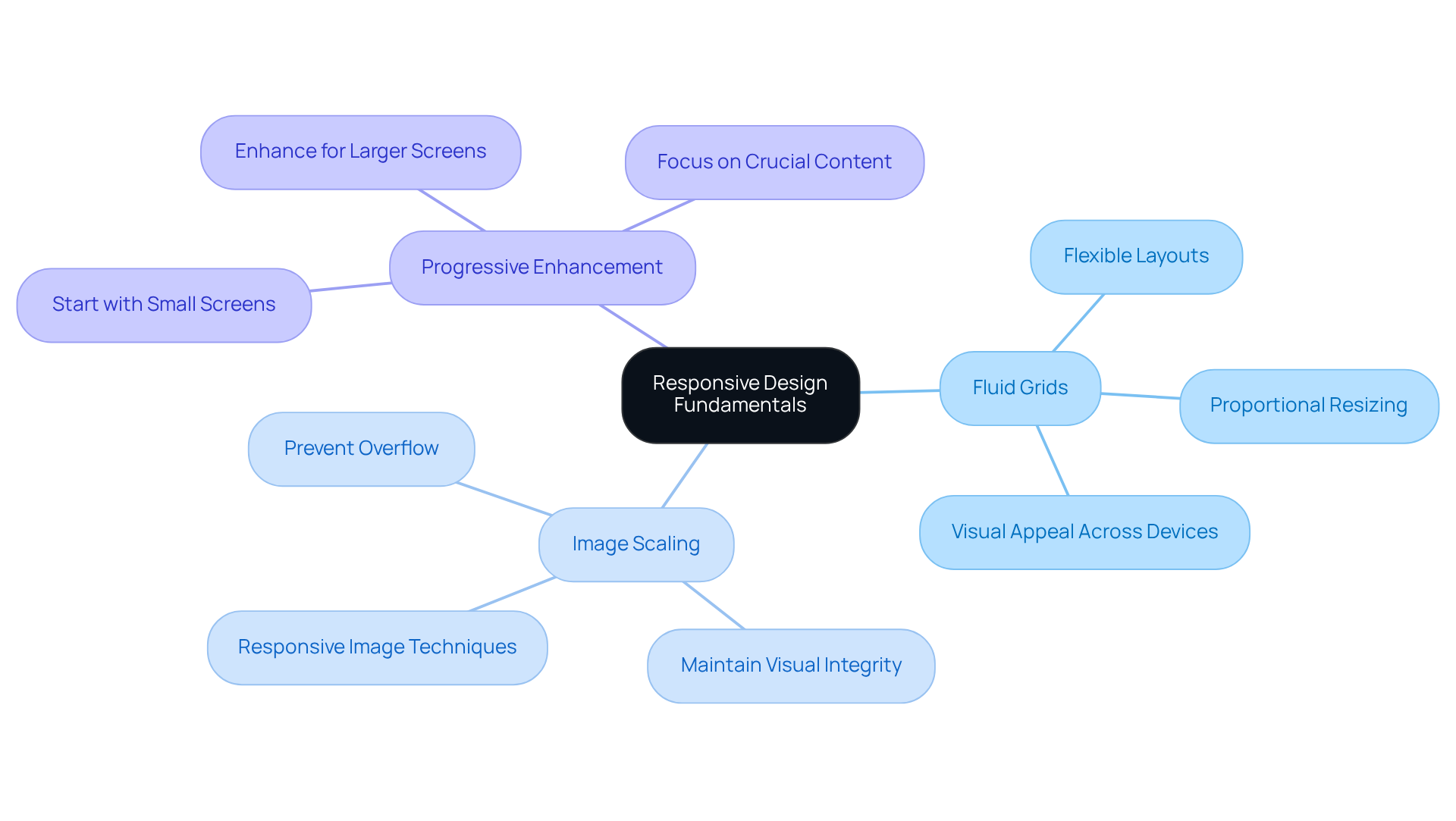
The key principles of responsive design for mobile apps include:
- Fluid Grids: Implementing a flexible grid layout allows elements to resize proportionally, ensuring your app maintains visual appeal on both small and large screens.
- Mobile App Responsive Design: Ensuring images scale appropriately within their containing elements is essential for preventing overflow and maintaining visual integrity across devices.
- Mobile App Responsive Design: By starting with the smallest screens in mind and progressively enhancing the interaction for larger screens, this approach emphasizes crucial content and functionality, ensuring a streamlined experience for your audience.
By 2025, around 90% of websites are anticipated to have embraced responsive approaches, highlighting its essential role in audience engagement. Startups that excel in these fundamentals can develop applications with mobile app responsive design that not only look outstanding but also function effectively across all devices, significantly improving user satisfaction and engagement.
Case studies show that businesses investing in responsive design see substantial improvements in conversion rates. For instance, Majestic Wine reported a remarkable 201% increase in form submissions after redesigning their category page. When you focus on these principles, you’re not just meeting expectations; you’re creating an experience that resonates with your users and sets your startup apart.
Implement Key Techniques for Responsive Mobile Apps
Have you ever felt frustrated when using an app that just doesn’t seem to fit your screen? Many startups struggle to keep users engaged due to frustrating interactions on mobile devices. To create responsive mobile apps, startups should consider the following techniques:
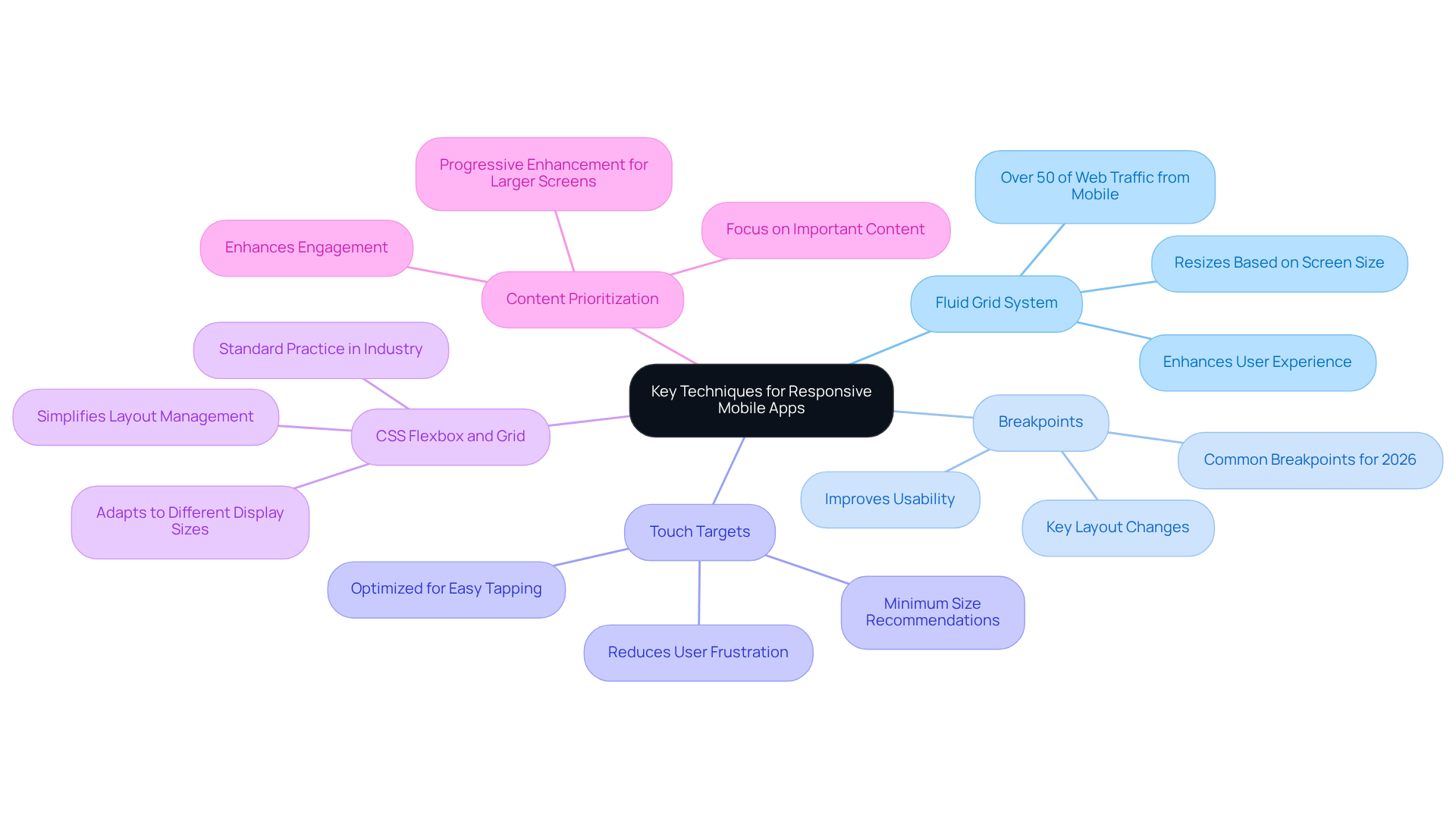
- Use a Fluid Grid System: Implement a grid system that allows for fluid layouts, enabling elements to resize based on screen size. This ensures a consistent look and feel across devices, enhancing user experience with mobile app responsive design. Did you know that over 50% of web traffic now comes from mobile devices? This makes fluid grids essential for maintaining engagement.
- Set Appropriate Breakpoints: Identify key breakpoints where the layout should change based on screen size. This customized approach enhances usability across various devices through mobile app responsive design, ensuring that individuals enjoy a seamless experience. As highlighted in case studies, effective breakpoint management within mobile app responsive design can greatly lessen frustration for users and enhance interaction rates.
- Optimize Touch Targets: Imagine how much smoother your app could be if users could easily tap buttons without frustration. Ensuring that buttons and interactive elements are adequately sized for easy tapping on touch screens improves usability and decreases frustration. Research shows that optimizing touch targets can lead to a more engaging user experience, as users are less likely to abandon apps due to interaction difficulties.
- Leverage CSS Flexbox and Grid: Utilize CSS Flexbox and Grid for layout management. These robust tools enable the development of adaptable layouts that adjust to different display sizes without extensive media queries, simplifying the process. The integration of these technologies is becoming a standard practice in the industry, allowing for more efficient and flexible design solutions.
- Prioritize Content: Focus on the most important content for smaller screens and progressively enhance the experience for larger screens. This approach guarantees that individuals receive the most pertinent information first, enhancing engagement and retention. Case studies have demonstrated that apps employing fluid grid systems and effective breakpoints significantly enhance engagement and reduce frustration, ultimately driving better business outcomes.
By embracing these techniques, you can achieve mobile app responsive design that not only responds beautifully but also feels intuitive and welcoming to your users. Ultimately, the right approach can transform user experiences, making your app a joy to use rather than a source of frustration.
Test and Optimize for Enhanced User Experience
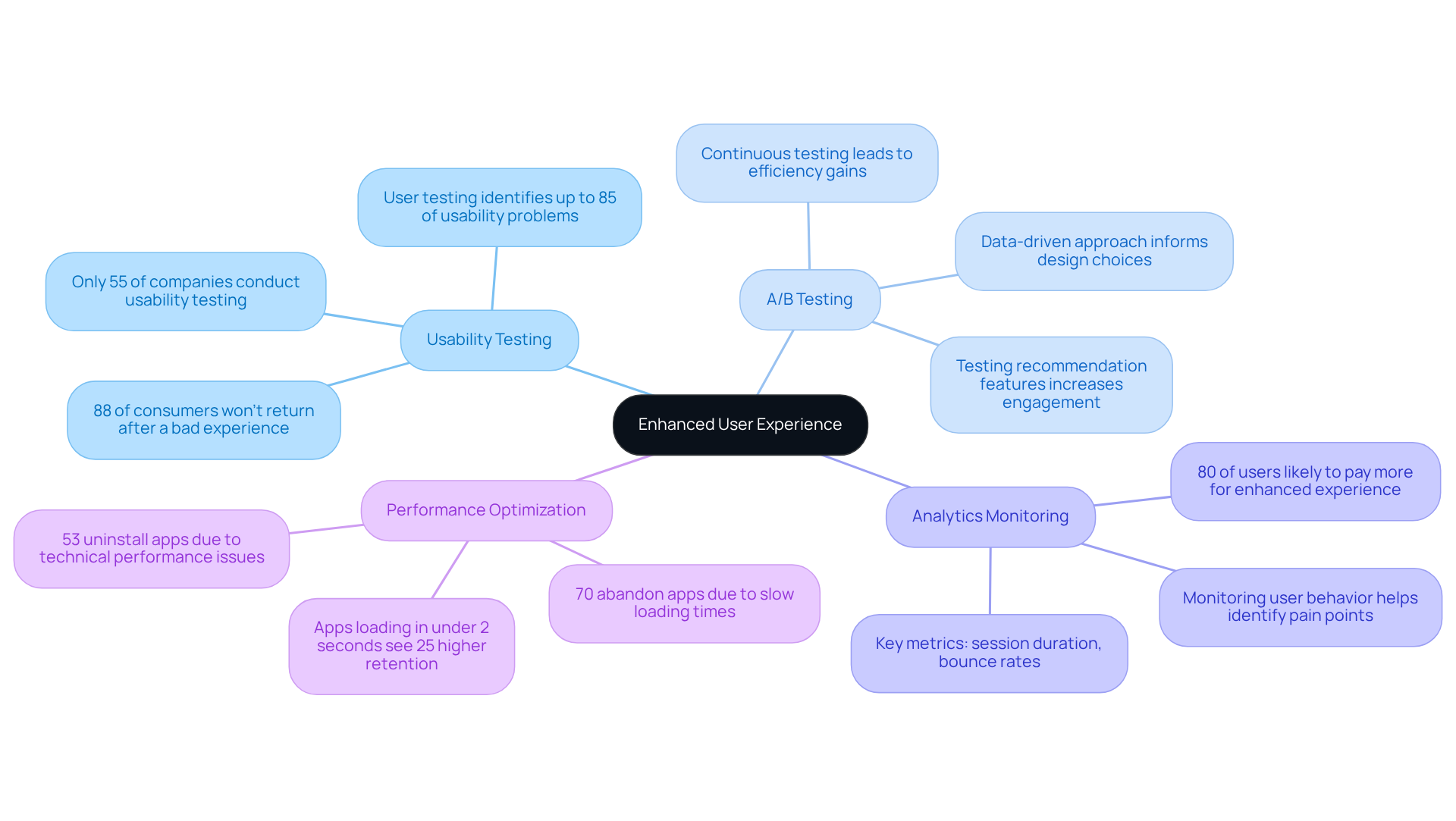
Have you ever felt the frustration of losing users due to a poor app experience? Regular usability testing with real users is so important to spot those frustrating pain points. As Pratyusha Guha reminds us, a staggering 88% of online consumers won’t come back after a bad experience. That’s a wake-up call for all of us!
Trying out A/B testing can really help you see which app features or layouts resonate more with your users. This data-driven approach not only informs your design choices but also fosters a deeper connection with your audience.
Using analytics tools to keep an eye on how users interact with your app is so important. Key metrics like session duration and bounce rates can provide valuable insights into engagement. Remember, 80% of individuals are likely to pay more for an enhanced experience, so investing in usability testing can pay off in the long run.
By continuously tweaking your app based on feedback and analytics, you can make sure it grows with your users. Research shows that 53% of individuals uninstall apps due to technical performance problems, which highlights the necessity for ongoing improvements.
It’s crucial to regularly check how your app is performing, like its load times and responsiveness. A quick and seamless experience keeps clients engaged, as 70% of individuals abandon applications due to slow loading times. Ensuring your app loads in under 2 seconds can significantly enhance retention rates.
When you focus on these testing and optimization strategies, you can create mobile apps with mobile app responsive design that truly meet your users’ needs and adapt as they change, fostering long-term engagement and success.
Learn from Industry Leaders: Case Studies in Responsive Design
Are you finding it challenging to keep your users engaged across different devices? Many startups struggle to implement mobile app responsive design, which is crucial for creating a seamless user experience, often leading to lost customers and revenue. Analyzing case studies of successful responsive implementations can offer valuable insights for you.
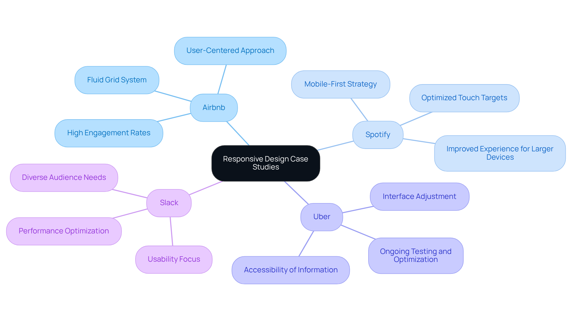
Take Airbnb, for instance. Their mobile app responsive design incorporates a fluid grid system and media queries to ensure a seamless experience across devices. By focusing on a user-centered approach, they've achieved high engagement and satisfaction rates. In fact, mobile-optimized sites see 40% greater conversions than their non-optimized counterparts. Google emphasizes that quicker mobile pages can enhance engagement and revenue, underscoring the significance of mobile app responsive design.
Then there's Spotify. Their app is crafted with a mobile-first strategy, emphasizing vital features for compact displays while improving the experience for larger devices. Their flexible layouts and optimized touch targets have played a crucial role in retaining clients, aligning with findings that effective web design can drive conversion rates by up to 400%.
Uber also stands out with its app that adjusts its interface according to the device being used. This ensures that essential information is easily accessible, no matter the screen size. Their ongoing testing and optimization practices have helped them maintain a competitive edge, enhancing the user experience. Research from Baymard shows that poor aesthetics can drive 38% of web visitors away, highlighting the need for effective strategies.
Lastly, consider the mobile app responsive design features of Slack. Their mobile app responsive design enables individuals to access their messaging platform seamlessly across devices. By concentrating on usability and performance, they've developed an app that meets the needs of a diverse audience. Research indicates that 75% of visitors perceive well-designed websites as more trustworthy, which is crucial for platforms like Slack that rely on user engagement.
By learning from these leaders, you can enhance user engagement and drive conversions, ultimately leading to greater success for your startup. Understanding common pitfalls in responsive design can help you avoid missteps, ensuring a smoother implementation process.
Conclusion
In a world where user expectations are constantly rising, many startups find it challenging to keep their apps relevant and user-friendly in a fast-evolving digital landscape. When startups focus on responsive design, they create apps that feel intuitive and enjoyable for users, no matter what device they’re on. This dedication to being adaptable helps meet user needs and opens doors to lasting success in today’s mobile-driven market.
Let’s remember the key insights we’ve discussed:
- Implementing fluid grids
- Optimizing touch targets
- Regularly testing usability
These can make a real difference. Learning from industry leaders like Airbnb, Spotify, and Uber shows us that thoughtful design not only boosts conversion rates but also fosters user loyalty and drives business growth.
Embracing responsive design principles is essential for startups looking to create impactful mobile applications. By investing in these best practices, startups can enhance their user experience and position themselves as leaders in their respective markets. Taking these steps now can turn your startup into a beacon of innovation and user satisfaction in the mobile app market.
Frequently Asked Questions
What is responsive design in mobile apps?
Responsive design in mobile apps ensures that applications operate smoothly across various devices and display sizes, providing a consistent user experience.
What are the key principles of responsive design for mobile apps?
The key principles include fluid grids, which allow elements to resize proportionally; ensuring images scale appropriately within their containers; and starting with the smallest screens in mind while progressively enhancing for larger screens.
Why is fluid grids important in responsive design?
Fluid grids are important because they enable a flexible layout that maintains visual appeal on both small and large screens, ensuring a cohesive look and feel across devices.
How does starting with the smallest screens benefit mobile app design?
Starting with the smallest screens emphasizes crucial content and functionality, ensuring a streamlined experience for users as the design is progressively enhanced for larger screens.
What is the anticipated trend for responsive design by 2025?
By 2025, it is anticipated that around 90% of websites will have embraced responsive design approaches, highlighting its essential role in audience engagement.
What impact does investing in responsive design have on businesses?
Businesses that invest in responsive design often see substantial improvements in conversion rates. For example, Majestic Wine reported a 201% increase in form submissions after redesigning their category page.
How does responsive design improve user satisfaction?
By focusing on responsive design principles, startups can create applications that not only look outstanding but also function effectively across all devices, significantly enhancing user satisfaction and engagement.
List of Sources
- Understand the Fundamentals of Responsive Design
- 70+ Key Web Design Statistics for 2026 | Wingify (https://wingify.com/blog/web-design-statistics)
- 30 Latest Web Design Statistics for You to Know in 2026 (https://simpalm.com/blog/essential-web-design-statistics)
- Responsive Website Design Stats: 40+ Key Statistics for 2026 (https://nexalitservices.com/guides/responsive-website-design-stats)
- These 90+ Web Design Statistics Show Why Most Websites Fail (https://wearetenet.com/blog/web-design-statistics)
- 28 Essential web design statistics for 2026: Trends & insights (https://hostinger.com/tutorials/web-design-statistics)
- Implement Key Techniques for Responsive Mobile Apps
- What Are the Most Common Breakpoints for Responsive Design? (https://readyartwork.com/what-are-the-most-common-breakpoints-for-responsive-design)
- Screen Sizes for Responsive Design: 2026 Guide - Shopify (https://shopify.com/blog/screen-sizes-responsive-design)
- Responsive Mobile App Design, Best Practices and Tools (https://unicoconnect.com/blogs/responsive-mobile-app-design)
- 60+ Web Design Statistics for 2026 | Figma (https://figma.com/resource-library/web-design-statistics)
- Responsive Design Breakpoints: 2026 Guide | Hoverify (https://tryhoverify.com/blog/responsive-design-breakpoints-2024-guide)
- Test and Optimize for Enhanced User Experience
- 25 Key Usability Testing Statistics to Revamp your Design | VWO (https://vwo.com/blog/usability-testing-statistics)
- 15 Mobile App User Behavior Metrics That Drive Retention (2026) (https://artisangrowthstrategies.com/blog/essential-mobile-app-analytics-user-behavior-metrics-guide)
- 15+ Mobile App Testing Statistics & Facts | Testlio (https://testlio.com/blog/mobile-app-testing-statistics)
- A/B testing vs. User Experience Research (https://linkedin.com/pulse/ab-testing-vs-user-experience-research-yann-riche)
- 20 Mobile App Statistics To Know In 2026 (https://mindsea.com/blog/app-stats)
- Learn from Industry Leaders: Case Studies in Responsive Design
- Case Study: Airbnb (https://medium.com/future-sensor/case-study-airbnb-7f4e2a66184c)
- 30 Latest Web Design Statistics for You to Know in 2026 (https://simpalm.com/blog/essential-web-design-statistics)
- 28 Essential web design statistics for 2026: Trends & insights (https://hostinger.com/tutorials/web-design-statistics)
- Responsive Website Design Stats: 40+ Key Statistics for 2026 (https://nexalitservices.com/guides/responsive-website-design-stats)
- More Than Homeshare: Learning from Airbnb's Journey to UX Leadership | Raw.Studio (https://raw.studio/blog/more-than-homeshare-learning-from-airbnbs-journey-to-ux-leadership)


