

Introduction
For many tech startup founders, the journey of designing a dashboard can feel overwhelming, especially when clarity and functionality are so crucial. This article explores ten inspiring examples of dashboard design that not only enhance user experience but also drive innovation and performance in the fast-paced world of technology.
As you work to make data-driven decisions, you might wonder: how can a well-crafted dashboard truly enhance your team's efficiency and engagement?
Dive into these compelling case studies to discover how leading platforms are redefining the dashboard landscape and what lessons can be applied to elevate any tech initiative.
RNO1: Transformative Dashboard Design for Digital Innovation
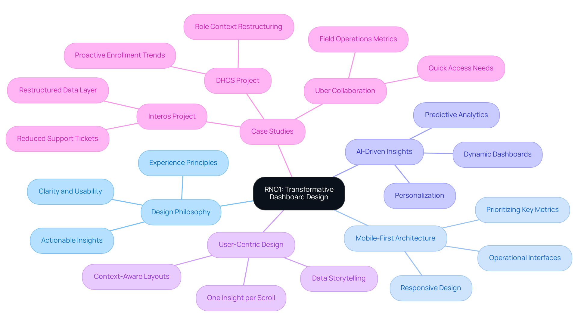
Navigating the world of interface creation can feel overwhelming for tech startup founders, especially when clarity and functionality are at stake. RNO1 creates interfaces that are both beautiful and functional, designed specifically for tech startups. Their design philosophy blends experience principles with advanced technology, ensuring that each interface provides actionable insights. By prioritizing clarity and usability, RNO1 helps startups tackle complex data landscapes, making informed decision-making easier. This approach not only engages users but also helps startups grow in meaningful ways, establishing RNO1's interfaces as essential tools for any tech initiative.
Recent trends highlight the importance of mobile-first architecture, which ensures that key metrics are prioritized for smaller screens. This is particularly beneficial for operational interfaces, allowing users to access vital information quickly. Additionally, the use of AI-driven insights is changing how information is presented, enabling dashboards to adapt dynamically to different roles and preferences. This showcases RNO1's commitment to leveraging AI-enhanced digital marketing and innovative solutions.
Case studies illustrate the impact of RNO1's philosophy on creation. For example, in a project with Interos, RNO1 restructured the data layer to enhance user experience, leading to a significant drop in support tickets. This shows how thoughtful planning can boost operational efficiency and lead to measurable success.
Many founders are realizing just how crucial user-centric design is for their interfaces today. The principle of 'one insight per scroll' is a common theme in effective interface creation, ensuring that users can focus on key metrics without feeling overwhelmed. Moreover, the emphasis on data storytelling transforms raw metrics into engaging narratives, helping users quickly grasp important changes and their implications.
Statistics reveal that 85% of users believe a company's mobile site should be as effective or better than its desktop version. This underscores the need for tech startups to invest in high-quality solutions that enhance the overall experience. By partnering with RNO1, startups can turn their interface challenges into opportunities for growth and engagement.
Trello: User-Centric Dashboard Design for Project Management
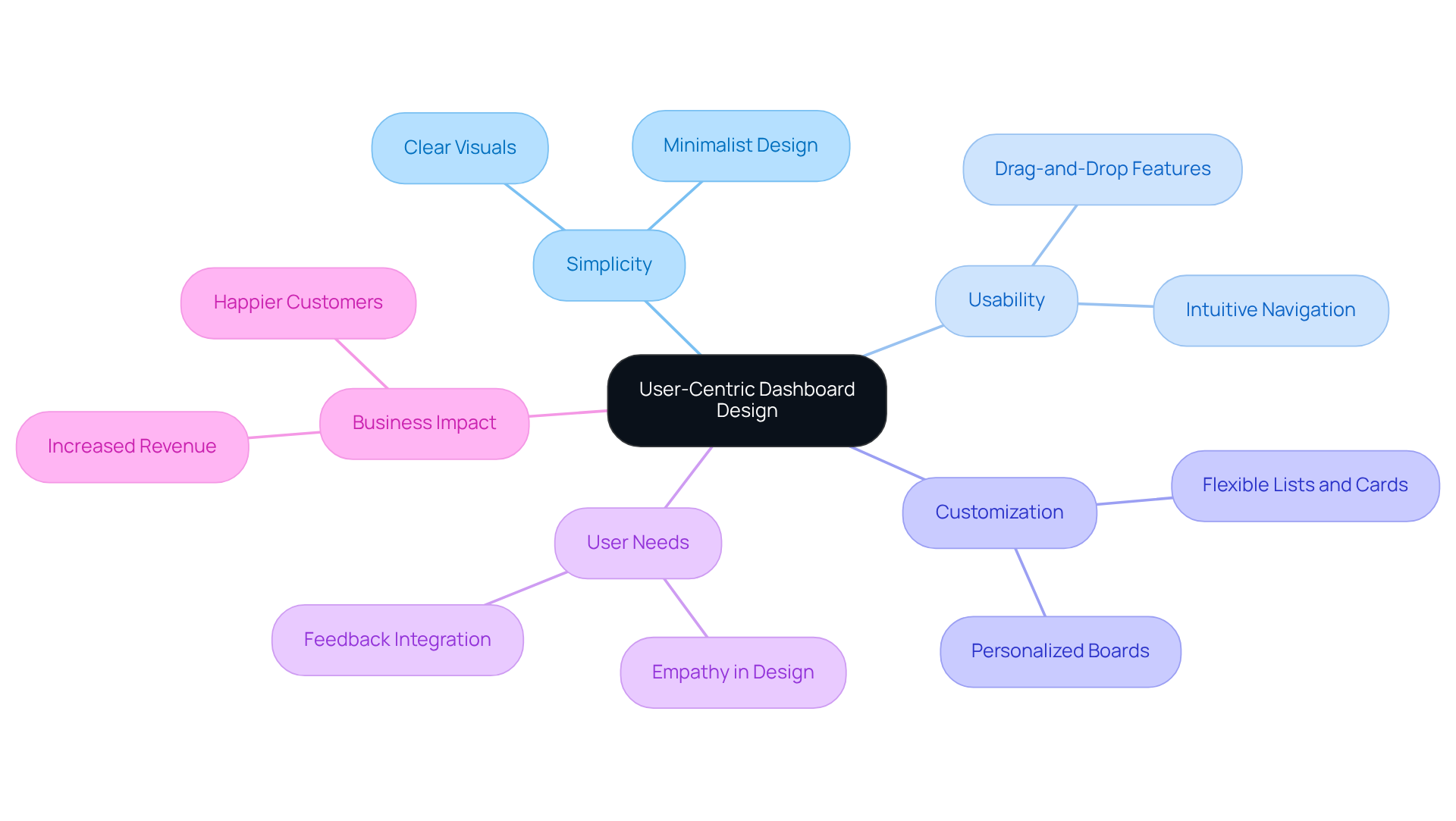
Have you ever felt overwhelmed by the complexity of project management tools? Trello understands this struggle and exemplifies user-centric principles by prioritizing simplicity and usability in its examples of dashboard design. Imagine being able to see your projects clearly with boards, lists, and cards that you can customize to fit your needs, making task management feel less daunting. With simple drag-and-drop features, you can easily adjust your workflow, making collaboration feel more natural and less stressful.
This way, you can focus on what truly matters, without feeling overwhelmed by distractions. Many users struggle with project management tools that just don’t meet their needs, which is why it’s so important to create experiences that truly resonate with them. Trello focuses on real human needs, making sure that every interaction feels genuine and valuable.
When organizations put users first, they often see not just happier customers but also a boost in their bottom line. Trello provides examples of dashboard design that illustrate how focusing on user experience can lead to meaningful innovations that truly make a difference for startups. At RNO1, we’re here to support you with services like UX/UI design and digital marketing, helping you create solutions that engage your users and drive growth together.
Salesforce: Dynamic Dashboards that Drive Business Insights
Have you ever felt overwhelmed by the sheer volume of data and unsure how to make the best decisions for your business? Salesforce's dynamic visualizations can help you cut through the noise and focus on what truly matters. These dashboards serve as excellent examples of dashboard design, offering extensive customization options that allow you to tailor them to reflect your unique business goals. Imagine concentrating on key metrics that drive your success, like the 'Opportunity Conversion Rate,' which is crucial for sales managers.
By seamlessly combining information from various sources, Salesforce enables you to visualize trends and respond effectively to market changes. The intuitive design improves navigation through complex information sets, ensuring that critical insights are always at your fingertips.
Consider the case studies, such as 'Leveraging Salesforce Dynamic Dashboards,' which serve as examples of dashboard design that show how businesses using these tools experience enhanced decision-making and operational efficiency. They provide customized insights based on roles and access levels, making it easier for everyone to stay informed.
As we look ahead to 2026, think about how advancements in Salesforce technology can empower you to collaborate more effectively and share vital information seamlessly. It's important to note that the number of interactive visualizations available varies by Salesforce edition, with restrictions in place to ensure optimal performance. By embracing these tools, you can transform your decision-making process and foster a more collaborative environment, ultimately leading to greater success for your startup.
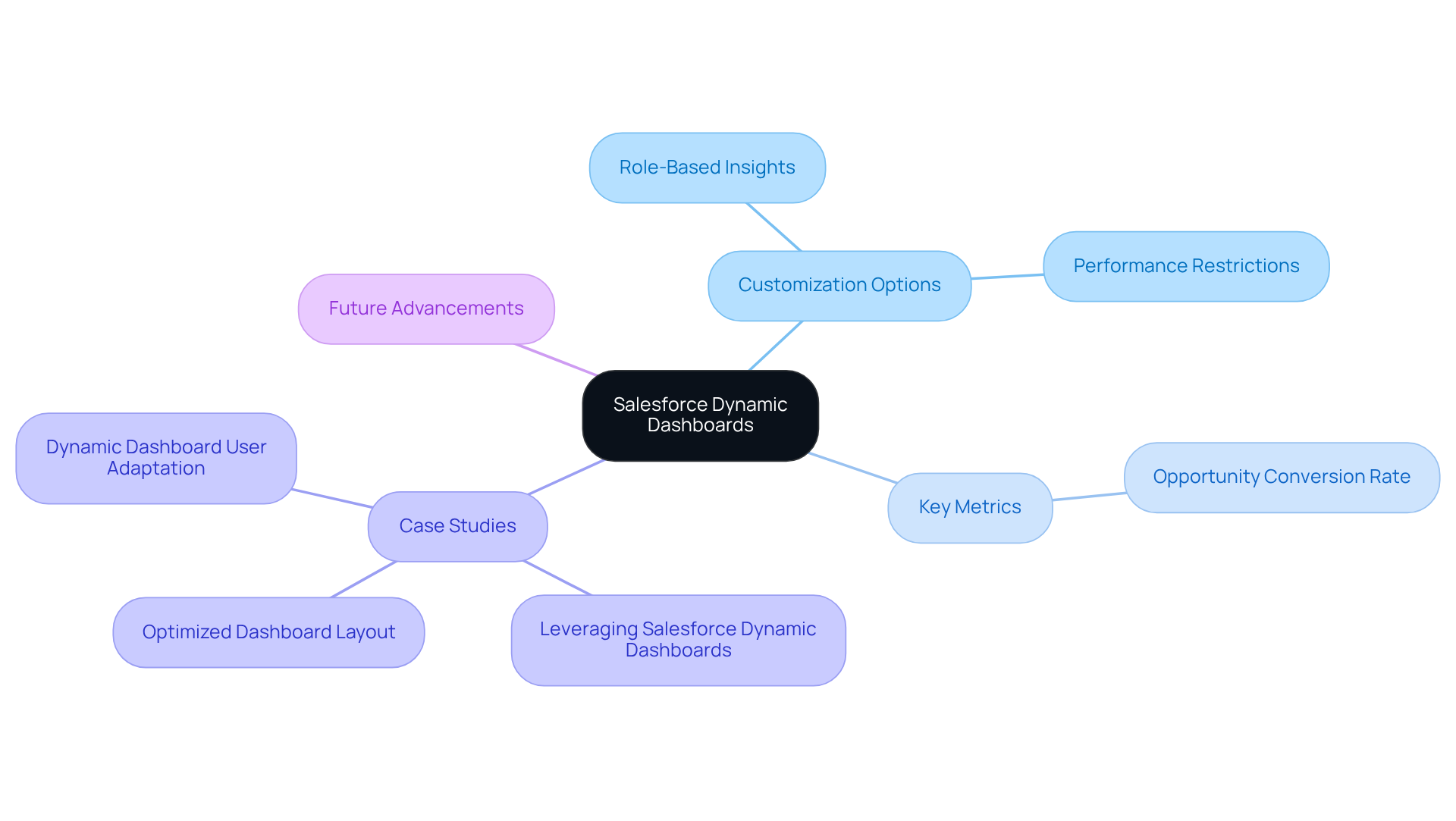
Tableau: Interactive Dashboards that Empower Data Visualization
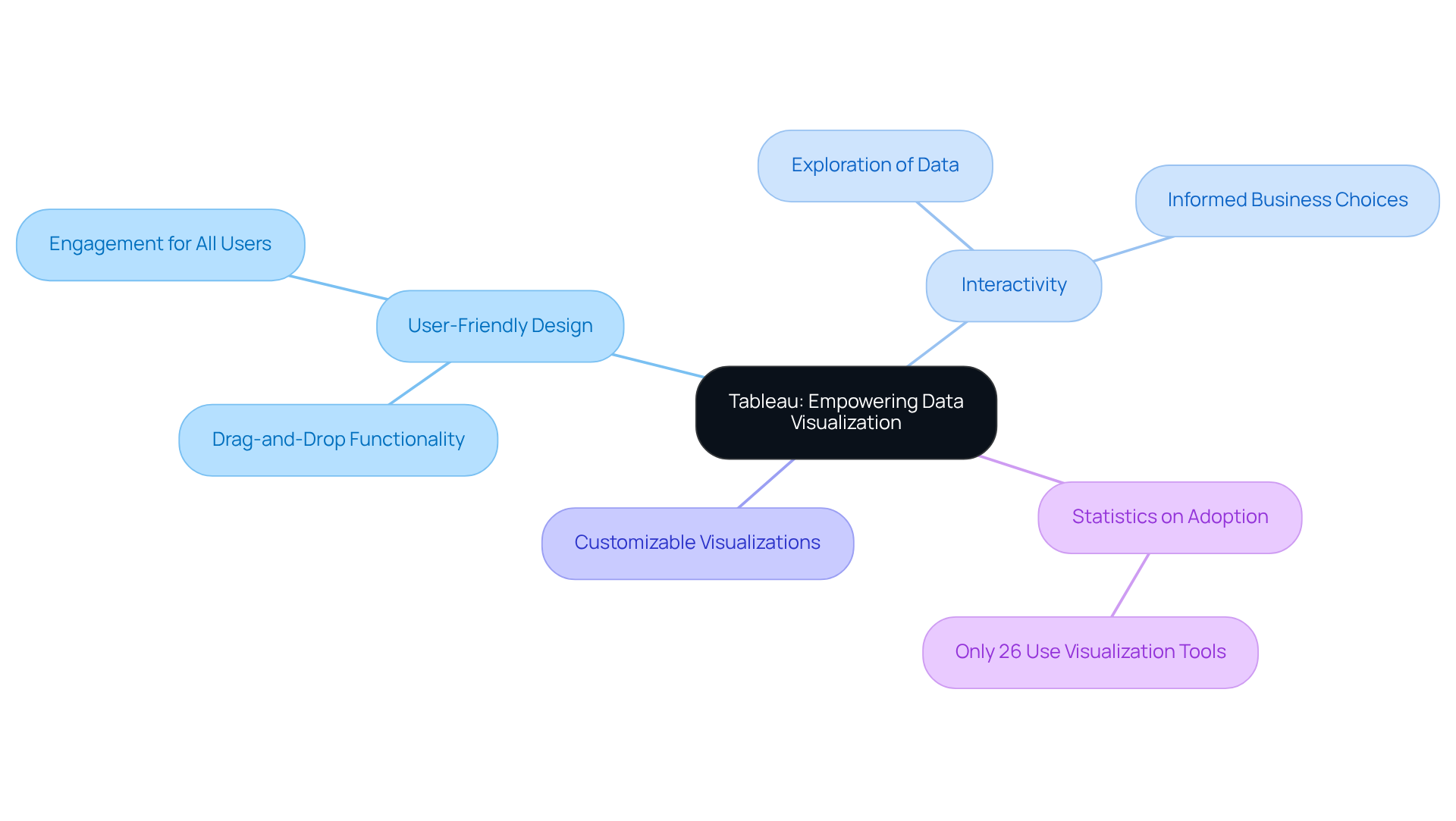
Many organizations struggle to make sense of their data, often feeling overwhelmed by the sheer volume of information available. Tableau provides examples of dashboard design that are here to help. With its user-friendly design, Tableau invites everyone to dive into their data, uncovering insights that can truly make a difference. The intuitive drag-and-drop functionality and customizable visualizations empower individuals to create tailored views that align with their analytical needs. This focus on interactivity allows users to explore their information more thoroughly, revealing insights that facilitate informed business choices. No matter your technical background, Tableau makes it easy for anyone to engage with their data and find meaningful insights. It's a vital tool for organizations seeking to utilize information effectively.
In fact, statistics from a recent study show that only 26% of organizations currently employ visualization tools, highlighting a significant opportunity for businesses to enhance their interpretation and decision-making processes through Tableau's capabilities.
As Andy Kirk wisely noted, "Data visualizations must communicate answers and provide business outcomes. If the information feeding an analytics interface is not reliable, the outcomes are insignificant."
By embracing Tableau's capabilities, organizations can develop examples of dashboard design that transform their data into actionable insights, paving the way for informed decisions that drive success.
Microsoft Power BI: Seamless Dashboards for Data-Driven Decisions
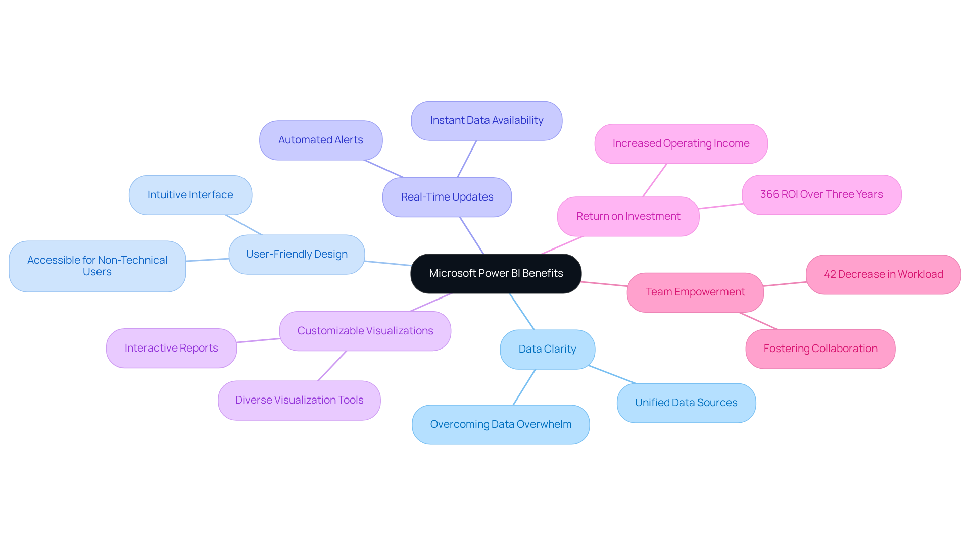
Many startup founders struggle to make sense of their data, often feeling overwhelmed by the sheer volume of information available. Imagine having a tool that brings together all your data in one place, giving you a clear view of your business metrics and helping you make sense of it all. With its user-friendly design, you can easily create visually engaging reports that highlight the key performance indicators that matter most to you.
Power BI offers real-time updates and customizable visualizations, allowing you to make agile decisions and swiftly identify trends. By embracing Power BI, you can turn data chaos into clarity, empowering your team to innovate and thrive in a competitive landscape.
Companies using Power BI report an impressive 366% return on investment over three years, showcasing how it can enhance information quality and business performance. Additionally, implementing Power BI visualizations can lead to a 42% decrease in the workload of analytics teams, freeing them to focus on strategic initiatives rather than routine reporting.
When you foster a culture of data transparency with Power BI, you’re not just improving efficiency; you’re empowering your team to collaborate and innovate, helping your startup thrive in a competitive landscape.
Figma: Collaborative Dashboards that Enhance Design Workflow
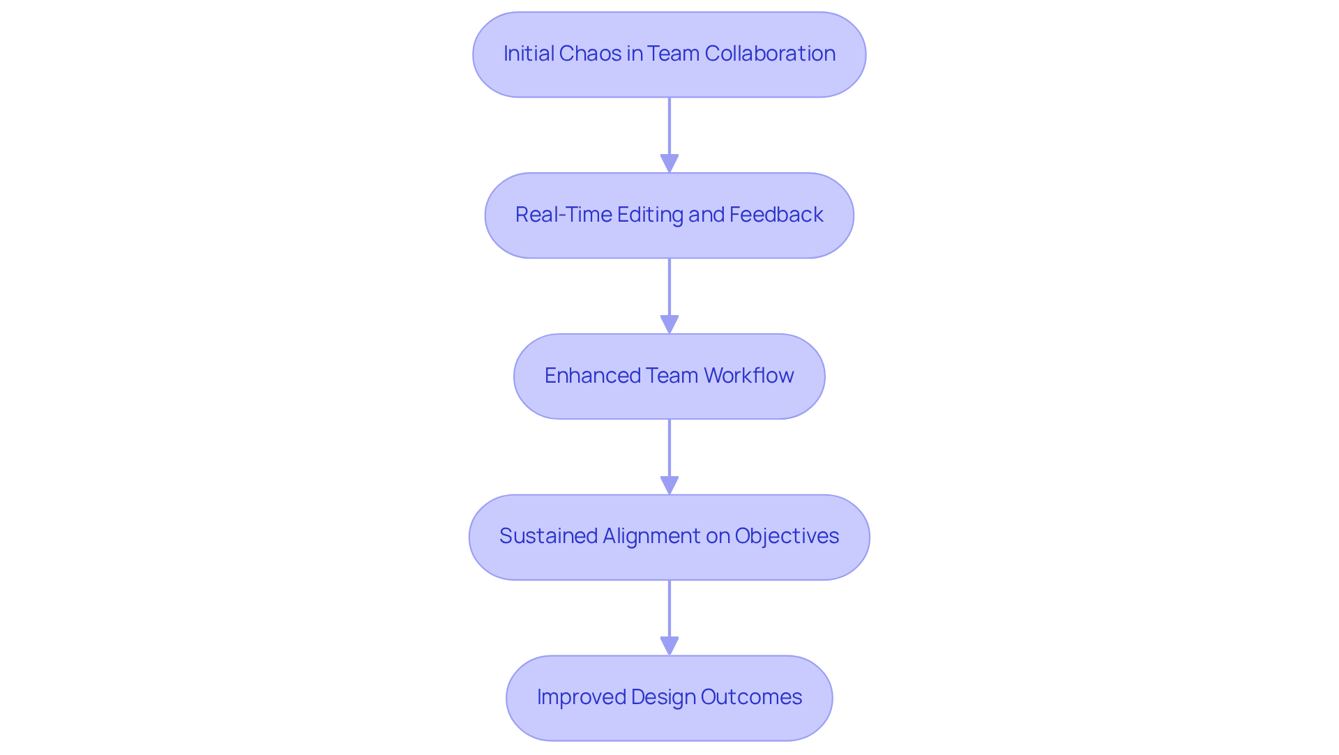
Have you ever felt overwhelmed by the chaos of team collaboration, struggling to keep everyone aligned on a project? It’s a common challenge many tech startup founders face. Without a streamlined approach, teams often find themselves lost in endless revisions and miscommunication. This can lead to frustration and a sense of disconnect among team members, making it hard to achieve your goals.
Imagine the relief of knowing everyone is on the same page, working towards a common goal without confusion. Figma offers a solution with its collaborative interfaces that allow multiple users to participate on the same project in real time. With real-time editing, you can share feedback instantly, creating a lively and engaging atmosphere where ideas flow freely. This dynamic collaborative environment not only enhances team workflows but also fosters a sense of unity and purpose.
By providing a thorough overview of project progress, Figma helps teams sustain alignment and concentrate on their objectives. Teams using Figma have shared stories of how they’ve cut down on confusion and improved collaboration, with many seeing a 30% reduction in view sprawl, allowing them to focus on what truly matters. This efficiency not only boosts productivity but also reinforces the importance of collaboration in achieving successful design outcomes.
With Figma, you can transform your team's collaboration experience, turning confusion into clarity and frustration into focus.
Notion: Versatile Dashboards for Personal and Team Productivity
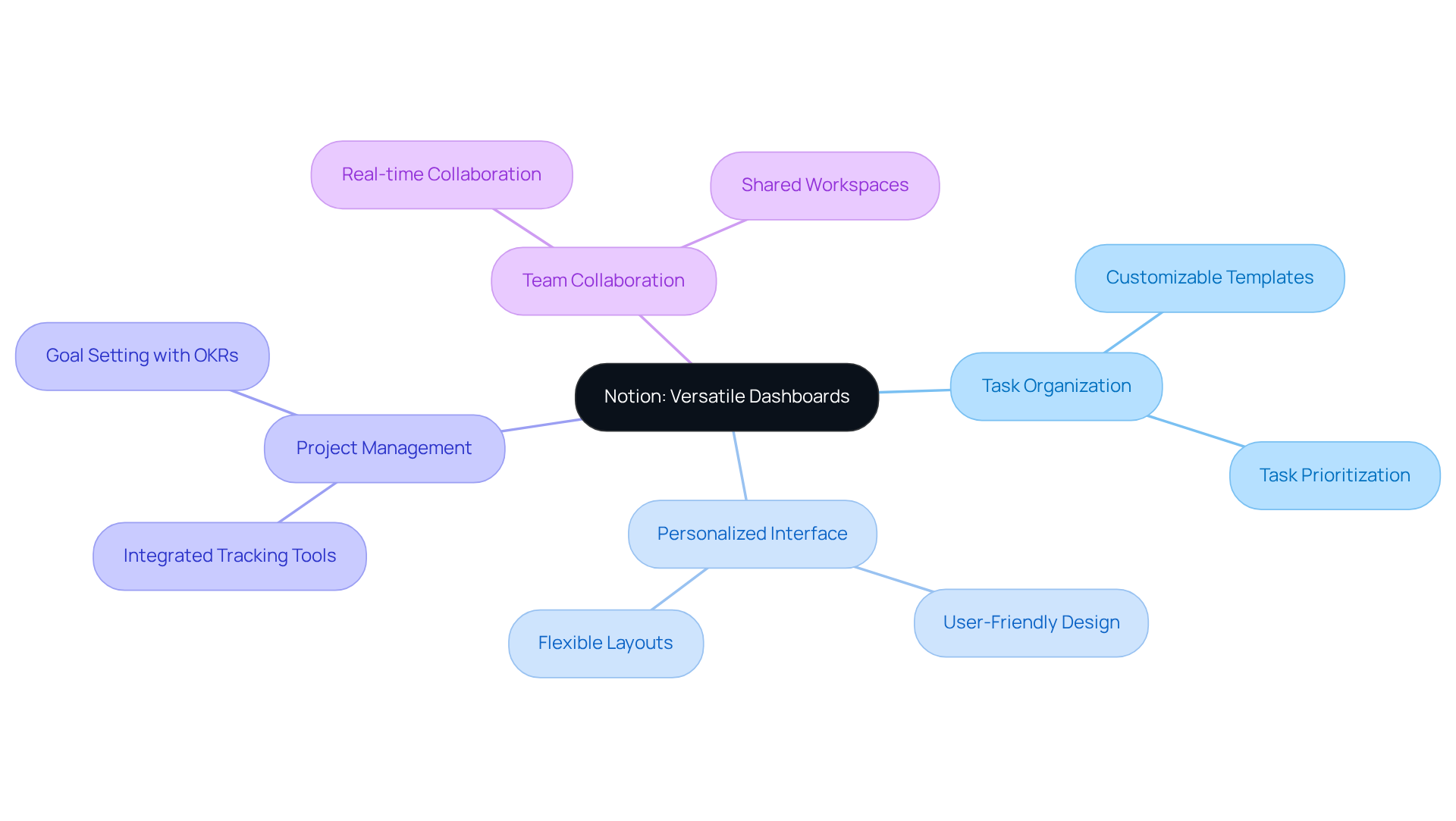
Are you struggling to keep your tasks organized while juggling multiple projects? With Notion, you can easily tailor your workspace to fit your specific needs, just like many founders have done to enhance their productivity.
Have you ever wished for a tool that adapts to your unique workflow, whether you're working solo or with a team? Notion's adaptability allows you to create a personalized interface that combines tasks, notes, and project management tools all in one place.
Navigating your workspace should feel effortless, and with Notion, many users find it’s a breeze to manage both projects and personal tasks. Imagine how much smoother your workflow could be with a tool that adapts to your unique needs.
Asana: Streamlined Dashboards for Effective Task Management
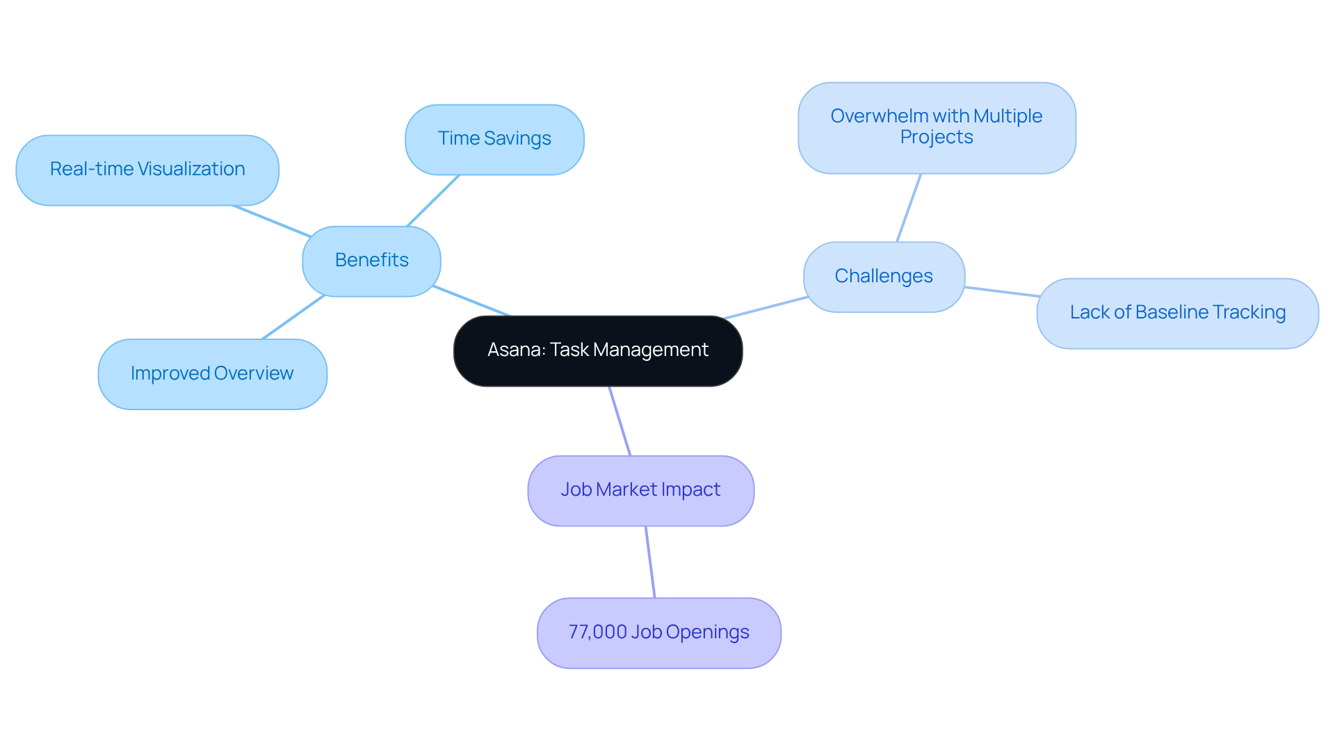
As a tech startup founder, you might feel the weight of managing multiple projects and ensuring your team stays on track. Asana's interfaces are expertly designed to improve task management, offering users a thorough overview of project status and team performance. The platform's intuitive interface allows for real-time visualization of tasks, deadlines, and progress, fostering a collaborative environment where team members can easily track their contributions and identify potential bottlenecks.
When teams embrace structured task management practices, like those offered by Asana, they often find themselves achieving greater project success. Yet, many teams find themselves feeling overwhelmed when juggling multiple projects in Asana, which can make it challenging to stay organized. Additionally, many workers have shared that they save precious hours each week thanks to automation, allowing them to focus on what truly matters.
However, the lack of baseline tracking for project timelines in Asana could limit its effectiveness in certain scenarios. As tech startup founders navigate the complexities of building cohesive teams, recognizing these challenges can empower them to make informed decisions about their task management tools. Furthermore, with 77,000 job openings projected annually for task management skills, leveraging tools like Asana can be pivotal in attracting and retaining talent. By embracing both the strengths and limitations of tools like Asana, you can create a more effective and supportive environment for your team.
Qlik: Insightful Dashboards that Transform Data into Action
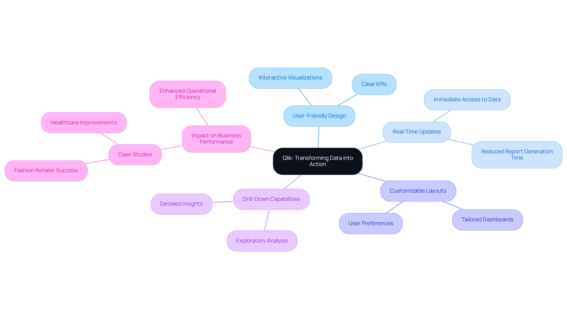
Have you ever felt overwhelmed by the sheer volume of data, unsure of how to turn it into something meaningful? Qlik's examples of dashboard design can assist you in making sense of it all, transforming complex information into actionable insights that empower you to make informed decisions quickly. The platform's intuitive interface allows you to create interactive visualizations that highlight key trends and metrics, making it easier to interpret your insights. This storytelling approach ensures that you can grasp the information at hand, ultimately driving better business outcomes.
Imagine being part of a company that not only keeps up with the competition but thrives - statistics show that those using real-time analytics are 23% more likely to do just that. It's not just about numbers; it's about the peace of mind that comes with having immediate access to the information you need. With a comprehensive view of performance metrics, you can utilize your insights effectively, significantly enhancing operational efficiency.
Qlik's user-friendly designs, real-time updates, customizable layouts, drill-down capabilities, and clear KPIs are excellent examples of dashboard design that foster a culture of collaboration and informed decision-making. Case studies illustrate the impact of these analytics tools; for instance, a prominent fashion retailer achieved near real-time visibility for over 500 individuals, leading to enhanced business performance and operational agility.
Without the right tools, navigating the complexities of data can feel like an uphill battle, but with Qlik, you can transform that challenge into an opportunity for growth and innovation.
Google Analytics: Comprehensive Dashboards for Web Insights
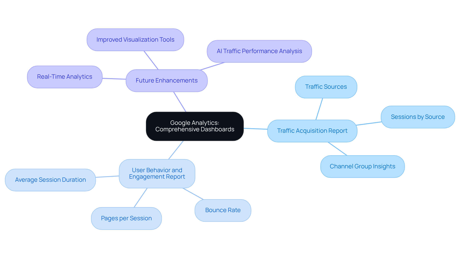
Navigating the world of website analytics can feel overwhelming, especially when you're trying to make sense of all the data at your fingertips. Google Analytics makes it easier for you to keep track of vital metrics like where your traffic is coming from and how engaged your visitors are, helping you feel more in control of your online strategy. When you visualize this information, it’s like having a guiding light, empowering you to make informed choices that truly enhance your digital strategies. The user-friendly interface means that even if you’re not a tech whiz, you can navigate the visual displays with ease, making it a must-have tool for anyone looking to boost their online presence.
For example, the Traffic Acquisition Report breaks down your sessions by source, showing you exactly which marketing efforts are resonating with your audience, so you can feel confident in your strategy. This insight helps you and your team allocate resources wisely and pinpoint areas that might need a little extra love and attention. Plus, the User Behavior and Engagement Report lets you see how visitors are interacting with your site, measuring important metrics like how long they stay and when they leave, giving you valuable insights into their experience. These visualizations help you enhance user experience and refine your content strategy, fostering deeper connections with your audience.
As we look ahead to 2026, Google Analytics is evolving, bringing updates that enhance its capabilities, like improved visualization tools and real-time analytics features that keep you ahead of the curve. By harnessing these detailed visualizations, you can turn raw data into actionable insights, paving the way for growth and innovation in your digital landscape. Additionally, examples of dashboard design, including web analytics dashboards, can help you improve profitability and ROI, reinforcing just how valuable these tools are for making strategic decisions that drive your business forward.
Conclusion
Many startups find themselves overwhelmed by the sheer volume of data, struggling to extract meaningful insights that can guide their decisions. At RNO1, we understand this challenge, and our user-centric dashboard designs are here to help turn that data into actionable insights. We’re dedicated to being a supportive partner for startups, helping them navigate the complexities of data with clarity and ease.
Throughout this article, we’ve seen how effective dashboard design can transform the way startups operate. From platforms like Trello and Salesforce to Tableau, each example highlights the importance of user experience and mobile-first architecture. These elements not only enhance productivity but also empower decision-making. Our collaboration with clients such as Interos showcases the measurable impact of strategic design on operational success.
In today’s fast-paced digital world, we believe that investing in thoughtful dashboard design is crucial for startups looking to thrive and grow. By partnering with RNO1, tech companies can leverage innovative design solutions that foster engagement, streamline workflows, and ultimately drive growth. By embracing these principles, startups can not only enhance their user experiences but also pave the way for sustainable growth in a competitive market.
Frequently Asked Questions
What is RNO1's approach to dashboard design for tech startups?
RNO1 creates interfaces that are both beautiful and functional, blending experience principles with advanced technology to provide actionable insights. Their design prioritizes clarity and usability, helping startups navigate complex data landscapes for informed decision-making.
How does RNO1 incorporate mobile-first architecture in their designs?
RNO1 emphasizes mobile-first architecture to ensure that key metrics are prioritized for smaller screens, allowing users to access vital information quickly, which is particularly beneficial for operational interfaces.
What role does AI play in RNO1's dashboard design?
RNO1 leverages AI-driven insights to dynamically adapt dashboards to different roles and preferences, enhancing the user experience and showcasing their commitment to innovative solutions.
Can you provide an example of RNO1's impact on a client's project?
In a project with Interos, RNO1 restructured the data layer to enhance user experience, resulting in a significant drop in support tickets, demonstrating how thoughtful planning can boost operational efficiency.
What is the principle of 'one insight per scroll' in interface design?
The principle of 'one insight per scroll' ensures that users can focus on key metrics without feeling overwhelmed, making it easier to grasp important changes and their implications.
Why is user-centric design important for tech startups?
User-centric design is crucial as it leads to happier customers and can positively impact the bottom line. It transforms raw metrics into engaging narratives, helping users quickly understand important information.
What statistics highlight the importance of mobile site effectiveness?
Statistics reveal that 85% of users believe a company's mobile site should be as effective or better than its desktop version, emphasizing the need for tech startups to invest in high-quality solutions.
How can startups benefit from partnering with RNO1?
By partnering with RNO1, startups can turn their interface challenges into opportunities for growth and engagement, leveraging RNO1's expertise in UX/UI design and digital marketing.
List of Sources
- RNO1: Transformative Dashboard Design for Digital Innovation
- 50+ UX Statistics To Convince Stakeholders 2025 (https://uxcam.com/blog/ux-statistics)
- Dashboard Design Trends 2026: Which Ones Actually Matter (https://fuselabcreative.com/top-dashboard-design-trends-2025)
- Find Your Inspiration UX Design Quotes That Motivate | Sivaprasad Paliyath (https://linkedin.com/posts/sivaprasad2020_find-your-inspiration-ux-design-quotes-that-activity-7295058902210027521-HbP2)
- Trello: User-Centric Dashboard Design for Project Management
- 30+ UI/UX Design Quotes: Inspiration Boosters for Creative Minds - Mockuuups Studio (https://mockuuups.studio/blog/post/ui-ux-design-quotes)
- User-Centered Design Statistics 2026: ROI, Process & Best Practices (https://gloriumtech.com/user-centered-design-guide)
- User-Centric Design in Project Management: A Product Manager's Perspective (https://linkedin.com/pulse/user-centric-design-project-management-product-casper-richard-r--5qnze)
- 20 User Research and UX Quotes to Inspire You | User testing and UX research platform (https://sharewell.eu/20-user-research-and-ux-quotes-to-inspire-you)
- 30 Quotes on User-centered Interaction Design (https://linkedin.com/pulse/30-quotes-user-centered-interaction-design-marina-yalanska)
- Salesforce: Dynamic Dashboards that Drive Business Insights
- Dynamic Dashboards in Salesforce: How to Create and Use Them (https://xappex.com/blog/dynamic-dashboards-salesforce)
- Unveiling the Power of Salesforce Dashboards: A Guide to Insightful Business and Project Monitoring - Mission Control (https://aprika.com/fundamental_library/unveiling-the-power-of-salesforce-dashboards-a-guide-to-insightful-business-and-project-monitoring)
- What Is A Salesforce Dynamic Dashboard? | Accounting Seed (https://accountingseed.com/resource/blog/salesforce-dynamic-dashboard)
- Key Benefits of Dynamic Dashboards - gettectonic.com (https://gettectonic.com/key-benefits-of-dynamic-dashboards)
- Tableau: Interactive Dashboards that Empower Data Visualization
- 50 Data Visualization Statistics That Prove Its Importance in 2026 (https://visme.co/blog/data-visualization-statistics)
- 20 Data Visualization Quotes by Industry Experts (https://coresignal.com/blog/data-visualization-quotes)
- 100 Essential Data Storytelling Quotes (https://effectivedatastorytelling.com/post/100-essential-data-storytelling-quotes)
- Microsoft Power BI: Seamless Dashboards for Data-Driven Decisions
- How a Power BI Dashboard Can Support Your Business - TenHats (https://tenhats.com/how-a-power-bi-dashboard-can-support-your-business)
- How Power BI Enables Data-Driven Decision Making (https://erpsoftwareblog.com/2024/12/how-power-bi-empowers-data-driven-decision-making-in-organizations)
- Data-Driven Decision-Making with Power BI - P3 Adaptive (https://p3adaptive.com/blog-data-driven-decision-making-with-power-bi)
- Data-Driven Decision Making: Make Informed Decisions (https://thoughtspot.com/data-trends/best-practices/data-driven-decision-making)
- Ecosystem Analytics Dashboard: Driving Data-Driven Decisions | GrowthNatives (https://growthnatives.com/blogs/analytics/analytics-dashboard-unlocking-data-driven-decision-making)
- Figma: Collaborative Dashboards that Enhance Design Workflow
- Collaborative Dashboard Features (https://linkedin.com/top-content/project-management/building-a-project-management-dashboard/collaborative-dashboard-features)
- Collaboration Software Statistics By Workplace, Workers, Technology (2026) (https://scoop.market.us/collaboration-software-statistics)
- How Collaboration Makes us Better Designers: Inclusive Design for Greater Social Impact (https://constructive.co/insight/collaborative-design-process-best-practices)
- The Power of Collaboration: Figma for UX/UI Designers | Touro GST (https://gst.touro.edu/blogs/articles/power-of-collaboration-figma-ux-ui-designers.php)
- Figma Design: Enhancing Collaboration & Product Thinking (https://rubikdigital.co.uk/knowledge/design-no-longer-just-visual-figma-supporting-product-thinking)
- Notion: Versatile Dashboards for Personal and Team Productivity
- How I Built a Notion Dashboard for Maximum Productivity? (https://medium.com/@whizzoe/how-i-built-a-notion-dashboard-for-maximum-productivity-541581429d98)
- All-in-One Productivity Dashboard Template | Notion Marketplace (https://notion.com/templates/all-in-one-productivity-dashboard?srsltid=AU7gw4WXLVPZgmYwEfFoKf72XYIRifwRABwfTwqFRE9qpgBz9vNLN7qY)
- How To Create A Productivity Dashboard in Notion – The Sweet Setup (https://thesweetsetup.com/how-to-create-a-productivity-dashboard-in-notion)
- 40+ remote work productivity statistics, trends & data for 2026 (https://worktime.com/blog/statistics/remote-work-productivity-statistics-trends-data)
- 50+ employee productivity statistics, data & trends in 2026 (https://worktime.com/blog/statistics/employee-productivity-statistics)
- Asana: Streamlined Dashboards for Effective Task Management
- Project Status Report for Strategic Insights That Matter | TrueProject (https://trueprojectinsight.com/blog/project-office/project-status-report)
- Task management statistics you need to know (2026) (https://breeze.pm/blog/task-management-statistics)
- How To Use Project Management Statistics For Better Results? (https://empmonitor.com/blog/project-management-statistics)
- Asana Dashboard: Key Features, Pros and Cons (https://projectmanager.com/blog/asana-dashboard)
- Qlik: Insightful Dashboards that Transform Data into Action
- Elevating Industry Standards: Real-World Applications of Qlik | Inside Info (https://insideinfo.com.au/real-world-applications-of-qlik)
- The Power of Real-Time Business Intelligence Dashboards (https://mokkup.ai/blogs/real-time-insights-the-power-of-business-intelligence-dashboards)
- The Role of Data Storytelling in Strategic Decision-Making (https://certiprof.com/blogs/news/the-role-of-data-storytelling-in-strategic-decision?srsltid=AU7gw4VQ8gz8wusn_H9Fq9ERitSEtNZzt55Nd19ms-PW_7iDAMUv9wez)
- Data Storytelling for Managers: Turn Dashboards Into Decisions | IWU (https://indwes.edu/articles/2026/01/data-storytelling-managers-dashboards-into-decisions)
- Google Analytics: Comprehensive Dashboards for Web Insights
- Web Analytics Dashboard Examples and Reporting Templates | Coupler.io (https://coupler.io/dashboard-examples/web-analytics-dashboard)
- Web Analytics Dashboard: Examples & Tips (https://technologyadvice.com/blog/information-technology/analytics-dashboard)
- Marketing Analytics Dashboards: Benefits and Best Practices - Swydo (https://swydo.com/blog/marketing-analytics-dashboards-benefits)
- 6 Essential Google Analytics Tips for Businesses & Marketers (https://monsterinsights.com/quick-google-analytics-tips-for-maximizing-data-analysis)
- Web Analytics Dashboards—A Primer for Content Teams | Parse.ly (https://parse.ly/web-analytics-dashboards-a-primer-for-content-teams)


