

Introduction
In a world where every second counts, the struggle for startups to create responsive mobile apps can feel overwhelming. Poorly functioning websites can frustrate users, leading to lost customers and revenue. Startups, however, have a unique opportunity to enhance user satisfaction through responsive design, which not only drives engagement but also boosts conversion rates. Many startups struggle to keep up with the fast-paced demands of users who expect seamless experiences on their mobile devices. Together, we’ll explore the essential strategies that can help startups create responsive mobile apps, fostering connections and driving success.
Define Responsive Mobile Apps and Their Importance
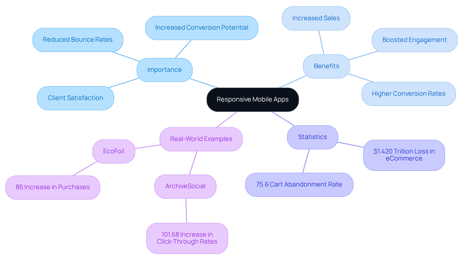
Have you ever felt frustrated when a website doesn’t work well on your device? Responsive mobile apps are designed to adjust their layout and functionality based on the screen size and orientation, ensuring a consistent and engaging experience across smartphones, tablets, and desktops. Adaptive layouts are vital; they enhance client satisfaction, reduce bounce rates, and increase conversion potential. When you make your applications adaptable, you’re not just reaching a wider audience; you’re creating a seamless experience that fosters loyalty among your users.
Did you know that the eCommerce sector loses about $1.420 trillion because of poor user experiences? That’s a staggering cart abandonment rate of 75.6%! On the flip side, businesses that embrace adaptive design often see significant benefits; 62% report increased sales after a redesign. Plus, responsive sites can boost engagement by around 20%, and those that are mobile-optimized enjoy conversion rates up to 40% higher than their non-responsive counterparts.
Let’s look at some real-world examples. ArchiveSocial improved their user experience and achieved a remarkable 101.68% increase in click-through rates after optimizing their homepage and pricing page. Similarly, EcoFoil experienced an 86% rise in purchases after redesigning their homepage for better visibility and accessibility. These stories show how thoughtful design changes can dramatically impact engagement and conversion rates.
As we look ahead to 2026, it’s clear that people are expecting seamless experiences across all their devices more than ever. A well-designed adaptable app that incorporates responsive mobile apps not only meets these expectations but also builds trust and credibility with users, making it an essential component of any startup's digital strategy. RNO1's approach to responsive solutions emphasizes not just aesthetics but also operational resilience, ensuring that startups can adapt and thrive in the evolving digital landscape.
Highlight Benefits of Responsive Design for Startups
Have you ever felt the frustration of losing potential customers because your website just doesn’t work well on their devices? Responsive design, particularly through responsive mobile apps, is more than just a trend; it’s a lifeline for startups navigating today’s digital landscape.
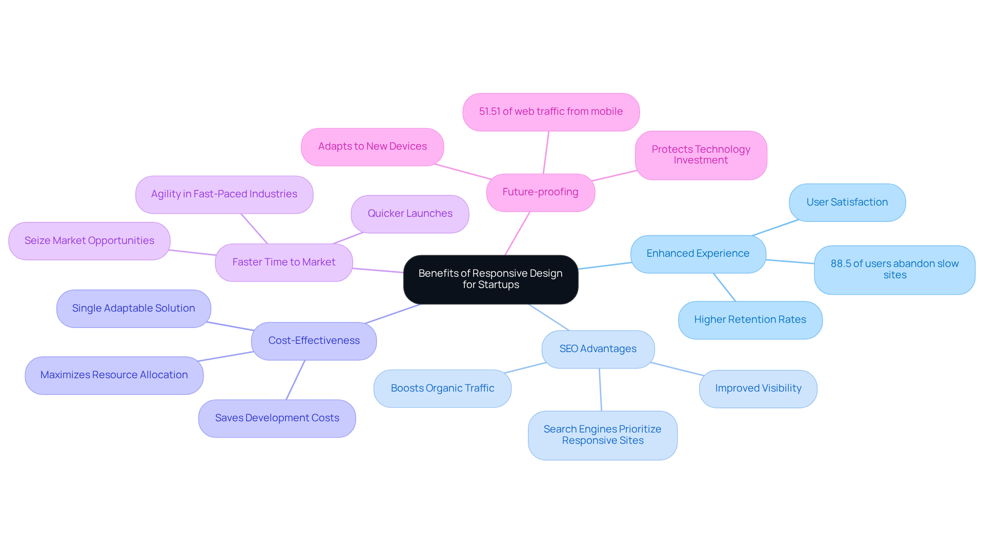
- Enhanced Experience: A consistent interface across devices significantly boosts satisfaction and engagement, leading to higher retention rates. With 88.5% of users considering slow loading times a top reason to abandon mobile sites, ensuring a seamless experience is critical. Imagine the relief of knowing your users are happy and engaged, rather than frustrated and leaving your site.
- SEO Advantages: Imagine your startup struggling to be seen online, only to discover that a responsive design could boost your visibility and attract more visitors. Search engines prioritize adaptable websites, which can enhance rankings and drive organic traffic. This is particularly vital for startups aiming to establish a strong online presence with responsive mobile apps in a competitive market.
- Cost-Effectiveness: Developing a single adaptable solution is often more economical than creating separate native platforms for different systems. This efficiency allows startups to allocate resources more effectively, maximizing their investment. Think about how much more you could do with those saved resources!
- Faster Time to Market: An adaptive approach enables quicker launches of responsive mobile apps, allowing startups to seize market opportunities without the delays associated with multiple versions. This agility is crucial in fast-paced industries. Picture your startup being the first to launch a new feature, capturing the attention of eager users.
- Future-proofing: Developing responsive mobile apps that adapt to new devices and screen sizes ensures they remain functional and visually appealing while protecting your investment in technology. With mobile devices accounting for 51.51% of global web traffic, adapting to this trend is essential for long-term success.
Case studies demonstrate these advantages: businesses that adopted adaptive approaches reported enhanced engagement from visitors and increased conversion rates. For example, mobile-friendly websites experience a 40% rise in conversion rates, illustrating the significant effect of adaptable interfaces on business results.
As we look ahead to 2026, think about how prioritizing adaptable layouts can not only enhance user experiences but also drive your startup’s growth in a mobile-first world. By collaborating with RNO1, you’re not just keeping up; you’re paving the way for your startup’s future success in a mobile-driven world.
Implement Responsive Design Strategies Effectively
Have you ever felt the frustration of losing potential customers because your app just doesn’t work well on their devices? It’s a common struggle for many startup founders, and it can be disheartening to see users leave your app due to usability issues. In fact, 88.5% of users abandon mobile sites because of slow loading times, often exacerbated by the lack of responsive mobile apps. This reality can weigh heavily on your mind, especially when you know that a well-designed app can significantly enhance user retention and conversion rates.
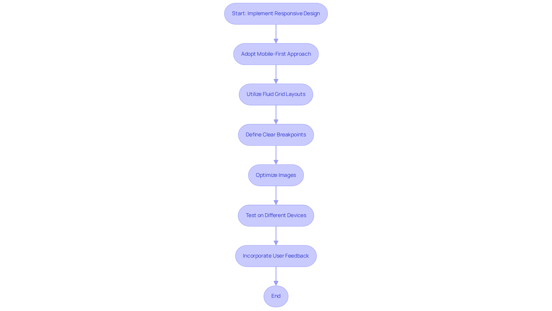
To tackle this challenge, consider adopting a mobile-first approach. Start by designing for the smallest screens first, ensuring that core functionalities are prioritized. This not only streamlines the experience but also aligns with the growing trend of mobile usage, which accounts for 52.2% of all web traffic. By focusing on mobile users first, you’re setting a solid foundation for your app’s success.
Next, utilize fluid grid layouts that allow elements to resize proportionally. This adaptability is essential, as 74% of individuals are more likely to return to a website if it is mobile-friendly. Imagine the relief of knowing that your app looks great on any device!
Defining clear breakpoints in your CSS is another vital step. This practice improves usability and ensures that responsive mobile apps adjust seamlessly to different screen sizes. Remember, 60% of consumers consider usability a vital characteristic for online shopping, so making this a priority can truly pay off.
Don’t forget about your images! Optimize them to be responsive by employing CSS techniques like max-width: 100%. High-quality images can significantly influence purchasing decisions, with 90% of shoppers considering image quality a key factor. You want your app to shine, right?
Make it a habit to test your app on different devices and screen sizes; it’s a great way to spot and fix usability issues before they become a problem for your users. This proactive step can make all the difference, especially since 60% of consumers say usability is key when they shop online.
Incorporating feedback from users into the development process is also crucial. Engaging with your audience can lead to a 400% potential increase in conversion rates, showcasing the importance of a participant-focused approach.
For instance, EcoFoil increased purchases by 86% after modifying the layout and design of their home page. This case study highlights the tangible benefits of implementing adaptable design strategies.
By embracing these strategies, you’re not just improving your app; you’re creating a welcoming space for your users that can lead to lasting relationships and increased success.
Compare Responsive Apps with Native Apps for Informed Decisions
Choosing the right app type can feel overwhelming for startup founders, especially when every decision seems to carry so much weight. When it comes to responsive mobile apps versus native apps, there are several important factors to consider.
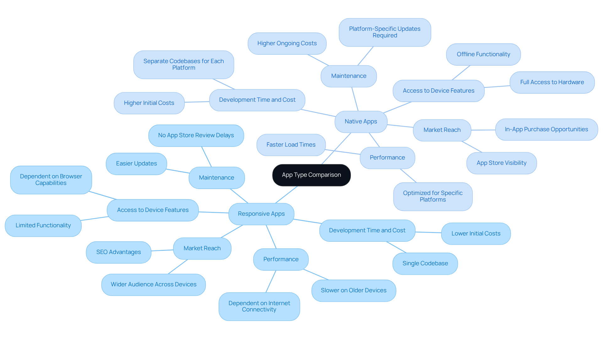
- First, let’s talk about performance. Native solutions generally provide superior performance and responsiveness, as they’re optimized for specific platforms. But don’t worry - if designed thoughtfully, responsive mobile apps can still deliver a great user experience that meets your needs.
- Next up is development time and cost. You might find that creating responsive mobile apps can be quicker and more budget-friendly, as they only need one codebase to work across devices. On the other hand, native software needs separate development for each platform, which can take more time and resources than you might have available.
- Another factor to consider is access to device features. Native software can leverage device-specific features like GPS and camera more effectively than responsive solutions, which may limit functionality. However, with the right design, responsive mobile apps can truly shine and offer an excellent experience for your users.
- Maintenance is another area where responsive solutions often excel. You’ll find that managing responsive solutions is often simpler, as updates only need to be made in one place, unlike native solutions that require updates on each platform.
- Finally, let’s discuss market reach. Responsive mobile apps can help you connect with a wider audience across various devices, making them an excellent choice if you’re looking to reach as many users as possible. Ultimately, the right choice can pave the way for your startup's success, making it essential to consider all factors carefully.
Conclusion
Many startups find themselves losing potential customers because their apps fail to engage users effectively. Responsive mobile apps are not just a design choice; they’re essential for thriving in today’s competitive digital landscape. When apps adapt seamlessly to different devices, it’s not just about functionality; it’s about making users feel valued and understood, which can lead to happier customers and better business outcomes.
Throughout this article, we’ve explored the many benefits of responsive design for startups. From enhancing user experiences to improving SEO and cost-effectiveness, the advantages are clear. Take EcoFoil, for example; after a thoughtful redesign, they saw a significant increase in purchases, showcasing the tangible impact that good design can have on business success. Additionally, understanding the differences between responsive and native apps helps startups make informed decisions that align with their goals.
Responsive design is crucial; it’s the backbone of a digital presence that truly connects with users, making them feel at home no matter where they are. Startups that prioritize adaptable layouts and collaborate with partners like RNO1 can position themselves for success, ensuring they meet the evolving expectations of their users. Investing in responsive mobile apps today means securing a brighter, more connected future for your startup tomorrow.
Frequently Asked Questions
What are responsive mobile apps?
Responsive mobile apps are designed to adjust their layout and functionality based on the screen size and orientation, providing a consistent and engaging experience across smartphones, tablets, and desktops.
Why are responsive mobile apps important?
They enhance client satisfaction, reduce bounce rates, and increase conversion potential by creating a seamless experience that fosters user loyalty.
What impact does poor user experience have on eCommerce?
The eCommerce sector loses approximately $1.420 trillion due to poor user experiences, with a cart abandonment rate of 75.6%.
What benefits do businesses see from adopting adaptive design?
Businesses that embrace adaptive design often report significant benefits, including a 62% increase in sales after a redesign and a 20% boost in engagement. Mobile-optimized sites can enjoy conversion rates up to 40% higher than non-responsive counterparts.
Can you provide examples of companies that improved their performance through responsive design?
Yes, ArchiveSocial improved their user experience and achieved a 101.68% increase in click-through rates after optimizing their homepage and pricing page. EcoFoil experienced an 86% rise in purchases after redesigning their homepage for better visibility and accessibility.
What are the expectations for responsive mobile apps in the future?
By 2026, users are expected to demand seamless experiences across all their devices, making well-designed adaptable apps essential for building trust and credibility with users.
How does RNO1 approach responsive mobile app solutions?
RNO1 emphasizes not just aesthetics but also operational resilience in their responsive solutions, ensuring that startups can adapt and thrive in the evolving digital landscape.
List of Sources
- Define Responsive Mobile Apps and Their Importance
- 70+ Key Web Design Statistics for 2026 | Wingify (https://wingify.com/blog/web-design-statistics)
- How Responsive Websites Improve Engagement & Conversions (https://midriffinfosolution.org/how-responsive-websites-improve-user-engagement-and-conversions)
- Highlight Benefits of Responsive Design for Startups
- Statistics Supporting Responsive Web Design (https://genetechsolutions.com/blog/stats-for-responsive-web-design)
- Mobile/Responsive Design Statistics [Infographic] (https://gate39media.com/blog/mobile-design-infographic)
- 28 Essential web design statistics for 2026: Trends & insights (https://hostinger.com/tutorials/web-design-statistics)
- Responsive Website Design Stats: 40+ Key Statistics for 2026 (https://nexalitservices.com/guides/responsive-website-design-stats)
- 8 Statistics that Show Responsive Web Design is Essential to SEO (https://infront.com/blog/8-statistics-that-prove-responsive-web-design-is-essential-to-seo)
- Implement Responsive Design Strategies Effectively
- 70+ Key Web Design Statistics for 2026 | Wingify (https://wingify.com/blog/web-design-statistics)
- 49 interesting web design statistics (https://contentsnare.com/web-design-statistics)
- 28 Essential web design statistics for 2026: Trends & insights (https://hostinger.com/tutorials/web-design-statistics)
- Statistics Supporting Responsive Web Design (https://genetechsolutions.com/blog/stats-for-responsive-web-design)
- 25+ Web Design Statistics that Are Essential to Know in 2023 (https://blog.hubspot.com/marketing/web-design-stats-for-2020)
- Compare Responsive Apps with Native Apps for Informed Decisions
- 20 Mobile App Statistics To Know In 2026 (https://mindsea.com/blog/app-stats)
- Mobile Web: Responsive vs. Native Performance - Pingdom (https://pingdom.com/blog/mobile-web-responsive-vs-native-performance)
- Responsive Web Apps vs. Native Mobile Apps (https://povio.com/blog/pros-and-cons-of-responsive-web-apps-vs-native-mobile-apps)
- Responsive Web App vs. Native Mobile App: A Comprehensive Guide | Bugsee (https://bugsee.com/blog/responsive-web-app-vs-native-mobile-app-a-comprehensive-guide)
- App Performance Rates (2026) (https://businessofapps.com/data/app-performance-rates)


